Recently Updated
Declined
Last Updated:
18 Oct 2021 13:51
by ADMIN
Created by:
Jeff
Comments:
2
Category:
Kendo UI for jQuery
Type:
Feature Request
It would be wonderful to have code highlighting and Intellisense for script blocks using the text/x-kendo-tmpl type in Visual Studio.

Currently you can change the type to text/html to get partial html syntax highlighting, but it does not highlight Kendo specific elements inside #: #.
Unplanned
Last Updated:
14 Oct 2021 11:31
by ADMIN
Created by:
gjb
Comments:
0
Category:
Kendo UI for jQuery
Type:
Feature Request
When a chart is exported from an application, the source is not very clear. It can be written in the author property, but that is not visible.
I would like to be able to create page header/footer.
I can export a PDF page with custom layout using a DOM selector, but in that case the output does not includes paged data in for example a Gantt chart
Declined
Last Updated:
14 Oct 2021 11:24
by ADMIN
Created by:
Steven
Comments:
0
Category:
Kendo UI for jQuery
Type:
Feature Request
There are times when it is not obvious that the Listview contains more records than are displayed. It would be nice to have an optional indicator that there are more records above or below the current scrolled view. Another option is to keep the scrollbar turned on.
Declined
Last Updated:
14 Oct 2021 11:22
by ADMIN
Created by:
EZ
Comments:
0
Category:
Kendo UI for jQuery
Type:
Feature Request
When the chart is rendered, it would be nice if the various chart elements (SVG groups/paths/shapes/etc) were assigned class names so that we can further tweak the chart using javascript, d3.js, drawing api, etc.

The addition of visual styles helps, but they are not available on all elements,
Declined
Last Updated:
14 Oct 2021 11:16
by ADMIN
Created by:
Cheryll
Comments:
0
Category:
Kendo UI for jQuery
Type:
Feature Request
We need the ability to disable the keyboard or input read only for the combo box widget. When we don't want a user to input their own data on the combo box currently there is no option to disable this function.
Declined
Last Updated:
14 Oct 2021 11:10
by ADMIN
Created by:
Lee
Comments:
0
Category:
Kendo UI for jQuery
Type:
Feature Request
When setting the 'useNativeScrolling' to true in 'app.js', the rendering of a drawer is effected.  Additionally, trying to scroll on the drawer actually scrolls the view (which will be partially off the screen).

Some views will not need native scrolling so it would be beneficial to have the option to choose which views use native scrolling and which do not.

I am aware there is the data-use-native-scrolling attribute but this seems to have the same problem as 'useNavtiveScrolling' in 'app.js'.
Declined
Last Updated:
14 Oct 2021 11:10
by ADMIN
Created by:
Andrew
Comments:
0
Category:
Kendo UI for jQuery
Type:
Feature Request
The mobile application exposes an 'init' event when the application has initialised. This would be useful on all UI widgets, especially in circumstances when MVVM is not being used, for example to check whether other widgets are also initialised and perform actions accordingly.
Declined
Last Updated:
14 Oct 2021 11:08
by ADMIN
Created by:
Don
Comments:
2
Category:
Kendo UI for jQuery
Type:
Feature Request
When you have a ListView that can show thousands of records (presumably using a remote dataSource), it would be very useful to be able to start at a given point in the list, rather than having to start at the top of the list and scroll down thousands of records to get to the point you want.

This is currently possible to do when you have a ListView with set number of records that are all displayed at once by using the view's .scrollTo() function, but not possible when endlessScroll is on on the ListView.

Here is my original support ticket and the response I received regarding this matter:

<BEGIN MY SUPPORT TICKET>
I have a ListView which has a remote dataSource.  EndlessScroll is on in the ListView.  That part works as expected.  However, at times I need to programmatically "scrollTo" a particular point in the ListView.  To do this, I call .scrollTo() on the view's scroller (e.g. $('#MyView').data('kendoMobileView').scroller.scrollTo(0, -725)).  If I .scrollTo() a point that is too far down the page, sometimes the data doesn't show or only a couple of records/rows show and the "loading" icon is beneath them.  Here is an example of what I mean.

Given that we have a ListView with endlessScrolling on to which is attached a dataSource that reads from a remote url and has a pageSize of 50.  If we .scrollTo() about 25% down the list (approximately 13 rows down), everything works fine (i.e. after the .scrollTo() completes, we are at the row we want and all the records are there).  However, if instead of 25% we .scrollTo() about 60% down (approximately row 30), none or only some of the records with a spinning "loading" icon will be visible.

Based off of what I read here http://docs.telerik.com/kendo-ui/getting-started/mobile/listview#press-to-load-more-/-endless-scrolling, I believe what is happening is that since the ListView "adds" more of the records from the page that was retrieved from the dataSource as you scroll down the list when in virtual mode, if we .scrollTo() too far down the page, the ListView isn't smart enough to know to "add more" rows to the DOM and also make a call to the next page of the dataSource if it is necessary.  Basically, I believe ".scrollTo()" needs to trigger the ListView to add to the DOM and make a call to the next page of the dataSource the same way that scrolling with your finger would do.

I hope there is a solution/fix/hack to this because I have spent many hours on this.
<END MY SUPPORT TICKET>


<BEGIN TELERIK'S RESPONSE>
Thank you very much for the detailed information.

I am afraid that when the ListView is used in "endless scrolling" mode the scrollTo() method will not work as expected. The main idea behind the endless scrolling functionality is to load records on demand and load only the elements that the user wants to see, this is why the elements displayed are constantly changed as new items are loaded.

Currently there is not a workaround that I can offer. If you really want to see this functionality added in the future I would suggest you to check our uservoice section, where you can post this as a feature request, so it will be considered for a future implementation.
<END TELERIK'S RESPONSE>
Declined
Last Updated:
14 Oct 2021 11:06
by ADMIN
Created by:
Stacey
Comments:
6
Category:
Kendo UI for jQuery
Type:
Feature Request
In followup to my last statement about adding data to the validation events, Kendo UI's validator would be greatly, greatly, GREATLY augmented with an extremely simple function...

onErrorDisplay(target, message, invalid) {

}


The sole purpose of this function is to allow users to hook into it, and custom handle error display more finely. It is fairly simple to add, look at line 11924 of the kendo source file; At Line 11948, there is the code to show the error message. The onErrorDisplay function would allow for catching that and interpreting it differently if requested.
Declined
Last Updated:
14 Oct 2021 11:05
by ADMIN
Created by:
Paul Reynolds
Comments:
1
Category:
Kendo UI for jQuery
Type:
Feature Request
At the moment, Kendo mobile is pretty 'static': you need to define labels, etc. for switches at the point of construction.

This makes internationalisation a little tedious, as to change the label for a different user selected language, we have to 'manually' use jquery to dig out the span, etc.

It also means that whilst we can get it working as mentioned above, any update to the toolkit could break our code as we are building in expectations on html structure.

Further, aside from label setting, 'containers' need to adjust their sizing to accommodate the dynamic content, e.g. switch is a good example of static!
Declined
Last Updated:
14 Oct 2021 11:04
by ADMIN
Created by:
Leslie
Comments:
0
Category:
Kendo UI for jQuery
Type:
Feature Request
the *.map files in the js directory are excluded by Eclipse. I have yet to figure out why this is. At any rate - they are not yet being returned to the browser
Declined
Last Updated:
14 Oct 2021 11:03
by ADMIN
Created by:
Jason Feng
Comments:
0
Category:
Kendo UI for jQuery
Type:
Feature Request
I use ios theme for Android to keep user interface consistent with ios and Android. However, there is a problem with form input. Please refer details in support Id: 796192. This is probably an easy fix from your guys. Thanks.
Completed
Last Updated:
14 Oct 2021 10:59
by ADMIN
Created by:
Jonathan
Comments:
0
Category:
Kendo UI for jQuery
Type:
Feature Request
Add advanced touched samples like drawing a line zooming a tab!
Declined
Last Updated:
14 Oct 2021 10:58
by ADMIN
Created by:
Imported User
Comments:
0
Category:
Kendo UI for jQuery
Type:
Feature Request
I would like to see the ability to hide an entire series from appearing in the legend of a multi series donut chart without having to add a VisibleInLegend property to my data model and set the value for every item. Doing this not only increases the amount of data being sent between client and server but it also adds information to the data model that ties it to particular chart types.
Declined
Last Updated:
14 Oct 2021 10:56
by ADMIN
Created by:
Adrian
Comments:
1
Category:
Kendo UI for jQuery
Type:
Feature Request
Currently drawer's automatically add a scroller wrapper. Sometimes you want the content in the drawer to automatically stretch to fit the drawer.
Declined
Last Updated:
14 Oct 2021 10:55
by ADMIN
Created by:
Tiberiu
Comments:
0
Category:
Kendo UI for jQuery
Type:
Feature Request
http://msdn.microsoft.com/en-us/library/0c899ak8(v=vs.110).aspx describes all sorts of format strings which can be used in formatting templates. For example, if one wants a conditional on positive, negative, and zero values, one can use such format "{0:N2};neg{0:N2};no value". Search in the link for Section Separator
Completed
Last Updated:
14 Oct 2021 10:46
by ADMIN
Created by:
Pete
Comments:
0
Category:
Kendo UI for jQuery
Type:
Feature Request
Make common elements publicly accessible.

Most notably, root objects like ui.Widget, ui.List, and data.DataSource objects, and sub functions like parseOption and parseOptions, are all internally referenced.  You cannot extend any of them to provide global functionality to the elements that inherit from them.

kendo.ui.List and kendo.data.DataSource were particularly frustrating to debug, since the externally available versions are only copies of the real internal objects.  I tried to add global functionality that never worked until I realized that the real inherited objects were closure objects.
Completed
Last Updated:
08 Oct 2021 07:05
by ADMIN
Release R3.2021.SP.next
Created by:
Aniket
Comments:
1
Category:
Kendo UI for jQuery
Type:
Bug Report
I am trying to upgrade to jQuery 3.5.1 and as per the documentation regarding compatible KendoUI versions I have upgraded KendoUI to v2021.1.119 (R1 2021). Now even though this version is compatible, I am getting warning messages from jQuery Migrate plugin as follows:
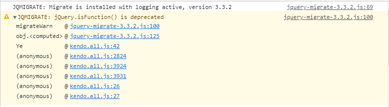
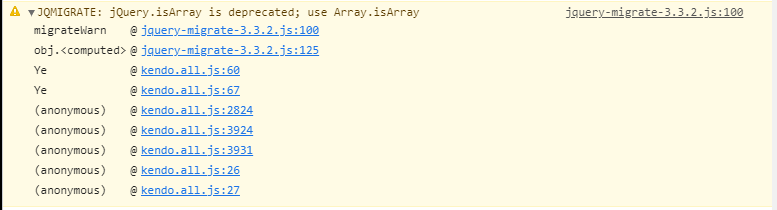
Wondering if this issue is known and support for the issue is on its way. Or else is it reccomended to change the minified JS files as these seems to be simple fixes.
Thanks!
Completed
Last Updated:
07 Oct 2021 10:32
by ADMIN
Release R3.2021.SP.next
Created by:
Alexander
Comments:
0
Category:
Kendo UI for jQuery
Type:
Bug Report
There are invalid styles in the PivotGrid less-based themes _layout file that cause compilation error.
Completed
Last Updated:
01 Oct 2021 14:30
by ADMIN
Created by:
Robert
Comments:
1
Category:
Kendo UI for jQuery
Type:
Feature Request
I moved from Silverlight to HTML/KendoUI for building RIAs. One feature I am accustomed to using is the template selector.

For instance I currently have a situation where I display an editable list of policy holders using KendoUI. However a policy holder could be a person or a business and different fields/labels should be shown depending on the source object.

As a workaround I have conditional logic in the template itself, but it isn't pretty.

Please add template selectors for all list controls so that it is easier to style items.