Plotband functionality for RadHtmlCharts in UI for Asp.net AJAX definitely needs the ability to add tooltips and labels, otherwise the plotband is meaningless.
http://www.telerik.com/help/silverlight/radexpressioneditor-overview.html
Please see http://dojo.telerik.com/uSaq/3 When you click on the "reload" button, the gauge always animates from 0 to the given value.

We would like to animate the gauge between current and next value, without jumping to 0.

(related to support ticket : http://www.telerik.com/account/support-tickets/view-ticket.aspx?threadid=892750 )
Something similar to this: http://ui.ajax.org/#demos/elements.flowchart
There only seems to be support for assigning a display timezone to the Scheduler component.  This means that other date/time components/formats are forced to use either the browser's timezone (default) or require various event hacks to allow for manual conversion of values from the browser timezone to the preferred timezone used to display date/time values.

It would be very nice if the following were supported:

1. Ability to set a default timezone across all date/time widgets (not just the scheduler). This could be similar to how cultures are set to localize messages and formats.  If left unset, it would use the browser's timezone.

2. Ability to set a display timezone (different from the default) on all date/time components similar to what's available on the Scheduler.

Those features should yield the following benefits:
- allow end-users of applications using Kendo to select/store a preferred display timezone, which could be applied to all components.
- reduce the additional effort and workarounds required to apply a particular timezone consistently across all/some widgets
- If #2 allowed for functions (at least on some components like the Grid), it should make it possible to display date/times based on timezone values from records
It would be nice to add the telerik controls for flutter.
Add possibility to create cell editors with button opening popup or window containing for example Rich text editor, textarea or any other advanced editor. Currently it is impossible due to some limitations in grid incell editing design.
If not, it would be helpful to see how the jQuery option could be integrated with Svelte's (amazing) change detection.
Hi Support Team,
Would like to request for a new feature to double click on the header column or row can auto fix the column and row size.
The functionality of the RadTagCloud control in UI for ASP.NET AJAX would be a handy addition to the UI for MVC toolset.
We need legend in kendo map for our requirement.
Work like à tree view, but display as an organisation chart to see a company hierachy
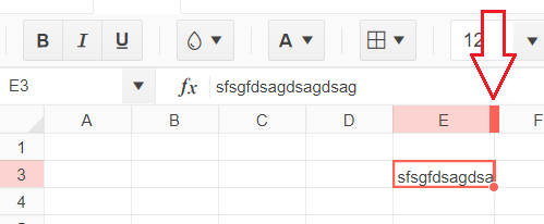
Pasting a cell value into multiple selected cells results in only the first cell in the range getting the value.
Steps to reproduce:
1) Go to https://demos.telerik.com/kendo-ui/spreadsheet/index
2) Click on cell B3 (Calzone) and press CTRL-C
3) Click on cell B4, hold the shift key and arrow down until cells B4-B7 are highlighted (or select the B4-B7 range with the mouse)
4) press CTRL-V
The outcome is only cell B4 receives the value of "Calzone".
Expected/desired behavior
All cells B4-B7 should have the value "Calzone".
One of the important features of any grid based pages is the ability to export the grid data in various formats. It's what is keeping me now from replacing all of the Datatables in my app with Kendo grids.The table Tools plugin for datatables is a great example, providing pdf, csv and excel exports all with aggregates, grouping and basic formatting options.

I;m hoping the next release has at least csv and/excel exporting options. Please also consider a UI column show/hide feature, again, similar to datables plugins.

I know the Kendo grid will eventually have all of this, but the sooner the better for those of us looking to move projects built with beta products (datatables) with more features to Kendo UI.

Thanks!
It would be good to have possibility to put button groups into multiple lines. Like Jquery Mobile. There is offeten to few space and too many buttons to fit them without multiple lies.
You can currently set series labels to position "center" on the pie chart to get them to render on the slices, but sometimes slices are too small to contain these labels. It would be great if there were an option for the chart to detect when a slice is too small and render the label outside the chart, while still rendering labels on pie slices that are big enough to contain them
Merge ListView and MobileListView implementations to have a single ListView with support for Grouping, PullRefresh, Infinite Scrolling etc.

For ex. Using a MobileListView with a single item per row on an ipad pro is a waste of space. But there is no support for applying grids ( purecss or bootstrap ) to the mobile listview. This is possible with the web listview but then you lose features like grouping, infinite scrolling, load more, etc.

Hence please make a single SuperListView with wider functionality support.
I'd really appreciate it if it were possible to include the Grid's aggregate data (the summary row) when using drawTabularData, and to format the summary row, like you can format the header row -- ideally including font style (e.g. bold), rather than just font color.
Hello,
I am experiencing a bug on my kendo grid filtering when doing a filter on the column with foreign keys.
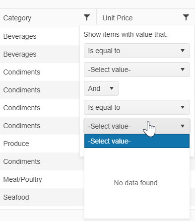
In the filtering popup, the 2nd dropdown to select value is always empty and there is no data associated with the dropdown.
You can also see this bug on yoru demo site:
https://demos.telerik.com/kendo-ui/grid/foreignkeycolumn
Here i am trying to filter by category and the first dropdown has data in it, however the 2nd one doesn't.
Please advise,
Thanks,
Vlad


