Bug report
While clicking tab key the button to choose Date or Time, Set and Cancel gets disappear
Reproduction of the problem
Dojo: https://dojo.telerik.com/eMaQIbAw
1. Click on the date button in the date time picker to open the Calendar popup
2. Press tab until the buttons disappear.
3. Pressing shift+tab will show the buttons again.
Expected/desired behavior
Set and Cancel buttons shall not disappear
Environment
Kendo UI version: [all]
jQuery version: x.y
Browser: [all]
Bug report
Modern DateTime picker messed-up and switches to timepicker when timpicker clicked i nthe back
Reproduction of the problem
1. Dojo: https://dojo.telerik.com/iJESeFUc
2. Click on the Calendar icon
3. Click around the calendar to hit the datepicker in the back
Result:
Environment
Kendo UI version: [all]
jQuery version: x.y
Browser: all
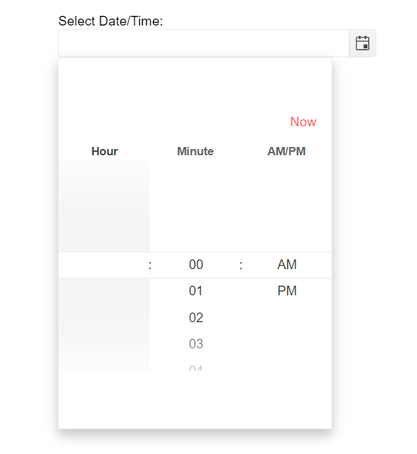
Bug report
Hours are not visible on load in modern DateTimePicker
Regression since 2022.1.119
Reproduction of the problem
https://demos.telerik.com/kendo-ui/datetimepicker/component-type
Expected/desired behavior
Hours shall be visible at all times.
Environment
Kendo UI version: 2022.1.119 or newer
jQuery version: [all]
Browser: [all]
The problem can be observed in the following example from the documentation:
When the dateInput property is set to true, the readonly method does not make the widget completely non-editable. It restricts user input, however, the date can be modified using the arrow keys.
Reproduction of the issue in a Dojo sample:
https://dojo.telerik.com/OpIFacOz
1. Initialize DatePicker
2. Set the dateInput property to true
3. Call the readonly() method
Current behavior
Value can be changed with the arrow keys
Expected/desired behavior
The value should not be editable
Environment
- Kendo UI version: 2019.1.220
- jQuery version: 1.12.4
- Browser: [all]
Bug report
When the Kendo UI TimePicker is used as an editor and the dateInput option is set to true, incorrect validation is initiated. By default, the DateInput underlying widget min option is set to today's date.
Reproduction of the problem
1. Create a TimePicker widget.
2. Set the dateInput option to true.
3. Open the cell for editing.
4. Press enter and see the default value applied.
Dojo sample:
https://dojo.telerik.com/EsolonuQ
Expected/desired behavior
When the TimePicker min option is set, the DateInput widget should take the min from the options of its owner, rather than taking today's date.
Workaround
Set the options of the DateInput after the initialization of the widget:
$(input).getKendoTimePicker()._dateInput.options.min = new Date(1910, 9, 11);Environment
* **Kendo UI version:** 2020.1.114
* **jQuery version:** 1.12.4
* **Browser:** [all]
Bug report
In DateInput, when format is set to "yyyy/MM/dd", the day number cannot be greater than 9.
Regression introduced with 2023.2.606
Reproduction of the problem
- Open the DateInput demo - https://dojo.telerik.com/edokOJuG
- Try to enter a number greater than 9 in the day part.
Current behavior
A number greater than 9 cannot be entered in the day part.
Expected/desired behavior
Numbers greater than 9 should be allowed for the day part.
Environment
- Kendo UI version: 2023.2.718
- Browser: [all]
Bug report
DateTimePicker throwns an error when templated date is selected in modern type
Reproduction of the problem
1) Open the Dojo:
https://dojo.telerik.com/aBohiHiR
2) Click on the dates which are highlighted (11or 6) in the below image. On clicking on the dates it will go to the Time tab
3) Click on the Set button. You can able to see an exception in the console.
Expected/desired behavior
No error shall be thrown
Environment
Kendo UI version: [all]
Browser: [all]
Date picker when entering the day or day and month to autofill the content with current year or current month and year, same as asp.net ajax datepicker
Bug report
Clicking on the Now button of a DateTimePicker with componentType: "modern" does not set the current time.
This is a regression introduced with v2023.1.314
Reproduction of the problem
- Run this dojo
- Open the Time view and click on
Now
Current behavior
Current date and time is not set.
Expected/desired behavior
Current date and time is set.
Environment
- Kendo UI version: 2023.1.314
- Browser: [all]
DateTimePicker controls for selecting a time don't scroll on touch screen devices as of 2022.2.510.
Previously this has worked without any problems, but since we updated to 2022.2.510 the timepicker dropdown list no longer scrolls on touch screen devices, and instead the entire page scrolls, so the user can't select any other times.
We have included the 'kendo.mobile.min.js' and 'kendo.mobile.scroller.min.js' files but this has not resolved the issue.
Dear support,
I didn't find in your documentation if and how we can use data-* annotations to setup dataInput options of a datepicker.
I would like to do the same thing that the code below does but with MVVM data-* annotation.
            self.date= $('#dateExample').kendoDatePicker({
                format: 'dd.MM.yyyy',
                dateInput: true,
            }).data('kendoDatePicker');
            self.date._dateInput.setOptions({
                format: 'dd.MM.yyyy',
                messages: {
                    'year': 'yyyy',
                    'month': 'mm',
                    'day': 'dd'
                }
I globally use data-bind for html and kendo UI components.
I just added the data-format in my html like below, and it works.
<input data-role="datepicker" id="dateExample" data-format="dd.MM.yyyy" data-bind="value: myValue">I wonder if we can setup format and messages options for the dateinput of the datepicker with MVVM without using jquery (with something like data-dateinput, data-dateinput-format, data-dateinput-messages...).
Thanks in advance for your usual support.
Regards,
Charline.
It would be great to allow custom configuration of Time drop down in DateTimePicker control.
Since most occurrences in normal system will take place between normal business hours (7am - 6pm), it would make sense to have the time dropdown start at 7am and then go on from there so it would be:
7am 8am 9am .... 4pm 5pm 6pm ...... 12am 1am etc.
This would improve user experience by putting the most commonly selected times first in the dropdown list and reduce the scrolling the user has to perform.
Hi Team,
I would like the user to be able to add a value into the Kendo UI DateTimePicker's input with the calendar opened. Currently, if the calendar is open, the focus will be on the calendar, and it will select today's date upon pressing enter.
Thank you!
The TimePicker widget allows specifying a max date via its options. If none is specified, the widget uses a default max date (00:00 of the current day). However, since the selected value also use the current day for its date part, all selected values are bigger than the max value.
This means that when checking whether a selected value is smaller than the defined max value, the check will always fail, because e.g. 2022-12-22 12:00 is bigger than 2022-12-22 00:00. This DOJO demonstrates the behaviour (select a value and check the console output).
In my opinion, it would make more sense to set the default max date to either 23:59 or 00:00 of the following day.
The time picker in the datetimepicker control doesn't work fully when accessed in mobile.
The behaviour can be seen on your own demo page here https://demos.telerik.com/kendo-ui/datetimepicker/index. Run the example, click the time icon to display available times, and you will see that you cannot scroll the times. It just shows what is initially loaded, we would expect this to scroll to allow the time to be amended as needed.
Optionally allow for the disabling of Daylight Savings time detection when using the DateTime picker, or to set the TimeZone for the picker manually.
Bug report
DatePicker throws JS error "Cannot read property '_focus' of undefined" in the following scenario:
1. Focus element
2. Select all text inside
3 Press Backspace or Delete
4. Remove focus from the element by clicking outside
Dojo to reproduce: https://dojo.telerik.com/uZAhiHuC
Reported in #1450532
Bug report
The close event of a DateTimePicker with componentType: modern does not provide reference to the view
Reproduction of the problem
- Run this dojo
- Open and close the DateTimePicker
- Note
e.viewisundefined
Expected/desired behavior
The event data of a DateTimePicker with componentType: modern should provide reference to the view
Environment
- Kendo UI version: 2022.3.913
- Browser: [all]
Since R1 2022, the setOptions method re-enables a disabled widget.
Dojo