Bug report
When the TabStrip has an empty dataSource initially, and then a new item is added using the dataSource.add() an error appears in the console and no item is added.
Reproduction of the problem
- Run the example and observe the console - https://dojo.telerik.com/nzQDTrjN
Current behavior
An error appears in the console, and no item is added.
Expected/desired behavior
An item should be correctly added in the TabStrip.
The issue is a regression starting with the KEndo version 2025.3.825
Workaround
Add an item in the dataSource initially and remove it when needed - Dojo - https://dojo.telerik.com/NgHHVOFy
Environment
- Kendo UI version: 2025.4.1111
- Browser: [all ]
Currently, when items are reordered or moved from one ListBox to another, the items are present in the dataSource, but not in the position they are displayed. I know about the following solutions:
- https://www.telerik.com/kendo-jquery-ui/documentation/knowledge-base/list-box-reordering-not-working
and - https://dojo.telerik.com/gDwkisQr
However, I would like to have a built-in method for retrieving the items in the order they are displayed.
Bug report
When NVDA is turned on the navigation in TabStrip is not working.
Reproduction of the problem
- Open the TabStrip demos - https://demos.telerik.com/kendo-ui/tabstrip/index
- Try to navigate between the tabs using the arrow keys.
Current behavior
The selection of the item is not changed.
Expected/desired behavior
It should be possible to navigate between the tabs in the TabStrip when NVDA is turned on.
The issue is a regression starting with 2022 R3 (2022.3.913) release.
Environment
- Kendo UI version: 2023.3.1114
- Browser: [all]
Bug report
The selected tab's text is not readable with the main-dark theme
Reproduction of the problem
- Open the TabStrip Overview demo - https://demos.telerik.com/kendo-ui/tabstrip/index?autoRun=true&theme=material-main-dark
Current behavior
The background of the Selected Tab is white and the text is not readable
Expected/desired behavior
The background of the Selected tab should contrast to its text
Environment
- Kendo UI version: 2023.2.718
- Browser: [all]
Bug report
TabStrip items are not receiving focus when navigating. Only the disabled items receive k-focus class.
Reproduction of the problem
Scenario 1:
- Open the Dojo - https://dojo.telerik.com/@NeliKondova/ucOToMUD/2
- Navigate using the keyboard
Scenario 2:
- Open the same Dojo and select a tab different than Tab 1
Current behavior
Scenario 1: The items could not be focused. The k-focus class is applied only to the 'Tab 3' tab which is disabled.
Scenario 2: The first Tab receives the k-focus class for a moment and appears as focused, while a different tab is selected
Expected/desired behavior
The tabs in the TabStirp should receive focus.
Environment
- Kendo UI version: 2023.1.425
- Browser: [all ]
Reproduction of the problem
https://dojo.telerik.com/AGaceyAD
Current behavior
Tabs exceeds parent container.
https://www.screencast.com/t/H4lCTxwwr
Expected/desired behavior
Tabs should wrap to the next row.
Environment
- theme: less themes
- Kendo UI version: 2022.2.510
- Browser: all
Hi Team,
I would like to request the functionality to configure the tabs position to be in multiple locations. Please see the attached image for an example.
Thank you!
Bug report
For a TabStrip in a PanelBar, the content for all tabs is displayed initially. You need to select all the tabs so that the content would start displaying correctly for the corresponding tab.
Reproduction of the problem
- Open this Dojo - https://dojo.telerik.com/@martin.tabakov@progress.com/IxUxAfOT/5
Current behavior
The content for all the tabs is displayed.
Expected/desired behavior
The content should be displayed separately for each tab.
Environment
- Kendo UI version: 2021.3.1207
- Browser: [all]
Bug report
Selecting a tab from the TabStrip causes the page to scroll to the top. The body height must be at least 746px in order to reproduce the bug.
Reproduction of the problem
- Open this Dojo example - https://dojo.telerik.com/@Dimitar-Goshev/ANOkAfor
- Scroll down the page until the tab's content is visible.
- Select another tab.
Current behavior
The page scrolls to the top.
Expected/desired behavior
Selecting a tab shouldn't cause scrolling.
Environment
- Kendo UI version: 2021.3.1207
- Browser: [all]

Describe the regression
Using the latest version of Kendo UI, if the Kendo UI TabStrip is set to scrollable: false, the tabs flex styling/structure is affecting the appearance of the tabs.
To reproduce
Steps to reproduce the behavior:
- Go to the following Progress Kendo UI Dojo
Expected behavior
Previously in Kendo UI version 2021.2.616, setting the scrollable to false will wrap the tabs above each other.
Working example
Affected suites
- Kendo UI for jQuery
Affected browsers
- All
Build system information
- Not Applicable
Hi,
I combined code form two examples found on your site in order to reproduce the bug.
The original example describes how to append tab to the tabStrip:
https://docs.telerik.com/kendo-ui/api/javascript/ui/tabstrip/methods/append
dojo editor: https://dojo.telerik.com/alEGIcod
I added this line
tabStrip.remove("li:first");
that was copied from the other example about removing tab:
https://docs.telerik.com/kendo-ui/api/javascript/ui/tabstrip/methods/remove)
Just "li:last" I replaced by "li:first"
Now the appended tab has content of the second tab "Content 2" instead of "Appended Tab 1 content".
The bug reproduced.
I think that the problem is that the both tabs have the same id: id="tabstrip-tab-2"
<!DOCTYPE html>
<html>
<head>
<meta charset="utf-8"/>
<title>Kendo UI Snippet</title>
<link rel="stylesheet" href="https://kendo.cdn.telerik.com/2020.3.1118/styles/kendo.default-v2.min.css"/>
<script src="https://code.jquery.com/jquery-1.12.4.min.js"></script>
<script src="https://kendo.cdn.telerik.com/2020.3.1118/js/kendo.all.min.js"></script>
</head>
<body>
<div id="tabstrip">
<ul>
<li>Tab 1</li>
<li>Tab 2</li>
</ul>
<div>Content 1</div>
<div>Content 2</div>
</div>
<script>
var tabStrip = $("#tabstrip").kendoTabStrip().data("kendoTabStrip");
tabStrip.remove("li:first"); // added line
tabStrip.append(
[{
text: "<b>Appended Tab 1</b>",
encoded: false,
content: "Appended Tab 1 content",
},
]
);
</script>
</body>
</html>
Hi,
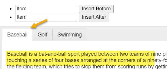
With the latest release of Kendo UI 2020.3.1118; the insertBefore/insertAfter methods of the tabStrip are removing the previous page tab content; works as expected in Kendo UI 2020.3.1021
Example - Select Inserted item, then select Baseball tab; Dojo Example
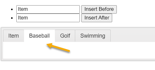
After insertBefore:
When focusing the comopnent a visual indication aims to show the user that something has changing during keyboard navigation. In the TabStrip there is no such indication. This also violates WCAG 2.4.7.
https://demos.telerik.com/kendo-ui/tabstrip/keyboard-navigation
At the moment, the tab strip renders the classes and elements that provide the scrollable functionality only on initial render.
Changing this configuration should be possible through the .setOptions() method, something like: https://dojo.telerik.com/@bratanov/EwoXAJuB
It should be possible to use a SlideIn animation in addition to the already-supported expand:vertical and fadeIn animations.
I'm working with a case where the text for the tab label is already HTML formatted. The TabStrip is bound to a DataSource object, allowing me to specify the text and value fields. However, I cannot specify whether the title is encoded or not.

Currently, the workaround is to use javascript to modify the HTML of the tab label after it has been rendered (http://dojo.telerik.com/UXuTE), but having a way to specify which data field to map to the encoded property would be much simpler (see above dojo for and example).
For the love of God please add this capability so people don't have to try and figure out all the different ways to do this either via MVC, AngularJS or just plain HTML5. You guys strain at a gnat and swallow a camel and it really ticks me off sometimes - you spend all this time creating a nice excel js object for the kendo toolkit but you can be bothered to spend the time to allow auto-creation of tab close button for the tabstrip. Trying to figure this out using an angular controller has proven to be a pain in the a$$ because your angular examples such to put it lightly!
Allow to edit tab(TabStrip) header name directly like when I double click or right click on any tab I can edit its name and on lost focus event it should save in database directly.


