Dear support,
I've found a bug in kendo ui grid concerning the combination of grouping, multi-column headers and showing/hiding columns. To reproduce the issue, please use the "Multi-column headers" demo on your kendo ui demos page. Now please use the column menu to hide both child columns of the 'Locatiion' column header ('Country' and 'City'). Now please group the data by the column 'Contact Title'. If you now use the column menu to show one of the previously hidden columns (e.g. 'Country'), you will see that it is shown at the wrong position (left site, index 0).
I've attached an image showing the issue.
Kind regards
Iggy
Starting from a Grid's "endless scrolling demo" on: https://demos.telerik.com/kendo-ui/grid/endless-scrolling-remote
Edit grid configuration to set smaller page size. All items of the first page need to be visible on the screen plus some free space. A grid height needs to be set. See this DOJO: https://dojo.telerik.com/amiNohIx
The vertical scroll bar is disabled and there is no way to get/see next pages of data.
Interesting is that use of the horizontal scrollbar (if one is available) starts some background operation (looks as data page load) and then the vertical scrollbar is OK.
Take this Dojo: https://dojo.telerik.com/iCECeXeC
1. Press 'Run'
2. Remove the filter for Contact Title
3. Press 'Save State'
4. Reload page (F5)
5. Press 'Run'
6. Press 'Load State'
Result: The filter for Contact Title is not removed.
On the other hand if I do the following:
1. Press 'Run'
2. Change the filter for Contact Title to 'Sales Representative'
3. Press 'Save State'
4. Reload page (F5)
5. Press 'Run'
6. Press 'Load State'
Result: The filter for Contact Title is changed correctly to 'Sales Representative'
Why is the first example not working? Is this intended behaviour or a bug? Is there a workaround?
Kind regards.
Hi,
There is a bug on the kendo grid when you have inline editing and a filter applied
So what's happening is that when you apply a filter and then click on "add new record" it doesn't show the new record, even worst it actually add the new empty record in the datasource, so you see new empty line when you remove the filter ....
it's really easy to demonstrate, i make you a dojo : https://dojo.telerik.com/EJIhohuf
this dojo is actually the editing inline demo (https://demos.telerik.com/kendo-ui/grid/editing-inline) with just the filtering enabled like so :
filterable: {
mode: "row"
}
to reproduce :
- apply any kind of filtering
- try to add a new record
- here you see nothing is happening, we expect to see a new empty line to add a new record (also the beforeEdit event is not fired but not sure this is a bug)
- remove the filtering
- you can see the empty lines (if click 5 times on add new record you get 5 empty lines)
Best regards,
you have a great product hope you can improve it even more
When resizing column widths have an option to lock the last column to the right hand border of the grid when sum of columns total width is smaller than grid. This way the grid will always fill the columns to the width of grid. For example if user reduces column 2's size in a 3 column grid then increase the size of column 3 so that it keeps the grid full width.
Instead of this:

It would look like this:

I have just tripped over a problem in the 2020 R1 release whereby the sort indicator is not being shown when autoBind is set to false.
To illustrate the problem run the following dojo
https://dojo.telerik.com/eMELiMut
which will show a sort indicator on the 'Ship Country' column.
Now if you uncomment 'autoBind:true' and 'dataSource.read();' and re-run you will see that although the data is being sorted correctly the 'Ship Country' column is missing the indicator.
Regards
Alan
We have few of dynamically created grid controls. I like to change the grid header style for all of them. I found this solution on the forum however there is an issue with this. If I override ".k-grid-header th.k-header" the change effects column filter popup content as well. See this example on dojo: https://dojo.telerik.com/@ssharifi/AvayONaQ all text and drop down texts are also effected.
I just need to override the title text. What style can I set so the title text is bold but not the filter options?
Thanks,
Shawn
Bug report
Grid's layout breaks when having columns with defined widths which sum exceeds 960px and the scrollable property is set to false.
Regression introduced in 2020.1.114
Reproduction of the problem
Open this Dojo in fullscreen and see Grid's layout.
If you change the Kendo UI version to 2019.3.1023, Grid's toolbar is correct
Current behavior
Expected/desired behavior
Grid's layout shouldn't break.

Environment
- Kendo UI version: 2020.1.114
- jQuery version: x.y
- Browser: [all]
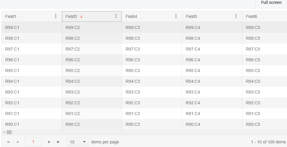
grid column virtualization issue with hidden column.
When you scroll further in your grid having one or multiple hidden column(s) the value of the hidden column appears in a side column.
<!DOCTYPE html>
<html>
<head>
<base href="https://demos.telerik.com/kendo-ui/grid/column-virtualization">
<style>html { font-size: 14px; font-family: Arial, Helvetica, sans-serif; }</style>
<title></title>
<link rel="stylesheet" href="https://kendo.cdn.telerik.com/2020.1.114/styles/kendo.default-v2.min.css" />
<script src="https://kendo.cdn.telerik.com/2020.1.114/js/jquery.min.js"></script>
<script src="https://kendo.cdn.telerik.com/2020.1.114/js/kendo.all.min.js"></script>
</head>
<body>
<div id="example">
<div id="grid"></div>
<script>
$(function() {
var columns = [];
var data = [];
var numberOfColumns = 500;
var numberOfRows = 100;
var field;
var row;
var i;
var j;
for (i = 1; i <= numberOfColumns; i++) {
field = ("Field" + i);
if(i==2)
columns.push({ field: field, title: field, width: 200, hidden: true });
else
columns.push({ field: field, title: field, width: 200 });
}
for (i = 1; i <= numberOfRows; i++) {
row = {};
for (j = 1; j <= numberOfColumns; j++) {
field = ("Field" + j);
row[field] = "R" + i + ":C" + j;
}
data.push(row);
}
var dataSource = new kendo.data.DataSource({
pageSize: 10,
transport: {
read: function(e) {
e.success(data);
}
}
});
$("#grid").kendoGrid({
dataSource: dataSource,
sortable: true,
scrollable: {
virtual: "columns"
},
width: 1000,
navigatable: true,
filterable: true,
columnMenu: true,
pageable: {
refresh: true,
pageSize: 10,
pageSizes: true,
buttonCount: 5
},
columns: columns
});
});
</script>
</div>
</body>
</html>
The SearchRow in RadGridView WinForms is extremely good.
https://docs.telerik.com/devtools/winforms/controls/gridview/rows/search-row
How can we implement the same in Kendo UI RadGrid?
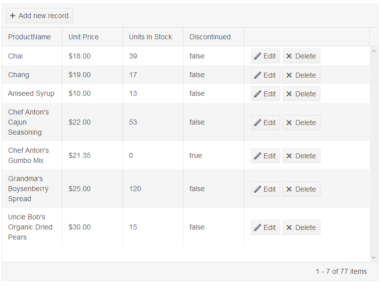
In the popup edit grid, when the editable: false option is displayed, the portion of the value is at the top rather than horizontal. Can you change it horizontal?
Bug report
When the horizontal scroll of the grid is shown and is configured for RTL, the resize handle is mispositioned.
Reproduction of the problem
1. Make the grid scrollable and set explicit widths to all columns.
2. Make the grid RTL.
3. Introduce multi-column headers.
4. Notice that the columns cannot be resized due to the disposition of the handler.
5. Dojo for replication:
https://dojo.telerik.com/IZInOVUd
6. Notice that whenever the horizontal scroll is not present, the resize handle is positioned correctly.
Environment
* **Kendo UI version:** 2019.3.1023
* **jQuery version:** 1.12.4
* **Browser:** [all]
Hi,
the adaptive rendering in the grid control is not working in the current version(2019.3.1023).
To reproduce go to https://docs.telerik.com/kendo-ui/controls/data-management/grid/appearance/adaptive#configuring-panes-on-mobile --> Open in Dojo --> Run and the 2 rows are not displaying. If you switch to version, choose Library dropdown, 2018.3.1017 or up to 2019.1.220 the 2 rows are ok.
Similar behaviour is inspected to the scheduler control agenda view. To reproduce go to https://docs.telerik.com/kendo-ui/controls/scheduling/scheduler/adaptive-rendering#configuring-panes-on-mobile --> Open in Dojo --> Run --> change view from week to Agenda and the 2 events are not shown. If you switch to version, choose Library dropdown, 2018.3.1017 or up to 2019.1.220 the 2 events are ok.
Tried in chrome, safari and mobile phones.
thanks,
Kostas Vlachakis
Enhancement
Excel files generated by Kendo Excel Export cannot be imported by the MS ODBC Driver. The error reported in this forum thread is: External table is not in expected format.
Current behaviour
If the file is opened and resaved with Excel or if the styles.xml file is replaced with any styles.xml generated by MS Excel, the error does not occur. When compared the styles.xml of Excel does not contain a numberFormat, no other obvious major differences at first glance:
E.g.:
<numFmts count="2">
<numFmt formatCode="#" numFmtId="165" />
<numFmt formatCode="#" numFmtId="166" />
</numFmts>
Expected/desired behavior
If possible, modify the styles.xml template to enable seamless use with OleDB
Bug report
Regression introduced in 2019.2.619.
Related commit: telerik/kendo@2a806f6#diff-f810c335b76ea2e4d78327457f230a46L3882-R3882
Reproduction of the problem
Dojo example.
- Add a new record.
- Click "Update" in the editor.
Current behavior
The following validation message is displayed: ! name
Expected/desired behavior
The validation message should be: ! name is required
Environment
- Kendo UI version: 2019.3.1023
- jQuery version: x.y
- Browser: [all]
I'd like the ability to choose the behavior of mutli-row selection on a virtual grid with persisted selection.
For purpose of example, assume we have a virtual grid with 50 rows (pager controls not shown), a page size of 10, and persisted selection.
1. Select row 1 on page 1.
2. Scroll down to trigger page 2 to load (rows 11-20).
3. Select row 11, page 2.
4. Current Behavior: Both row 1 and row 11 remain selected.
5. Desired Behavior: Only row 11 remains selected.
Reasoning: I believe that a virtual scrolling grid should have selection behavior identical to a single page. That means that the only way to add rows to the selection is holding down control/shift during selection. In other words, on page 1 of the above example, if I select row 1, then row 2, only row 2 remains selected. If I select row 1, then Ctrl+click/Shift+click row 2, both remain selected. For virtual scrolling where multiple pages are displayed fluidly as if a single page, it seems odd to have the selection behave differently.
Bug report
Reproduction of the problem
Dojo example.
- Drag the page splitter to resize the screen and see the Grid's pager correctly switch between the different responsive styles (expected)
- Click the "Open Modal" button, which opens a Kendo Window with another Grid in it
- Drag the page splitter and/or resizing the Window to see each of the Grid's paging styles changing accordingly (expected)
- Close the Window (destroy is called in the deactivate event handler)
- Try again to drag the page splitter to resize the screen. This time, the Grid's pager is no longer responsive
Current behavior
Responsiveness of the pager of a Grid declared outside the Window is affected by the Window's destroy method.
Expected/desired behavior
Calling the destroy method has no unexpected effect on components that are not nested in the Window.
Environment
- Kendo UI version: 2019.3.1023
- jQuery version: x.y
- Browser: [all ]
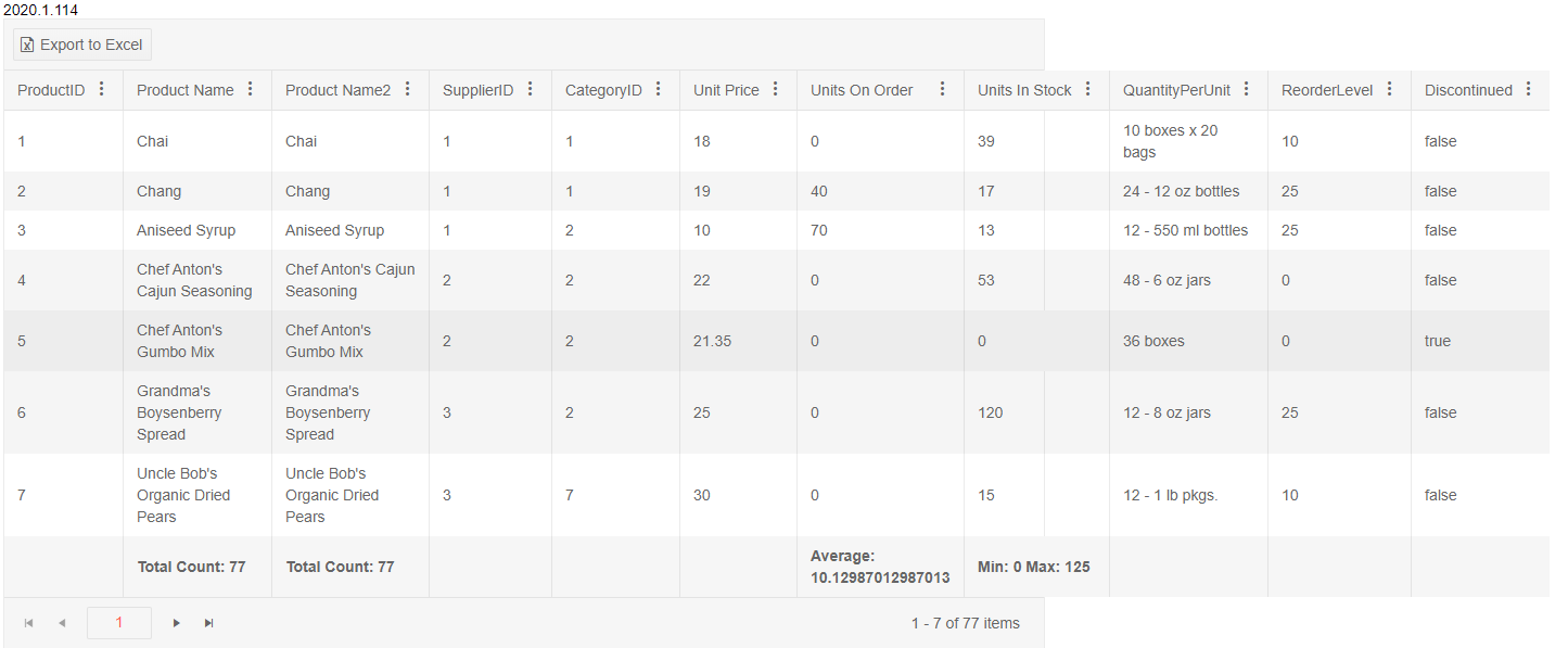
Hello, the Excel Export doesn't export the columns headers sums (view in image).
Is it possible export to Excel columns headers sums?
Bug report
When the Kendo UI Grid is paged and the Search panel input is focused, the page is automatically switched to the first one.
Reproduction of the problem
1. Navigate to the live demo:
https://demos.telerik.com/kendo-ui/grid/search-panel
2. Change page to 2 (for instance).
3. Focus the Search panel input.
4. The page is changed to the first one.
Expected/desired behavior
When the search panel is empty and only focused, the page should remain the same.
Environment
* **Kendo UI version:** 2019.3.1023
* **jQuery version:** 1.12.4
* **Browser:** [ IE 11.768.17763.0]


