When a non functional template is used for the labels in the Chart in webpack project, an error is thrown.
- Run the attached sample and observe the behavior.
npm install
npm start
The following error is displayed: labelTemplate is not a function TypeError: labelTemplate is not a function
If the template is removed or replaced with funcitonal template, the Chart displayes as expected
Workaround:
resolve: {
        mainFields: ['es2015', 'es', 'module', 'main', 'browser']
    }
User want to drag the series point as well as series line(whole series line) in any direction, so the user can move the series where he want, please refer the below URL, where user can move the series point in vertical direction only, likewise the user want to drag the series point as well as series line in any direction, so he can set the threshold  limit where he want by using the custom series and analysis the chart against his threshold limit

http://jsfiddle.net/SpaceDog/QsKaJ/1/
Chart Series provide a toggleVisibility() method that allows to hide some data points of the series (or all of them) from the user. However, setting the first series to invisible breaks the chart's keyboard navigation.
This DOJO demonstrates the behavior: For the sake of simplicity, the first of the two series is toggled invisible right after the chart is rendered, but this may happen at any other point in time. Click anywhere in the DOJO's output area. Press TAB to focus the chart. The following error is logged in the browser console:
Uncaught TypeError: Cannot read properties of undefined (reading 'options')
    at init.focusVisual (kendo.all.min.js:9:4230266)
    at init._focusElement (kendo.all.min.js:9:4410242)
    at init._focusFirstPoint (kendo.all.min.js:9:4409100)
    at init._focus (kendo.all.min.js:9:4407358)
Hi Team,
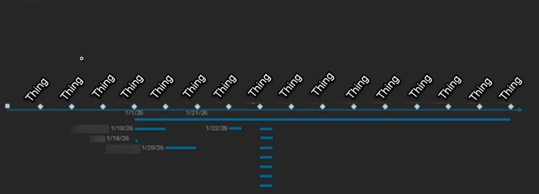
I would like to request a chart which visually displays workflow data similar to a Gantt chart but in pivoted form.
Thank you!
Description
When the points in the ScatterLine chart are unevenly spaced, the resulting line may appear less smooth and have unexpected curve
Steps To Reproduce
- Open the Dojo - https://dojo.telerik.com/AqCtkUxD
Screenshots or video

Actual Behavior
The line may appear with an unexpected curve and is not smooth.
Expected Behavior
When the smooth option is enabled, the line should appear smooth with all the data.
Reported in TicketID: 1703639
Hi Team,
I would like to request a built-in way to set a gradient area between line series.
Thank you!
Hi Team,
I would like request adding automatic line breaks for Kendo UI Charts to help avoid lengthy labels.
Thanks!
Hi Team,
I would like to request a way to set the color/type of a series so if it makes a condition, the color/type would change. For example, if the series count reaches a certain amount, change the color of the line, and the type to dash. Perhaps setting the Series.Line.Color as a function would be great.
Thank you!
Hi Team,
Currently, the Kendo UI Chart's legend labels and Drawing API offers font property, which includes style, size and family only, as described in CSS documentation. Needs underline and strikethrough, which are considered "decorations" on the font in CSS, but seems like since these attributes exist already in editor, the code is around there somewhere. Would like to see either font include support for those attributes or another "decorations" attribution (or maybe underline attribute and strikethrough attributes if that's easier for people to understand).
Thank you!
In the Kendo UI Chart Widget, if labels are too close to each other, they end up overlapping, making the labels unreadable (as visible in the attached screenshot), thus rendering the widget unusable.
It would be really useful to have implemented a feature similar to Smart Labels (included in the WPF version and also documented in the attached screenshot)
Hi,

For example, if you look at this chart in 10 days zoom view, you will notice they skip the weekends, means, they are not drawing empty data points for weekends. It is normal requirements for candle charts in stock market.

https://mbshighway.com/features/interactive-charts
In Excel, there is an option for Sparkline to set a marker for the highest point, lowest point, first point, last point, and negative point.
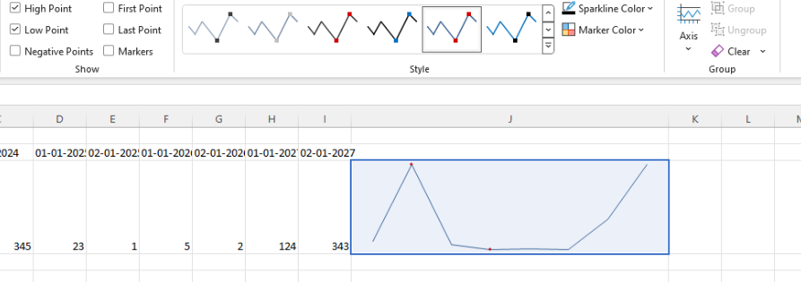
I know that it is possible to customize the appearance of the markers using the markers.visual. However, I would like to have the option as a built-in configuration to ensure better performance.
Bug Report
When the zIndex is set the the chart marker in the legend is misaligned.
Reproduction of the problem
- Open the Dojo - https://dojo.telerik.com/@NeliK/OCEtoRuz
Current behavior
The line and the marker in the legend are misaligned.

Expected/desired behavior
The line and the marker should be aligned even when the zindex is set.

Environment
- Kendo UI version: 2024.1.319
- Browser: [all ]
In case you are using a chart with the following configuration:
$("#chart").kendoChart({
  series: [{
    type: "radarLine",
    missingValues: "gap",
    data: [1, null, null, null, 5]
  }]
});
There is no line between the last and the first data point of the series.
But when the 2nd and 4th data points are set as well, this connection is added:
$("#chart").kendoChart({
  series: [{
    type: "radarLine",
    missingValues: "gap",
    data: [1, 3, null, 3, 5]
  }]
});
Expected behaviour: As the chart displays a "circle", all data points next to each other should be connected in case they are having a value.
The same issue can be seen in this DOJO, where the fifth data point is not connected to the rest of the points. This only happens if "missingValues" is set to "gap".
Bug report
Setting the visibility using the toggleVisibility method in the legendItemHover event leads to legendItemHover being triggered multiple times. Thus, the legendItemLeave method is never called.
Reproduction of the problem
- Open the Dojo example - https://dojo.telerik.com/@NeliKondova/UVIVaBoH
- Hover the legend
Current behavior
If you try to move the cursor slightly the legendItemHover event is fired multiple times and the legendItemLeave event is never called.
Expected/desired behavior
The legendItemHover should be fired a single time when the mouse enters the legend and also the legendItemLeave should be fired even if the visibility of the legend is set through the toggleVisibility method.
Workaround - Check for visible/not visible series in the series._options
function onLegendItemHover(e){
        e.preventDefault();
        console.log("Hover");
        let chart = e.sender;
        let seriesIndex = e.seriesIndex;

        for(let i = 0; i < chart.options.series.length; i++){
          if(i !== seriesIndex){
            let series = chart.findSeriesByIndex(i);
            if (series._options.visible) {
	            chart.findSeriesByIndex(i).toggleVisibility(false);
            }
          }
        }
      }

      function onLegendItemLeave(e){
        e.preventDefault();
        let chart = e.sender;
        console.log("Leave");
        for(let i = 0; i < chart.options.series.length; i++){
          let series = chart.findSeriesByIndex(i);
          if (!series._options.visible) {
            chart.findSeriesByIndex(i).toggleVisibility(true);
          }
        }
      }
Dojo with workaround - https://dojo.telerik.com/@NeliKondova/EpOYadid
Environment
- Kendo UI version: 2023.3.1114
- Browser: [all ]
I need that the point will be in the start of chart (like justified property behavior) and the line style of "rangeArea" type property will be "step".
In this example the point in the start and the justified property works as expected.
https://dojo.telerik.com/IZuXOyAZ
but in the second example, when I added property: line: {style: "step"} to "rangeArea" type, the point start in the middle of labels, and justified property not working.
https://dojo.telerik.com/ILOxehAB/3
So I need that my chart will be like the second example, but the start point of the line will be like the first example.
Currently each of the labels for the:
- Axises
- Legend
- Tooltip
- Chart Title
Provide their own "font" property setting. However, it would be beneficial if there is a default configuration that can apply a font for each of the aforementioned Chart Label compartments.
Bug report
Chart with log valueAxis allows to deem zoom and throws an error: Uncaught Error: Non positive values cannot be used for a logarithmic axis
Reproduction of the problem
Dojo: https://dojo.telerik.com/OCuziYOr
Expected/desired behavior
The Chart shall not allow this deep zoom
Environment
Kendo UI version:[all]
Browser: [all ]
Several forum posts have mentioned that the best way to customize a legend is to hide Kendo's and make our own. I would be so great if we could just customize the legend similarly to most other areas of the chart that can be customized.
Bug report
When the user tries to zoom the Chart and a zero range is selected, an error (Uncaught TypeError: Cannot read properties of undefined (reading 'min')) is thrown in the browsers console.
Reproduction of the problem
- Open the Dojo - https://dojo.telerik.com/@NeliKondova/eQiKUqOB
- Press the
Shiftkey and select a range. Try the min and max of the range to be almost the same.
Current behavior
Uncaught TypeError: Cannot read properties of undefined (reading 'min') error is thrown in the console.
screencast - https://somup.com/c06lloBaw2
Expected/desired behavior
There should be no error in the browsers console, no matter of the selected range.
Environment
- Kendo UI version: 2023.3.1010
- Browser: [all ]