One of the basic stock chart features for amcharts\yahoo\google charts is to recalculate a percent axis during comparisons.

http://www.amcharts.com/stock-chart/
https://www.amcharts.com/tutorials/disabling-or-enabling-value-axis-recalculation-to-percents/

The stockchart should be more of a widget that allows comparisons that automatically converts to percents during comparisons.

For example, in the amcharts you can add\remove stocks easily, and when there are two stocks to compare it automatically shifts to a percent axis. The chart itself does the calculations as they are very standard.

For us, this would also need to work in a virtual MVC scenario.

Currently, we have to do the calculations either on the client\server, insert\remove\hide\show price\percent axis and legend info etc....just to duplicate other charts that are built in with these features.
Kendo Chart has setting min/max for the axis. However, when zooming and/or dragging/panning the chart, the min/max values are no longer in effect, therefore the chart ends up displaying values outside of this range. If min/max is used to specify the current axis values, then there should be another to specify the general boundaries/range of the axis.
Example: if you have a plot with XAxis min=1950 and max=2050, when zooming the XAxis and depending on the data it will eventually display 1948 and 2060; or, it will stop at 2030 even though I requested XAxis to go up to 2050.
As per support ticket 806897

Telerik: "By design both seriesClick and plotAreaClick events of Kendo UI Chart  don't contain information about the clicked button or mouse coordinates. We will appreciate it if you submit this idea as a feature request at our UserVoice portal - this way the community would be able to evaluate it and if the suggestion gains popularity we will consider its implementation for future releases."

Original request:

We are using mvvm binding to your Chart events

seriesClick
plotAreaClick

both of these events I am unable to determine which mouse button caused the click.

Is is possible or should I raise a user-voice for this?

I want to run different code if the user right-clicked or if the user normal clicked on the chart.

I would also like to know the x,y pixel position of the mouse (or tap, or tap-hold) event because depending if they interact with the top of a bar chart bar or the bottom I want to run different code...

I cannot find any of this information in the event object.

When I wrap the chart in a data-role touch widget and use the touch widgets event handling I can get this information, but it would be better that the chart events make this available.
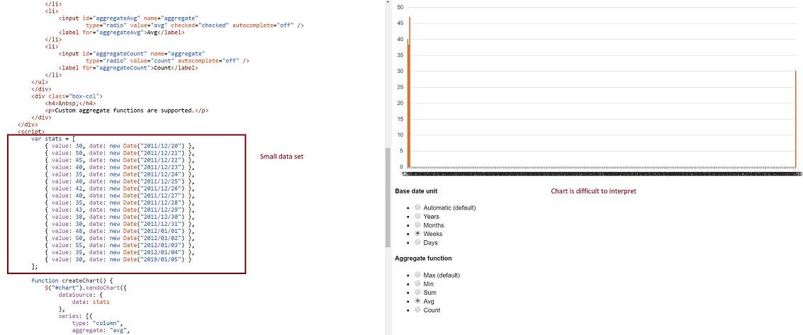
-- Problem: Consider a datasource where at least two date fields span a large time frame. We can build a chart that aggregates that data by small units (categoryAxis.baseUnits) such as 'days' or 'months'. That chart however contains many empty data points and the 'real' data is difficult to locate on the chart. This often requires zooming in and out many times to view the data one is looking for. However, it is still very valuable to be able to group by day or month, and to view this data in one succinct image.
-- Demo: The best way to experience this is to use the following Demo
https://dojo.telerik.com/eCILAMOB
This dojo is from the 'Date axis' chart demo on the demos.telerik.com site under Kendo UI for JQuery. Edit the example. There are 17 values in the datasource. Change the year on the last value to '2019'. All current values have dates between 2011-2012.
-- Required Chart Setup: Create a chart utilizing the following chart options
series.aggregate = 'avg'
categoryAxis.baseUnit = 'days'
dataSource with fields that contain at least one large date span
-- Suggestion
Add option to hide date aggregates chart points where no data exists within the datasource.
-- Image
I suggest to add some simple arithmetic for the stack values and display them as label to explain the chart in a profession way. Such as showing the total time of all usage for the meeting room. So use sum({0}, {1}) and display it on top of the bar chart.
Currently, Category Axis Label Rotation will only rotate around the center of the label.  When labels are long, they do not align well with the chart (e.g. column chart).  See the following forum post for more info:
http://www.telerik.com/forums/categoryaxis-label-rotation---align-with-column-chart
The majority of the charts right now choke heavily on large datasets.

http://dojo.telerik.com/urIne - This example shows 20,000 points on a scatterLine chart.  It takes a very long time to render this and, when panning or zooming, the redraw time is huge.  This means it is completely unsuited for any large data sets (I've found anything over ~1000 points creates a major lag for the end user).
A bubble chart without nothing inside is not that helpful, if you can set an icon or image inside the bubble itself can give quickly a hint of what it is. Also it would be nice, if the same bubble value changes position, to have an animation where it grows or shrinks while moving to the next position, instead of completely redrawing the bubble.
Currently the colorField property only sets the color of markers in scatterline line charts. It would be very useful for us if scatterline data point field could be used to set line drawing attributes like color, width and type (solid, dash)).
Would like to have automatic text wrapping enabled feature as was available in obsolete charts in the HtmlChart control as well.

https://docs.telerik.com/devtools/aspnet-ajax/controls/chart/features/automatic-text-wrapping#automatic-text-wrapping
Currently long text in chart notes makes them wide which usually results in overlapping notes. It would be great if note text is wrapped at some point. For example, if icon width can be specified and the text is wrapped to fit that width.
User clicking on legend currently hides/shows that series on the chart. Would be great to have a public method that does the same so we can show/hide a series programmatically. (Like the private _legendItemClick method currently does.)
Need the ability to group related bars on UI Chart. We are not able to accomplish this using spacing and gaps currently. We have multiple series of data but some of the series of data is related and there is no way to put the bars closer together to show the relationship without bunching all bars for a given interval together.
We dynamically update our charts based off a polling period. If there was tooltip show/hide events, we could suspend polling while the tooltip is visible. Currently, we continue to poll and when the dataSource is updated, the tooltip goes away. This unfortunately leads to another problem that when that tooltip is displayed again, the displayed point no longer resides on the plot line. I'll file a defect report for that.
We would like the ability to have the values of the data points on box plots to be displayed next to each plot. For example it would be useful to know what the high, low, median values were by having the actual numerical values displayed next to the plots on the chart.
Add an option for AxisLabelHover (similar to LegendItemHover) on the Chart. Because labels can be long, I truncate the text that is shown on the graph. I need to make the full text available via the hover.
The bar chart I got is drawn form the values which are normalized. I have 7 bar charts which are drawn by looping a csv file and all the values are normalized. When I hover mouse on the bar, I want to see actual values not the normalized. So I need to include a variable in tooltip object of CSS part. But it is not working, please make something regarding this.
I use it to upload a chart, I'd like to prevent showing the uploaded chart in the browser. Prefer to just upload and then get control back and let my app decided what to do next.
Currently you can bind against a datasource to pull values for a series, however if you want to specify a series as well via the datasource you cannot. This is a shame since it restricts the developers ability to do full dynamic results.

Say for example you have a video and a poll / poll result beside the video. You cannot currently pull the poll from the server dynamically you sould have to re-create the chart from scrath using data already in the form (or do some nasty javascript building to get the chart working with series data through the datasource).
I would like to set dashtype, line color, line width and other line segment properties for individual line segments (between two points) of a line type series in kendo chart.

this functionality is available in Microsoft charts.

note, I can set the dashtype for the entire line no problem. I have a requirement to change the dashtype for different sections of the line. maybe starting dashed, then long dash, then solid to indicate different aspects of the data being charted.

it would be great to be able to use a function to return dashtype, line color, line width and other line segment properties based on a e.dataitem.?