Hi,
What I am looking for is a "better" way of carrying out the manual calculation for label skipping:
http://www.telerik.com/forums/how-to-access-charts-(chartarea)-width-to-calculate-labels-step(x)

Preference would be similar functionality to the categoryAxis itself (autoBaseUnitSteps/baseUnitStep/maxDateGroups) but it would only affect the labelling without aggregating the data.

Assuming similar functionality to CategoryAxis using a step of "auto" the maxDateGroups should also have an "auto" setting that would adjust the max groups so that the labels never overlap.

Thanks
Add ability to add an additional title (sub-title) below the chart title and style differently that title
It would be nice if the charts supported more marker types. Currently only circles, triangles and squares are supported. This poses a problem when you have more than 3 series and want to show distinct markers for each series. I suggest adding support for a cross and star. It would also be nice to support custom marker images.
Currently the colorField property only sets the color of markers in scatterline line charts. It would be very useful for us if scatterline data point field could be used to set line drawing attributes like color, width and type (solid, dash)).
We currently use ObjectPlanets EasyCharts and they allow you to define a drill-down URL that can be associated with each line or bar. This allows us to have a bar chart on a page with a data grid. When the user clicks a bar, a URL is posted to the server that populates the data grid with more detail on the selected chart item.
I want to display a table below the chart with values as in this example  - http://telerik.com/help/aspnet-ajax/chart-plot-area-data-table.html
I am wondering if Kendo/Telerik can do it? If not, I think it would be a great idea that we be able to manipulate the data in this way?
It'd be useful to have more things built into DataViz to allow for keyboard accessibility and screenreader usage of the charts.
Currently you can bind against a datasource to pull values for a series, however if you want to specify a series as well via the datasource you cannot. This is a shame since it restricts the developers ability to do full dynamic results.

Say for example you have a video and a poll / poll result beside the video. You cannot currently pull the poll from the server dynamically you sould have to re-create the chart from scrath using data already in the form (or do some nasty javascript building to get the chart working with series data through the datasource).
Update your stock chart with Financial indicators, like SMA, EMA, VWAP and many more. These indicators are useful in trading analysis.
It would be nice be able to have a "broken" value axis on charts. Particularly bar charts, but it may apply to others.

Something to this effect: http://peltiertech.com/images/2011-11/Ybroken.png
We may place legend on custom offsets - no such option for title - only top and bottom. Give us more granular control over it and make option to place it on top or behind visualized dataItems. Will give watermark like effect
There should be an option to set the number of labels user want to view at any time on any axis. Currently there is nothing like that and no concrete workaround and the user can implement.
I want Tooltips to have a default date format for each chart base unit, for any date, like #:category#, appearing in them. Right now I have to use a custom template script and do all kinds of clever math to figure out what the base unit is, if it's set to auto.

Also all Chart types should have access to category name in tooltip.format, using {1} or similar.
Current Label Position, Padding & Rotaton helps to adjust the label. Am  looking to get implement a approch where each slice/Wedge represent with a unique name so like to show the x axis label in the middle of the slice/wedge instead of label appearing along with the line.

The same case in Y Axis to show the label in the middle of the circle instead on the line of the circle to make it clear on the each circle represnt the entire circle.

How to achive those or any alternative for the same
the dashed line in the chart is showing correctly in IE 10, but when exporting to a png image with the function exportImage, the dashed line becomes a solid line. I've been told that this can be solved with kind of polyfilling, you guys should really make this work, the reason is that this works in Chrome, for the sake of your product consistency, this feature should also work in IE.

if there is a possibility to fix an issue, I think we'd better make it.

Regards

Z. Wang
Create another series based on of 2 series in kendo chart.

when you have series A and B and want the series C would be series A / series B
allow zooming on both axes separately and together
ex. scroll over chart - zoom both axes (unless any of axes locked)
      scroll/drag category axis - Y axis locked zoom
      scroll/drag value axis - X axis locked zoom

Zoom to default - dblclick on chart.. or button or whatever
I would like to request the functionality to add an image into the series displayed in a Kendo UI Chart instead of it being a color.
### Bug report
When the title of the legend in the Kendo UI Chart widget is longer, the labels are not centered as per the default legend alignment.
### Reproduction of the problem
1) Create a Chart widget and set the title of the legend to "If the title is longer than the series names is not centered anymore is left aligned";
2) The title is centered, but the labels are aligned to the left.
A Dojo sample for reproduction: https://dojo.telerik.com/UBoTOBID
### Expected/desired behavior
The labels of the legend should be centered below the title.
### Environment
* **Kendo UI version: 2021.2.616
* **jQuery version: 1.12.4
* **Browser: [all]
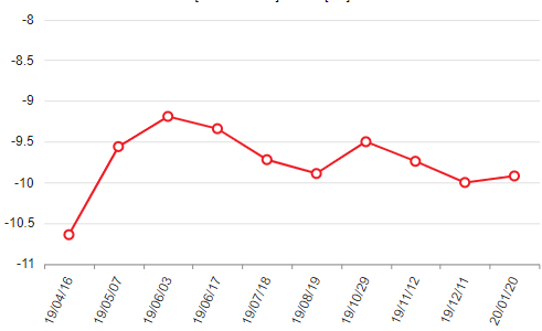
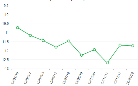
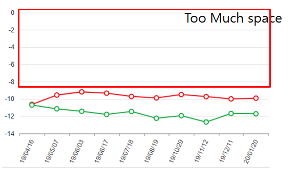
When the data values are all negative, if you create a line graph using kendo chart function, Autoscale on the Y axis is not applied properly. Please check if there is any possible solution.
The two attached figures are normally auto scaled, but the charts that combine the two graphs are not auotoscale normal.
Chart1
Chart2
issue chart


