https://docs.telerik.com/kendo-ui/api/javascript/ui/grid/configuration/pdf.allpages
We are using 2 kendo components together: kendoChart & kendoPager:
https://dojo.telerik.com/iqOnEHUN
We need to export the entire kendo-chart so that each page in kendo-chart gets its own page in the PDF file.
The out of the box legend does not offer the ability to split its items and to show them as labels over the series (graphs).
Extract my attached zip file and look at the MSWord document which shows you where I would like to position the 2 legends.
Add some visual indication (scrollbar, arrow image, etc.) to give a hint to the user that the panning is enabled and there are currently not visible items in the chart:
Please provide a property that will enable the ValueAxis of Radar Chart to be visible on top of the RadarArea series.
Currently, if the RadarArea Series has the opacity property set to 1.0, it masks the ValueAxis. To make the ValueAxis visible, the RadarArea's opacity should be reduced and this in turn makes the color of RadarArea less appealing.
Please provide a feature whereby we can make the ValueAxis visible through the RadarArea series without compromising on the opacity.
It would be great if hierarchical chart types were available. Currently there's not a good way to represent hierarchical data outside of a TreeMap, but TreeMaps don't always work well (particularly for small datapoints). An ideal chart type would be the sunburst chart (nested pie/donut charts), as it can have multiple layers, hide a segment (and all children), and potentially zoom into child layers.
There are a variety of sunburst examples currently out there from other Javascript libraries:
d3 (one of many variations): https://observablehq.com/@d3/zoomable-sunburst
Highchart: https://www.highcharts.com/demo/sunburst
Syncfusion: https://www.syncfusion.com/jquery/javascript-ui-controls/sunburst-chart
Currently the shared tooltip's position gets in the way of actually seeing the current category's series, as well as hindering any attempts to click on any series behind the tooltip.
Ideally, the tooltip should form off to the side of the current category's visible/clickable elements, either dynamically based on room available, or statically based on configuration (top, bottom, left, right).
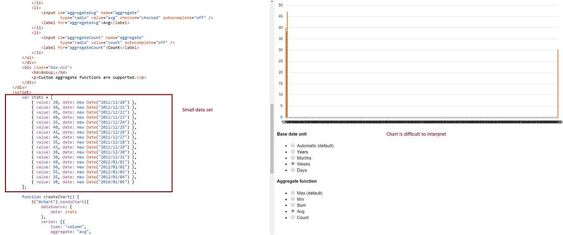
-- Problem: Consider a datasource where at least two date fields span a large time frame. We can build a chart that aggregates that data by small units (categoryAxis.baseUnits) such as 'days' or 'months'. That chart however contains many empty data points and the 'real' data is difficult to locate on the chart. This often requires zooming in and out many times to view the data one is looking for. However, it is still very valuable to be able to group by day or month, and to view this data in one succinct image.
-- Demo: The best way to experience this is to use the following Demo
https://dojo.telerik.com/eCILAMOB
This dojo is from the 'Date axis' chart demo on the demos.telerik.com site under Kendo UI for JQuery. Edit the example. There are 17 values in the datasource. Change the year on the last value to '2019'. All current values have dates between 2011-2012.
-- Required Chart Setup: Create a chart utilizing the following chart options
series.aggregate = 'avg'
categoryAxis.baseUnit = 'days'
dataSource with fields that contain at least one large date span
-- Suggestion
Add option to hide date aggregates chart points where no data exists within the datasource.
-- Image
Possibility to have half top, half bottom, half left, half right, quarter top left, quarter top right, quarter bottom left, quarter bottom right in additiont to circle and donut chart. Please add an option to be able to shape the Pie or Donut accordingly
I want the chart rendered with svg to be able to pan and zoom on a touch device.
This is different than multi-line labels which I know are supported.  Staggered labels would put the 2nd, 4th, 6th, etc. label on a line below.

e.g.

LABEL     LABEL     LABEL     LABEL     LABEL
         LABEL     LABEL     LABEL     LABEL
Would like to have automatic text wrapping enabled feature as was available in obsolete charts in the HtmlChart control as well.

https://docs.telerik.com/devtools/aspnet-ajax/controls/chart/features/automatic-text-wrapping#automatic-text-wrapping
it would be good if there is a feature to export to excel the charts.
There should be an option to set the number of labels user want to view at any time on any axis. Currently there is nothing like that and no concrete workaround and the user can implement.
For the following  use cases:

1.	Drag points on a line
a)	Line chart with three or more colored lines with points on them.  User can mouse over and see the value at that point.
b)	User clicks and drags a point on any of the colored lines
c)	The graph interactively shows the point moving and the line updating
d)	User releases the mouse button
e)	That line is now updated.  Mousing over the point will display the new value at that point on the line.

2.	Click and edit a point’s value
a)	Line chart with three or more colored lines with points on them.  User can mouse over and see the value at that point.
b)	User clicks on that point
c)	At the mouse point (or any other place we determine is best to put the widget), an input area appears
d)	User inputs a new value
e)	The line and point update with the new value.   Mousing over the point displays the new value


As per sales:


“These requirements are unfortunately not built in features of the Kendo Chart.
We don't offer any way for a user to "click and drags a point on any of the colored lines" nor a built-in approach to click and edit items on the chart.
This event is useful on mobile device to drill-down serie, while tap (click) is for showing tooltip (or viceversa)
I use it to upload a chart, I'd like to prevent showing the uploaded chart in the browser. Prefer to just upload and then get control back and let my app decided what to do next.
Feature required where user cannot increase/decrease selection range, they can only move the existing selection window.
We may place legend on custom offsets - no such option for title - only top and bottom. Give us more granular control over it and make option to place it on top or behind visualized dataItems. Will give watermark like effect