Hi,
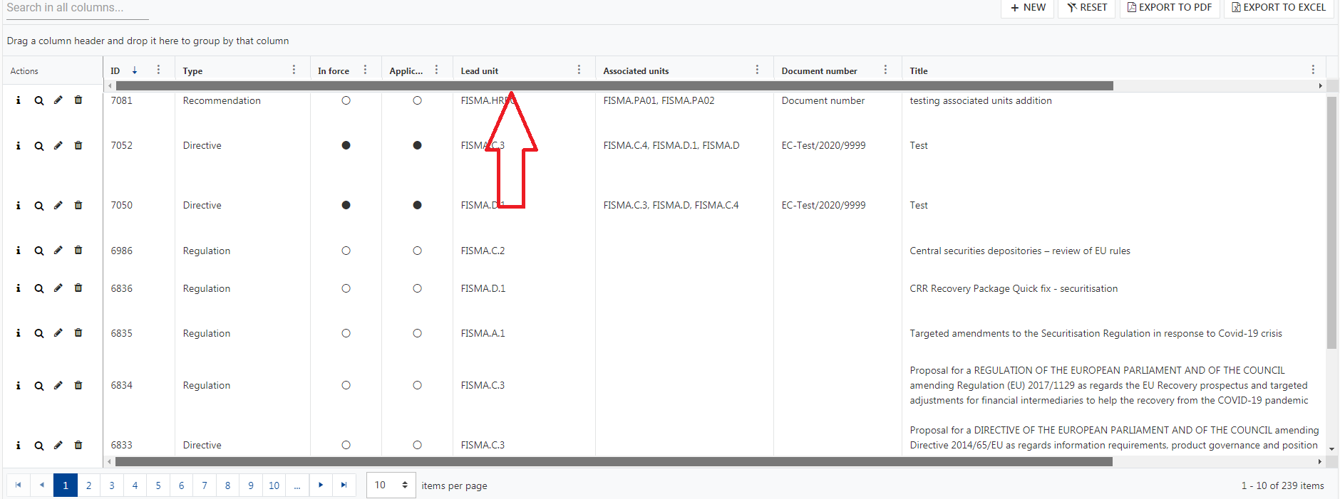
It seems there is an issue with the material theme and nested grids. When you have master-detail nested grids, the entire last nested grid gets applied with the same styling as the bottom rows of all the other nested grid.
The styling in my browser is showing up as
- border-bottom-width: 0;
Which causes the rows in the last grid to not appear.
I have attached an image where I have changed the styling to 5px and red so you can see that it is being incorrectly styled. You can see that even the other rows in in the last grid are getting styled along with the last row style.
I am running the latest version of Kendo.
Cheers,
Clint
I've created a Plunker: http://plnkr.co/edit/WoqkaDZpq8hU24m0eKcv?p=preview

Show the detail template of Row 1 in Beverages, then collapse the Beverages group. the Detail for Chai does not go away with the rest of the table.
It would be nice to have a builder for complex filter in the grid like that: https://js.devexpress.com/Demos/WidgetsGallery/Demo/DataGrid/FilterBuilder/Angular/Light/Compact/
Use IE11:
1. Try to use the grids column menu for filtering
2. Click the column icon => popdown menu opens
3. Click the filter oder column icon inside the menu => nothing happens
I can't even open up your docs using IE11, it just loads forever:
https://www.telerik.com/kendo-angular-ui/components/grid/columns/menu/
Reproduction
- Use a grid with data coming from a service (or another source)
- Click the delete button (built in with the grid
It removes the element from the grid as soon as I click the button but I want to remove it only after confirming the deletion.
Add events like detailInit, detailExpand, detailCollapse in the Kendo Grid for jQuery. Add possibility to know whether the detail template is expanded or not.
Currently the grid uses indexes to memorize which data row is expanded. When a new row is inserted (due to a new data item inserted in the underlying collection) before a currently expanded details row, then then expanded details view will shift to the row before (old index). This is not desirable in a scenario with a lot of adding/removing of items.
It would be great if memorizing expanded details row could be bound to the data object.
When using virtual scrolling and the data changes, then it might be desireable to programmatically scroll to top or to scroll to a row containing the data of interest.
A built-in option for enabling a second scrollbar on the top of the Grid like the following screenshot would be nice feature to have:
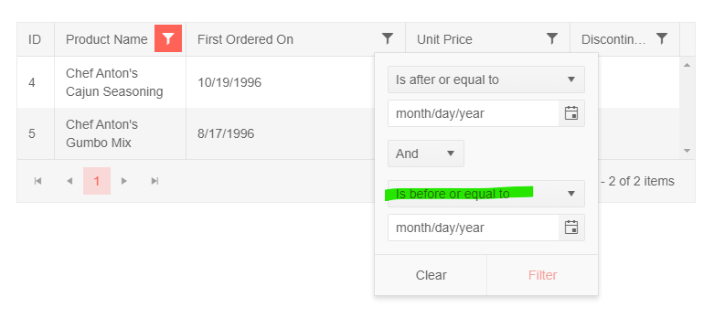
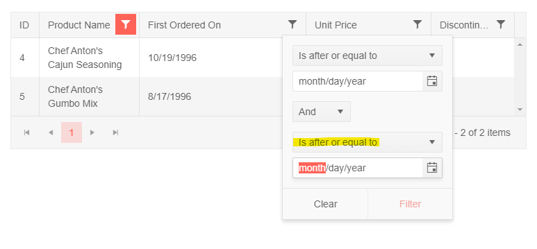
Is it possible to modify the default filter for a date on a grid so that it is a "between" filter? i.e. the second clause will show "Is before or equal to" instead of "Is after or equal to"?
https://stackblitz.com/edit/angular-ygnmj1
Preferred default:
instead of:
Can you add a method to go to a specific page in the Grid?
It is easy in Kendo UI for jQuery, https://docs.telerik.com/kendo-ui/api/javascript/data/datasource/methods/page
dataSource.page(2);
The equivalent way of doing it in Kendo UI for Angular is to bind skip to a Grid, and calculate the skip by ourselves, but it doesn't feel as natural as doing datasource.page(2)
As of right now it is a lot of work to properly implement a foreign key column and some of the features are only working with multiple workarounds. It would be nice to have a foreign key grid column as it already exists for ASP.NET. The ultimate goal would be to set the foreign key field which the column is bound to, pass a list of complex objects and set the text field and value field for that list.
An example of an hypothetical implementation:
<kendo-grid-column field="ProductId" [data]="ProductList" [valueField]="'Id'" [textField]="'Name'"></kendo-grid-column>Currently all of this has to be done manually by defining a cell template and edit template which comes with a couple of limitations. The greatest limitation is that the out of the box sorting and filtering does not work since the grid will sort/filter by the Id instead of the cell template value. For the filtering additionally a custom made filter needs to be implemented for each column which displays the DropDown in the filter menu.
For ASP.NET all of these things come out of the box and are extremely helpful. Here is a link to the ASP.NET implementation for a foreign key column: https://demos.telerik.com/aspnet-core/grid/foreignkeycolumn
I wish something like that will be implemented in Angular as well in the near future as it makes the development extremely hard without this feature.
I saw the sorting/filtering together with the foreign key column as one of the main reasons to choose Telerik as it is extremely helpful and setting it apart from its competitors.
Hello Team,
When in Kendo-Grid for Angular there more columns then that fits in the page, we get a horizontal scroll.
If i apply reordering of columns and try to move one to any direction.
1. If the columns need to be moved on same visible section, it does moves perfectly.
2. but if i want to move something beyond the visible section, i can't as the scrolling does not work automatically, either i need to use Keyboard to move scroll bar which in case users needs to be trained or is not user friendly or i need to it in parts.
Please help us to include feature to auto scroll when we move columns
Thanks
In Version 74.0.3729.108 (official Build) (64-Bit) of chrome, a defined grid with no predefined style property does not scroll properly.
There is a live-demo on Stackblitz at https://stackblitz.com/edit/angular-b38r7s-jzsgty
This is a fork of the demo example from the kendo-angular-ui documentation available at
https://www.telerik.com/kendo-angular-ui/components/grid/scroll-modes/virtual/#
In the example, the scrollable grid was defined with a height property. This does not feet to our requirements, as we need a grid component that should flex according to the outside or parent container.
This problem occured after the update of chrome browser from 73.0.XXX to the version 74.0.3729.108
The problem is fixed when we defined a grid with a height property like [style.height.%] = “100” but according to the documentation the grid should flex automatically without this property.
When there are multiple columns in grid, horizontal scroll is added. In such scenario, action column which is generally the right most column is not visible. To access it user has to scroll till right most column. It would be of great use in such scenario