Hello,
You have this jQuery example: Binding to Kinvey Backend Services. Do you have a similar example for Angular? I cannot find one.
Thank you.
Basically whats described in this issue right here: https://github.com/telerik/kendo-angular/issues/2093
It would be nice if column group visibility could be toggleable via the column chooser.
If not, a more elegant workaround would be to indicate in the column chooser that certain columns are part of column groups. The way it is now is too clunky and unclear.
For example, I have the following column groups:
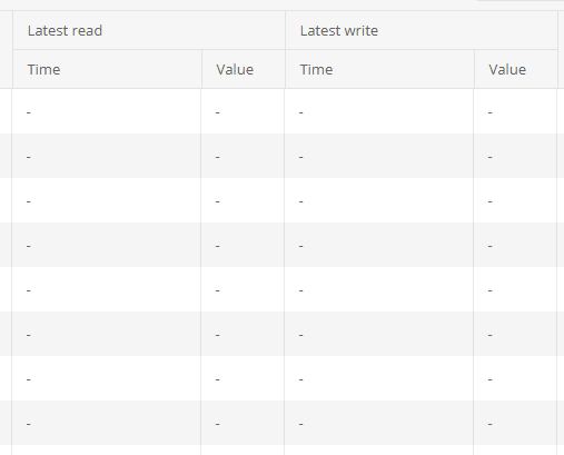
But the above columns show up in the column chooser like so:

It would be nice if the column group name was at least prepended to child columns in the column chooser to at least indicate that it's part of a group. For example, it would show as follows instead:
[x] Latest read - Time
[x] Latest read - Value
[x] Latest write - Time
[x] Latest write - Value
Thanks so much.
Our application uses grouped grids but doesn’t use the built-in collapse feature. We instead hide the collapse arrow to disable the option. This leaves an empty space to the left of the parent grid label (where the collapse arrow would normally sit) and an empty column on the left side of all child grids. We’re looking for a more “official” and supported way of achieving the effect that removing ‘[group]=“groups”’ currently achieves. We’d like to minimize the amount of nonstandard code we’re introducing to our Kendo implementation as well as minimize unintended consequences of altering the grid code.
https://docs.telerik.com/devtools/wpf/controls/radgridview/features/search-as-you-type
Previously igrid 5.0.0 introduced sortable column headers and their contents being wrapped in spans with inner cell and link classes
<span class="k-cell-inner">
       <span class="k-link>......
now after upgrading to 11.2.0 it looks like ALL column headers get this additional element nesting even if they aren't sortable which is greatly affecting how column headers display since .k-link has a display: flex value. As well as many other styles.
Before
After
There are also "link" like styles applied to any and every column even if it doesn't sort giving the false impression that a column header is clickable.
This can be seen from kendo's own stackblitz for the grid https://stackblitz.com/edit/angular-lyxxa7?file=src%2Fapp%2Fapp.component.ts where if you inspect the header elements you'll see they've been wrapped in the sortable span elements. If this is intentional to wrap all column headers in we'll just have to work around it but we're curious if applying the sortable styling to ALL column headers was done on purpose or a bug.
In the jQuery version of the Angular Grid, it was possible to add row templates to a grid which was useful because you could set attributes directly to the tr.

In my case, I have a scenario where I want to add a title attribute for tooltips for the whole row, not just individual cells.

I can provide a function for rowClasses, which is great, but it would be nice if there was a similar function I could use to add other attributes as well directly to the tr.

At the moment my work around is to add the title to every column individually, but that's not ideal as it affects the positioning of the tooltip etc
https://stackblitz.com/edit/angular-4bbepg?file=src%2Fapp%2Fapp.component.ts
The sort indicator (down arrow) remains after removing the sort (setting the [sort] input to undefined)
Thanks,
-Adam
Hey Kendo Team,
you already have a solution in jQuery for my problem (https://docs.telerik.com/kendo-ui/knowledge-base/grid-group-remove-footer-header-one-record).
Unfortunately this solution did not work in Angular.
Desirable solution would be a flag in GroupHeaderTemplate which removes header if group size is one.
Another solution could be; allow a class field in GroupHeaderTemplate, so that we can set display to none if group size is one.
Best regards,
Matthias
Now I can configure possible filter operators and default operator on column basis. Doing so I have much copy-pasted code for each grid column.
I want to have a grid level option to configure this on "type" basis with a reusable js object (e.g. public constant shared across components):
<kendo-grid [filterOptions]="GridFilterOptions" ...Where GridFilterOptions:
public const GridFilterOptions: ... = [
{ type: "string", default: "contains", operators: ["contains", "doesnotcontain"]},
{ type: "number", default: "eq", operators: ["eq", "neq"]}
];
Add icons for grid filter operators to easily understand current operator (DevExpress example):
https://gyazo.com/3806906633b2c1ca66f6cacc2b32ba88
I have being trying to implement the multiple row selection function but am unable to get multiple rows selected at once, even though I have multiple selected mode enabled,Is it possible to archieve this in Kendo ui grid in Angular?
Please see my function bellow. event=1 row always even though I select more one row.
if (event.length>0) {
Setting grid.columns[i].hidden may work to some extend, but isn't emitting columnVisibilityChange and further activities on a column set visible are not working but resulting in error, e.g. calling reorderColumn() results in:
TypeError: Cannot set property 'orderIndex' of undefined
at GridComponent.push../node_modules/@progress/kendo-angular-grid/dist/fesm5/index.js.GridComponent.updateColumnIndices (https://localhost:4201/vendor.js:196833:43)
The grid internal method updateColumnIndices() throws an error, because it doesn't get the newly visible column from expandColumnsWithSpan() and expandedColumns.indexOf(source) is -1.
Thus it's required to add methods like showColumn/hideColumn or setColumnVisibilty.
Add "between" grid filter row operator similar to DevExpress for angular one.
Example here:
https://js.devexpress.com/Demos/WidgetsGallery/Demo/DataGrid/Filtering/Angular/Light/
I'm facing an issue where having locked columns in my grid makes the UI performance bad:
1. The page takes more time to stabilize than when not having the columns locked.
2. The scrolling lags.
I'm using (locked) property for columns, and the issue happens regardless of the grid content or number of locked columns.
Please advise or fix accordingly.
Regards,
Ban
Essentially the most basic GridComponent when ngIf'd in and out will not be collected -- apparently because of orientation change / resize change listeners not being appropriately removed.
Steps to Reproduce
Click the TOGGLE TABLE button to hide the table
Click the TOGGLE TABLE button to show the table
repeat several times
Take a memory snapshot
There will be HTMLTableRowElement items that grow each iteration of toggling the table.
The HTMLTableRowElements retention shows that they eventually lead to a resize listener, or an orientation change listener.
We would like to have the possibilty to create custom implementation of grid columns (or any other control/component). Because we also have this in our WPF projects and it was very useful to minimize the redundant code and also the "initialization code". This can't be done in a simple template, for example we need to inject services and get data etc..

Example:
In our WPF project have lots of different grids with values related to units. The cell can convert this unit to and other unit itself, it can localize the texts, it shows the information in some kind of "progress bar", has a tooltip, etc... And all we have to do in the code is to set a column like this <custom-column valueField="test" unitField="test2" />.

It would be great to have this feature in the Angular 2 grid as well.