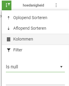
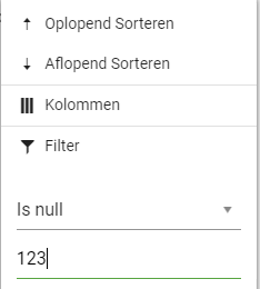
When using KendoUI for Angular 2+, the filter value is still enabled and accepts input when "Is null" or "Is empty" is selected.
Since those selections do not require a parameter, I'd prefer the filter value to be default disabled.
Use IE11:
1. Try to use the grids column menu for filtering
2. Click the column icon => popdown menu opens
3. Click the filter oder column icon inside the menu => nothing happens
I can't even open up your docs using IE11, it just loads forever:
https://www.telerik.com/kendo-angular-ui/components/grid/columns/menu/
Current behavior
The grid component already has the functionality to resize and reorder columns by the user, but is missing functionality for saving an restoring columns configuration, so that changes done by the user are lost after a page change.
There is the Persist the State article in the "How to section" in the documentation, but the described solution is only applicable when adding grid columns by using *ngFor. When defining columns in the markup, due to extensive usage of templates (kendoGridColumnMenuTemplate, kendoGridFilterMenuTemplate, kendoGridCellTemplate, ..), there is no reasonable solution available.
Expected behavior
Provide methods, similar to the jQuery grid, to save and restore columns configuration. This should at least include the column's order, width and sort.
PS: This is not a duplicate of the feature request Add persistent state for grid (and other components). The latter one has been marked as "Completed" but does not include the needed functionality.
It would be nice to have support for horizontal virtual scrolling for the Grid in cases of large number of columns. Just like the current feature for vertical scrolling, in which you can update the visible rows through a pageChange() event handler.
Currently in the Grid, the GroupHeaderTemplate can create just one cell. I'd prefer to have option to have columns in the group header like it is implemented in the jQuery Grid. Check it here https://demos.telerik.com/kendo-ui/grid/aggregates
This option will be handy for displaying aggregates in a group header.
when expanding a group, inside the expand event (function) we do have access to the groupIndex.

but groupIndex is not available inside the groupHeader(Footer)Template itself.

we need that groupIndex, so we can get the parent items (groups) to the group that is expanded.
Currently the pager is always at the bottom of the grid. I would love to see an option to place the pager at the top and/or bottom. Without adding custom code every time I need this.
When using virtual scrolling and grouping features (currently achieved with kendoGridGroupBinding directive), the ability to control the expanded state of the groups is disabled due to limitation.
The available methods are helpfull when you want to control the state of the groups at runtime, but are not compatible with virtual scrolling since the records are loaded on demand.
It would be nice if we had the ability to collapse and expand all groups of the Grid programatically when using virtual scrolling.
We need to store column's show and hide state when apply from ColumnMenuChooser component.
I opened this question

https://stackoverflow.com/questions/51331725/kendo-grid-for-angular-2-reactive-formarray

Would be nice to make grid reactive more transparent, or make a complete example to use it.
Introduce support for Loading / Error templates for components. eg.:

<kendo-grid [success]="boolean" [loading]="boolean>
  <div kendo-error-template>
   We Cannot load your data
  </div>

 <div kendo-loading-template>
    <!== some kind of spinner, or just text>
  </div>
</kendo-grid>
I find myself reusing similar/identical code in order to implement filtering, sorting and virtual paging. In almost all cases, I am simply applying the filters, sort and determining the records to select based on the page as shown in the API.

This code should be inbuilt into the kendo grid. If filterable is true, kendo should implement the filter change event and apply filters automatically; the users should not be forced to define what happens on filter change for every grid instance. Similarly, if sortable is true, the kendo grid should automatically implement default sort functionality.

The same would also be useful for virutal scrolling. If scrollable is set to 'virtual', then the view to be shown in the grid should be automatically calculated on page change.
If the value "-1" is passed in as one of the values in pageSizes input for the PagerPageSizesComponent, that option should be shown as "All" and should show all rows available for the grid.
Currently the grid uses indexes to memorize which data row is expanded. When a new row is inserted (due to a new data item inserted in the underlying collection) before a currently expanded details row, then then expanded details view will shift to the row before (old index). This is not desirable in a scenario with a lot of adding/removing of items.
It would be great if memorizing expanded details row could be bound to the data object.
I would like to know Do you have any plan to release context menu feature for kendo grid
Drag and Drop of grid's columns the same way we have on the jquery version (with a Input on the component saying if we want columns to be draggable)
Need to have Parent --> Child hierarchical records to be displayed in Grid..
It should support up to 'n' level , it means a parent can have any number of child records. can this be done using current Master Detail grids?.

 Parent 1
   --- Child 1
        -- Grand Child 1
            -- Grand Child 1
        -- Grand Child 2


Thanks in advance.