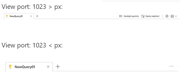
When Toolbar component is configured to
- Have spacer between two elements: Angular ToolBar Control Types - Kendo UI for Angular
- AND it uses `overflow=menu` strategy: Angular ToolBar Responsive ToolBar - Kendo UI for Angular
- AND when there is sufficient space, so the Toolbar is NOT overflowing. In other words, the visibility of the overflow button is set to hidden.
THEN the elements are not properly aligned with the right edge of the Toolbar component. This is because the overflow button still occupies the space as is the bahviour of the `visibility` style: visibility CSS property - CSS | MDN
- The visibility CSS property shows or hides an element without changing the layout of a document.
Minimal reproducible example:
import { Component } from '@angular/core';
import { KENDO_TOOLBAR } from '@progress/kendo-angular-toolbar';
import { FormsModule } from '@angular/forms';
import { KENDO_INPUTS } from '@progress/kendo-angular-inputs';
import { KENDO_LABELS } from '@progress/kendo-angular-label';

@Component({
  selector: 'my-app',
  imports: [FormsModule, KENDO_TOOLBAR, KENDO_INPUTS, KENDO_LABELS],
  template: `
    <kendo-label [for]="width" text="Set toolbar width"></kendo-label>
    <kendo-slider
      #width
      [(ngModel)]="toolbarWidth"
      style="width: 100%; display: block;"
      [showButtons]="false"
      [min]="0"
      [max]="100"
      [largeStep]="1"
      tickPlacement="none"
    ></kendo-slider>

    <kendo-toolbar overflow="menu" [style.width.%]="toolbarWidth">
      <kendo-toolbar-button text="My Kendo Angular Toolbar Button A" />

      <kendo-toolbar-spacer></kendo-toolbar-spacer>

      <kendo-toolbar-button text="My Kendo Angular Toolbar Button B" />
    </kendo-toolbar>
  `,
})
export class AppComponent {
  toolbarWidth = 100;
}
Expected behaviour: The overflow button does not occupy that space in the scenario described above.
- EITHER has `display: none` OR it is completely removed from the DOM when there is sufficient space.
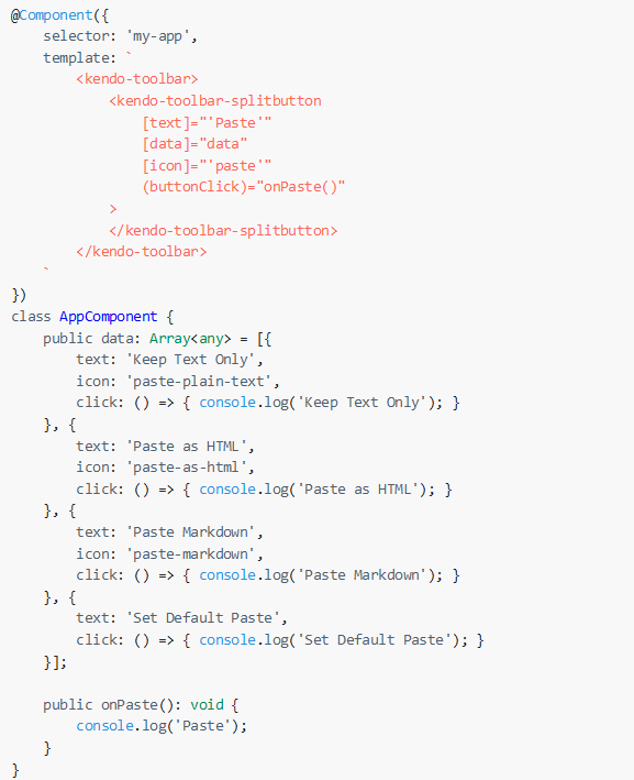
Provide an item template directive for the ToolBarSplitButton and the ToolBarDropDownButton that allows the customization of their items, similar to the ones available for the default SplitButton and DropDownButton components:
Currently, the only way to use this item template is by implementing the default buttons as custom tools in the Toolbar.
Hi,
I want to define some of the items in the toolbar to have overflow = "always", so they'll always be inside the 3 dots menu.
I found a way to do it in JQuery here, but didn't find a way to do it in Angular.
How can I reach this result?
Thanks,
Hi Kendo Team,
It will be a good addition if the ToolBar button controls allow nesting child components or directive to apply custom icon to the buttons. Similar to the button component where it is available as an option.
Currently the developer would need to create a custom control to achieve that withing the ToolBar component:
https://stackblitz.com/edit/angular-qfzm2q-f6fppa?file=src%2Fapp%2Fcustom-tool.component.ts
    <button kendoButton>
        <fa-icon [icon]="['fab', 'github']"></fa-icon>
        Browse
    </button>
Improving the button controls would allow the developer to directily define the icon inside the ToolBar button control like the following:
    <kendo-toolbar-button>
        <fa-icon icon="calendar" size="lg"></fa-icon>
    </kendo-toolbar-button>
Also this can be concidered for the other component packages that Kendo UI for Angular offers.
Thank you for the concideration.
Currently there is no straight-forward way to add HTML attributes to the Button elements within the ToolBar tools, barring a direct DOM manipulation after the components are rendered.
Please expose a public API for setting the desired set of HTML attributes.
Please make it possible to define the children of the kendo-toolbar-dropdownbutton in html.
It makes the using of the kendo-toolbar-dropdownbutton much easier.
Translation (i18n), Observables (asyn), additional directives are supported in markup but must be added with additional effort in code.
Example:
<kendo-toolbar>
    <kendo-toolbar-dropdownbutton [text]="'Paste Variations'">
        <kendo-toolbar-button [text]="'Paste'" i18n-text (click)="onClick($event)" [disabled]="canPast$|async === false"></kendo-toobar-button>
    </kendo-toolbar-dropdownbutton>
</kendo-toolbar>We need to align the toolbar buttons to the right of the toolbar near by the overflow button. By default buttons are always aligned to the left.
It would be great to have an option like "alignment" with values "near" and "far" to align the buttons near to or far from the overflow button.
Please add the "overflow" property (like available in the jQuery counterpart) to the ToolBarToolComponent to determine whether the tool is initially pushed to the toolbar's overflow.
Should be useful to decide where to align every single button of the toolbar center/left/right (or at least every button in the toolbar left or right).
This feature should be granted combined with the overflow option, in order to have a responsive behavior.
Hi,
Today the tollbar can be responsive - in this case it moves the items according the space in the screen.
We want to be able to hide the tools manually.
In our case, we want to move the tools to poup from specific screen width:
We'd appricate this feature!
Thanks,
Michal.
The toolbar component works perfectly for our application header requirements. But: the default styles (here material theme with grey background and drop shadow) does not make sense. While it's not a problem to work around it...
Please allow us to add custom CSS classes to toolbar component. Example:
<kendo-toolbar class="header"></kendo-toolbar>Please could you add the possibilty to add tools via API to the toolbar.
Something like it's done at the splittbutton.
It would be realy great to have an overflow button like in the jquery version:
It would be great if toolbar buttons allowed title attributes so we could provide more context to buttons.


