

Feature request: a global hook to style popups and dialogs that are appended outside their originating component
Environment
- @progress/kendo-angular-popup, -dialog, -dropdowns, -tooltip, -menu and -grid 25.2.0
- @progress/kendo-theme-default 14.5.0, Angular 21.2
Use case
Our application lets the user zoom single views, not the whole page (Ctrl+mouse wheel). A view is scaled by re-declaring the Kendo theme size custom properties (spacing, font sizes, line heights, ...) on the view element, multiplied by a factor in a custom property. Everything inside the view scales correctly with the theme, including the Kendo components.
Kendo popups and dialogs, however, are appended to the application root, outside the scaled view, so they do not inherit the view's custom properties and appear unscaled. This affects the DropDownList, ComboBox and DatePicker popups, tooltips, menus and context menus, the Grid's column menu and filter popups, and dialogs opened through DialogService.
The same need arises for any styling that is scoped to a part of the page: per-area themes, density modes, or a CSS class that marks a region.
Current options and their limits
POPUP_CONTAINERonly moves the popups into another container element. Placing them inside the view lets them inherit its styles, but clips them at the view's edges and puts them under its stacking context.popupSettings.popupClassandDialogSettings.cssClasswork per component instance or per call. Many popups do not expose them (e.g. the Grid's internal popups, the tooltip and menu popups of other components), and a class cannot carry a value that changes at runtime, such as the zoom factor.- The components provide their own
PopupServiceinstances (in their component or module providers), so an application-level replacement provider is never used. - Dialogs opened by shared libraries cannot be given per-call settings without changing those libraries' APIs.
Why a common container or appendTo is not sufficient
The suggestions we received recommend a global POPUP_CONTAINER with shared styles, or popupSettings.appendTo to render the popup inside the originating component. We evaluated both:
- The zoom factor is a property of each view, not of the application. Several views with different factors are visible at the same time, so one shared container cannot carry the right value for every popup. It would have to be changed on every open, which again needs a hook at open time.
appendTo: 'component'(or a container inside the view) inherits the right styles, but clips the popup at every ancestor withoverflow: hiddenorauto(grid cells, scrollable views, windows), and puts it under the stacking context of the view.appendTois not available for all popups, e.g. the Grid's internal popups, tooltips and menus of other components, and dialogs opened from shared libraries.
We understand that an earlier request to add CSS classes based on the creating component was declined. This request is more general: it does not ask Kendo to decide which classes to add, only for a supported point where the application can adjust the created element itself.
Request
A global, supported way to adjust the element of every popup and dialog when it is opened, for example one of:
- an injection token for a callback that
PopupService.open()andDialogService.open()(andWindowService.open()) call with the created element and the anchor or the originating element, or - an injection token for a default class and inline style applied to every popup and dialog element, or
- an option that copies selected custom properties or classes from the anchor's ancestors onto the popup element.
Ideally the hook is also called when an open popup is repositioned, so that a changed scale can be applied without reopening it.
If such a hook is not planned, it would already help to document PopupService.open() and DialogService.open() as stable extension points, i.e. that every component opens its popups through them and that the returned references keep giving access to the created element.
Workaround we use
We wrap PopupService.prototype.open and DialogService.prototype.open. After the original call, we read the scale factor inherited by the popup's anchor (or, for dialogs, by the focused element or the last pressed element) and set the scale class and the custom property on the returned popup or dialog element. Kendo positions the popup after the next render, so the position is computed from the scaled size.
This works, but depends on the prototypes and on what open() returns, which may change in any release. One detail we noticed: PopupSettings.anchor is declared as ElementRef, but some components pass a plain HTMLElement, so our wrapper has to handle both.
Hi,
Please provide closing animations for the Dialog just like there are animations for the opening.
thanks

Because of the CSS, if a parent element has used translate (transform: translateX(0px); ) every child element under it is no longer fixed.
This causes components like kendo-dialog to be relatively positioned inside the drawer - usually cut off.
Even turning off animation still leaves the style rule.
- Disabling animation should also ensure no related CSS is applied (like using transform: none at least)
- Provide a keyframe based animation instead of translateX (example http://jsfiddle.net/whnuLf6v/50/)
Currently, the (X) close button is always shown and visible. In other words, it is not possible to configure the dialog component to NOT display this icon button. It is actually not just about the icon button, but also the ESC shortcut. It should not be possible to close the dialog when the input is set.
Feature request: Add an input `closable` for the Dialog Component ('kendo-dialog') to be able to turn off the closable behaviour. Example:
```html
<kendo-dialog [closable]="false"></kendo-dialog>
```
The "closable" is `true` by default, ensuring that it is backwards compatible.
Use case: A certain dialog is presented to the user and user must NOT be able to close/ignore the dialog. The user is thus forced to resolve the instructions presented in the dialog and resolve it the intended way.
I would like to move dialog (because there is some content behind I need to see in order to fill form in dialog).
It would also be great if it could be resizable. If you have an input component inside dialog, you could set width to 100%.
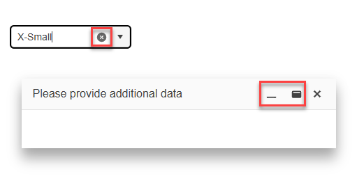
I used this example to replace the built-in icons of the Kendo UI components. I was able to modify all the icons except the x icon in the Kendo UI Dialog and Window component. The x icon in the Kendo UI ComboBox was replaced as well.
The issue can be seen in this StackBlitz example.

When opening a Kendo dialog, it's in most cases necessary to prevent the background page from scrolling.
Telerik offers a solution to address this issue:
https://www.telerik.com/kendo-angular-ui/components/knowledge-base/page-is-scrollable-when-open-dialog
Example usage:
<kendo-dialog disableBackgroundScroll>
  ...
</kendo-dialog>
Hi,
I'm using the DialogService and it would be good to be able to provide my own injector so I can extended the service. Currently the DialogService uses the container's injector.
Reason for this feature request is to provide data to the dialog itself via DI, similar to how Angular Material allows this via MAT_DIALOG_DATA injection token.
Thanks,
Anthony
Provide a 'title' property for the DialogAction objects in order to have the ability to configure a tooltip for the action buttons of the Dialog when DialogService is used.
Currently, there is no existing option for setting a title for the action buttons when they are passed as a collection of DialogAction objects to the actions property. A title can be set only when the action buttons are configured separately in a template:
I would like to switch off scrollbars for individual dialogs, thus it would be great to have a scrollable (https://docs.telerik.com/kendo-ui/api/javascript/ui/window/configuration/scrollable) option to control this behavior. This should be also available in the configuration of dialog service.
Add configuration inputs for control animation of Dialog component.
As already present on popupService -> https://www.telerik.com/kendo-angular-ui/components/popup/api/PopupSettings/#toc-popupclass
is it possible to have also dialogClass when dialogService is used?
Thanks.
Currently, the DialogAction only supports setting primary as a configuration.
Could it be extended to also allow other button variants - like look=flat or a cssClass config option?
Passing a template beats the entire purpose of using a service - you need to now add additional local HTML, manually handle button clicks etc.
I need accessibility support for dialog, h2 in the title, role=alertdialog on the window
When using the DialogService (or the PopupService), you must pass either a TemplateRef or a Component class to the content property for it to create. However, if you have a Component that needs special initialization (i.e. constructor parameters) or that you have already created using a factory, you cannot use that as the content for the DialogService/PopupService. This feature request is to allow the content parameter to be valid if an existing component instance (already created) is passed.
I would like to dialog can drag and set position.
Provide the "buttonLayout" (https://docs.telerik.com/kendo-ui/api/javascript/ui/dialog/configuration/buttonlayout) setting for Dialog and DialogService.

Useful values for layout would we "Stretched", "Start", "Center" and "End".