

We have noticed that the labels on the y-axis are rendered too close together, almost touching each other. This can be configured by setting the step option.
However, it could be ideal in such cases for the step to be determined automatically by the Chart based on the available space (similar to the rotation option which rotates the label, but in this case to control the step).
Please provide an option to automatically render the labels based on the available space.
Hi team,
Please provide an animate property part of the Tooltip interface and all tooltip-related components:
https://www.telerik.com/kendo-angular-ui/components/charts/api/TooltipComponent/
https://www.telerik.com/kendo-angular-ui/components/charts/api/ValueAxisCrosshairTooltipComponent/
https://www.telerik.com/kendo-angular-ui/components/charts/api/SeriesTooltipComponent/
..etc
Currently, the tooltip animations can be disabled through the tooltipInstance.tooltip property of the Chart reference:
@ViewChild('chart') public chart: ChartComponent;
ngAfterViewInit() {
    this.chart.tooltipInstance.animate = false;
}

Currently, the width property is available only for horizontally oriented legend:

Provide an option to set the width of the legend when orientation is set to vertical.
Hi Kendo Theme,
The current behavior will re-render the Chart and the tooltip or crosshair disappear and the user will need again to hover over the series. This behavior can be observed in the following example:
https://stackblitz.com/edit/angular-dmpexe-sf8zoj?file=src%2Fapp%2Fapp.component.ts
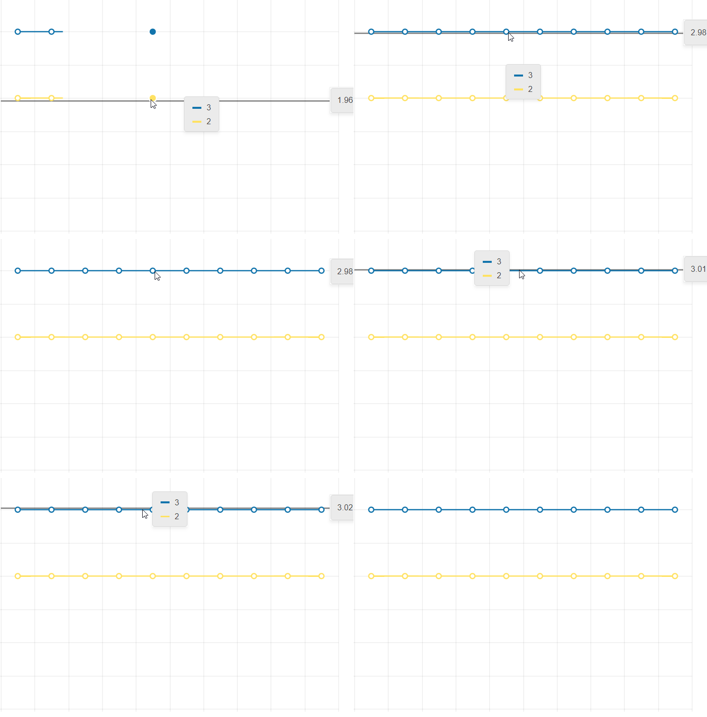
The desired behavior would be to keep the popup open or the crosshair present when updating the data.
Thank you for your consideration.
Hi,
Please provide an option that allows forcing the chart to use whole numbers for its value axis when zooming in or out. It's not something uncommon to have charts that can't have decimals (eg. number of people).
Thank you
Hello,
The feature applies mainly to scatter plots and is as follows:
* The user has the ability to select individual data points by clicking on them after which they are highlighted.
* The user has the ability to select regions of points by clicking and dragging. These regions can be a lasso, rectangle, oval, free form, or any other shape.
* The user has the ability to select multiple points or regions of points simultaneously (i.e. previously selected points/regions don't "unselect" when the user selects new ones).
An example of this is this Lightning Charts example: https://lightningchart.com/lightningchart-js-interactive-examples/edit/lcjs-example-0040-customLassoInteraction.html?isList=true
I'm also attaching a script that you can copy and paste into the example above which shows the ability to select rectangular regions and individual data points.
It will be a good addition to the chart types if the Marimekko Chart was introduced. This chart type is useful for visualizing categorical data distributions with variable column widths.
Description
When you move the cursor to a new series item, the tooltip position does not move until you leave the chart area and re-enter. It changes the content based on where the cursor is pointing, but does not change the position.
Steps To Reproduce
- Create a new Angular application
- Add the Kendo UI Chart and paste the following code in the app.component.ts file:
import { Component } from '@angular/core';
import {KENDO_CHARTS} from "@progress/kendo-angular-charts";

@Component({
  selector: 'app-root',
  imports: [KENDO_CHARTS],
  template: `
    <kendo-chart>
      <kendo-chart-legend position="bottom"></kendo-chart-legend>
      <kendo-chart-series>
        <kendo-chart-series-item
          type="donut"
          [data]="data"
          field="value"
          categoryField="category"
          colorField="color"
          [holeSize]="60"
          [tooltip]="{
            visible: true,
            format: '{0:C0}'
          }"
          [highlight]="{ visible: true }"
        >
        </kendo-chart-series-item>
      </kendo-chart-series>
    </kendo-chart>
`,
})
export class App {
  public data = [
    { category: "Electronics", value: 245000, color: "#0058e9" },
    { category: "Clothing", value: 189000, color: "#37b400" },
    { category: "Home & Garden", value: 156000, color: "#f59c1a" },
    { category: "Sports", value: 134000, color: "#ff6358" },
    { category: "Books", value: 98000, color: "#8c43ff" },
    { category: "Toys", value: 78000, color: "#00acc1" },
  ];
}
- Run the application
Screenshots or video
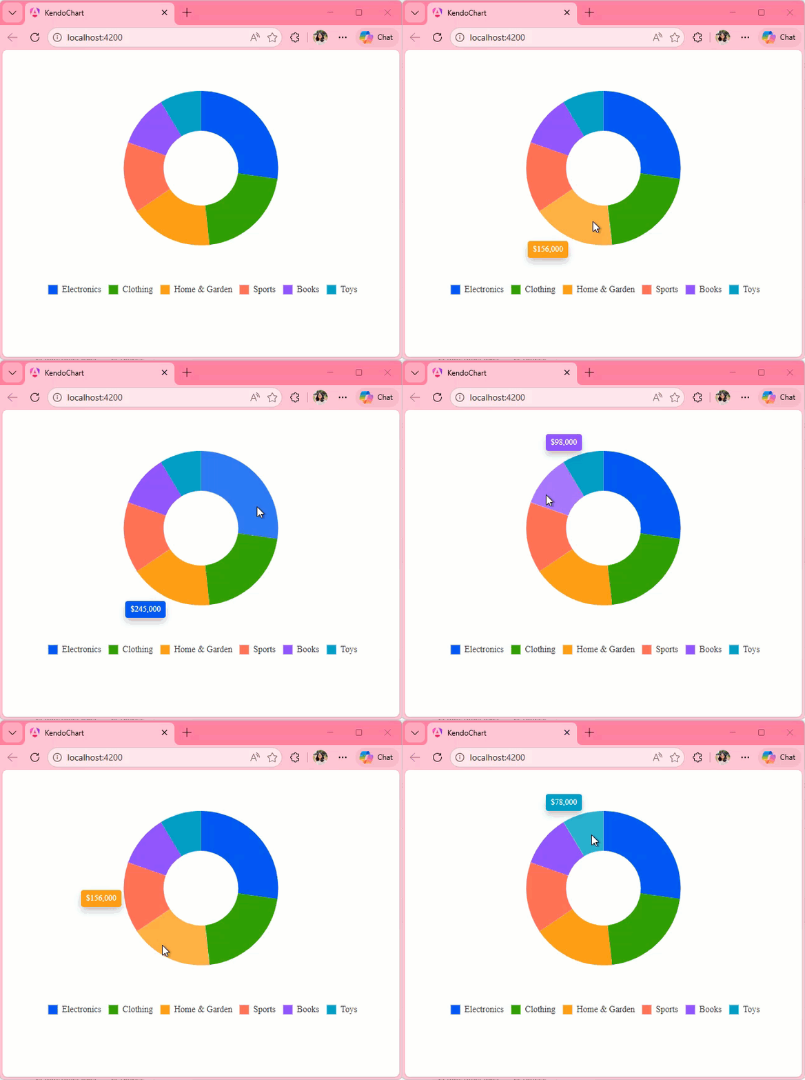
Actual Behavior
The Tooltip position only changes when you leave and reenter the Chart area. It does not change when you move the cursor from one series item to other, it updates the content displayed in the Tooltip though.
Expected Behavior
The Tooltip position should move with the cursor as seen in the screen recording below:
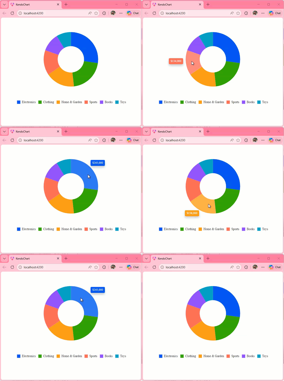
https://stackblitz.com/edit/angular-sdmdrbjt-5yunmeo2
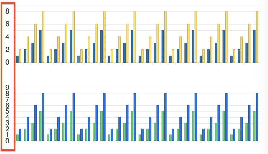
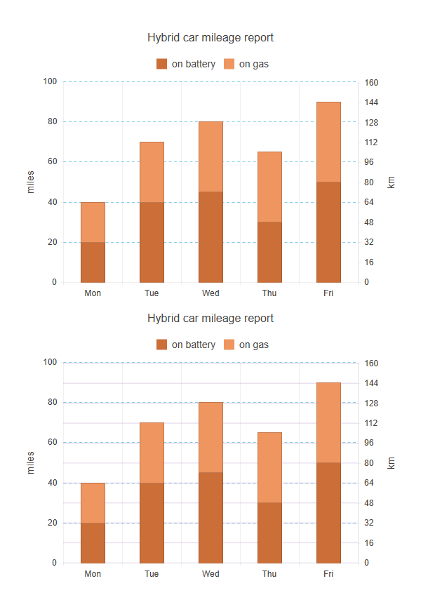
Currently, in Kendo UI for Angular Charts, when using multiple axes of the same orientation (e.g., two Y axes), only the major grid lines of the first axis are displayed. The grid lines of the second axis (Y2) are ignored, even if enabled in the configuration. This limits the readability of multi-axis charts, as it is not possible to visually distinguish the graduations of each axis.
Add an option (for example, showGridLinesOnAllAxes: true) that would allow displaying major grid lines on all axes, not just the primary one.
The Kendo team suggests using plot bands to simulate the grid lines of the second axis, but this solution is less convenient and requires manual configuration.
Below is a screenshot of what it might look like; the first graph shows what is currently possible, and the second shows what would be possible if this feature were added.
Hello ,
Kindly Have issue with stacked bar when try to draw two items in chart with specified with as the below
<kendo-chart-series>
  <kendo-chart-series-item type="bar" [stack]="{ type: '100%' }" [data]="[97]">
  </kendo-chart-series-item>
  <kendo-chart-series-item type="bar" [stack]="{ type: '100%' }" [data]="[7]">
  </kendo-chart-series-item>
</kendo-chart-series>
Can Anyone help on that ?
When setting the color using a function, a TypeScript error will occur because the property expects a value of type string.
Type '(e: SeriesLabelsContentArgs) => string' is not assignable to type 'string'.The color properties of the Chart components should support a callback to prevent such errors, as this is a valid feature to implement. The current workaround is to skip type checking.
          <kendo-chart-series-item-labels
            [color]="$any(labelColor)"
          >
Colour gradient on AreaChart would look great - see workaround below:

https://stackblitz.com/edit/angular-x1vrhq?file=app/app.component.ts
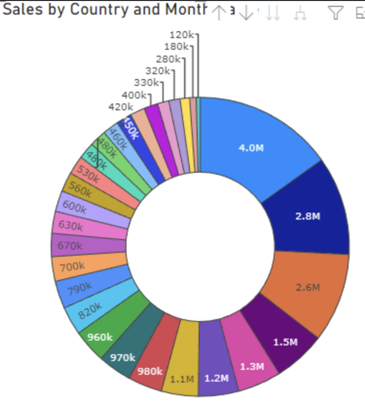
Provide support for dynamic label positions for the Donut chart.
Some labels to be displayed inside the Donut, and other (which couldn't fit) to be outside, similar to:
Implementing a Lollipop Chart type would improve data representation. This chart type enhances readability by combining a dot and a line to emphasize data points, making comparisons clearer.
https://datavizproject.com/data-type/lollipop-chart/
The introduction of an Alluvial Diagram chart type would be beneficial. This type of chart helps visualize changes in categorical data over different stages, supporting insights into process flows and transitions.
https://datavizproject.com/data-type/waterfall-plot/
The introduction of an Alluvial Diagram chart type would be beneficial. This type of chart helps visualize changes in categorical data over different stages, supporting insights into process flows and transitions.
https://datavizproject.com/data-type/alluvial-diagram/
Adding a Parallel Sets chart type would enhance data visualization capabilities. This type of chart effectively displays categorical data flows and relationships, making it useful for comparative analysis.
https://datavizcatalogue.com/methods/parallel_sets.html
I would like to modify the crosshair tooltip to display the interpolated y value for the given x position of the crosshair (see data below the chart)
Hi Team
I was using Kendo UI for Angular to render a Sankey chart.
I checked with the technical support and currently there is no way to adjust the width of link lines in Sankey Chart API for Angular.
In many cases because of data , the link lines appear too big for the whole canvas and does not look good, leading me to use another chart types or alternate libraries.
Request you to please look into this and provide a way as soon as possible.
Thanks
Mohit