In firefox, open the Kendo Radio Button documentation and slowly resize the window (https://www.telerik.com/kendo-angular-ui/components/inputs/radiobutton)
The radio button will kind of jiggle around and occasionally the white dot in the radio button will become off-center.

This also seems to happen in response to some material bouncy (cubic-bezier) animation transitions.
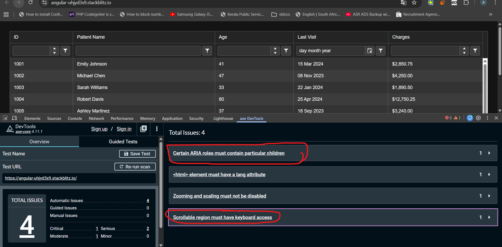
I have tested kendo grid accessibility with AXE Dev tool. Found following errors that seems difficult to fix.
1)Certain ARIA roles must contain particular children
2)Scrollable region must have keyboard access
Any suggestion to fix these above-mentioned issues could be very helpful. Noticed these issues even exist in kendo grid demos published in kendo documentation. Check the link below
stack blitz link : https://stackblitz.com/edit/angular-uhjyd3x9?file=src%2Findex.html
When a tooltip of a dialog is shown and the dialog is closed, the tooltip is still present and is moved into the top left corner.
We use e.g. `kendo-dialog-titlebar` and the close button has a tooltip.
Hi,
if I change the [placeholder] input on a kendo-editor, the changes are not reflected.
Reproduction (forked from your example): https://stackblitz.com/edit/angular-uqbchubd
Can you please take a look at it?
Best regards,
Michael
momentjs is a widely used date library which makes handling dates much more comfortable, and all Date components should support it
In the Kendo ComboBox, the selection part is not working with shadow dom.
1. Reproduction:
Please look at the below links,
With ShadowDOM:
https://stackblitz.com/edit/angular-evkasb?file=app%2Fapp.component.ts
Without ShadowDOM:
An example is provided in the below link under 'ENABLING SUGGESTION' section
https://www.telerik.com/kendo-angular-ui/components/dropdowns/combobox/suggestions/
Expected Result:
When user type 'C', the first word starts with C in the list 'Croatia' is suggested and 'roatia' is selected. But as soon as I type 'y' next to 'c', the combo box is suggesting 'Cyprus' and 'prus' should be selected
Actual Result:
As soon as I type the first word starts with C in the list is 'Croatia' is populated in the Combobox and 'roatia' is NOT selected. So the user cannot type ‘y’ in this case. But the user wants to select ‘CYPRUS’ but 'Croatia' is filled as the input and Cyprus is not suggested.
I have attached the video for the difference between with/without shadow dom.
Also, If you need any additional information, I have created a support ticket:
Ran this on StackBlitz
import { Component } from '@angular/core';
import {
  LegendLabelsContentArgs,
  SeriesClickEvent,
} from '@progress/kendo-angular-charts';
import { IntlService } from '@progress/kendo-angular-intl';

@Component({
  selector: 'my-app',
  template: `
    <kendo-chart
      (plotAreaClick)="onClick($event)"
      [transitions]="false"
      title="World Population by Broad Age Groups"
    >
      <kendo-chart-legend position="bottom"></kendo-chart-legend>
      <kendo-chart-series>
        <kendo-chart-series-item
          type="donut"
          [data]="pieData"
          field="value"
          categoryField="category"
          explodeField="exploded"
          [labels]="{ visible: true, content: labelContent }"
        >
        </kendo-chart-series-item>
      </kendo-chart-series>
    </kendo-chart>
  `,
})
export class AppComponent {
  public pieData: Array<{
    category: string;
    value: number;
    exploded: boolean;
  }> = [
    { category: '0-14', value: 0.2545, exploded: false },
    { category: '15-24', value: 0.1552, exploded: false },
    { category: '25-54', value: 0.4059, exploded: false },
    { category: '55-64', value: 0.0911, exploded: false },
    { category: '65+', value: 0.0933, exploded: false },
  ];

  constructor(private intl: IntlService) {
    this.labelContent = this.labelContent.bind(this);
  }

  public labelContent(args: LegendLabelsContentArgs): string {
    return `${args.dataItem.category} years old: ${this.intl.formatNumber(
      args.dataItem.value,
      'p2'
    )}`;
  }

  public onClick(event: any): void {
    console.log('Click');
  }
}
When the event is seriesClick, it works as expected, and if I change the type to bar, it works as expected, but when it's as shown as above, the onClick event isn't triggered.
As I have donuts/pies that might not have data in it, I needed to use plotAreaClick (which I have done for the bar charts)
Thanks,
I am using below piece of code inside <kendo-grid>. Here, I am using a dropdown and kendo excel export button inside toolbar. dropdown is in left and button is right aligned. Earlier, it was working till Kendo 18. When I upgraded to kendo 19, it stopped working.
Root Cause is kendo-dropdownlist contains an array button. When we click on button to expand dropdown, excel export button gets the focus and dropdown loses focus. When we click on dropdown button, 'k-focus' class is applied on 'excel-export'. Because of this, dropdown is not working.
Code:
<ng-template kendoGridToolbarTemplate>
<div class="toolbar-container" style="display: flex; align-items: center; gap: 16px; width: 100%;">
<!-- Dropdown Wrapper -->
<div style="flex-shrink: 0;">
<kendo-dropdownlist [data]="data"
[(ngModel)]="someField" [valuePrimitive]="true" (valueChange)="perform()"
[popupSettings]="{ appendTo: 'component' }" style="width: 175px;">
</kendo-dropdownlist>
</div>
<!-- Spacer to push button to right -->
<div style="flex-grow: 1;"></div>
<!-- Excel Export Button -->
<div style="flex-shrink: 0;">
<button type="button" kendoGridExcelCommand>Export</button>
</div>
</div>
</ng-template>
./node_modules/@progress/kendo-angular-layout/fesm2022/progress-kendo-angular-layout.mjs:19:0-75 - Error: Module not found: Error: Can't resolve '@progress/kendo-angular-progressbar' in 'C:\LiveMRIProjects\MRI.AgoraInsightsAnywhere-Angular\node_modules\@progress\kendo-angular-layout\fesm2022'
./node_modules/@progress/kendo-angular-layout/fesm2022/progress-kendo-angular-layout.mjs:22:0-56 - Error: Module not found: Error: Can't resolve '@progress/kendo-angular-intl' in 'C:\LiveMRIProjects\MRI.AgoraInsightsAnywhere-Angular\node_modules\@progress\kendo-angular-layout\fesm2022'
this is the error is coming
when we add kendo thing into module.ts file
If the pane is scrolled, the dark highlight shown when grabbing the splitter is misaligned like this:

Stackblitz repro can be found here
Hi,
https://stackblitz.com/edit/angular-dadm5ywe?file=src%2Fapp%2Fapp.component.ts
Please select the top-most button, then press TAB until the focus is on the button in the last grid cell.
Then press tab again => the focus moves to the last cell itself.
Press tab again => the focus moves back to the last button.
=> here we got into an endless loop, you cannot navigate to the button below the grid.
Interestingly, you can leave the grid if you navigate backwards with shift+tab.
best regards,
Michael
Hi Team,
Allow the ability to change the styling on the inner input of the component. This will allow developers easy access to change the placeholder styling based on condition or overall input element. Currently, a custom implementation like the following can be used:
https://stackblitz.com/edit/angular-pzv7zc?file=app/app.component.ts
or with a directive:
https://stackblitz.com/edit/angular-pzv7zc-v4te8u?file=app%2Fapp.component.ts
Thanks.
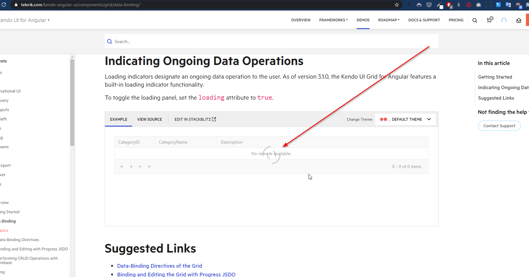
While the grid is initially loading data, the "No records available." message is confusing and provides no useful information.
Expected behavior - when the grid is initially loading, don't display the message as the rows/data might very well appear
To reproduce basically just go to the grid demo page (refresh if needed) and pay attention to the grid loading: https://www.telerik.com/kendo-angular-ui/components/grid/data-binding/
Example in our project - intuitively you'd think that the grid has no records until you see the loader; in any case, the message looks out of place:

When increasing the browser zoom level while using a kendo-splitter with two kendo-splitter-pane elements, one of the panes exceeds the boundaries of the kendo-splitter. As a result, part of the content becomes hidden.
Steps to Reproduce:
- Use a kendo-splitter with two kendo-splitter-pane elements.
- Resize one of the panes
- Increase the browser zoom level.
Template:
<kendo-splitter>
  <kendo-splitter-pane [collapsible]="true" size="30%">
    <div>
      <h3>Inner splitter / left pane</h3>
      <p>Resizable and collapsible.</p>
    </div>
  </kendo-splitter-pane>

  <kendo-splitter-pane>
    <div>
      <h3>Inner splitter / center pane</h3>
      <p>Resizable only.</p>
    </div>
  </kendo-splitter-pane>

  <kendo-splitter-pane [collapsible]="true" size="30%">
    <div>
      <h3>Inner splitter / right pane</h3>
      <p>Resizable and collapsible.</p>
    </div>
  </kendo-splitter-pane>
</kendo-splitter>
The page numbers and total items within a pager do not appear to respect the currently loaded i18n locale. For example, there's no comma in the thousands place for the en locale. What makes me believe this is a bug is that the page input which can appear DOES have i18n applied to it so the discrepancy is clearly visible between the two.
As there's no demo with such large page numbers I've created an example as well as a screenshot:
B187rdik (forked) - StackBlitz

By default the grid pagination only works taking count of the actual records instead of (alternatively) taking in consideration the groups count.
It would be nice to have the possibility to choose between those 2 when using groupBy and process functions.
This pagination feature is already implemented in the Kendo Ui for Asp.Net Core, but it is not available in functions such as process, groupBy or (toDataSourceRequest/toDataSourceRequestString/toOdataString)
Here you can find the related documentation page for the Asp.Net implementation.
Right now the only possible way to achieve this behavior in combo with a KendoAngularGrid is to use the (toDataSourceRequest/toDataSourceRequestString), then into the controller you'll have to mutate the DataSourceRequest Object like following:
[HttpGet]
public async Task<IActionResult> GetData([DataSourceRequest] DataSourceRequest request, CancellationToken cancellationToken) {
    var data = //...  ;

    request. Skip = (request.DataSourceRequest.Page - 1) * request.DataSourceRequest.PageSize;
    request.Take = request.DataSourceRequest.PageSize;
    request.IsExcelExportRequest = true; // without this the items property of the GroupResult type will be null
    request.GroupPaging = true;

    return Ok(await data.ToDataSourceResultAsync(request, cancellationToken);
}
Hi,
I'd like to request a feature for programmatically dismissing notifications in Angular. This is a common feature for notification / toast component, but it is missing in Kendo UI for Angular.
Right now, once a closable notification is shown, there's no way to dismiss it programmatically, which can lead to clutter (see attached screenshot).
Here are the proposed features:
Programmatic Notification Dismissal:
- Dismiss by type
- Dismiss by ID
- Dismiss all
Global Notification Limit:
- Set a global limit for how many notifications can be displayed at once.
These additions would greatly enhance the user experience by preventing notification clutter and providing better control for developers.
Thanks for considering this!
Best, Sergei.
Hi,
I've noticed a strange issue with the ContextMenu: in Firefox, the div text selection loses focus after the context menu is shown.

Here is FireFox context menu behavior (focus lost on selected text).
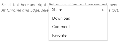
Sample Code:
Please let me know if there is any solution for this.
Thanks,