Hello Kendo Team,
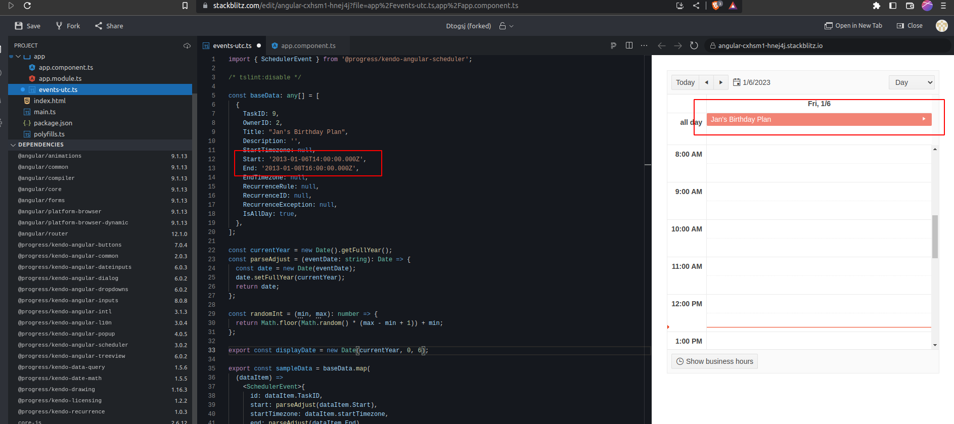
Need support for all day events to be shown just like slot events instead of showing it in the all day section at the top.
The use case of this scenario is that it removes the confusion for an end user, and helps them to better understand the available slot for a particular day.
Also the all day approach has multiple visual bugs for instance if an appointment start date is 17th March- 08 PM to 19th March 04 PM, as the appointment is more than 24 hours it goes to the all day section but then the slots before 08 PM of 17th march is still available and it is very difficult for an end user to find out that slot.
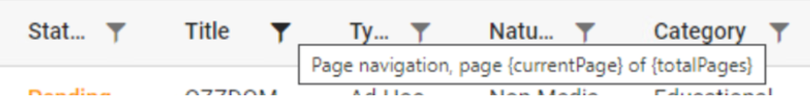
We are upgrading from @progress/kendo-angular-grid 4.8.0 to 7.4.2 and are running into an issue where a `kendo-grid-command-column` on a non-reorderable single column-sortable grid has gained the `pointer: cursor` CSS style where it did not previously.
The kendo documentation also shows this behavior, implying clicking on the command column header will do something when it will not, unlike the other columns. https://www.telerik.com/kendo-angular-ui/components/grid/editing/inline-editing/#toc-using-reactive-forms
kendo-angular-grid 4.8.0:
kendo-angular-grid 7.4.2:
This happens if the TimePicker is visible on the page and you change your system timezone (like from +2 to +12) and try to open the timepicker.
Allowing users to close but still have automatic default timeout should be possible.
Hi,
It will be a great addition if the `in` and `notin` (SQL-related) operators are added to the FilterDescriptor.
Hi,
Currently the kendo-datepicker submits the form when you press the enter key in the calendar popup.
I don't think this is the purpose? Can this be prevented please? If the current behaviour is useful in some scenarios, maybe provide a configuration option to alter this.
Thank you in advance.
Best regards,
Johan
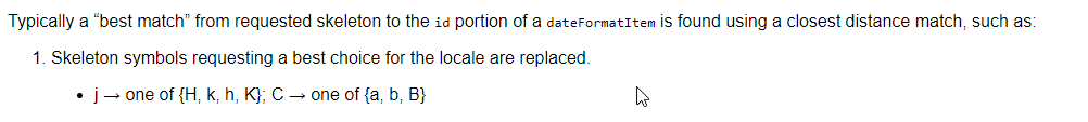
Hi Kendo Angular team,
It will be a good addition to the Kendo UI internalization to add support for the 'j' input skeleton symbol.
https://www.unicode.org/reports/tr35/tr35-dates.html#dfst-hour
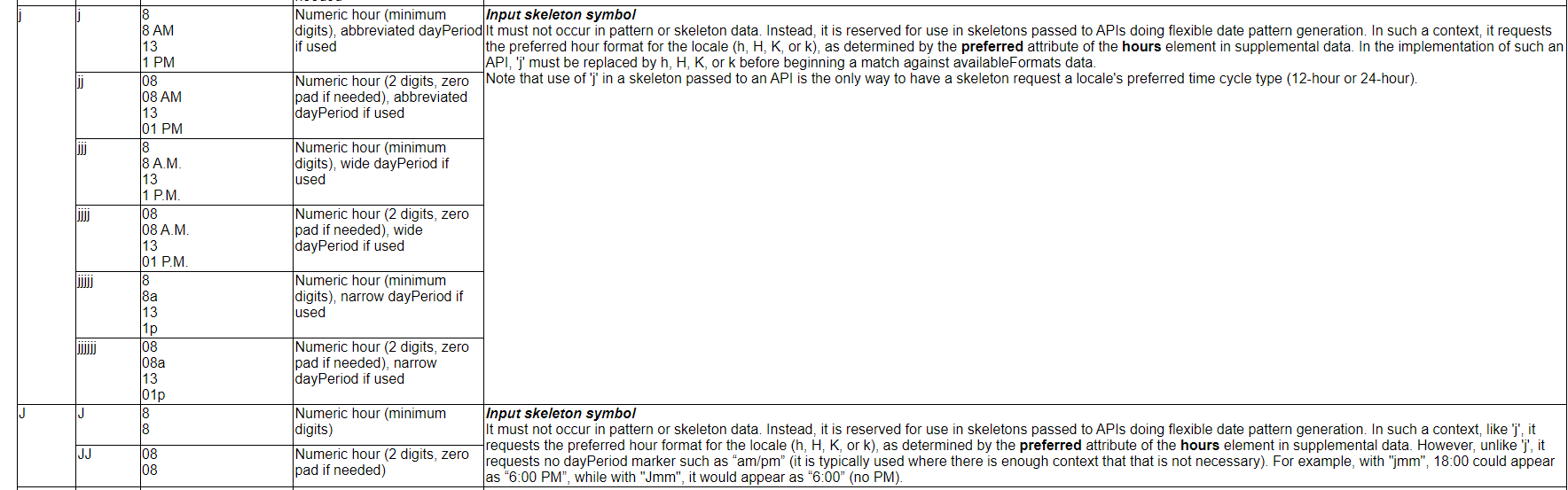
Thank you for your consideration.
When the user enters each character into the combobox, the system should validate that the resulting value is valid. If not, the system should not display the character
Step to produce:
Give focus to combobox
Type res
System should select Residential
Type z
System should not accept z character (both values in list that start with res do not have a z as the next character)
Type t
System should select Restaurant
Type y
Tap Tab
Expected Result: Restaurant should be selected
<kendo-combobox class="kendo-combobox" [ngClass]="{'inactive-color' : custColor}"
         #comboboxComponent [openOnKendoFocus]="comboboxComponent"
          formControlName="CustType" [data]="custTypes" textField="Description" valueField="CustTypeID"
          [suggest]="true" [valuePrimitive]="true" [allowCustom]="false" (selectionChange)="onCusttypechange($event)">
          <ng-template kendoComboBoxItemTemplate let-dataItem>
            <span class="template_lbl" [ngClass]="{'inactive-color' : dataItem.QInactive}">
              {{ dataItem.Description }}</span>
          </ng-template>
        </kendo-combobox>
when someone clicks on a date in the middle of the component, it will scroll the component instead of selecting the date.
This occurs in chrome and edge. In firefox this issue is not observed.
Steps:
1. Open a datepicker (https://www.telerik.com/kendo-angular-ui/components/dateinputs/datepicker/)
2. Hover over tuesday (bootstrap theme), between tuesday and wednesday in default theme.
3. Click on the date.
4. The component scrolls instead of selecting the date.
The cursor also changes from pointer to default. It seems another component is on top of the tuesday column.
The TextBox component allows us to specify a template for the prefix and suffix areas by applying the TextBoxPrefixTemplate and TextBoxSufffixTemplate directives to an ng-template.
I would also like to able to specify a template for the actual input area itself.
My use case for this is that I have a directive that I use within my application that I would normally apply to the <input> tag to ensure some custom processing is undertaken during user input. With the current TextBox component I am unable to do this.
Additionally I would like to specify the autocomplete attribute for the <input> tag to alow the browser to autocomplete things such as shipping-address etc. or even to disable the browser autocomplete completely by setting this to "off". Again this is not possible with the current TextBox but would be easily achievable if I could specify the template for the input area.
If this was implemented as requested I would expect my angular HTML to look something like:
 <kendo-textbox>
   <ng-template kendoTextBoxPrefixTemplate>
       <button kendoButton look="clear" icon="image"></button>
   </ng-template>
   <ng-template kendoTextBoxInputTemplate>
       <input myDirective [autocomplete]="myValue" />
   </ng-template>
   <ng-template kendoTextBoxSuffixTemplate>
       <kendo-textbox-separator></kendo-textbox-separator>
       <button kendoButton fillMode="clear" icon="calendar"></button>
       <kendo-icon name="bell"></kendo-icon>
    </ng-template>
 </kendo-textbox>
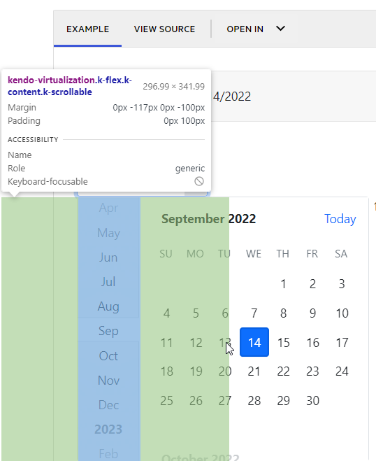
The DatePicker control for Angular has a hidden vertical scrollbar on the kendo-virtualization element, which is nested inside the kendo-calendar-navigation and kendo-calendar-viewlist elements. Though it is hidden from view, it is still clickable, and can obscure the selectable dates in the calendar. Clicking it results in activating the scrollbar, which will result in the navigation sidebar scrolling.
I have attached two screenshots to show the affected areas. Highlighted in red are the areas that when clicked will activate the sidebar scrollbar, and highlighted in blue is the area that will activate the calendar scrollbar, along with their respective elements in the DOM.
It appears the scrollbar is hidden from view via a combination of padding and margin settings from the css below:
.k-calendar .k-content.k-scrollable,
.k-calendar .k-calendar-content.k-scrollable {
box-sizing: content-box;
overflow-x: hidden;
overflow-y: auto;
display: block;
padding-right: 100px;
padding-left: 100px;
margin-left: -100px;
margin-right: -117px;
}
I am using Edge Version 105.0.1343.50
Tab Key: When you press the TAB key, the editor loses control of the focus. It is intended to give tab space rather than leave editor control. The indent space actually differs greatly from the tab space.
We are using placeholder like <span id="P_Name" name="P_Name">{P_Name}</span> . this would replace with the patient name on loading the editor.
we used the ContentEditable = false is not working for the span. Some important content such as patient information should be read-only.
attached the sample editor content , the below content are loading dynamically , so we should restrict user should not edit the conent.
https://stackblitz.com/edit/angular-e53ira?file=src/app/app.component.ts
If the popup is off-screen, it is simply cut off, unlike vertical which flips it to the other side.
Hi there,
we'd like to raise a change request in relation to column widths on grids:
https://www.telerik.com/kendo-angular-ui/components/grid/columns/width/
Currently, we can either set a fixed width on a column, or not set a width at all and leave it dynamic. Our problem is, that we have some columns that would benefit from additional space if it is available (e.g. on a larger screen), yet really suffer if they do not receive enough space.
When we give such a column a fixed size, we have to choose an amount that will still leave other columns enough space on smaller screens, and since it is fixed, is does not increase in size with larger screens.
If we don't set a fixed width, (or give all columns a fixed width), the available space will be distributed evenly/proportionally among the columns. So here, the columns do benefit from extra space, but the problem is that on smaller screens, they also can become too small to display the content.
We would like to be able to set a minimum width on columns. We imagine the behavior to be as follows:
If there are some columns with a fixed width and some with a min. width, and
- the available space is less than the sum of the fixed and min. widths -> a horizontal scrollbar is added
- the available space is more than the sum of the fixed and min. widths -> the additional space is distributed among the columns with a min. width (evenly or proportionately, either option is fine)
Would like to have a carousel component for pictures or carousel-ing through templates
Something like this maybe: https://stackblitz.com/edit/ivycarousel-demo?file=src%2Fapp%2Fapp.component.ts
Hi there,
It would be extremely useful to have some sort of global configuration for component settings / inputs.
For example: I want to remove animation from all of my dropdown lists.
This should be easier. The default workflow is to configure each and every instance of DropDownList using the component's input properties.
Less than ideal workarounds
- Create an angular directive that auto configures a given Kendo component and apply that directive to each instance of your component.
- Wrap a given Kendo component in a custom component, and configure it there. This will break the Kendo component's form integration, and you must implement the wrapper component to account for this.
Thank you.
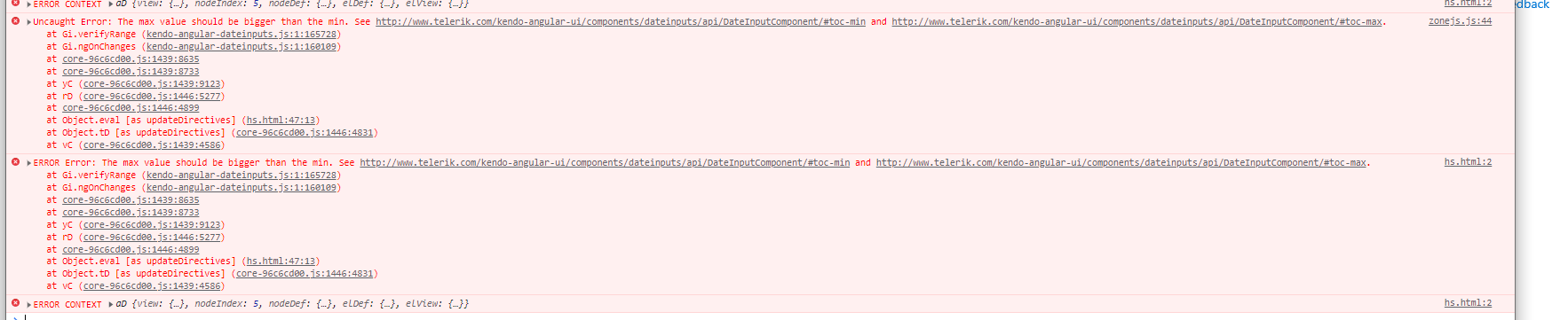
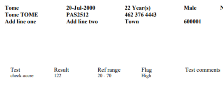
Please find the below screenshot for your reference and help us
Thanks,
Rajkumar S