For the Kendo DatePicker, if you try to set the size on a kendo-datepicker with plain text, it will not render and give a console error of "ERROR TypeError: Cannot read properties of undefined (reading 'nativeElement')".
Errors:
// HTML
<kendo-datepicker size="small" ... />
---
But on the other hand, it does work if you create a field of type "DateInputSize" and pass that variable to the size.
Works:// TS
protected size: DateInputSize = 'small';
// HTML
<kendo-datepicker [size]="size" ... />
Hi,
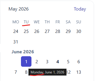
When the first day of the week is changed dynamically through a custom IntlService, the Calendar weekday headers are updated, but the date cells are not repositioned. (The first day is changed as described in your guide: https://www.telerik.com/kendo-angular-ui/components/knowledge-base/calendar-first-day )
Reproduction (forked from your example): https://stackblitz.com/edit/angular-tqvypgwg
Click on "Set first day to Monday ": the weekday headers are updated to start with Monday, but the date cells remain in their previous positions.
Best regards,
Michael
The DrawerAnimation interface isn't exposed in the index file.
DrawerItem, DrawerMode, and DrawerPosition are all exported but DrawerAnimation is missing.
The directive `kendoGridColumnChooserTool` does not work correctly when having columns which are grouped. See this example: https://stackblitz.com/edit/angular-r9duqpcn?file=src%2Fapp%2Fapp.component.ts
- It shows that 0 items are selected ("0 Selected items") - This is incorrect because all columns are selected by default. In the example above, I would expect it shows that 4 items are selected.
- When unselecting an item in the list (popup), it does not actually hide any column.
- When using directive `kendoGridToolbarTemplate` with `kendo-grid-column-chooser` component, it works as expected. I would expect that `kendoGridColumnChooserTool` directive would work (behave) exactly the same way.
import { Component } from '@angular/core';
import { FormsModule } from '@angular/forms';
import {
  KENDO_GRID,
  KENDO_GRID_EXCEL_EXPORT,
  KENDO_GRID_PDF_EXPORT,
} from '@progress/kendo-angular-grid';
import { KENDO_TOOLBAR } from '@progress/kendo-angular-toolbar';
import { KENDO_LABELS } from '@progress/kendo-angular-label';
import { KENDO_INPUTS } from '@progress/kendo-angular-inputs';
import { KENDO_BUTTONS } from '@progress/kendo-angular-buttons';
import { Product } from './model';
import { products } from './products';

@Component({
  selector: 'my-app',
  standalone: true,
  imports: [
    FormsModule,
    KENDO_GRID_EXCEL_EXPORT,
    KENDO_GRID_PDF_EXPORT,
    KENDO_GRID,
    KENDO_BUTTONS,
    KENDO_TOOLBAR,
    KENDO_LABELS,
    KENDO_INPUTS,
  ],
  template: `
    <kendo-grid
      [kendoGridBinding]="products"
      [pageSize]="5"
      [pageable]="true"
      [sortable]="{ mode: 'multiple' }"
      [style.width.%]="gridWidth"
    >
      <ng-template kendoGridToolbarTemplate position="bottom">
        <kendo-grid-column-chooser></kendo-grid-column-chooser>
      </ng-template>

      <kendo-toolbar overflow="scroll">
        <kendo-toolbar-button kendoGridColumnChooserTool></kendo-toolbar-button>
      </kendo-toolbar>

      <kendo-grid-column-group title="TestA">
      <kendo-grid-column
        field="ProductName"
        title="Product Name"
      ></kendo-grid-column>
      </kendo-grid-column-group>

      <kendo-grid-column-group title="TestB">
      <kendo-grid-column
        field="UnitPrice"
        filter="numeric"
        title="Price"
      ></kendo-grid-column>
      <kendo-grid-column
        field="Discontinued"
        filter="boolean"
        title="Discontinued"
      ></kendo-grid-column>
      <kendo-grid-column
        field="UnitsInStock"
        filter="numeric"
        title="Units In Stock"
      ></kendo-grid-column>
      </kendo-grid-column-group>
    </kendo-grid>
  `,
  styles: [
    `
      .example-info {
        background: rgba(83, 146, 228, 0.1);
        border-radius: 2px;
        margin: 10px auto 10px auto;
        padding: 15px;
        border-left: 4px solid #5392e4;
        font-size: 14px;
      }
    `,
  ],
})
export class AppComponent {
  public gridWidth: number = 100;
  public products: Product[] = products;
}
Hi ,
I want the kendoGridFocussable to apply the FocusableDirective on an anchor tag. This should allow the user to reach the anchor element using only the arrow keys without pressing Enter. (Example : Please, check out the following StackBlitz demo: https://stackblitz.com/edit/angular-rqqzam)
Regards,
Uzma
Add functionality to the Java Spring Boot sample application to support server-side data operations, such as sorting, filtering, and pagination. Currently, the demo uses the process method to do the operations on the client.
https://github.com/telerik/kendo-angular/tree/master/examples-standalone/kendoangular-java-integration
When typing into the Angular Datepicker on iOS devices, the page scrolls unexpectedly after entering the first character of any date part (day, month, year). The scroll occurs on each subsequent character input (2nd, 3rd, etc.), making it difficult to use the input field.
Steps to Reproduce:
- Open a webpage with a Kendo UI Datepicker on an iPhone (iOS v16+, any model). Ensure the datepicker is positioned far enough down the page that scrolling is required to reach it. Example can be seen at https://angular-v7j3ag.stackblitz.io/
- Focus on the Datepicker input field.
- Enter a date manually using the on-screen keyboard.
- After typing the first character into any date part, the page behaves normally, but it scrolls up to the top of the page on subsequent character inputs.
Expected Behaviour: The page should remain in place when typing, allowing smooth input without scrolling.
Observed Behaviour: The page scrolls up after entering the second character of any date part (day, month, or year) and continues to do so on each further input.
Reproduction: The issue was recreated using Kendo's own Datepicker example (with added spacing to demonstrate the scroll behaviour). https://stackblitz.com/edit/angular-v7j3ag
Affected Platforms:
- All iPhone models (tested 11 - 15) with iOS v16+ (reproducible on Safari and Chrome browsers).
- Does not occur on desktop or Android devices.
Additional Notes:
- A video demonstrating the behaviour is attached.
- This has been reproduced on both BrowserStack and physical iPhone devices.
I couldn’t find an existing bug report related to this issue, so I would appreciate it if you could confirm whether this has been reported or provide further guidance.
Severity: Sev2
Environment (OS, Application, Versions):
OS: Windows11 (build 22631.3296)
Chrome Version 122.0.6261.129 (Official Build) (64-bit)
Chromium Edge Version 122.0.2365.80 (Official build) (64-bit)
AT (include version number):
NVDA Version 2023.3.4. (2023.3.4. 31265)
Jaws (Version 2024.2312.53)
Narrator (Version Win11)
Repro Steps:
1.Turn on NVDA screen reader.
2.Hit the Dropdowns Library - Overview | Kendo UI for Angular (telerik.com)
3.TAB till "AutoComplete" edit combo box and insert "C", suggestion list will expand.
4.Press down arrow key to navigate through expanded list.
5.Observe that NVDA is not announcing the available list items.
Actual Results:
NVDA is not announcing the available suggestion list items of "Auto complete" combo box when we navigate with arrow keys.
Expected Results:
NVDA should announce the available suggestion list items of "Auto complete" combo box when we navigate with arrow keys.
9991592_NVDA_KendoExternal.mp4
When virtual is true for a multiselect and checkboxes are set to true, there is a bug which results in multiple items being selected.
To reproduce, one needs to scroll down a long list of items. The amount to scroll seems random but might have something to do with the itemHeight setting. When clicking directly inside the checkbox, two items are selected at once - the item selected, and one other seemingly random item. This does not happen if the click selection event happens inside the item, but not the checkbox.
I have reproduced this inside this code sandbox: https://codesandbox.io/p/sandbox/mystifying-shirley-2qxn32
Dear Kendo-Supportteam,
We are experiencing an issue with the Editor component.
It turns out that setting the iframe input to false causes the paste event to be triggered twice.
Once as documented before the valueChange event and once seemingly as the native paste event after valueChange.
There are multiple issues resulting from this.
- Calling preventDefault on the initial event also does NOT prevent the native event from triggering directly after. Only the following events from the Editor itself are prevented.
- As the next event is the actual native event of type ClipboardEvent, the interface is different from what the type definitions suggest. Leading to errors, if the attached method tries to just call isDefaultPrevented on the event.
It is quite easy to reproduce this from your event demonstration examples by just setting the iframe input to false and maybe also trying to call isDefaultPrevented in the respective paste event handler.
Kind Regards,
Hannah
Please provide built-in way to set attributes to the internal Input element. These can be HTML attributes like "autocomplete", "aria-describedby" and others, and also custom attributes if such are required.
Currently the only way to set attributes is programmatically, for example through a custom directive:
https://stackblitz.com/edit/angular-douddd?file=src%2Fapp%2Fapp.component.ts
Related feature request - https://feedback.telerik.com/kendo-angular-ui/1582022-set-area-describedby-and-area-labelledby-to-form-controls
Hi,
It will be a good addition to your standalone examples if a Java backend implementation is also added to the list:
https://github.com/telerik/kendo-angular/tree/master/examples-standalone
As demonstrated by the example of the current version and its screenshot, the title of the legend is black when using a dark theme:
Legend - Chart - Kendo UI for Angular (telerik.com)
The rest of the text is white which leads me to believe that this is a bug. This issue is not present when using a light theme.
https://stackblitz.com/edit/angular-mqywpa?file=src%2Fapp%2Fupload.component.ts
When using kendoTooltip directive on the upload component - tooltips are positioned in invalid position somewhere on the app.
cancel, delete, retry tooltips.
Test Environment:
Windows 11 Enterprise 22H2 22621.1848.
Narrator
Microsoft Edge Version 114.0.1823.79
Repro steps:
- Open link https://www.telerik.com/kendo-angular-ui/components/grid/examples/filter-all-columns/?theme=default-main&themeVersion=6.4.0
- Run Narrator
- Tab to the table present.
- Tab to the column header "Contact Name" and move to the column menu present and press enter
- check if the screen reader is announcing the column menu is expanded.
Actual Result:
When pressing enter on the column menu present beside the "Contact name" column header of the table, Screen reader is no announcing the state of the the column as it is expanded or collapsed because of the role set as link.
Expected Result:
When pressing enter on the column menu present beside the "Contact name" column header of the table, screen reader should be announcing the state of the column menu as it is expanded or collapsed, role should be set as button with expand collapse functionality.
When the user wants to select a date, the filter closes up and the user is not able to select any date from the calendar.
The issue is happening on tablet device in portrait mode and we found out that it's happening on your documentation too. To reproduce the issue, please go to the "Angular Grid Filter Menu" in your documentation:
https://www.telerik.com/kendo-angular-ui/components/grid/filtering/filter-menu/
Please open the dev tools and set the browser on any tablet portrait size or use Galaxy Tab S4.
In your first example (Angular Grid Filter Menu), please click on the "Date" filter in the grid. When the popup opens up, please click on the calendar icon
of the date input field.
When the calendar shows up, try to select any date. You'll see that the filter closes up and the user is not able to select any date. Demo video attached for reference.
Please fix this bug as we support Samsung Galaxy tablet devices and we're using this feature in our project.
When printing directly from Angular PDF Viewer results in a blurry printed PDF document. Downloading to PDF and printing does not affect the document
When setting the [zoom] value in TypeScript the drop down value does not reflect this and remains at the default of 125% even though the PDF is zoomed in/out.
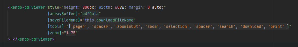
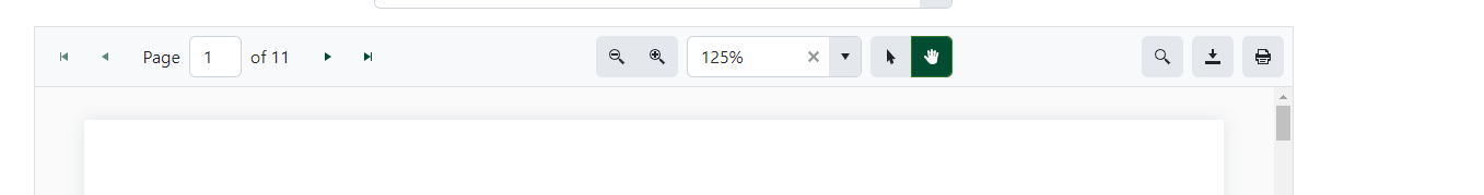
Adjusting the zoom level using the buttons then "corrects" the issue and it displays the right value.
Hi, Team!
Currently, I am using the Column Menu functionality of the Grid component and would like to be able to set a default value/placeholder of the input fields in the Filter section.