Are there equivalent instructions to https://docs.telerik.com/fiddler/Configure-Fiddler/Tasks/UseFiddlerAsReverseProxy for Fiddler Everywhere?
I have enabled "Allow remote computers to connect". I tried setting up an Auto Responder rule with a match condition of http://localhost:8866 and an Action of http://localhost:80. However, I am getting a ERR_TOO_MANY_REDIRECTS in chrome.
Fiddler Classic implements and documents this feature. Is this true for Fiddler Everywhere? Can you provide instructions?
I can tell you what does not work on Windows 11:
- Copying my client certificate to $env:USERPROFILE\Documents\FiddlerCore\ClientCertificate.cer
- Copying my client certificate to $env:USERPROFILE\Documents\Fiddler2\ClientCertificate.cer
- Copying my client certificate to $env:USERPROFILE\.fiddler\ClientCertificate.cer
- Copying my client certificate to $env:USERPROFILE\.fiddler\Certificates\ClientCertificate.cer
Please provide detailed instructions for setting this up. Thank you.
I do teach web development/security on a regular basis and in my classes I use Fiddler classic, and that works great. (teaching developers at companies, not school/university)
But I wish there was a student/training edition of Fiddler Everywhere, that I as a teacher could install on my student machines and that does NOT require any signup/account creation. Perhaps limited to be used for a few days before nagging for signup?
In my training typically provide a disposable virtual machine for my students and as a trainer, I do prioritize the ease of deployment/setup.
add .proto file doesn’t work
Invalid .proto file (Error: ENOENT: no such file or directory, open 'D:\Learn_develop\Common\src\main\proto\proto\api\services\dino\service\task\proto\api\services\dino\data\task\dino_task_info.proto'). Please try again or upload another file
dino_task_info.proto:
After I am done working with a saved session in Fiddler Everywhere, I need to be sure no trace of it remains on my machine, as it can contain customer/user data.
At the moment, all sessions I open are copied to the following path:
C:\Users\<user>\.fiddler\<fiddler user id>\Snapshots
So, even if I close the tab in Fiddler, close Fiddler, and delete the original file I loaded (say, from my desktop), the data is still on my machine.
The request is that Fiddler cleans this folder up upon exit.
Perhaps this can be a setting in Options, or even some confirm dialog on exit (e.g., what if someone wants to keep some tabs open, although I'd like to avoid an extra confirm upon exit).
Best,
Marin
Implement syntax highlighting and formatting in the inspector for common formats like JSON and XML in http rest requests and responses.
And would be nice if it is auto formatted
Consider adding a feature to modify the HOSTS file through the Fiddler Everywhere UI, similar to this feature in Fiddler Classic https://docs.telerik.com/fiddler/knowledge-base/hosts.
Currently, there is no UI option to modify the operating system HOSTS file, so users must modify it manually as noted in the following documentation section: https://docs.telerik.com/fiddler-everywhere/capture-traffic/reverse-proxy#reverse-proxy-for-remote-web-servers.
Example:
Configure the hosts file on your OS to map www.example.com to 127.0.0.1.
On Windows:
# Add entry to hosts file (run as Administrator)
echo 127.0.0.1 www.example.com >> C:\Windows\System32\drivers\etc\hosts

# Verify the entry was added
type C:\Windows\System32\drivers\etc\hosts | findstr example.com

# Flush DNS cache to apply changes
ipconfig /flushdns
On macOS:
# Add entry to hosts file (requires sudo)
echo "127.0.0.1 www.example.com" | sudo tee -a /etc/hosts

# Verify the entry was added
grep example.com /etc/hosts

# Flush DNS cache to apply changes
sudo dscacheutil -flushcache
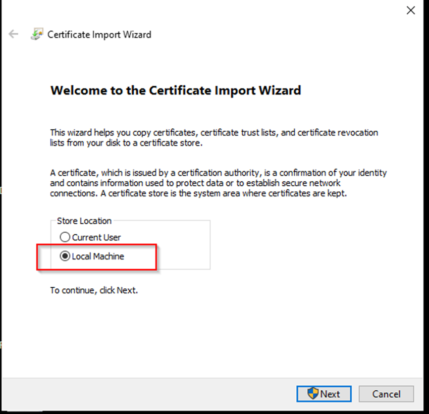
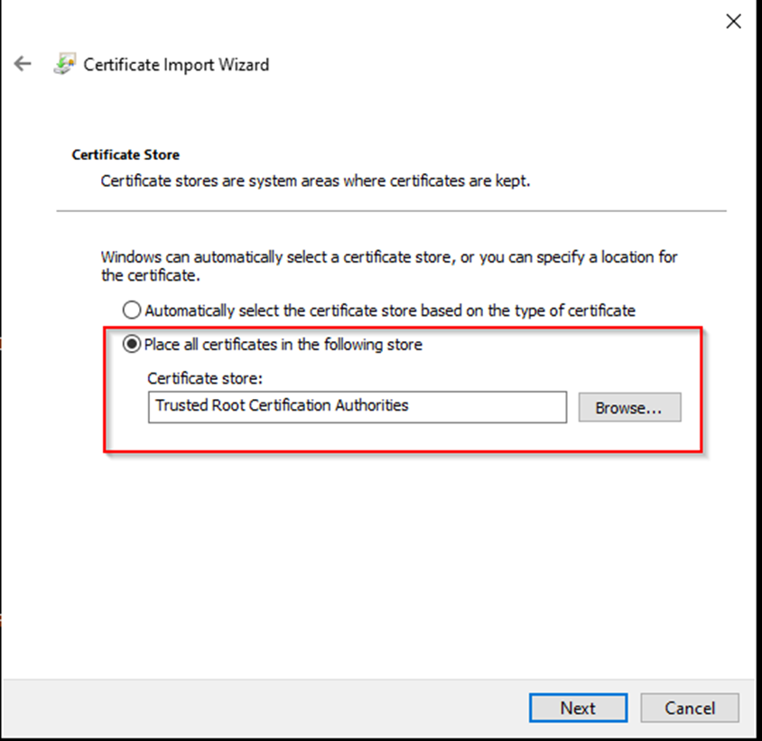
sudo killall -HUP mDNSResponderPerhaps a checkbox in the confirmation dialog "are you sure you want to add the rca to your user" could have a checkbox like 'also add to the Local Machine store".
Applies to Fiddler Everywhere and, more importantly for me, to Fiddler Everywhere Reporter.
In my use case, I need the cert there as well to get traffic from a process that runs as a service.
As things stand, I need to (instruct non-technical end users) to export the cert and manually add it to the Local Machine store and I would rather it were simpler.
Consider adding support for managed app configuration through Group Policies.
Currently, Fiddler provides app configuration options through registry keys on Windows. While that works well in most cases, it presents a limitation when using tools like Intune, where it is impossible to reuse a custom security group set in AD. Setting the managed app configurations through group policies will enable administrators to use custom security groups (instead of the predefined groups like Administrators, All, Everyone, etc.).
... Intune can also apply permissions to the Windows Registry, and we can use the standard Windows groups like Everyone, Administrators, etc. but not custom security groups that we've defined in Active Directory; Intune doesn't have access to Active Directory. We had wanted to create a security group, to enable authorized users to be permitted to modify the restricted settings managed in the registry, but we cannot apply permissions for this group using Intune.
Requested through t.1686216
The current Fiddler Everywhere rules do not allow you to simulate modem like you could do with Fiddler Classic.
I want this functionality brought back so I can do things like we had in the old Fiddler:
Fiddler includes a Custom Rules Engine that can simulate throttling. To enable it go to Rules -> Customize Rules... or (CTRL + R) and set the m_SimulateModem variable to true.
The script that executes when this is true is as follows:
if (m_SimulateModem) {
    // Delay sends by 300ms per KB uploaded.
    oSession["request-trickle-delay"] = "300";
    // Delay receives by 150ms per KB downloaded.
    oSession["response-trickle-delay"] = "150";
}
I have tried Delay Request but it's not the same:
Consider adding an option that will enable users to save a preferred set of columns that they can easily apply to multiple snapshots.
This will ease users' work by testing different scenarios based on different sets of snapshots.
Currently (version 6.3.0), a custom column is added to all opened snapshots only during their initial creation. However, to add/remove already created columns in multiple snapshots explicitly, one will have to go through each separate snapshot, which is not convenient and is time-consuming.
It appears that I need to add new columns for "VIA" and "SERVER" with each new recorded HAR session that I open.
Is there a way to set these extra two columns to always appear in my defaults?
It would be amazing if you could add a Search option for saved requests and Saved Request Folders and Also Sorting saved request folder by Name and Date
Folks,
I've been doing a bunch of OAuth work recently where DPoP is enforced. This makes it difficult to craft requests in the composer, because they need to be signed with the proof of possession token.
It strikes me this could be a feature, allow me, in composer, to provide the access token, proof of possession token and current nonce and generate the right authentication and signature headers.
Barry
Currently, the only option to intercept and decrypt secure traffic is to install and trust the Fiddler root CA. However, some applications might use different variations of cert pinning, which can be "solved" by creating and using a self-signed certificate. This would also be a viable option for testers of secured applications (that have access to the actually pinned cert).
Suggestions: provide an option for passing a custom self-signed certificate that Fiddler can use instead of the Fiddler root CA.
Related to https://stackoverflow.com/questions/42236967/change-the-root-signing-certificate-used-by-fiddler
Requested through t.1676901
Is there a way to run a filter across multiple captures (i.e. multiple SAZ files loaded into My Snapshots), as opposed to per individual capture? I'm having difficulty scaling the filtering feature across 100+ captures loaded.
Additionally, is there a way to export the filtered results to CSV/XLS for ease of mass review/searching?
Thanks!
Applications use named pipes on Windows to do interprocess communications in addition to tcp connection on localhost.
Sometimes they run grpc , sometimes json.
It would be great if Fiddler would support listening, replay and editing of those named pipe communications.
Some Applications don't like wildcards.
Battle.net prefers "eu.version.battle.net" and turns down the offered "*.version.battle.net" made by the Telerik CA.
It would be nice if we could optionally change this behaviour to better adapt to the specific needs of an application.


