.png)
Hello
The new adaptive toolbar I think doesn't follow the same style as other components, particularly scrollable tabs.
https://demos.telerik.com/blazor-ui/grid/adaptive
The UI scroll buttons shouldn't just disable, they just be hidden/removed from the UI altogether when they are not active (as it is pretty confusing to the user otherwise) - they should only appear when they need to appear. They also take up real-estate for no value.
Telerik already have the same concept in the UI for the scrollable-tabs seen here;
https://demos.telerik.com/blazor-ui/tabstrip/scrollable-tabs
So I see some inconsistency between the 2 UI's and think they should not appear as does on scrollable tabs.
PanelBarItem panelBarItem = new()
{
Id = menuItem.PageId,
Text = menuItem.PageTitle,
ParentId = menuItem.PageChildId,
HasChildren = menuItem.HasChildren,
Url = menuItem.PageURL,
Icon = menuItem.Icon
};
<TelerikDrawer @ref="@Drawer"
Data="@DrawerData"
MiniMode="false"
Mode="@DrawerMode.Overlay"
Class="DrawerClass"
@bind-Expanded="@IsDrawerOpen">
<Template>
<TelerikPanelBar Data="@PanelBarItems" ExpandMode="PanelBarExpandMode.Single" OnItemClick="@PanelBarClickHandler">
<PanelBarBindings>
<PanelBarBinding>
<HeaderTemplate Context="PanelBarContext">
@{
var item = PanelBarContext as PanelBarItem;
<b>@item?.Text</b>
}
</HeaderTemplate>
</PanelBarBinding>
</PanelBarBindings>
</TelerikPanelBar>
</Template>
</TelerikDrawer>
Hi,
I'm using two TelerikListBox elements, one left, one right. The right ones Data attribute is bound to already selected items that I get from the DB through EF Core. As you know, EF Core makes use of navigation properties. As you probably also know, the TelerikListBox recursively copies elements on binding. This causes a documented StackOverflowException, as written here -> https://www.telerik.com/blazor-ui/documentation/knowledge-base/common-stackoverflowexception-editing-circular-references.
I fixed the issue by calling
.Select(x => x.RemoveNavigation())
before binding, with RemoveNavigation being a simple "NavigationProp = null; return this;" function.
Eventhough this works, I think
a) the documented solution is not great, because the navigation properties are very useful, are one of the big reasons to even use EF Core in the first place and are automatically generated by, for example, EF Core Power Tools. Expecting the users to remove them from affected models is not a viable long term solution.
b) it would be better for Telerik to fix the issue by implementing some kind of logic to prevent the issue alltogether. My suggestion would be to ignore virtual, non-collection object properties on copy.
In the TelerikSignature control, the ExportScale property defaults to 2. This causes the image size to be doubled without realizing it. While it can be useful to scale the exported image, the default should be 1, because that is the expected default output.
<TelerikSignature @bind-Value="Medlog.Signature" Width="700px" Height="120px" Smooth="true" StrokeWidth="2" PopupScale="2" ExportScale="1">
</TelerikSignature>
We would like to get the datetime picker to autofill the year when entering just two digits for the year with a format of dd-MM-yyyy HH:mm:ss.
So when you enter 23-04-25 it changes to 23-04-2025. Currently it changes it to 23-04-0025, which isn't our desired result.
Something along the lines of how this works: https://jsfiddle.net/anbdwL0h/ but then with a 4 year digit format as result.
hello
please add support for bind pivotgrid to datatable or expando objects (local mode)
Please consider adding a TooltipTemplate parameter to the GridColumn component to allow developers to define custom tooltips for each cell using the same template logic available in CellTemplate.
Why This Matters
In enterprise applications — especially in ERP dashboards, cutover schedules, and KPI reports — data often needs contextual clarification. While tooltips are supported globally or via title attributes, there’s currently no clean, built-in way to customize tooltips per column using templating logic.
Please consider adding new grid-level properties to control visual styling and editing behavior more intuitively:
- HeaderThemeColor
- ShowGridLines
- EditModeDisplay (e.g., None, ValueOnly, All, Auto)
These options would provide teams with greater flexibility to align grids with branding, accessibility, and user interaction standards.
Why This Is Valuable
Grids are the centerpiece of most enterprise applications — and users rely on visual consistency and responsive interaction. Today’s grids need to:
- Match branding and accessibility guidelines (dark/light, color accessibility).
- Visually separate data (e.g., grid lines on for financial reports, off for dashboards).
- Clearly communicate edit state (inline, batch, or value-only editing).
These settings would empower developers to deliver purpose-built grids without deep CSS overrides or workarounds.
Please consider adding support for an optional header row indicator that can display a conditional icon + themed tooltip, used to show non-field-level validation or status messages — especially during inline or in-cell editing, and ideally in batch edit scenarios.
Why This Is Needed
In enterprise applications — especially those with batch entry workflows, cutover planning, or financial approvals — validation needs often extend beyond just field-level errors. Common use cases include:
- Rule-level messages (e.g., “Only one Primary Owner allowed per group”).
- Cross-row or cross-field issues (e.g., overlapping dates, missing dependencies).
- Batch edit feedback (e.g., conflict indicators before submit).
Currently, there’s no clean way to show column-specific validation or guidance in a visual, inline way that:
- Doesn’t clutter the cell.
- Surfaces at the column level (just like a header).
- Feels native to the grid.
In many cases the header text of columns gets truncated to an ellipses if the columns aren't wide enough. It would be nice if there was a global way to display a tooltip for each column header that is made up of the header text. I know that I can do this using the column header template, but that will require that I create a template for every column in all of my grids. I'm looking for a way to have it work globally. This could be with a general header template that has context about the header Title, or just a Boolean flag to display column header tooltips.
Thanks,
Mike
Hello,
i am trying to add a Clear Button inside the DropDownList-Component.
I tried to follow the instructions provided here: How do I add a Clear button to a DropDownList? in UI for Blazor | Telerik Forums respectiveley here: Telerik REPL for Blazor - The best place to play, experiment, share & learn using Blazor.
But unfortunateley, the button is never inside the component. It's always next to it or under the component.
In your example provided above, the button is inside the component.
I would love to have any solution for this one. A clear button is needed quite often.
I also have attached our custom component, where we use the Telerik DropDownList Component.
Thank you
In our application "Today" is NEVER a valid selection. But there is no way to turn it off.
Yes, we realize that we can create our own header template. But then we have to reproduce the next/previous functionality, for every single instance of the component -- and we have many dozens of them.
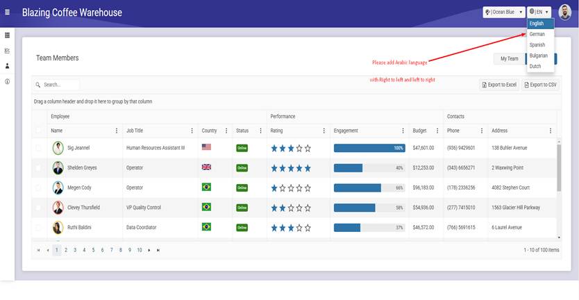
Dear all,
Please, Can you send the source code for this template with Arabic language https://demos.telerik.com/blazor-coffee/
Please add Arabic translate from right to left automatic when select Arabic language
I've been looking at your Keyboard Navigation page:
https://demos.telerik.com/blazor-ui/grid/keyboard-navigation
If you are navigating in the Grid and arrow over to the "+" sign and press ENTER it expands the Details. Then you can press TAB to access the button within the details. Great. Your demo works fine.
However, on my grid, I have another grid in my Details section. I would like to be able to expand the Details section and then TAB into those details so I can access the link in the header of the grid, and also be able to use arrow keys to navigate around this sub grid. Well, honestly MOSTLY I just wanted to be able to tab to the "View Checkout History" link within the Details grid. See attached screenshot.
However, pressing TAB after expanding the details simply moves the focus to the first button in the next column of that row. It doesn't go into the Details section like your web demo does for a button.
Please expand your Keyboard Navigation capabilities to allow more navigation into the Details section other than just a button like your demo shows. I'll bet a lot of people probably have sub-grids within their details section.
Thanks!
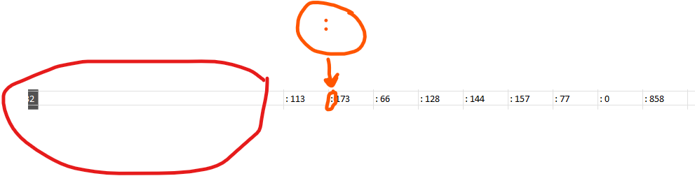
Cuando agrego GridAggregates el exportador de excel no me permite dejar limpia la fila de Totales (FooterTemplates) para unicamente dejar el Dato me coloca la siguiente estructura: "aggregate_sum: X" y al remover el aggregate_sum de los archivos de recursos me deja el texto ": X" por lo que la cadena sigue sin quedar limpia.
De igual manera en mi grid view tengo la columna de Totales y no la agrega al archivo que se exporta los totales como se ve en la imagen:

Would you be able to create a support and feedback for all UI/UX tools? I have feedback for the "Page Templates and Building Blocks" but no obvious place to add my feedback or support questions.
The feedback I have on the page templates is that the DrawerItem class does not contain a an ItemUrl. When I created the ItemUrl and added a URL to my DrawerItems, ie /Weather, gets rendered under the Drawer component, not to the right.
Hi,
I have spent a while looking for the feature to move the Footer Template to the first line of the Telerik grid. Is this currently possible with a parameter I'm unaware of? How possible would this be to do if not.
Kind Regards,
Elliot
Hi,
We use compact sized grid all the time in our application.
However, with sorting and filtering enabled, the icons take too much space in the header cell and make the actual header text hard to read.
Please consider scale down those icons and reduce padding.
Thanks and best regards,
Peili
Demo: https://blazorrepl.telerik.com/mSOIQZvO51cwrorJ49
===ADMIN EDIT===
To reduce the size of the icons and the font in a Compact Grid, you can follow the approach from the knowledge base article How to make Compact Grid elements smaller.
Currently the GridSearchBox is able to search in all of the visible columns but when it comes to searching in multiple columns split by space it does not work. Or even two different strings in the same cell.
Example:
If from the above grid, I type in the search box, "LT" three products will be returned but if I type "LT LD" it should return two products but the results set comes with nothing.
I have implemented CustomSearchBox component as a solution in the interim to achieve this functionality. But it would be a worthwhile effort to have this functionality out of the box.
Thank you.
Sheraz