Refreshing the Grid data frequently may cause performance issues.
Improve the component's memory management, related to calling the .Rebind() method.
Hi Telerik Team!
We’ve noticed that your official website uses anchor scrolling (clicking on links to scroll to specific sections smoothly), and we’d love to see that as a Telerik Blazor component.
This would be super useful in scenarios where:
The only way to present content is via long scrollable pages
Tabs aren’t a good UX fit
What we’re looking for:
-Smooth scrolling to internal page anchors (sections)
-Scrollspy-like feature to highlight active section
-Optional scroll offset for sticky headers
-Lightweight, flexible integration (with or without Telerik Form/Layout components)
We feel this would be a great addition to the Telerik Blazor suite — especially for documentation-style pages, long forms, or configuration panels.
Thanks a lot and keep up the awesome work!
Best regards,
Bohdan
First of all – great job on the DockManager component! It’s one of the most powerful and flexible layout tools available for Blazor. I really enjoy using it in my application – the drag/drop docking behavior, pane resizing, and layout persistence are all incredibly useful. It feels like working in a full-featured IDE, which is awesome!
That said, I’d love to suggest a small usability improvement:
Could you consider adding a built-in toggle/collapse button to the splitter between docked elements?
It would be great to have it natively supported in DockManager. It would improve the UX, especially when users want to focus on the main content area and temporarily hide side panes.
Let me know if this feature is already possible or if there's a recommended workaround.
Thanks again for all your amazing work – Telerik UI for Blazor keeps getting better and better!
Attaching two screenshots of TelerikSplitter and TelerikDockManager to show better what is the case.
Best regards,
Bohdan
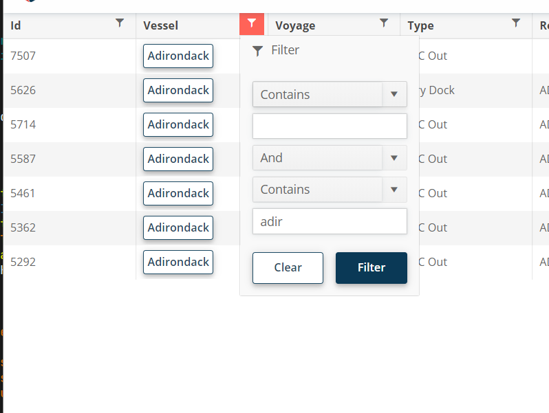
Hi - this one is a feature request, not a bug. :)
For the filter menu, when you enter a filter value, it would be nice if you could press enter to execute the filter instead of having to click "Filter."
I need to be able to allow our users to tab into the dropdownlist control and open it with enter (similar to standard HTML select).
Here is also a sample from the W3 documentation to compare against: DropDownList keyboard support.
In <TelerikTimePicker>, how can I enable format in the dropdown for minutes in two digits like 01, 02, 03, 04? Currently, I found these formats for Blazor Timepicker - https://demos.telerik.com/blazor-ui/timepicker/formats. All formats are showing single-digit minutes like 1, 2, 3, and 4.
I want to set the format in the dropdown for minutes to be two digits. Same as here https://demos.telerik.com/aspnet-mvc/timepicker/component-type.
In the docs https://www.telerik.com/blazor-ui/documentation/components/chart/overview#styling-with-css-variables there is an example on using CSS variables to set colours of the Chart component. And yes, if I set the --kendo-chart-bg CSS variable to some colour, the chart background is coloured with it. But, I can't change the colour at runtime, for example for switching between light and dark themes at user request.
But, shouldn't this be possible as the SVG is rendered inline? I see the chart being rendered as elements like below where the fill propertys value comes from the --kendo-chart-bg variable. But if the fill was instead set to "var(--kendo-chart-bg)" I would be able to change --kendo-chart-bg at runtime and the chart would reflect the change without needing to be refreshed separately? Same should go for all the text and series' colours.
<svg>
<g>
<path d="M0 0 L 400 0 400 240 0 240Z" stroke="none" fill="#0f0"></path>
</g>
</svg>
I also saw this, but I think this is before you added the CSS colouring? https://feedback.telerik.com/blazor/1496389-using-custom-themes-changing-at-runtime-does-not-change-the-chart-component-style
I am working on a form where experienced agents need to input data quickly. Often enough they know the codes and so they can type them in the combo box, but they shouldn't have to look for the mouse to select the item, the combo box should select it when the user presses Tab to move to the next field.
This should happen only when the user has filtered the combo box so they see some items (and so the dropdown is open) - I want them to be able to select only items from the available options, AllowCustom does not work for me.
=====
TELERIK EDIT / TLDR
The desired behavior violates accessibility standards. That's why we will refrain from implementing it as a built-in feature. We suggest the following workaround that is now part of the documentation: Select focused ComboBox item on tab
Hello,
We are looking to port an angularjs web application to Blazor and I didn't see the diagram component similar to the one found in Kendo UI. It would be nice to see a viso-like component in UI for Blazor.
Thank you.
I want to change the default Grid loading animation to a pulsing loader indicator.
.png)
Hello
The new adaptive toolbar I think doesn't follow the same style as other components, particularly scrollable tabs.
https://demos.telerik.com/blazor-ui/grid/adaptive
The UI scroll buttons shouldn't just disable, they just be hidden/removed from the UI altogether when they are not active (as it is pretty confusing to the user otherwise) - they should only appear when they need to appear. They also take up real-estate for no value.
Telerik already have the same concept in the UI for the scrollable-tabs seen here;
https://demos.telerik.com/blazor-ui/tabstrip/scrollable-tabs
So I see some inconsistency between the 2 UI's and think they should not appear as does on scrollable tabs.
PanelBarItem panelBarItem = new()
{
Id = menuItem.PageId,
Text = menuItem.PageTitle,
ParentId = menuItem.PageChildId,
HasChildren = menuItem.HasChildren,
Url = menuItem.PageURL,
Icon = menuItem.Icon
};
<TelerikDrawer @ref="@Drawer"
Data="@DrawerData"
MiniMode="false"
Mode="@DrawerMode.Overlay"
Class="DrawerClass"
@bind-Expanded="@IsDrawerOpen">
<Template>
<TelerikPanelBar Data="@PanelBarItems" ExpandMode="PanelBarExpandMode.Single" OnItemClick="@PanelBarClickHandler">
<PanelBarBindings>
<PanelBarBinding>
<HeaderTemplate Context="PanelBarContext">
@{
var item = PanelBarContext as PanelBarItem;
<b>@item?.Text</b>
}
</HeaderTemplate>
</PanelBarBinding>
</PanelBarBindings>
</TelerikPanelBar>
</Template>
</TelerikDrawer>