Hello,
I would like to add a CSS-Class to some items in my TelerikDrawer control. Since the ItemTemplate only controls the contents and the Template is overkill as it overrides the rendering for the entire drawer contents, I was wondering whether there was any support for adding custom CSS classes to items (similar to how it is described for Angular here: https://www.telerik.com/kendo-angular-ui/components/layout/drawer/items/).
TIA
- Chris
Cases:
- I am using the Template to control the rendering of the Drawer. When I place an <a> tag and focus it, I cannot use the Enter key to navigate to the desired link. The component traps the onkeypress event, which it should not.
- When I place a TreeView inside the Drawer Template and focus it, the keyboard navigation does not work because the Drawer traps the HTML events like onkeydown.
<Admin>
Workaround for the first case:
<script suppress-error="BL9992">
    window.navigateToHref = (ev) => {
        if (ev.key === "Enter") {
            location.href = ev.target.href
        }
    };
</script>

@* This example shows how to create header and footer for the Drawer and select an item manually. *@
<TelerikDrawer @bind-Expanded="@DrawerExpanded"
               Data="@Data"
               MiniMode="true"
               Mode="@DrawerMode.Push"
               @bind-SelectedItem="@SelectedItem"
               @ref="@DrawerRef">
    <Template>
        @* the header *@
        <div>
            <TelerikButton OnClick="@(() => DrawerRef.ToggleAsync())" Icon="@FontIcon.Menu" />
            @if (DrawerExpanded)
            {
                <div class="text-info" style="border-bottom:solid; font-weight: bold; margin-bottom: 3em; white-space:nowrap">
                    <a href="https://google.com" onkeydown="navigateToHref(event)">
                        My Custom Navigation to Google
                    </a>
                </div>
            }
            else
            {
                <div class="text-info" style="border-bottom:solid; font-weight: bold;">
                    Nav
                </div>
            }
        </div>

        @* custom items rendering and item selection *@

        <div class="k-drawer-items">
            <ul>
                @if (SelectedItem != null && DrawerExpanded)
                {
                    <li class="k-drawer-item" style="white-space:nowrap">
                        <div>
                            <p><strong>@SelectedItem.Text</strong></p>
                            <p>@SelectedItem.Description</p>
                        </div>
                    </li>
                }

                @foreach (var item in Data)
                {
                    @* Use onclick to handle manual item selection *@
                    <li @onclick="@(() => SelectedItem = item)"
                    class="k-drawer-item @GetSelectedItemClass(item)" style="white-space:nowrap">
                        <TelerikFontIcon Icon="@item.Icon"></TelerikFontIcon>
                        @if (DrawerExpanded)
                        {
                            <div>
                                <div>@item.Text</div>
                            </div>
                        }
                    </li>
                }
            </ul>
        </div>

        @* the footer *@
        @if (DrawerExpanded)
        {
            <div style="text-align: center; margin-top: 3em; padding-top: 2em; border-top: 2px solid black; white-space:nowrap">
                <img src="user-avatar.png" alt="my avatar" style="border-radius: 50%; width: 50px; height: 50px;" />
                <br /><br />
                <TelerikButton Icon="@FontIcon.Logout" ThemeColor="primary">Log Out</TelerikButton>
            </div>
        }
    </Template>
    <DrawerContent>
        <div class="m-5">Content for @SelectedItem?.Text - @SelectedItem?.Description</div>
    </DrawerContent>
</TelerikDrawer>


@code {
    public TelerikDrawer<DrawerItem> DrawerRef { get; set; }
    public DrawerItem SelectedItem { get; set; }
    public bool DrawerExpanded { get; set; } = true;
    public IEnumerable<DrawerItem> Data { get; set; } = new List<DrawerItem>
    {
        new DrawerItem {Text = "Shopping Cart", Icon = FontIcon.Cart, Description = "Items in shopping cart"},
        new DrawerItem {Text = "Settings", Icon = FontIcon.Gear, Description = "My profile settings"},
        new DrawerItem {Text = "Notifications", Icon = FontIcon.ExclamationCircle, Description = "My profile notifications"},
        new DrawerItem {Text = "Calendar", Icon = FontIcon.Calendar, Description = "My events"},
    };

    public string GetSelectedItemClass(DrawerItem item)
    {
        if (SelectedItem == null) return string.Empty;
        return SelectedItem.Text.ToLowerInvariant().Equals(item.Text.ToLowerInvariant()) ? "text-info" : "";
    }

    public class DrawerItem
    {
        public string Text { get; set; }
        public FontIcon? Icon { get; set; }
        public string Description { get; set; }
    }
}
</Admin>
It would be nice to have a handle feature within the rendered Drawer component that would expand and collapse the component.
For example, see the following screenshots.
Draw Open
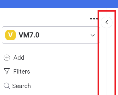
Draw Closed

For example, I could have projects with various levels of completeness. By grouping these by the project status would make it much easier to navigate.
Mini mode is very useful for conserving valuable screen estate but with the drawer in mini mode the user only sees a group of icons.
How can I add a mouse-over/hover descriptive text for each of the mini-mode icons so that users don't have to expand the menu to see the one that they want? I really don't want to resort to jQuery but this is an example where it may be the only solution.
The Drawer component is excellent BTW.
Kind regards,
Paul