Bug report
Reproduction of the problem
(bug report only)
The issue is reproducible when SlotDivisions is set to 1. If it is set to 2, or 3, the events are displayed correcty.
1. Run the following example: https://blazorrepl.telerik.com/wKOgYNbv564C2KOK04
Current behavior
(optional)
Events overlap.
Expected/desired behavior
Events are shown stacked.
Environment
- Kendo/Telerik version: 14.0.0
- Browser: [all ]
Bug report
Reproduction of the problem
1. Set a culture in the app, e.g.,
Program.cs
CultureInfo.DefaultThreadCurrentCulture = new CultureInfo("fr-CA");
CultureInfo.DefaultThreadCurrentUICulture = new CultureInfo("fr-CA");
2. Add a basic Scheduler with Agenda view enabled.
Current behavior
The weekdays in the Agenda view date headers are not translated in the language set by the culture.
Expected/desired behavior
The weekdays in the Agenda view are translated. Note that they are properly translated in other views, e.g., Week and Month.
Environment
- Kendo/Telerik version: 13.1.0
- Browser: [all ]
Normally when you drag an appointment from one grouping to another the grouping id is updated.
This does not occur when trying to drag a recurring appointment to another grouping.
In this case the time will update, but the grouping itself will stay the same.
This can be tested in the scheduler grouping demo (https://demos.telerik.com/blazor-ui/scheduler/grouping)
Steps to reproduce:
1. Create a recurring appointment for one room.
2. Drag one of the appointments to another room.
3. Select "Edit the series".
Result: the appointment is moved to the time it was dropped at, but it is still planned for the same room.
Hello,
The fun that one can have with dates, time and time zones seems almost infinite. I just stumbled across an issue with the Scheduler component where deleting a single occurrence of an appointment series did not work correctly sometimes. Specifically, it doesn't work in my use case for daily and hourly recurrences, but works fine for the others. When it does not work, the problem is that the recurrence exceptions do not match the actual start time of the event that they are supposed to "except". For compatibility reasons with other libraries, we have to feed the scheduler with events that have all of their dates and times represented as DateTime with DateTime.Kind == DateTimeKind.Unspecified .
I traced the issue to the RecurrenceCalculator where for both the GetNextDailyOccurrence and GetNextHourlyOccurence, the DateTime of the exception is created from the original event's start date, but with the DateTimeKind explicitly set to UTC. For example, if I have a daily recurring event from 2025-08-11 13:00 to 14:00 (with unspecified DateTimeKind) and then I delete the occurrence for 2025-08-12 in the scheduler, then the exception that is added excludes "2025-08-12T14:00:00.000Z" (with UTC DateTimeKind) which is clearly not correct. It is also not consistent with the other recurrence frequencies.
In the code of the RecurrenceCalculator
new DateTime(year, month, day, date.Hour, date.Minute, date.Second, date.Millisecond, DateTimeKind.Utc)
creates a new UTC DateTime regardless of whether the original date had DateTimeKind UTC, local or unspecified. Therefore I'm pretty sure this qualifies as a bug. There is an argument to be had about which "way" would be correct as the rest of the code creates new DateTime instance with DateTimeKind.Unspecified instead by not specifying the kind at all.
I personally would argue that for all occurrences, new DateTime instances should always be created with the same kind as the original DateTime.
Also, the events that we are displaying definitely don't happen in the UTC time zone and converting everything to UTC is really not an option as the events would be displayed incorrectly. I also don't want to "reinterpret" all the times as UTC without actually converting the time because that would end up being extremely confusing.
Regards,
// Lukas Angerer
I have been having issues adding the month view to a Telerik Blazor scheduler component, when there is grouping. It gives a null reference error any time I try to switch to the month view. I also tried it using the available demo for grouping in Telerik REPL, the only difference I found between my code and the demo was that I had used the ItemsPerSlot parameter. I added this to the demo, and was able to reproduce the error I was seeing, and I have attached the console output from the REPL demo. I believe there is either a bug with the ItemsPerSlot being used in conjunction with grouping on a scheduler component, or some instruction missing from how to set it up properly to prevent this null reference issue.
Changed code:
<SchedulerMonthView ItemsPerSlot="5"></SchedulerMonthView>
Demo used:
Blazor Scheduler (Event Calendar) Demos - Grouping | Telerik UI for Blazor
The behavior is reproducible only in the Material and Bootstrap themes - it can be observed in the online demo.
When I scroll to a point where an appointment is not fully visible and click it, the page scrolls up. This does not happen in the other themes.
Reproduction video: https://www.loom.com/share/b8303675096d42ea8582a1638f37571f.
Once a user has clicked an appointment to select it, I'd like the ability to clear this selection. For example, if you show one set of appointments, then click a radio button on the page to switch to a different set of appointments, I'd like to clear the selection so that no appointment is selected. The way it works now, the component appears to store the index of the selected appointment and then re-apply that when it's rendered with new appointments.
More context here: https://www.telerik.com/forums/how-to-clear-the-selected-slot-in-the-scheduler
In the scheduler for Asp.net Ajax, the month view would put a k-other-month class on the cells from other months outside of the current one and those cells would have a different style (grayed day numbers or background, etc.). In the Blazor scheduler component it doesn't look like that class is being put on those cells anymore. The Telerik SCSS themes still allow for that class, so is there a way to add them or is there a workaround so that those cells can be re-styled similar to the way the Ajax Scheduler functions?
Thanks,
Mike
I'd like to have a data virtualization feature (similar to the OnRead event), so I can load only small chunks of data (appointments) specifically for the current page/view.
===
ADMIN EDIT
===
Currently, you can achieve similar functionality by handling the DateChanged and ViewChanged events of the Scheduler to load only the relevant appointments for the selected period.
You can find an example here: Load Scheduler Appointments on Demand.
The Timeline view currently does not provide the "Show business hours" option as in the other views.
Please add that for the Timeline view similar to the jQuery version of the component.
===
ADMIN EDIT
===
For the time being, you can achieve this functionality with a custom approach by programmatically setting the StartTime and EndTime of the view to equal the WorkDayStart and WorkDayEnd.
Here is a basic example: https://blazorrepl.telerik.com/QyEhvjbO07j1ZvID42.
Hello,
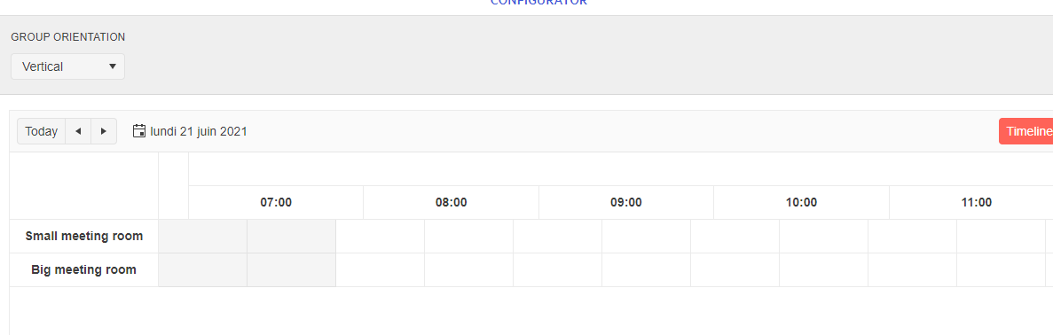
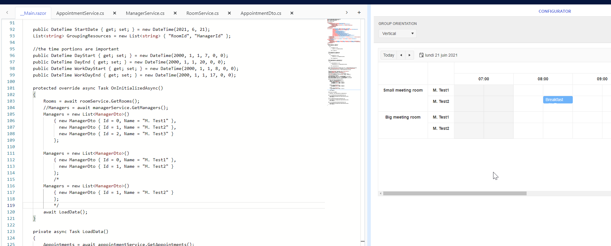
I use the scheduler component with grouping ressources on a timeline view.
When there is only one ressource for the second group, there is no text showing on the view.
It works with 2 ressources.
I try over your demo and i have the same result.
https://blazorrepl.telerik.com/GyYAmBGE22N2CcIQ27
When I use 2 ressources it works.
Thank you
Now that we can have more than 2 events in a day in Month View, we need to add an AppointmentHeight parameter to be able to make the appointments taller in height to accommodate longer titles.
ADMIN EDIT
An alternative for the time being is to show the longer content by using the appointment templates and the Tooltip component. For example:
https://github.com/telerik/blazor-ui/tree/master/scheduler/appointment-tooltips