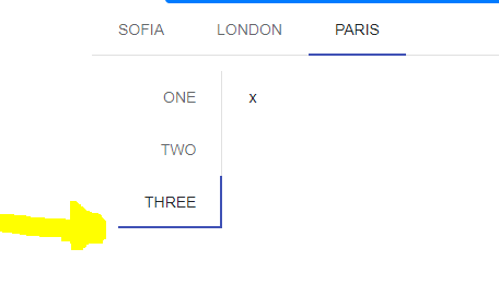
<TelerikTabStrip TabPosition="TabPosition.Top">
<TabStripTab Title="Sofia">
</TabStripTab>
<TabStripTab Title="London">
</TabStripTab>
<TabStripTab Title="Paris">
<TelerikTabStrip TabPosition="TabPosition.Left">
@foreach (var item in new string[] { "one", "two", "three" })
{
<TabStripTab Title="@item">x</TabStripTab>
}
</TelerikTabStrip>
</TabStripTab>
</TelerikTabStrip>
The ActiveTabIndex parameter can take a value -1 to denote that no tab should be selected. This can plug into the current two-way binding as well.
ActiveTabIndex works as expected when tabs are always Visible, but when you set the Visible property to false, then back to true, the ActiveTabIndex does not work.
<TelerikTabStrip @bind-ActiveTabIndex="@ActiveTabIndex" PersistTabContent="true">
<TabStripTab Title="Tab 0 Always Visible"><TabStripTab Title="@TabTitle" Visible="@IsTabVisible" >
..
IsTabVisible = true;
ActiveTabIndex = 1;
I encountered this behavior in both v2.30.0 and v3.2.0
The TabStrip throws ArgumentOutOfRangeException if the first tab is not Visible.
<TelerikTabStrip>
    <TabStripTab Title="A" Visible="false">
        Tab A
    </TabStripTab>

    <TabStripTab Title="B" Visible="true">
        Tab B
    </TabStripTab>

    <TabStripTab Title="C" Visible="true">
        Tab C
    </TabStripTab>
</TelerikTabStrip>
I am using the Telerik TabStrip and am trying to make the tabs scrollable while also showing additional tabs once a button is pressed.
When the additional tabs are shown, the tabs are not scrollable. Notice that when you toggle the visibility of the tabs, the new tabs being shown do not make the tab list scrollable.
=====ADMIN EDIT=====
Here is a possible workaround for the time being - REPL link.
Hello,
I am utilizing the TabStrip component with nested custom components that have parameters. When I change tabs, the inner child component's OnParametersSet is being fired off twice.
Please research if it's possible to prevent the duplicate renders and life cycle events.
This currently happening in both my application, and in some of your demos. If you set the focus to one of the tabs in the tabstrip, and then hit the tab key on the keyboard, it should set focus to the tabstrip content itself. However, in some cases it sets the focus right back to the tab, so you can never navigate off of the tab with the keyboard.
An example of this can be seen in the Overview and Scrollable Tabs demos, but it is working in position and alignment demo. I should also note that if I open the Overview and Scrollable demos in the Repl, it also works. So I'm not sure what is preventing it on the demo pages themselves. Any help would be appreciated, since the same thing is happening in my projects after I upgraded the Telerik controls to v9.x. Here are the demo links that I'm referring to.
https://demos.telerik.com/blazor-ui/tabstrip/overview
https://demos.telerik.com/blazor-ui/tabstrip/scrollable-tabs
- Activating the second tab leads to its header having the focus (correct).
- Using the tab key, the focus changes to the second tabs content (correct).
- Using "Shift + Tab", the focus changes back to the header row, but to the first tab header (incorrect, the second tab header should be focused).
- Using the right arrow key, the focus changes to the third tab header and this tab gets activated (actually correct, but confusing considering the previous point).
The problem is caused by the tab index of the tab headers not being updated properly. The first one seems to have 0 at all times, while all others stay at -1. Instead, the active tab header should have tab index 0, while all others get -1.
The window actions OnClick handler does not execute when a predefined action (e.g. Close) is triggered. This prevents custom logic from running during standard close operations.
Reproducible on version 14.0.0
Repro: https://blazorrepl.telerik.com/wqaJcWbu45qZxbeX49
Content inside the tabs is narrow and elements float next to each other. For example, charts or other divs have limited width (screenshot of the issue at the end of this post).
@using Telerik.Blazor@using Telerik.Blazor.Components.Chart@using Telerik.Blazor.Components.TabStrip@*WORKAROUND 1*@<style> .k-tabstrip .k-animation-container-relative { width: 100%; }</style>@*WORKAROUND 2<style> .k-tabstrip .k-animation-container-relative { display: block; }</style>*@<TelerikTabStrip> <TelerikTab Title="First"> First tab content. <div style="border: 1px solid red;">some div that must be as wide as the tab strip</div> Chart follows and it should also be as wide as the tab <TelerikChart> <TelerikChartSeriesItems> <TelerikChartSeries Type="ChartSeriesType.Line" Name="Product 1" Data="@series1Data"> </TelerikChartSeries> <TelerikChartSeries Type="ChartSeriesType.Line" Name="Product 2" Data="@series2Data"> </TelerikChartSeries> </TelerikChartSeriesItems> <TelerikChartCategoryAxes> <TelerikChartCategoryAxis Categories="@xAxisItems"></TelerikChartCategoryAxis> </TelerikChartCategoryAxes> <TelerikChartTitle Text="Quarterly revenue per product"></TelerikChartTitle> <TelerikChartLegend Position="ChartLegendPosition.Right"> </TelerikChartLegend> </TelerikChart> </TelerikTab> <TelerikTab Title="Second" Disabled="true"> Second tab content. This tab is disabled and you cannot select it. </TelerikTab> <TelerikTab Title="Third"> Third tab content. </TelerikTab></TelerikTabStrip><TelerikChart> <TelerikChartSeriesItems> <TelerikChartSeries Type="ChartSeriesType.Line" Name="Product 1" Data="@series1Data"> </TelerikChartSeries> <TelerikChartSeries Type="ChartSeriesType.Line" Name="Product 2" Data="@series2Data"> </TelerikChartSeries> </TelerikChartSeriesItems> <TelerikChartCategoryAxes> <TelerikChartCategoryAxis Categories="@xAxisItems"></TelerikChartCategoryAxis> </TelerikChartCategoryAxes> <TelerikChartTitle Text="Quarterly revenue per product"></TelerikChartTitle> <TelerikChartLegend Position="ChartLegendPosition.Right"> </TelerikChartLegend></TelerikChart>@code { public List<object> series1Data = new List<object>() { 10, 2, 5, 6 }; public List<object> series2Data = new List<object>() { 5, 8, 2, 7 }; public string[] xAxisItems = new string[] { "Q1", "Q2", "Q3", "Q4" };}
Hi All,
I want to build a TabStip with many Tabs in multiline header like this:
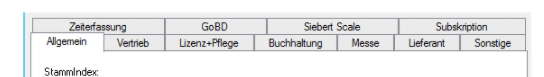
, but now all headers located in a long line as shows below:
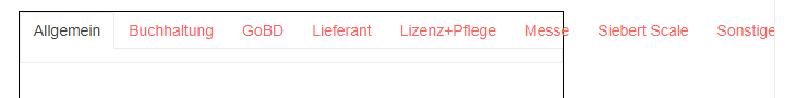
I could not found any attribute or a HeaderTemplate example to do this.
Can you please help me to do this?
I like the way Drawer is designed to support navigation.
It would be neat if TabStrip supported the same use-case. The basic idea would be that it would work like the Drawer navigation, but be presented as a tabbed interface. (Github's pull request UI works very much like this.) As this would require new syntax, I'm guessing it would be a new component such as NavTabStrip.
<TelerikRootComponent>

    <TelerikNavTabStrip Data="@NavigablePages">
        <NavTabStripContent>
            @Body
        </NavTabStripContent>
    </TelerikNavTabStrip >

</TelerikRootComponent>
Accessibility issue for TelerikTabStrip (3.6.0)
Issue is found in the attached png file.
<TelerikTabStrip TabPosition="@TabPosition.Top">
<TabStripTab Title="Handoff">
<VideoHandoff></VideoHandoff>
</TabStripTab>
<TabStripTab Title="Handoff Status">
<VideoHandoffStatus></VideoHandoffStatus>
</TabStripTab>
</TelerikTabStrip>
Reproduction: https://blazorrepl.telerik.com/QHFuExbc57Wq6HVG28.
Hi all,
Could you please add the OnBeforeActiveTabIndexChange event and allow cancellation (prevent) of ActiveTabIndexChanged in the handler?
I saw an example in the doc about how to prevent tab (index) change, but it is not sufficient because of:
- event if you won't change the tab index, the active tab is still being destroyed and recreated;
- we want to avoid keeping the tab in memory by using the PersistTabContent flag;
We need to prevent tab switching by showing the user a confirmation and reacting to the user's choice. We need to prevent the tab switching - not to post react and apply any kind of crutches.
To deactivate all tabs I have to set the ActiveTabIndex parameter to -1.
This was working up to version 4.6.0. After that version I start getting an error:
System.ArgumentOutOfRangeException: Index was out of range. Must be non-negative and less than the size of the collection. (Parameter 'index')
Here is an example with 4.6.0 where it is working:
https://blazorrepl.telerik.com/QSPuvKvI06m6AhF929
Here is an example with the current version:
https://blazorrepl.telerik.com/mIvOlqlI062NR9Vi59
When ActiveTabId is null, the TabStrip selects the first tab automatically, but does not render its content.
<TelerikTabStrip @bind-ActiveTabId="@TabStripActiveTabId">
    <TabStripTab Title="First" Id="t1">
        First tab content.
    </TabStripTab>
    <TabStripTab Title="Second" Id="t2">
        Second tab content.
    </TabStripTab>
    <TabStripTab Title="Third" Id="t3">
        Third tab content.
    </TabStripTab>
</TelerikTabStrip>

@code {
    private string? TabStripActiveTabId { get; set; }
}
With `PersistTabContent="true"`, when tabs start with `Visible="false"` and later become `Visible="true"`, all visible tab contents are instantiated simultaneously instead of only the active tab.
Reproduction:
@page "/TestPage"

<button @onclick="Load">Load</button>

<TelerikTabStrip PersistTabContent="true">
    <TabStripTab Title="Tab 1" Visible="@_tabsVisible">
        <TestInitComponent Message="Hello from tab1" />
    </TabStripTab>
    <TabStripTab Title="Tab 2" Visible="@_tabsVisible">
        <TestInitComponent Message="Hello from tab2" />
    </TabStripTab>
    <TabStripTab Title="Tab 3" Visible="@_tabsVisible">
        <TestInitComponent Message="Hello from tab3" />
    </TabStripTab>
</TelerikTabStrip>

@code {
    private bool _tabsVisible = false;

    private void Load()
    {
        _tabsVisible = true;
    }
}
TestInitComponent.razor
<h3>TestInitComponent</h3>

@code {

    [Parameter]
    public string Message { get; set; } = string.Empty;

    protected override void OnInitialized()
    {
        base.OnInitialized();
        Console.WriteLine($"TestInitComponent OnInitialized {Message}");
    }
}
Steps: Open page → click Load.