Problem Statement:
We have the following blazor grid:
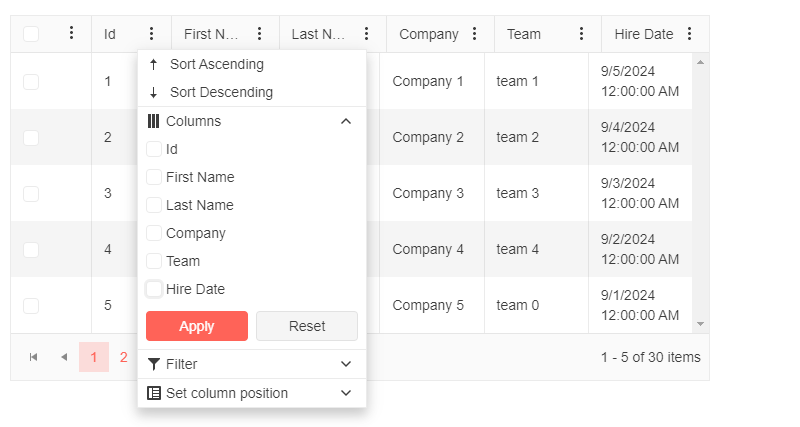
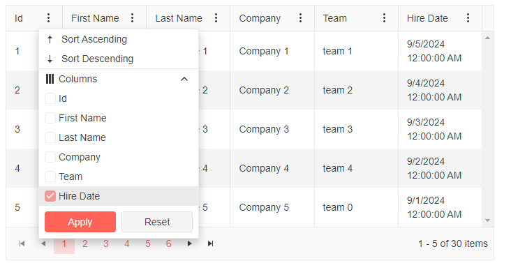
We have enabled the GridColumnMenuSettings
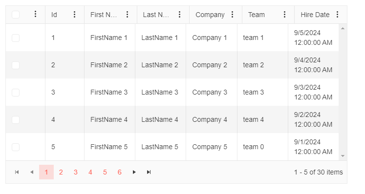
Now when we open the column chooser it does not disable for the last option.
When we don't have the GridCheckboxColumn then it works as intended
The last column option is disabled
Expected Result : We don't want the check box column to be shown in the column chooser and the last option to be unchecked in the column chooser needs to be disabled.
@* Use the Template to render the list of columns and add some custom styles *@

<TelerikGrid Data="@MyData"
             Pageable="true"
             PageSize="5"
             Width="700px"
             FilterMode="@GridFilterMode.FilterMenu"
             Sortable="true"
             ShowColumnMenu="true">
     <GridSettings>

     <GridColumnMenuSettings Sortable="true"
                             Lockable="false"
                             FilterMode="@ColumnMenuFilterMode.None" />
 </GridSettings>
    <GridColumns>

 <GridCheckboxColumn Width="80px" HeaderClass="header-select-all" />
        <GridColumn Field="@(nameof(SampleData.Id))" Width="80px" Title="Id" Id="id-column-id" />
        <GridColumn Field="@(nameof(SampleData.FirstName))" Title="First Name" Id="firstname-column-id" />
        <GridColumn Field="@(nameof(SampleData.LastName))" Title="Last Name" Id="lastname-column-id" />
        <GridColumn Field="@(nameof(SampleData.CompanyName))" Title="Company" Id="companyname-column-id" />
        <GridColumn Field="@(nameof(SampleData.Team))" Title="Team" Id="team-column-id" />
        <GridColumn Field="@(nameof(SampleData.HireDate))" Title="Hire Date" Id="hiredate-column-id" />
    </GridColumns>
</TelerikGrid>

@code {
    public string TextboxValue { get; set; } = string.Empty;

    public IEnumerable<SampleData> MyData = Enumerable.Range(1, 30).Select(x => new SampleData
    {
        Id = x,
        FirstName = $"FirstName {x}",
        LastName = $"LastName {x}",
        CompanyName = $"Company {x}",
        Team = "team " + x % 5,
        HireDate = DateTime.Now.AddDays(-x).Date
    });

    public class SampleData
    {
        public int Id { get; set; }
        public string FirstName { get; set; }
        public string LastName { get; set; }
        public string CompanyName { get; set; }
        public string Team { get; set; }
        public DateTime HireDate { get; set; }
    }
}
So what I propose is a fixed width for a column of the grid (and locked) with the remaining columns auto-sizing.
In my situation, I have an action switch button where the client can delete a row, edit a row etc but the action code dropdown column needs to ALWAYS be the same width. The rest of the columns should automatically size based on the existing behaviour.
Now I have tried using the autosize for just that column, but I have to render the grid first, then run the autosize (which gives a fun show of resizing to the user) then all the columns become fixed width, but the vertical scroll bar doesn't move and stays in its initial position.
Grid with columns price1 and price2. Enter value in price1, switch to price2, enter value there, and editor is set to old value after async events finish.
The value entered in price2 is correctly set to the property, but the editor reverts to the previous value. If you escape edit mode of the cell, the value entered before the events finish will be shown.
On (fast) tabbing and entering values, this removes the first values entered before the async background events finish.
I tried reproducing the problem in REPL, but could not get the exact same behaviour. In our case no specific value is being set to price2, it just reverts.
https://blazorrepl.telerik.com/cxEzvQvE52q8aaAi27
How would you approach preventing the editor from being overridden by other cells' delayed events?
It would be good to have a Grid parameter like "ExpandDetailsOnSelection" for the Grid:
-> When the user selects a row, the DetailTemplate automatically expands - the DetailTemplate of the previous selected item is automatically collapsed
Advantages:
- no "+" button needed
- easy to integrate for 2-way-binding on SelectedItems (no need to use GridState and RowClick event)
Hi,
it seems that grid.GetState() and FilterDescriptors, contains +1 "dummy" object.
- If it is by design, ok, BUT then, how to bind this filter descriptor to the ie TelerikFilter? = It displays that dummy object as it is, and confusing end users. Or how to "identify 100%" that is some kind of dummy value to be trashed?
How to reproduce:
1 run the repl demo
2 put "a" into the first colum(Name) filter
3 click button and observe the content of filter descriptors(serialized below the grid - RED is wrong, Green is expected as ok)
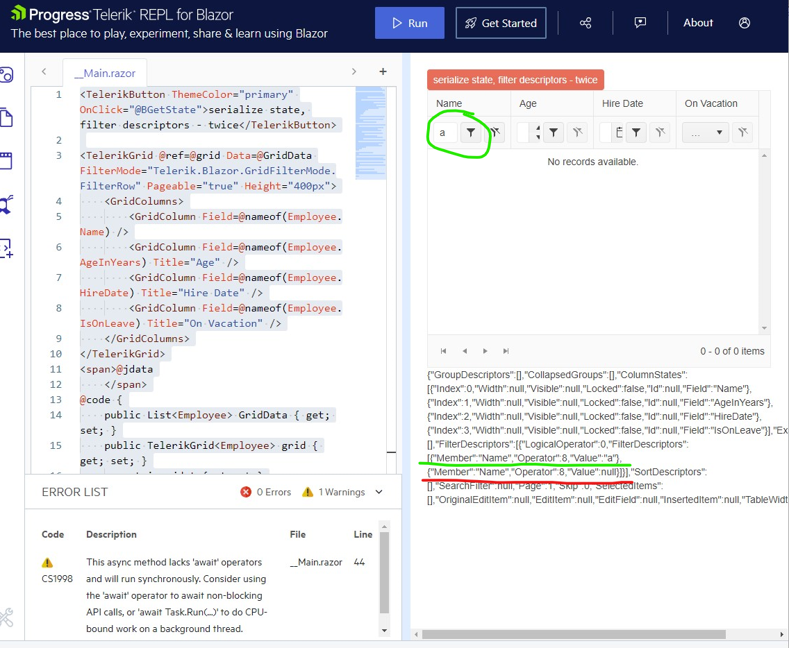
similar, but not the same(iam came from here):
Thanks for the tip, clarification, or removing that redundant values.
On grids with a lot of data there is a delay between when the grid is assigned the data to when the grid shows the data. During this UI painting period, the NoDataTemplate is displayed for a second or two.
The grid should not show the NoDataTemplate unless the data source is loaded with an empty collection, not just while it is still trying to show the data.
Note: Having a generic message like in the documentation "No Data available / The data is still loading ..." is not satisfying our users. (Blazor Grid - No Data Template - Telerik UI for Blazor) These should really be two different states that can show different messages.
Thanks
Greetings,
When using single selection mode, a row can be selected either by clicking the checkbox or by clicking on the rest of the row. There is no difference at all. Now, let's say I have a grid with multiple selection mode enabled, e.g.:
<TelerikGrid Data="listOfFoos" SelectionMode="GridSelectionMode.Multiple">
    <GridColumns>
        <GridCheckboxColumn SelectAll="true" SelectAllMode="GridSelectAllMode.All"  />
        <GridColumn Field="@nameof(Foo.Name)" Title="Name" />
    </GridColumns>
</TelerikGrid>
public class Foo {
public string Name { get; set; }
}
public List<Foo> listOfFoos = [ new Foo{Name="First"}, new Foo{Name="Second"}, new Foo{Name="Third"} ];
When we click an unselected row, the behavior varies depending on where we click exactly:
- if we click on the checkbox of the unselected row, the unselected row becomes selected. Previously selected rows are still selected. Everything is fine.
- if we click on the unselected row but not on the checkbox (e.g. on another column), the unselected row becomes selected but previously selected rows are unselected.
This notably makes multiple selection impossible if we click on the row but not on the checkbox and gives the impression we are using single selection mode. It is especially strange if we consider the existence of the CheckBoxOnlySelection parameter of <GridCheckboxColumn> whose name suggests we can select using the rest of the row by default.
Looking through the examples I can't find one with SelectionMode="GridSelectionMode.Multiple" and using a RowTemplate.
ADMIN EDIT: This is not a bug in the component, an example of how this can be implemented by the app is available in the comments.
I'm not sure what I should be binding my checkbox to so it accurately reflects selection state.
From the RowTemplate Example adding SelectionMode:
<TelerikGrid Data=@GridData
@bind-SelectedItems="@SelectedItems"
SelectionMode="GridSelectionMode.Multiple" Height="@Height">
<RowTemplate Context="product"> @*Trying to inspect what is generated in the examples I came up with this, but not sure what to bind to checked*@
<td role="gridcell" colspan=0 data-col-index="0">
<span>
<input class="k-checkbox k-grid-checkbox telerik-blazor" type="checkbox" />
</span>
</td><td> <img class="rounded-circle" src="@($"images/{product.ProductId}.jpg")" alt="Alternate Text" /> @product.ProductName </td> <td> @(String.Format("{0:C2}", product.UnitPrice)) </td> </RowTemplate> <GridColumns> <GridColumn Field=@nameof(Product.ProductName) Title="Product Name" /> <GridColumn Field=@nameof(Product.UnitPrice) Title="Unit Price" /> </GridColumns> </TelerikGrid>
Hello,
after updating to the versin 4.6.0 from 4.5.0, almost all svg icons dissapeared(inside the grid). No erros, no console warnings.
Is there some breaking changes or aditional steps how to bring them back?
Original markup without changes(first blue button in example should have "play" icon at the beginning):
<TelerikButton OnClick="@(_ => OZRowCmd(null,20))" Icon="@FontIcon.Play" Title="Zahájit novou" Class="bg-primary" Size="@Telerik.Blazor.ThemeConstants.Button.Size.Large">Zahájit novou</TelerikButton>
I added a comment to this feedback post. In this post, I made a comment on how to get Tab select working in a grid component for a combobox.
It would be nice if tab select was a parameter for any dropdown component and autocomplete. Maybe a parameter called "TabSelect"? It would need to fire before the grid component picks up the Tab key first in InCellEdit mode.
If that was changed above, then the grid component could have the following:
Enter key to move down the list, and Shift-Enter keys to move up the list. Is there a way to do that currently, or could it be added?
The Blazor TelerikGrid component should support a dropdown column. It should be exactly the same as the dropdown column in the Ajax grid.
https://docs.telerik.com/devtools/aspnet-ajax/controls/grid/columns/column-types#dropdown
Problem
It seems the Grid and GridSearchBox assume the search string by taking the value of GridState.SearchFilter.FilterDescriptors[0].Value and this is causing a few issues:
- If the first filter is a CompositeFilterDescriptor, it causes an exception.
- If there is no filter, the search box gets cleared.
- If the first filter has a different value than what was typed (because filters were added/changed programmatically), the search box value will be changed.
Background
I am expanding grid search to include non-string columns, and I want this to apply by default across our entire application without having to update every grid individually or developers having to remember to opt in.
To search other type columns, I’ve largely taken the logic from Search Grid in numeric and date fields - Telerik UI for Blazor and it works well. However, that solution utilizes a custom search box component that I would have to add to each grid.
Instead, I have placed this filter creation logic in the OnStateChanged handler as exemplified in How to Search Grid Items with a StartsWith Filter Operator - Telerik UI for Blazor, as we already have a handler for this event that all grids utilize.
This has worked wonderfully except for the issues I’ve mentioned.
Issue #1 – CompositeFilterDescriptor causes exception
If the first filter is a CompositeFilterDescriptor, it causes an exception. Specifically:
Unable to cast object of type 'Telerik.DataSource.CompositeFilterDescriptor' to type 'Telerik.DataSource.FilterDescriptor'.
at Telerik.Blazor.Components.Common.TableGridBase`2.LoadSearchFilter(IFilterDescriptor descriptor)
at Telerik.Blazor.Components.TelerikGrid`1.SetStateInternal(GridState`1 state)
at Telerik.Blazor.Components.TelerikGrid`1.<SetStateAsync>d__311.MoveNext()
at Web.Pages.Grid.<OnStateChangedHandler>d__18.MoveNext() in C:\src\Web\Pages\Grid.razor:line 196
If there is another filter in the collection that is not a CompositeFilterDescriptor, I can work around this problem by moving it to the front of the list.
// Make sure first filter is not composite.
var nonCompositeFilter = newSearchFilter.FilterDescriptors.OfType<FilterDescriptor>().FirstOrDefault();
if (nonCompositeFilter is not null && newSearchFilter.FilterDescriptors[0] is CompositeFilterDescriptor)
{
    newSearchFilter.FilterDescriptors.Remove(nonCompositeFilter);
    newSearchFilter.FilterDescriptors.Insert(0, nonCompositeFilter);
}
However, if all filters are composite, the exception is unavoidable.
Issue #2 – Search box gets cleared
If the GridState.SearchFilter.FilterDescriptors collection is empty, the search box gets cleared. This is a problem when a user needs to type more characters for a filter to be created.
For example, let’s say you are only searching DateTime columns and using the logic from Search Grid in numeric and date fields - Telerik UI for Blazor. As you type, it checks to see if the input is an integer between 1000 and 2100. Until you type the fourth digit, it will not meet that condition thus will not add a filter. So if you begin by typing “2”, it searches and a filter will not be added yet. However, because there are no filters, it will clear the search box. You won’t be able to type out a full year value of “2023” unless you type fast enough to outpace the debounce delay.
Issue #3 – Search box gets changed
Using the same example as above but with an Enum column instead of a DateTime, begin typing text. If the text matches an enum name, a filter is added for the enum item’s underlying value. For example:
- Type “e”.
- The first enum item’s name matches “e”, so a filter is added for (int)item IsEqualTo 0.
- The search box text is replaced with “0”.
Possible solutions?
- Is there some sort of “dummy” filter descriptor I could add to the beginning of the FilterDescriptors collection? Like, it would contain the search string as the Value but it would always evaluate to true and never affect which records match?
- I give in and create a custom search box component to hold the search string value separate from GridState, which would require me to update every current and future grid after all.
- Telerik could add a SearchString property to the GridState separate from the SearchFilter so that any filter changes would not affect the search string. Or something.
Sample project attached.
Hello,
as you can see in the provided example : https://blazorrepl.telerik.com/GwEsxPFc05zxpF2u01
i have set a filter for column Country on OnStateInitHandler event. However when i try to clear the filter from the filtermenutemplate button , Check box has the previous value. But data are bound correctly.
Could you give me some advice?
Hi,
We ran into an issue with manual binding and selected items with Grid component. I used the 'WebApiFromServerApp' sample in 'grid\datasourcerequest-on-server' folder from Telerik's samples on GitHub.
To recreate the issue, modify 'GridWithService.razor' file in 'WebApiFromServerApp' project. I attached modified project.
To test the behavior:
- Select records with Id 2 and 3 from grid.
- Navigate to another page and return back to the first one.
- Despite selected items exist in the grid's 'SelectedItems', but they are not being shown. This is the first issue.
- The second issue is you can still select them again! In that case they would be duplicated as selected items.
Thank you.
Hi,
When we use custom filters with FilterMenuTemplate in combination with setting filters programmatically, the filter value remains visible after using the 'delete' button.
Simplified example:
- First we load a filter programmatically by the button, this works fine:
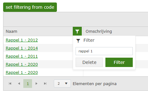
- When user uses the Delete button, the grid state loses the FilterDescriptor and we get all the data as expected (also the filter icon loses the green color, as expected because no filter is active)
- When user reopens the filter menu, the value which was loaded programmatically is still present, without being used as a filter:
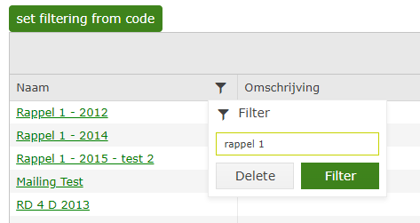
Note: We have the same issue with a custom filter with a checkbox list and that code is based on the example of the filter menu template in the documentation.
Note 2: When we use the custom filters and the 'Delete' button without setting the filters programmatically, everything works fine.
It's like the 'Delete' button clears the FilterDescriptors in de Grid State (and we get the data we expect), but the FilterDescriptors in the FilterMenuTemplateContext aren't cleared.. But only when those are set programmatically.. (by setting the grid state).
I already tried to think of a workaround by hooking the OnStateChanged, but there the FilterDescriptors on the grid state are empty when the 'Delete' button is used. As expected, because we get the data we want.. But don't think I can access the FilterMenuTemplateContext there, to clear it as well..
When working with grid column templates, it would be incredibly helpful if you could filter by the content of the cell itself rather than be restricted to a field that is a part of the model. Considering that the main use case of a template is to display something in a different format from how it appears on the model I think it's fair to say that most users would then expect to be able to filter the text they see rather than some value behind the scenes.
This has been problematic for example when trying to show data from a separate object by joining on a common ID value via the template. I understand one option would be to create a separate view model for the purposes of the grid but that potentially adds additional complexity to a project just to add some basic text filtering.
One workaround I've implemented for now is to use the OnRead event to manually filter the initial collection of data for my templated columns. I use a dictionary to map id values to my desired display text and then filter using LINQ. This is workable but again adds a lot of extra steps for something that would ideally be much simpler.
Thanks,
Kevin
Hi,
is it possible to implement grid attribute that would disable alternating row coloring altogether?
It would leave onHover settings as is.
It's causing us problems when we color rows using onRowRender to custom color a row based on some value in the record, but alternating css "jumps in" and overrides onRowRender.
See attached screenshot (all rows should be green), but alt are still dark-grey )instead of green.
This should me marked as feature or bug.
BR, Smiljan