The Grid resets and disables the adaptive mode for a column menu if the column has been hidden. The component also uses the previous adaptive mode that is no longer correct if the browser window is resized.
Steps to reproduce:
- Shrink the browser width. Hide a column, show it back and then show its column menu.
- Start from a wide browser. Show a column menu. Shrink the browser. Show the same column menu.
- Start from a narrow browser. Show a column menu. Expand the browser. Show the same column menu.
Test page:
<TelerikGrid Data="@GridData"
             AdaptiveMode="@AdaptiveMode.Auto"
             FilterMode="GridFilterMode.FilterMenu"
             ShowColumnMenu="true">
    <GridColumns>
        <GridColumn Field="@nameof(Product.Name)" />
        <GridColumn Field="@nameof(Product.Group)" />
        <GridColumn Field="@nameof(Product.Price)" DisplayFormat="{0:c2}" />
        <GridColumn Field="@nameof(Product.Quantity)" DisplayFormat="{0:n0}" />
        <GridColumn Field="@nameof(Product.Released)" DisplayFormat="{0:d}" />
        <GridColumn Field="@nameof(Product.Discontinued)" />
    </GridColumns>
</TelerikGrid>

@code {
    private List<Product> GridData { get; set; } = new();

    protected override void OnInitialized()
    {
        var rnd = Random.Shared;

        for (int i = 1; i <= 3; i++)
        {
            GridData.Add(new Product()
            {
                Id = i,
                Name = $"Name {i} {(char)rnd.Next(65, 91)}{(char)rnd.Next(65, 91)}",
                Group = $"Group {i % 3 + 1}",
                Price = rnd.Next(1, 100) * 1.23m,
                Quantity = rnd.Next(0, 10000),
                Released = DateTime.Today.AddDays(-rnd.Next(60, 1000)),
                Discontinued = i % 4 == 0
            });
        }
    }

    public class Product
    {
        public int Id { get; set; }
        public string Name { get; set; } = string.Empty;
        public string Group { get; set; } = string.Empty;
        public decimal Price { get; set; }
        public int Quantity { get; set; }
        public DateTime Released { get; set; }
        public bool Discontinued { get; set; }
    }
}
Customers report inconsistent in-cell editing behavior with DatePicker columns in the Grid.
- Case 1: click a date cell to enter edit mode, then click outside the Grid — edit mode terminates.
- Case 2: click a date cell to enter edit mode, open the DatePicker popup, then click outside the Grid — the popup closes but the cell remains stuck in edit mode until pressing Esc or clicking another cell.
Here is a REPL test page that reproduces the issue (first date column) and provides a workaround (second date column):
https://blazorrepl.telerik.com/QAErkrEh090ykIxR16
The workaround relies on Grid EditorTemplate, the DatePicker OnClose event, and programmatic Grid edit mode management. The relevant code is:
@using System.ComponentModel.DataAnnotations

<TelerikGrid @ref="@GridRef"
             Data="@GridData"
             EditMode="@GridEditMode.Incell"
             OnUpdate="@OnGridUpdate"
             OnCreate="@OnGridCreate">
    <GridToolBarTemplate>
        <GridCommandButton Command="Add">Add Item</GridCommandButton>
    </GridToolBarTemplate>
    <GridColumns>
        <GridColumn Field="@nameof(Product.Name)" />
        <GridColumn Field="@nameof(Product.StartDate)" Title="BUG" DisplayFormat="{0:d}" />
        <GridColumn Field="@nameof(Product.EndDate)" Title="WORKAROUND" DisplayFormat="{0:d}">
            <EditorTemplate>
                @{ var editItem = (Product)context; }
                <TelerikDatePicker Value="editItem.EndDate"
                                   ValueChanged="@((DateTime? newValue) => OnGridDatePickerValueChanged(newValue, editItem))"
                                   ValueExpression="@( () => editItem.EndDate )"
                                   OnClose="@(async () => await OnGridDatePickerClose(editItem))" />
            </EditorTemplate>
        </GridColumn>
    </GridColumns>
</TelerikGrid>

@code {
    #nullable enable

    private TelerikGrid<Product>? GridRef;
    private List<Product> GridData { get; set; } = new();

    private int LastId { get; set; }

    private DateTime LastDatePickerValueChanged { get; set; } = DateTime.Now;

    private void OnGridDatePickerValueChanged(DateTime? newValue, Product editItem)
    {
        editItem.EndDate = newValue;
        LastDatePickerValueChanged = DateTime.Now;
    }

    private async Task OnGridDatePickerClose(Product editItem)
    {
        if (DateTime.Now - LastDatePickerValueChanged > TimeSpan.FromMilliseconds(500))
        {
            GridState<Product> gridState = GridRef!.GetState();

            if (gridState.EditItem is not null && gridState.EditItem.Id == editItem.Id)
            {
                // Uncomment to perform an item update instead of cancel
                // OnGridUpdate(new GridCommandEventArgs { Item = editItem });

                gridState.OriginalEditItem = null!;
                gridState.EditItem = null!;

                await GridRef.SetStateAsync(gridState);
            }
        }
    }

    private void OnGridCreate(GridCommandEventArgs args)
    {
        var createdItem = (Product)args.Item;

        createdItem.Id = ++LastId;

        GridData.Insert(0, createdItem);
    }

    private void OnGridUpdate(GridCommandEventArgs args)
    {
        var updatedItem = (Product)args.Item;
        var originalItemIndex = GridData.FindIndex(i => i.Id == updatedItem.Id);

        if (originalItemIndex != -1)
        {
            GridData[originalItemIndex] = updatedItem;
        }
    }

    protected override void OnInitialized()
    {
        for (int i = 1; i <= 5; i++)
        {
            GridData.Add(new Product()
            {
                Id = ++LastId,
                Name = $"Product {LastId}",
                Price = Random.Shared.Next(0, 100) * 1.23m,
                Quantity = Random.Shared.Next(0, 1000),
                StartDate = DateTime.Today.AddDays(-Random.Shared.Next(60, 1000)),
                EndDate = DateTime.Today.AddDays(Random.Shared.Next(1, 60)),
                IsActive = LastId % 4 > 0
            });
        }
    }

    public class Product
    {
        public int Id { get; set; }
        [Required]
        public string Name { get; set; } = string.Empty;
        public decimal Price { get; set; }
        public int Quantity { get; set; }
        public DateTime? StartDate { get; set; }
        public DateTime? EndDate { get; set; }
        public bool IsActive { get; set; }
    }
}
Bug report
Reproduction of the problem
(bug report only)
Regression introduced in 9.0.0.
1. Run the code posted below and export the Grid.
2. Open the exported Excel file.
<TelerikGrid Data=@GridData
             Pageable="true" Sortable="true" Resizable="true" Reorderable="true"
             ShowColumnMenu="true" FilterMode="@GridFilterMode.FilterMenu"
             Width="800px" Height="400px">
    <GridToolBar>
        <GridToolBarExcelExportTool>
            Export to Excel
        </GridToolBarExcelExportTool>
    </GridToolBar>
    <GridExport>
        <GridExcelExport FileName="telerik-grid-export" AllPages="false" />
    </GridExport>
    <GridColumns>
        <GridColumn Title="Personal Information">
            <Columns>
                <GridColumn Field=@nameof(Customer.FirstName) Title="First Name" Width="100px" />
                <GridColumn Field=@nameof(Customer.LastName) Title="Last Name" Width="100px" />
            </Columns>
        </GridColumn>
        <GridColumn Title="Company">
            <Columns>
                <GridColumn Field=@nameof(Customer.CompanyName) Title="Name" />
                <GridColumn Field=@nameof(Customer.HasCompanyContract) Title="Has Contract" Width="120px" />
            </Columns>
        </GridColumn>
        <GridColumn Title="Contact Details">
            <Columns>
                <GridColumn Field="@nameof(Customer.Email)" Title="Email"></GridColumn>
                <GridColumn Field="@nameof(Customer.Phone)" Title="Phone"></GridColumn>
                <GridColumn Field="@nameof(Customer.City)" Title="City"></GridColumn>
            </Columns>
        </GridColumn>
    </GridColumns>
</TelerikGrid>

@code {
    public List<Customer> GridData { get; set; }

    public class Customer
    {
        public int Id { get; set; }
        public string PasswordHash { get; set; }
        public string FirstName { get; set; }
        public string LastName { get; set; }
        public string CompanyName { get; set; }
        public bool HasCompanyContract { get; set; }
        public string Email { get; set; }
        public string Phone { get; set; }
        public string City { get; set; }
    }

    // generation of dummy data
    protected override void OnInitialized()
    {
        GridData = GenerateData();
    }

    List<Customer> GenerateData()
    {
        var data = new List<Customer>();

        string[] fNames = new string[] { "Nancy", "John", "Orlando", "Jane", "Bob", "Juan" };
        string[] lNames = new string[] { "Harris", "Gates", "Smith", "Caprio", "Gash", "Gee" };
        string[] cNames = new string[] { "Acme", "Northwind", "Contoso" };
        string[] cities = new string[] { "Denver", "New York", "LA", "London", "Paris", "Helsinki", "Moscow", "Sofia" };
        Random rnd = new Random();

        for (int i = 0; i < 150; i++)
        {
            string fName = fNames[rnd.Next(0, fNames.Length)];
            string lName = lNames[rnd.Next(0, lNames.Length)];
            string cName = cNames[rnd.Next(0, cNames.Length)];
            data.Add(new Customer
            {
                Id = i,
                PasswordHash = "not shown",
                FirstName = fName,
                LastName = lName,
                CompanyName = cName,
                HasCompanyContract = i % 3 == 0,
                Email = $"{fName}.{lName}@{cName}.com",
                Phone = $"{rnd.Next(100, 999)}-555-{rnd.Next(100, 999)}",
                City = cities[rnd.Next(0, cities.Length)]
            });
        }

        return data;
    }
}
Current behavior
(optional)
The “Personal Information”, “Company”, “Contact Details” headers are not exported.
Expected/desired behavior
The multi-column headers are exported.
Environment
- Kendo/Telerik version: 14.0.0
- Browser: [all ]
Bug report
Reproduction of the problem
(bug report only)
Regression introduced in 13.0.0.
1. Run this example: https://blazorrepl.telerik.com/wUuSGClv00orFeRm59
Current behavior
(optional)
The Size, Rounded, FillMode parameters are ignored.
Expected/desired behavior
The parameter values should apply and change the appearance of the SearchBox.
Environment
- Browser: [all ]
Hi Support,
I have an issue with the DragToSelect feature of a Telerik grid in Blazor when this grid is inside a TelerikWindow.
Summary
When a TelerikGrid configured with GridSelectionSettings DragToSelect="true" is rendered inside the <WindowContent> of a <TelerikWindow>, the drag-to-select (rubber-band) behavior is not working properly — the user can only select cells/rows via individual clicks.
Single-click selection continues to work in both cases. The issue is specific to the drag gesture.
Steps to reproduce
Create a page with a TelerikWindow set to Visible="true".
Inside <WindowContent>, place a TelerikGrid with:
SelectionMode="@GridSelectionMode.Multiple"
SelectedCells / SelectedCellsChanged bound
<GridSettings><GridSelectionSettings SelectionType="@GridSelectionType.Cell" DragToSelect="true" /></GridSettings>
Open the window and try to select multiple cells by pressing the mouse button on a cell and dragging over neighboring cells.
Expected behavior
A rubber-band selection rectangle appears and all cells the pointer passes over become selected — same as when the identical grid is placed on a regular page (outside a modal window).
Actual behavior
Drag selection occur rarely. Only the single cell under the initial mousedown gets selected. The rubber-band rectangle rarely appears, and SelectedCellsChanged fires with a single descriptor instead of the full drag range.
Minimal repro (REPL-ready)
<TelerikWindow Visible="true" Width="800px" Height="500px">
<WindowTitle>Repro</WindowTitle>
<WindowContent>
<TelerikGrid Data="@Data" TItem="SampleItem"
SelectionMode="@GridSelectionMode.Multiple"
SelectedCells="@SelectedCells"
SelectedCellsChanged="@((IEnumerable<GridSelectedCellDescriptor> c) => SelectedCells = c)">
<GridSettings>
<GridSelectionSettings SelectionType="@GridSelectionType.Cell" DragToSelect="true" />
</GridSettings>
<GridColumns>
<GridColumn Field="@nameof(SampleItem.Id)" />
<GridColumn Field="@nameof(SampleItem.Name)" />
</GridColumns>
</TelerikGrid>
</WindowContent>
</TelerikWindow>
@code {
public record SampleItem(int Id, string Name);
private List<SampleItem> Data = Enumerable.Range(1, 20).Select(i => new SampleItem(i, $"Item {i}")).ToList();
private IEnumerable<GridSelectedCellDescriptor> SelectedCells = Enumerable.Empty<GridSelectedCellDescriptor>();
}
Now my questions :
- Is this a known limitation of DragToSelect when the grid is inside a modal TelerikWindow?
- Is there an officially supported workaround (CSS pointer-events tweak on .k-overlay, event capture override, grid setting, etc.)?
- If it is a bug, could you open a public issue we can track?
Many thanks you in advance.
Franck Boisdé
Bug Description
Introduced in v13.1.0. An item that has no text (empty string) renders a span (.k-list-item-text) with height 0px.
Steps to Reproduce
Steps to reproduce the behavior:
- Go to https://blazorrepl.telerik.com/mgEobKlm00OJm8OW55
- Click the DropDownList to show its list
- Inspect the second item in the browser dev tools
Also reproducible in: https://dojo.telerik.com/ZVOXYUsb/3
Expected Behavior
The item that has no text should have the same height as items that have text.
Actual Behavior
The height of the span.k-list-item-text is 0px.
Screenshots/Videos
Environment Information
Affected Theme(s)
- All themes
Affected Component(s)
Please specify the component(s) where the bug occurs: ___________
Affected Suites
- Kendo UI for jQuery
- Telerik UI for Blazor
- Telerik UI for ASP.NET Core
- Telerik UI for ASP.NET MVC
- likely others as well
Browser Information
- All browsers
Build System Information
Reproduction Case
CodePen/StackBlitz/JSFiddle Link
https://blazorrepl.telerik.com/mgEobKlm00OJm8OW55
https://dojo.telerik.com/ZVOXYUsb/3
Sample Code
<TelerikDropDownList Data="@DropDownListData" @bind-Value="DropDownListValue" />

@code {
    private List<string> DropDownListData = new List<string>() { "Item1", string.Empty, "Item3" };

    private string DropDownListValue { get; set; } = string.Empty;

    protected override void OnInitialized()
    {
        DropDownListValue = string.Empty;
    }
}
Workaround
<style>
    .k-list-item-text {
        min-height: 20px;
    }
</style>
Hi,
The ask is for a feature request to take the already wonderfully done globally applied filter features down to a per column basis without the overhead and burden of resorting to the custom FilterMenuTemplate approach.
The current way of doing business creates much overhead in code particularly when several columns are involved.
Something like:
<TelerikGrid Data="@MyData"
FilterMode="@GridFilterMode.PerColumn"
<GridColumns>
<GridColumn Field="MyField01" FilterMode="@GridFilterColumnMode.FilterRow" />
<GridColumn Field="MyField02" FilterMode="@GridFilterColumnMode.FilterMenu" />
<GridColumn Field="MyField03" Filterable="false"/>
etc..
</GridColumns>
</TelerikGrid>
Thanks!
Ron
Bug report
Reproduction of the problem
Possibly related to https://github.com/telerik/blazor/issues/2594
- Run this example: https://blazorrepl.telerik.com/wAkdbZPo47oCuV5G32
- Without scrolling the Grid horizontally resize a non-locked column (e.g., In Stock)
Current behavior
(optional)
The first locked column (ID) is rendered after the second locked column (Product Name). When you resize a non-locked column, the ID column disappears and is revealed at its new position after you scroll the Grid horizontally.
The behavior is reproducible with RTL enabled.
Expected/desired behavior
The order of the locked columns should persist.
Environment
- Telerik version: 13.0.0
- Browser: [all]
Specifically, if the div mentioned in the error does not have tabindex=1, tabbing from the header causes the browser to focus that area, which is not the expected behavior. Ideally, the focus should move to the first cell, as that intermediate area is not user-interactive.
On the other hand, if tabindex=-1 is used, tools like Аxe and Lighthouse report errors. Removing the tabindex attribute altogether still results in errors, and the browser continues to focus that area.
We are actively exploring possible approaches to address this, but at the moment, there is no immediate solution we can apply without side effects.
An exception occurs if a Grid row is dropped in another empty Grid in RTL mode:
Error: System.FormatException: the input string '-1' was not in a correct format.
We would like Telerik to implement built‑in safeguards to automatically neutralize potential macro injection vectors.
The penetration test revealed that it is currently possible to insert values beginning with Excel formula metacharacters—such as =, +, -, and @—into fields that are later exported using Telerik’s Excel Export functionality.
In older versions of Microsoft Excel, these values may be interpreted and executed as formulas when users open the exported file. Even though newer Excel versions often warn users, this still presents a security concern and may violate corporate export or data‑handling policies.
See also this blogpost: https://blog.securelayer7.net/how-to-perform-csv-excel-macro-injection/
The Telerik Excel Export functionality should include an option to automatically sanitize or escape values that may pose a risk of Excel macro or formula injection.
- Automatic escaping of formula-starting characters: Prepend a single quote (') to any exported value beginning with: '=', '+', '-', '@'.
- Optional configuration flag to enable/disable this behavior, for example: <GridExcelExportSettings EscapeFormulas="true" />
While we can implement a workaround in our own application code, we believe this is a security concern that many customers may encounter, and therefore a native solution within the Telerik framework would be highly valuable.
We kindly request that Telerik consider adding a built‑in mechanism to protect against Excel macro injection in exported files. This would improve security, reduce custom development work, and strengthen the reliability of Telerik’s Blazor export functionality.
Description
A column cannot be reordered by dragging beyond the currently visible columns of the Grid. This significantly limits the column reorder functionality only to the visible viewport.
Steps To Reproduce
- Run this example: https://blazorrepl.telerik.com/QqudFlYZ18zv7Gv547
- Drag a column header to the right border of the Grid.
Actual Behavior
The Grid does not scroll horizontally while the column is dragged.
Expected Behavior
The Grid scrolls horizontally while dragging the column and allows dropping it beyond the currently visible columns.
Browser
All
Last working version of Telerik UI for Blazor (if regression)
No response
How to reproduce:
- Go to https://demos.telerik.com/blazor-ui/grid/editing-incell
- Go to the last Grid page, which has empty space below the last table row.
- Open any Grid cell for editing.
- Click on the empty space in the Grid below the last table row.
- The Grid does not exit edit mode like it should.
The regression was introduced in version 12.2.0. The last version that works correctly is 12.0.0.
The possible workarounds are:
- Remove the Grid Height, so that there is no empty space after the last Grid row. You can apply a max-height style to the Grid to prevent unlimited vertical expansion.
- Use an @onfocusout event in the Grid <EditorTemplate> to close the Grid edit mode programmatically:
@using System.ComponentModel.DataAnnotations
@using Telerik.DataSource
@using Telerik.DataSource.Extensions

<TelerikGrid @ref="@GridRef"
             OnRead="@OnGridRead"
             TItem="@Product"
             EditMode="@GridEditMode.Incell"
             OnCreate="@OnGridCreate"
             OnDelete="@OnGridDelete"
             OnUpdate="@OnGridUpdate"
             Height="600px">
    <GridToolBarTemplate>
        <GridCommandButton Command="Add">Add Item</GridCommandButton>
    </GridToolBarTemplate>
    <GridColumns>
        <GridColumn Field="@nameof(Product.Name)">
            <EditorTemplate>
                @{ var dataItem = (Product)context; }
                <span @onfocusout="@( async () => await OnGridCellFocusOut(nameof(Product.Name)) )">
                    <TelerikTextBox @bind-Value="@dataItem.Name" />
                </span>
            </EditorTemplate>
        </GridColumn>
        @* <GridColumn Field="@nameof(Product.Price)" DisplayFormat="{0:C2}" />
        <GridColumn Field="@nameof(Product.Quantity)" DisplayFormat="{0:N0}" />
        <GridColumn Field="@nameof(Product.ReleaseDate)" DisplayFormat="{0:d}" /> *@
        <GridColumn Field="@nameof(Product.Discontinued)" Width="120px">
            <EditorTemplate>
                @{ var dataItem = (Product)context; }
                <span @onfocusout="@( async () => await OnGridCellFocusOut(nameof(Product.Discontinued)) )">
                    <TelerikCheckBox @bind-Value="@dataItem.Discontinued" />
                </span>
            </EditorTemplate>
        </GridColumn>
        <GridCommandColumn Width="180px">
            <GridCommandButton Command="Delete">Delete</GridCommandButton>
        </GridCommandColumn>
    </GridColumns>
</TelerikGrid>

@code {
    private TelerikGrid<Product>? GridRef { get; set; }

    private ProductService GridProductService { get; set; } = new();

    private async Task OnGridCellFocusOut(string field)
    {
        await Task.Delay(100);

        if (GridRef is null)
        {
            return;
        }

        GridState<Product> gridState = GridRef.GetState();
        Product? editItem = gridState.EditItem as Product;

        if (editItem is null)
        {
            return;
        }

        GridCommandEventArgs args = new GridCommandEventArgs()
        {
             Field = field,
             Item = editItem
        };

        await OnGridUpdate(args);


        gridState.EditField = default;
        gridState.EditItem = default!;
        gridState.OriginalEditItem = default!;

        await GridRef.SetStateAsync(gridState);
    }

    private async Task OnGridCreate(GridCommandEventArgs args)
    {
        var createdItem = (Product)args.Item;

        await GridProductService.Create(createdItem);
    }

    private async Task OnGridDelete(GridCommandEventArgs args)
    {
        var deletedItem = (Product)args.Item;

        await GridProductService.Delete(deletedItem);
    }

    private async Task OnGridRead(GridReadEventArgs args)
    {
        DataSourceResult result = await GridProductService.Read(args.Request);

        args.Data = result.Data;
        args.Total = result.Total;
        args.AggregateResults = result.AggregateResults;
    }

    private async Task OnGridUpdate(GridCommandEventArgs args)
    {
        var updatedItem = (Product)args.Item;

        await GridProductService.Update(updatedItem);
    }

    public class Product
    {
        public int Id { get; set; }
        [Required]
        public string Name { get; set; } = string.Empty;
        public string Description { get; set; } = string.Empty;
        public decimal? Price { get; set; }
        public int Quantity { get; set; }
        [Required]
        public DateTime? ReleaseDate { get; set; }
        public bool Discontinued { get; set; }
    }

    #region Data Service

    public class ProductService
    {
        private List<Product> Items { get; set; } = new();

        private int LastId { get; set; }

        public async Task<int> Create(Product product)
        {
            await SimulateAsyncOperation();

            product.Id = ++LastId;

            Items.Insert(0, product);

            return LastId;
        }

        public async Task<bool> Delete(Product product)
        {
            await SimulateAsyncOperation();

            if (Items.Contains(product))
            {
                Items.Remove(product);

                return true;
            }

            return false;
        }

        public async Task<List<Product>> Read()
        {
            await SimulateAsyncOperation();

            return Items;
        }

        public async Task<DataSourceResult> Read(DataSourceRequest request)
        {
            return await Items.ToDataSourceResultAsync(request);
        }

        public async Task<bool> Update(Product product)
        {
            await SimulateAsyncOperation();

            int originalItemIndex = Items.FindIndex(x => x.Id == product.Id);

            if (originalItemIndex != -1)
            {
                Items[originalItemIndex] = product;
                return true;
            }

            return false;
        }

        private async Task SimulateAsyncOperation()
        {
            await Task.Delay(100);
        }

        public ProductService(int itemCount = 5)
        {
            Random rnd = Random.Shared;

            for (int i = 1; i <= itemCount; i++)
            {
                Items.Add(new Product()
                {
                    Id = ++LastId,
                    Name = $"Product {LastId}",
                    Description = $"Multi-line\ndescription {LastId}",
                    Price = LastId % 2 == 0 ? null : rnd.Next(0, 100) * 1.23m,
                    Quantity = LastId % 2 == 0 ? 0 : rnd.Next(0, 3000),
                    ReleaseDate = DateTime.Today.AddDays(-rnd.Next(365, 3650)),
                    Discontinued = LastId % 2 == 0
                });
            }
        }
    }

    #endregion Data Service
}
Description
When clicking a Grid row and the Grid is in GridDataLayoutMode.Stacked mode, the RowClick event fires twice.
Steps To Reproduce
- Run this example: https://blazorrepl.telerik.com/QgkmvDvQ296Ea3Ij28
- Click a row in the Grid
Actual Behavior
The RowClick event fires twice.
Expected Behavior
The RowClick event fires once.
Browser
All
Last working version of Telerik UI for Blazor (if regression)
No response
The following KB article shows a workaround for removing the Grid aggregate labels ("Sum" and "Count") from the exported Excel document: https://www.telerik.com/blazor-ui/documentation/knowledge-base/grid-remove-aggregate-labels-in-excel-footr
It would be nice to have this option as a parameter in the Grid. It would allow to toggle on/off this behavior, instead of having to rely on custom code to work around it.
Or in the OnBeforeExport method, add extra data to GridBeforeExcelExportEventArgs that contains the aggregates so they can be changed.
 private async Task OnBeforeExcelExport(GridBeforeExcelExportEventArgs args)
 {
     await Task.CompletedTask;

     // Loop through all columns and fix the footer aggregate values
     // Replace the default "Sum: 1234.56" text with just the decimal number
     foreach (var column in args.Columns)
     {
         if (column.HasAggregate)
         {
             // Set the number format for the column so Excel treats it as a number
             column.Aggregate.Field.Value == "MyNewValue";
         }
     }
 }
I created a subclass of the TelerikGrid to extend the limited built-in search functionality.
To do that, I use the GridStateChanged event to rewrite the SearchFilter: I replace the default filter with a more complex CompositeFilterDescriptor (including highlighting). This works perfectly during normal interaction.
Now I also want the search to be persisted, so that after reloading the page the grid shows the same search again. Saving the grid state is not a problem, but when restoring the saved state during OnStateInit / GridStateInit, the following exception occurs:
Unable to cast object of type 'Telerik.DataSource.CompositeFilterDescriptor' to type 'Telerik.DataSource.FilterDescriptor'.
System.InvalidCastException: Unable to cast object of type 'Telerik.DataSource.CompositeFilterDescriptor' to type 'Telerik.DataSource.FilterDescriptor'.
at Telerik.Blazor.Components.Common.TableGridBase`2.LoadSearchFilter(IFilterDescriptor descriptor)
at Telerik.Blazor.Components.TelerikGrid`1.SetStateInternalAsync(GridState`1 state)
at Telerik.Blazor.Components.TelerikGrid`1.InvokeOnStateInit()
at Telerik.Blazor.Components.TelerikGrid`1.OnParametersSetAsync()
at Microsoft.AspNetCore.Components.ComponentBase.CallStateHasChangedOnAsyncCompletion(Task task)
at Microsoft.AspNetCore.Components.ComponentBase.RunInitAndSetParametersAsync()
at Microsoft.AspNetCore.Components.RenderTree.Renderer.GetErrorHandledTask(Task taskToHandle, ComponentState owningComponentState)
fail: Microsoft.AspNetCore.Components.Server.Circuits.CircuitHost[111]
Unhandled exception in circuit 'MYsaCsOgfpbyHeO0xNFpA7ViPHNUC6rpc1K9eIwVR5Y'.
System.InvalidCastException: Unable to cast object of type 'Telerik.DataSource.CompositeFilterDescriptor' to type 'Telerik.DataSource.FilterDescriptor'.
at Telerik.Blazor.Components.Common.TableGridBase`2.LoadSearchFilter(IFilterDescriptor descriptor)
at Telerik.Blazor.Components.TelerikGrid`1.SetStateInternalAsync(GridState`1 state)
at Telerik.Blazor.Components.TelerikGrid`1.InvokeOnStateInit()
at Telerik.Blazor.Components.TelerikGrid`1.OnParametersSetAsync()
at Microsoft.AspNetCore.Components.ComponentBase.CallStateHasChangedOnAsyncCompletion(Task task)
at Microsoft.AspNetCore.Components.ComponentBase.RunInitAndSetParametersAsync()
at Microsoft.AspNetCore.Components.RenderTree.Renderer.GetErrorHandledTask(Task taskToHandle, ComponentState owningComponentState)
I also tried saving the search term and the selected columns separately and then restoring the state in OnAfterRender, but at that point the SearchFilter can no longer be set.
How should I approach this? Is there a supported way to persist and restore a custom CompositeFilterDescriptor as the grid’s search filter (or otherwise restore the search state) without triggering this cast exception?
Sincerly Daniel
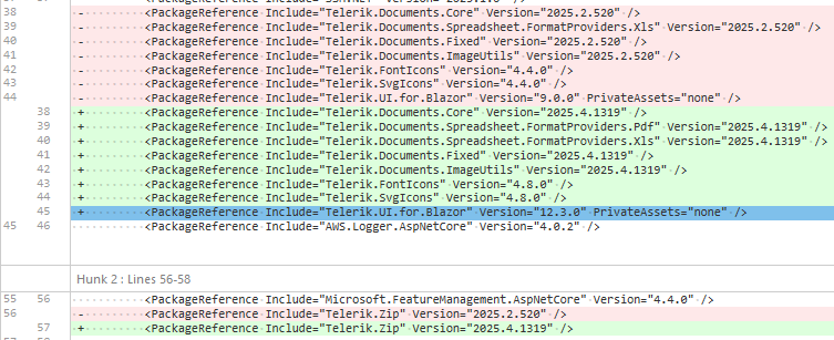
Hello,
we recently updated Telerik.UI.for.Blazor from 9.0.0 to 12.3.0, afterwords we noticed that in several instances where we use the `TelerikGrid` component, keyboard interactions stopped working. Specifically the `@onkeydown` seems to no longer propagate to parent elements of the grid. As this was not mentioned in the Breaking changes for the version 10 or 12 releases we assume this to be a bug.
here a simplified example:
            <div style="padding: 0; width: @(ShowSidePanel ? "65%" : "99%")" tabindex="0" @onkeydown="@(OnKeyPress)">
                <TelerikGrid TItem="IncomingInvoiceGridItemViewModel"
                             @ref="GridRef"
                             Class="admin-grid"
                             Height="@OverviewHeight"
                             RowHeight="50"
                             Pageable="false"
                             PageSize="PageSize"
                             FilterMode="@GridFilterMode.FilterMenu"
                             Sortable="true"
                             Resizable="true"
                             Reorderable="true"
                             ShowColumnMenu="true"
                             ScrollMode="@GridScrollMode.Virtual"
                             SelectionMode="@GridSelectionMode.Single"
                             OnStateInit="@OnStateInit_SetStateAsync"
                             OnStateChanged="@OnStateChanged_SaveStateAsync"
                             SelectedItemsChanged="@OnSelectedItemsChanged_LoadPdf"
                             OnRead="@OnRead_UpdateFilteredItems">
                    <GridSettings>
                        <GridColumnMenuSettings Lockable="false" />
                    </GridSettings>
...
<!-- aggregates, columns and noDataTemplate omitted -->
...
                </TelerikGrid>
            </div>
Implementation / usages of the features did not change, only updates where changes required by the update Telerik.UI.for.Blazor from 9.0.0 to 12.3.0.
These were the dependencies updated alongside the update of Telerik.UI.for.Blazor from 9.0.0 to 12.3.0 :
Hello,
seems like the GridToolbar(even the GridToolbarTemplate) in grid is not rendering "GridToolBarOverflowMode.Section". The "Scroll" mode is ok.
Is there any additional setup, or did i missed some setup...?
REPL:
https://blazorrepl.telerik.com/wqYQvvEq40GkajEZ30
based on:
https://www.telerik.com/blazor-ui/documentation/components/grid/toolbar
some mention about "sections" but it seems for another purpose:
https://www.telerik.com/blazor-ui/documentation/knowledge-base/common-net8-sections
Thanks