The scenario involves a DropDownList, which receives its data through OnRead at runtime asynchronously. The initial OnRead event that the component fires is not used, so the app calls Rebind() at some point. In this case, the component Value doesn't display until the user opens the dropdown. A possible workaround is to set the Value after the OnRead execution is complete.
Here is the scenario:
- A select component is near the bottom of the screen and its dropdown shows above the component.
- Height="auto" is set in the PopupSettings
- Filtering is enabled.
- Component version 6.1.0 or later
In this case, reducing or increasing the number of visible dropdown items does not adjust the open dropdown's position. As a result, it may either float too high, or overflow the screen.
Possible workarounds are:
- Use a fixed height in the PopupSettings.
- Downgrade to version 6.0.2.
Here is a test page:
<div style="height:80vh;background:linear-gradient(white,orange)">
    <ol>
        <li>Open a ComboBox</li>
        <li>Type a character to filter and reduce the visible data items</li>
        <li>Observe incorrect popup position that leaves a gap</li>
    </ol>
    <ol>
        <li>Focus a closed ComboBox</li>
        <li>Type a character to filter and display a reduced list of data items</li>
        <li>Remove the filter string to increase the visible data item count</li>
        <li>Observe incorrect popup position that overflows the screen</li>
    </ol>
</div>

WORKS:
<TelerikComboBox Data="@ListItems"
                 @bind-Value="@SelectedValue"
                 TextField="@nameof(ListItem.Text)"
                 ValueField="@nameof(ListItem.Id)"
                 Filterable="true"
                 FilterOperator="@StringFilterOperator.Contains"
                 Width="300px" />

BROKEN:
<TelerikComboBox Data="@ListItems"
                 @bind-Value="@SelectedValue"
                 TextField="@nameof(ListItem.Text)"
                 ValueField="@nameof(ListItem.Id)"
                 Filterable="true"
                 FilterOperator="@StringFilterOperator.Contains"
                 Width="300px">
    <ComboBoxSettings>
        <ComboBoxPopupSettings Height="auto" MinHeight="50px" MaxHeight="60vh" />
    </ComboBoxSettings>
</TelerikComboBox>

<div style="height:80vh;background:linear-gradient(orange, white)">

</div>

@code {
    private List<ListItem> ListItems { get; set; } = new();

    private int SelectedValue { get; set; }

    protected override void OnInitialized()
    {
        ListItems = new List<ListItem>();

        for (int i = 1; i <= 50; i++)
        {
            ListItems.Add(new ListItem()
            {
                Id = i,
                Text = $"Item {i} {(char)Random.Shared.Next(65, 91)}{(char)Random.Shared.Next(65, 91)}{(char)Random.Shared.Next(65, 91)}{(char)Random.Shared.Next(65, 91)}"
            });
        }

        base.OnInitialized();
    }

    public class ListItem
    {
        public int Id { get; set; }
        public string Text { get; set; } = string.Empty;
    }
}
_close_crop.png)
Currently, a TextField value of empty string will produce a blank item in the dropdown.
On the other hand, a null TextField value will produce the fully qualified class name.
Here are possible workarounds: https://blazorrepl.telerik.com/myOlFpFb1465jW8E07
I am reaching out to suggest an enhancement to the existing filtering feature in the Telerik Blazor dropdown component. Currently, the filtering capability is quite useful, but it would be even more powerful if there was an event trigger during the filtering process. This event would allow developers to execute custom logic while a user is typing in the dropdown field. The ability to respond in real-time as the input changes would significantly enrich the interactivity and functionality of the dropdown, enabling more dynamic and user-tailored experiences. Implementing this feature could greatly enhance the flexibility and utility of the dropdown component. Thank you for considering this enhancement, and I eagerly anticipate its potential integration in future updates.
Kind regards,
Suryateja KONDLA
Using DropDownList with Filter enabled will lost track of Focus when an item from dropdown is selected or tabbing away from filter input.
Steps to reproduce:
- Open a DropDownList with filter enabled
- Press TAB
Expected Behavior:
Focus in the next focusable element
Actual Behavior:
Focus is lost, and will go to the browser buttons
It is possible to reproduce in the demos:
https://demos.telerik.com/blazor-ui/dropdownlist/filtering
Steps to reproduce:
- Open the Edit in Telerik REPL link from the demo page for DropDownList - Grouping.
- Add Filterable="true" to TelerikDropDownList.
- Run.
- Open the dropdown.
- Type in for instance the last item of the list "Röd Kaviar", that belongs to the category "Seafood".
Expected: the group name should change to "Seafood".
Actual: the group name is still "Beverages".
I need to be able to allow our users to tab into the dropdownlist control and open it with enter (similar to standard HTML select).
Here is also a sample from the W3 documentation to compare against: DropDownList keyboard support.
The DropDownList triggers exceptions if there are no items in the dropdown and one tries to use keyboard navigation:
- up/down arrows to change the selected item, no matter if the component is open or not
- Enter after filtering for non-existent item
Here is a test page. A possible workaround is to set DefautText, so that the dropdown always contains at least one item.
Open and press Enter, Up or Down:

<TelerikDropDownList Data="@( new List<string>() )"
                     @bind-Value="@SelectedValue"
                     TItem="string"
                     TValue="string"
                     Width="200px" />

<br /><br />

Open, filter by something non-existent and press Enter, Up or Down:

<TelerikDropDownList Data="@DropDownData"
                     @bind-Value="@SelectedValue"
                     TItem="string"
                     TValue="string"
                     Filterable="true"
                     Width="200px" />

@code {
    string SelectedValue { get; set; }

    List<string> DropDownData = new List<string>()
    {
        "foo",
        "bar",
        "baz"
    };
}
DropdownList does not work very well with a screen reader.
It should work like this one https://www.w3.org/TR/wai-aria-practices-1.1/examples/listbox/listbox-collapsible.html
Using NVDA and Firefox, it reads the selected item 3 times, sometimes does not work at all (This is only when you open the dropdown using alt plus down arrow). Using just the arrow up and down keys does not work.
Using Cromevox and ChromeOn the dropdowns, it does not give a description of how many options are available like, "1 of 4" when you first tab to it. It reads it after I already selected the first option. That should be reversed, read the options first and not after its selected (This is only when you open the dropdown using alt plus down arrow). Using only the arrow key up and down it reads the selected item only but does not reads the other options.
Hello,
If I scroll the page down and open a filterable DropDownList, the page will scroll up.
Here is a REPL test page
UI for Blazor 2.30 works as expected. This broke in version 3.0.0. The issue exists only in WebAssembly apps.
This only happens if the popup somehow could otherwise overflow the viewport, i.e. only when the DropDownList, the MultiSelect or the ComboBox component are very close to the bottom of the viewport.
The following knowledge base article describes how to select the default value in a drop down, but if there's no default value the selection is not cleared using this method.
When setting the bind value to null (or the default, or frankly anything that doesn't exist in the drop down) I'd like the drop down list selection to be cleared when there's no default value set on the DropDownList.
@page "/"
<br />
<TelerikButton OnClick="@ClearSelection">Clear selection</TelerikButton>
<TelerikDropDownList Data="@data" @bind-Value="selectedValue" />
@code {
List<string> data = new() { "selection" };
string selectedValue;
void ClearSelection()
{
// This does not cause the drop down to clear the selection and I think it should.
selectedValue = null;
}
}
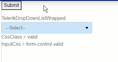
1. Submit the empty form to trigger validation. A validation message is displayed and the field shows a red border as expected.
2. Select a valid value. The validation message goes away as expected, but the red border remains.
3. Select an invalid value. The validation message appears, but now the red border disappears.
4. Select a valid value. The validation message goes away, but the red border remains.
Interestingly, this only happens when using the keyboard. Using the mouse, the border is displayed/hidden at the same time the validation message is displayed/hidden, as would normally be expected.
So to cause this: tab into the field, press one key (e.g., a letter or the down arrow) to select a value, then tab out of the field. If you change the value more than once, the red border will disappear the second time if it is also a valid value.
Animated demo:
I've encountered almost the exact same scenario with other fields when using async validation rules (which Blazor currently does not support), leading me to believe the DropDownList control may be using async somewhere that's resulting in this problem.
Additionally, I'm only experiencing this when I'm wrapping the DropDownList control in my own custom component. I'm not sure why this is.
---
I've included a page and components that demonstrate this problem. It's a little messy but hopefully sheds some light on when it does and doesn't occur. It shows:
1. The issue happens to the TelerikDropDownList when wrapped in a custom component but not otherwise.
2. The issue does not happen to Microsoft's built-in InputSelect even if wrapped in a custom component.
3. The issue does not happen to TelerikTextBox even if wrapped in a custom component.
4. The values of CssClass and InputClass differ, indicating that validation only completes after the value has been changed and OnParametersSet() has been called. (async issue?)
In the attached demo page, the issue only occurs in the last field ("TelerikDropDownListWrapped").
---
Seems like this is a bug with TelerikDropDownList. If not a bug, how can I avoid this issue and why does it not occur with other controls?
---
ADMIN EDIT
This behavior is observed in the DropDownList when filtering is enabled and in the ComboBox regardless of whether filtering is enabled or not.
The (filter) input gets focus, which shows the soft keyboard, which changes the viewport size, which causes the dropdown to hide. Unfortunately, there is no workaround at the moment (except perhaps disabling filtering for small viewports).
---