When I have a DatePicker and it's DateOnly value is default, the control displays 1/1/2001 instead of either nothing, a placeholder, or the correct value.

The image above shows the DatePicker value and the current value in the model underneath.
Please advise.
For some reason I'm unable to select the date 01/03/2000 when using the date picker to select the date. Only thing special about this date is its exactly 24 years ago today.
I was able to reproduce in repl. https://blazorrepl.telerik.com/QyYFkdbU34QbG0Te32
I also attached a video so you can review the steps followed and result.
Description
The DatePicker and the rest of the picker that have the ShowClearButton parameter (e.g., TimePicker, DateTimePicker) do not hide the clear button, when the initial value is null or after the user clears the existing value. This is inconsistent with the TextBox behavior, or with the behavior of the pickers in other suites.
Workaround
https://blazorrepl.telerik.com/wpaiFzFc26Zot90s18
Steps To Reproduce
Run the following REPL example: https://blazorrepl.telerik.com/QfEWvzvc35O5poYW04
Actual Behavior
The clear button is visible.
If you select a date and clear it, the clear button remains visible.
Expected Behavior
The clear button is hidden.
Browser
All
Last working version of Telerik UI for Blazor (if regression)
No response
- See the DatePicker Validation Demo
- Highlight the year
- Start typing 2029
- See that even on the first input stroke the validation is triggered.
<Admin>
As a workaround, you can add the DebounceDelay parameter with a high number as in this REPL link.
</Admin>
TELERIK EDIT: This appears to be fixed in version 6.0.0
====
Hi
I have created a REPL here: https://blazorrepl.telerik.com/QHYGbTPk59IqOcEU51
to reproduce the issue I am talking about:
- click on the cell
- Press the 'Delete' Key
- Press the 'Enter' Key
you will notice that the value displayed below the table is what was previously in the cell
I would have expected the value to be null which can be achieved via
- click on the cell
- Press the 'Delete' Key
- Click outside the cell
Delete the input, choose a date from the dropdown. The issue is that the first picker remains invalid, while it is valid, a keyboard interaction with the input is required to clear the invalid state.
Reproducible:
@using System.ComponentModel.DataAnnotations;

    <EditForm Model="ModelData">
        <DataAnnotationsValidator />
        <ValidationSummary />
        <br /><br />
        <span>Not nullable</span> @ModelData.Date<br />
        <Telerik.Blazor.Components.TelerikDatePicker @bind-Value="ModelData.Date" Min="DateTime.MinValue" Max="DateTime.MaxValue"></Telerik.Blazor.Components.TelerikDatePicker><br /><br />
        <span>Nullable</span> @ModelData.Date2<br />
        <Telerik.Blazor.Components.TelerikDatePicker @bind-Value="ModelData.Date2" Min="DateTime.MinValue" Max="DateTime.MaxValue"></Telerik.Blazor.Components.TelerikDatePicker><br /><br />
    </EditForm>

@code  {

    public MyModel ModelData { get; set; }

    protected override void OnInitialized()
    {
        ModelData = new MyModel();
    }

    public class MyModel
    {
        public string Name { get; set; }

        [Required(ErrorMessage = "Non nullable required")]
        public DateTime Date { get; set; } = DateTime.Today;

        [Required(ErrorMessage = "Nullable required")]
        public DateTime? Date2 { get; set; } = DateTime.Today;
    }
}
Steps to reproduce
- Add a DatePicker
- Bind it to nullable DateTime object
- Use the dd.MMM.yyyy format
- Select any date and when the popup is closed press any numeric key on the keyboard.
Currently, if the ReadOnly parameter value is set to 'true,' the user can modify the value of the DateInput by using the arrow keys.
Reproduction: https://blazorrepl.telerik.com/mxaiabvd178zy7p948
Hello,
I have an issue with TelerikDatePicker globalization. It works fine at all, but "Today" has the same translation.
I've used code like this:
CultureInfo.DefaultThreadCurrentCulture = new CultureInfo(MyStringLanguage);And it still works only for "days" and "months". Could you please tell about current situation about localization and globalization or maybe to suggest some different solution.
Thanks for your help.
Hi
When you focus on the DatePicker input element the cursor is at the end of the input instead of the start.
Here is an example
https://blazorrepl.telerik.com/ccOtaTOZ59tdXv1J10
Any help would be appreciated
Regards
Stewart
The problematic setup:
<TelerikDatePicker Min="@Min"
                   Max="@Max"
                   @bind-Value="@selectedDate">
</TelerikDatePicker>


@code  {
    public DateTime Max = new DateTime(2021, 3, 29);
    public DateTime Min = new DateTime(2021, 3, 1);
    private DateTime? selectedDate;
}
I want to apply some custom CSS to hide the disabled dates. However, it appears that k-state-disabled class is not applied to all of them.
For example, if I set the Max parameter to October 15th 2021, the remaining dates of October have the k-state-disabled but the ones in November only have k-other-month class.
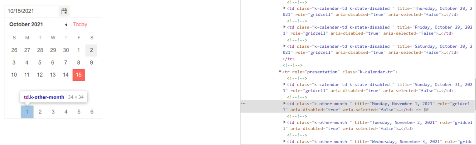
The same behavior occurs when I set the Min parameter - the dates from the previous month do not have k-state-disabled class.
===========
ADMIN EDIT
===========
Note: This bug also affects Calendar, DateRangePicker and DateTimePicker components.
As a workaround for the time being you might try another approach - all the disabled cells have aria-disabled = "true" attribute which you can use as a CSS selector to target the disabled cells:
<style>
    [aria-disabled="true"] {
        visibility: hidden;
    }
</style>

<TelerikDatePicker @bind-Value="datePickerValue" Max="@MaxValue"></TelerikDatePicker>

@code  {
    DateTime datePickerValue { get; set; } = new DateTime(2021, 10, 1);
    DateTime MaxValue { get; set; } = DateTime.Now;
}
When using a DateTime? for input and a specific format, for example yyyy-MM-dd. If you just want to change the month part and type 03 the focus shifts to the start of the input and the month part gets replaced by MM. Also applies to DateInput.
Reproduce:
https://blazorrepl.telerik.com/QGYFEfPU52ceM2wL03
Select the month part and type 03 for example. If using a non nullable DateTime, this does not happen.
This was marked as a duplicate for this issue: https://feedback.telerik.com/blazor/1468716-datepicker-loses-focus-when-the-input-date-starts-with-0
That issue is now "completed" but the issue I'm describing is not fixed.
The normal InputDate in blazor has an @ondblclick event. The intellisense for TelerikDatePicker indicates that this should be available but gives the error "...does not have a property matching the name 'ondblclick'."