---
ADMIN EDIT
Screen recording attached below, code to reproduce it too.
---
Is it possible to change plot area background color on charts so that every second line is a different color.
I have attached a image with the background color look.
---
ADMIN EDIT
The current request targets the ability to color the whole plot area in alternating way. If you need to only color a certain range of the plot area, you may take a look at the Plot bands feature request.
While the most common use case is to alter the background color based on the major plot area units, we'd like to gather your feedback on how you'd expect the feature to behave - allow color altering on major units, minor units or custom steps.
---
jQuery.Deferred exception: Cannot read property 'bbox' of undefined TypeError: Cannot read property 'bbox' of undefined.
Like in Kendo (here and here) so I can change the cursor for the chart to a pointer when the user hovers the series - I want that to indicate they can click on it (through the SeriesClick event).
---
ADMIN EDIT
workaround that you can consider which uses CSS to traverse the chart rendering:
<style>
    /* this will work in the chart below with its settings, axes, title and so on */
    .k-chart g[clip-path] g g g path {
        cursor: pointer;
    }

    /* a very generic selector that will capture just about everything in the plot area of the chart */
    /* Try this if you cannot make a more specific selector like the one above by inspecting the rendered content */
    /*.k-chart path {
        cursor: pointer;
    }*/
</style>

<TelerikChart>
    <ChartSeriesItems>
        <ChartSeries Type="ChartSeriesType.Column" Name="Product 1" Data="@series1Data">
        </ChartSeries>
        <ChartSeries Type="ChartSeriesType.Column" Name="Product 2" Data="@series2Data">
        </ChartSeries>
    </ChartSeriesItems>

    <ChartCategoryAxes>
        <ChartCategoryAxis Categories="@xAxisItems">
        </ChartCategoryAxis>
    </ChartCategoryAxes>

    <ChartTitle Text="Quarterly revenue per product"></ChartTitle>

    <ChartLegend Position="ChartLegendPosition.Right">
    </ChartLegend>
</TelerikChart>

@code {
    public List<object> series1Data = new List<object>() { 10, 2, 5, 6 };
    public List<object> series2Data = new List<object>() { 5, 8, 2, 7 };
    public string[] xAxisItems = new string[] { "Q1", "Q2", "Q3", "Q4" };
}
---
I would like to be able to control the rendering of the Lines on the X and Y axis for the Chart. For example, I would like to be able to hide them, change their color, etc. Currently, such an option is available for the stock chart with the following nested tags: StockChartCategoryAxisLine and StockChartValueAxisLine.
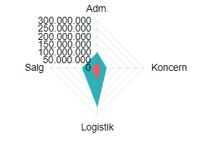
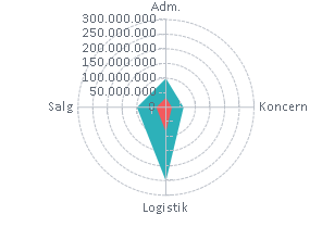
When I place a Chart in a small container, for example, a div, the labels are cut off and thus unreadable.
===
ADMIN EDIT
===
A possible workaround for the time being is changing the position of the labels so they are not cut off. For example: https://blazorrepl.telerik.com/mHkNkCEC16hMJnTg26.