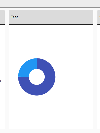
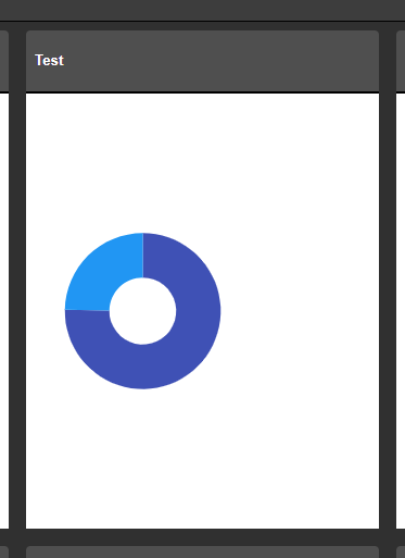
Our Site supports multiple themes that we have built using the SASS Theme Builder. For all Telerik Components we have used so far the theme changes on them as expected when using the example found here (Change Theme at Runtime). The problem seems to be the chart component will not adhere to the newly applied theme after its initial load. Seems like this is because it is shown as an SVG with hardcoded attributes on the element. Is there a workaround for this (other than reloading the components entirely)?
Before & After Theme Change:
Enhance the Chart date axis label format, so that it's culture-aware in globalization scenarios, and there is no need to set ChartCategoryAxisLabels Format explicitly.
In the meantime, here are a few workarounds for the case when the ChartCategoryAxis BaseUnit is Days and the Chart shows MM/dd labels even to non-US users.
- The easier option is to use a standard format string:
<ChartCategoryAxis BaseUnit="ChartCategoryAxisBaseUnit.Days"
                    Type="ChartCategoryAxisType.Date">
    <ChartCategoryAxisLabels Format="d" />
</ChartCategoryAxis>
- The above contains the year, so another option is MonthDayPattern:
<ChartCategoryAxis BaseUnit="ChartCategoryAxisBaseUnit.Days"
                    Type="ChartCategoryAxisType.Date">
    <ChartCategoryAxisLabels Format="@( CultureInfo.CurrentUICulture.DateTimeFormat.MonthDayPattern )" />
</ChartCategoryAxis>
- To display a shorter numeric month, use the MonthDayPattern to detect the day-month order and then set a custom format string.
Razor
<ChartCategoryAxis BaseUnit="ChartCategoryAxisBaseUnit.Days"
                    Type="ChartCategoryAxisType.Date">
    <ChartCategoryAxisLabels Format="@( GetShortDayMonthPattern() )" />
</ChartCategoryAxis>
C#
    private string GetShortDayMonthPattern()
    {
        var mdp = CultureInfo.CurrentUICulture.DateTimeFormat.MonthDayPattern;
        var separator = CultureInfo.CurrentUICulture.DateTimeFormat.DateSeparator;
        string pattern = mdp.IndexOf("M") < mdp.IndexOf("d") ? $"MM{separator}dd" : $"dd{separator}MM";

        return pattern;
    }
Regards, Author nickname Progress Telerik
Hi
We would like to be able to draw a label for a group of series in the chart axis while also labelling the series individually. See the following example:
In Kendo UI you can achieve this: https://dojo.telerik.com/ulIJihIF. In Blazor, we can force the text into the chart axis categories, but we cannot seem to position them accurately, REPL.
Thank you
I would like to visually distinguish a certain element in a series from the others if its value matches a given criteria (for example, value exceeds a threshold). Ideally, I'd want to add a hash to my bars, because I want to keep all items with the same color (I don't want to use the ColorField).
Something similar is available in Kendo: https://demos.telerik.com/kendo-ui/bar-charts/visuals.
In Kendo-React chart i can set the property "maxDivision" like this:
<ChartCategoryAxis>
<ChartCategoryAxisItem
maxDivisions={30}
name="categoryAxisName"
categories={categories}
...
and the chart will show only 30 dates in the displayed range, even if zoom in.
Is there a way for doing the same thing in Blazor Chart?
I tryed Type"fit" and MaxDateGroup but i need to show always all the points and this isnot a good solution.
I tryed ChartCategoryAxisLabels Step="number_of_labels_to_render" but when i zoom in the chart
will not show other dates.
Regards,
Davide
To reproduce the problem, hover over the last value of the series. While the Tooltip enters, it causes horizontal and vertical scroll and flickers. Then, it is positioned correctly.
The issue is better observed if you increase the transition speed of the Tooltip wrapper.
Reproduction: https://blazorrepl.telerik.com/cREDloaV42j7Z19G13.
===
ADMIN EDIT
===
A possible workaround for the time being is to alter or stop the Tooltip animation with CSS. Here is a runnable sample demonstrating the approach: https://blazorrepl.telerik.com/QnEjvIOC04hXA6W709
It would be nice to make the label container less than the width of the element so that it stands out more.
I know that it can be set to different colors and transparent but adjusting the width would be a nice addition as well.
Hello,
Please allow us to distinguish which mouse button triggered the SeriesClick event.
The Scatterline Chart is flipped upside down if the Height is under 100px.
Reproduction1. Run this REPL
2. Set the height of the Chart to 90px
3. The chart is rendered upside down
Hi,
We are implementing chart control in our application and we noticed spikes in the chart when we are using time series that contains UTC timestamps with milliseconds that are divisible by 100. The issue is reproduceable on Telerik REPL as well and I am attaching the REPL link as well
I was wondering if you guys can provide some insight from your end as to whether that is indeed a bug and some work arounds and timeline on when we can resolution from your end.
Cheers,
Danish Shahid
How do I stop a column chart generating over the hover-over effect?
The property exists in the Kendo Chart.
It would be helpful to me if this chart type was supported.
In need a chart that has a shaded area between a max and min set of curves, indicating the allowable area
Like this one: https://demos.telerik.com/kendo-ui/range-area-charts/index
I want to be able to set different colors for the separate series items.
===
ADMIN EDIT
===
A possible option for the time being is to add each item in a dedicated series where you can specify its color.Currently, the Chart does not plot anything when zero values are included in the dataset on a logarithmic axis.
Reproduction: https://blazorrepl.telerik.com/cdYgkWFH23W9PVon54
At least the "Success" data should be plotted.