Please see the links below to see examples of the scale break feature I'm looking for: Scale Breaks - ChartView - Telerik UI for WinForms.
https://docs.telerik.com/devtools/aspnet-ajax/controls/chart/features/scale-breaks
I know about Logarithmic Axis as well, but it's not exactly what I'm looking for.
Hi,
Just a bug I have found. I have found something similar before with the DateTime format of a category axis.
Please note the single lowercase 't' in the below appears to be being interpreted by the compiler as 'time' identifier (AM or PM). In this case, it is printing on the chart label as 'a'.
<ChartValueAxes>
     <ChartValueAxis AxisCrossingValue="@AxisCrossingValue">
          <ChartValueAxisLabels Format="@("{0}" + " a b c d e f g h i j k l m n o p q r s t u v w x y z")"></ChartValueAxisLabels>
    </ChartValueAxis>
</ChartValueAxes>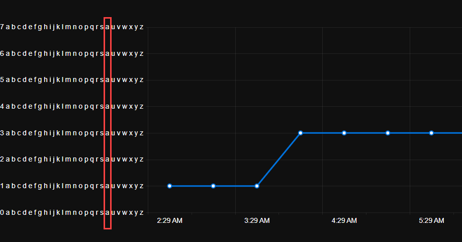
I discovered this as my original unit was 'Count' which was being displayed at runtime on the chart as 'Couna'.
Currently the bubble sizes in the Chart are determined automatically, according to an internal algorithm.
Please add parameters for setting specific min and max bubble sizes by the application.
If a Chart is recreated at runtime and the mouse cursor is over the component, a JavaScript error may occur:
Error: Microsoft.JSInterop.JSException: null is not an object (evaluating 'e.top')
A possible workaround is to delay the Chart tooltip initialization a little:
<TelerikDrawer Data="@NavigablePages" Expanded="true" MiniMode="true" Mode="@DrawerMode.Push">
    <DrawerContent>
        <TelerikGridLayout>
            <GridLayoutItems>
                <GridLayoutItem Column="1">
                    <TelerikCard Width="300px" Height="400px">
                        <CardHeader>
                            <CardTitle>CARD 1</CardTitle>
                        </CardHeader>
                        <CardBody>
                            @if (IsLoading)
                            {
                                <span style="height:100%">...loading...</span>
                            }
                            else
                            {
                                <TelerikChart Transitions=@false>
                                    <ChartSeriesItems>
                                        <ChartSeries Type="ChartSeriesType.Donut" Data="@donutData"
                                                        Field="@nameof(MyDonutChartModel.SegmentValue)" CategoryField="@nameof(MyDonutChartModel.SegmentName)">
                                            <ChartSeriesTooltip Visible="@IsChartTooltipVisible" Background="#222731" Color="#FFFFFF">
                                                <Template>
                                                    @((context.DataItem as MyDonutChartModel)?.Tooltip)
                                                </Template>
                                            </ChartSeriesTooltip>
                                        </ChartSeries>
                                    </ChartSeriesItems>
                                </TelerikChart>
                            }
                        </CardBody>
                    </TelerikCard>
                </GridLayoutItem>
                <GridLayoutItem Column="2">
                    <TelerikCard Width="300px" Height="400px">
                        <CardHeader>
                            <CardTitle>CARD 2</CardTitle>
                        </CardHeader>
                        <CardBody>
                            <TelerikButton OnClick="@OnClickHandler">REFRESH CHART</TelerikButton>
                        </CardBody>
                    </TelerikCard>
                </GridLayoutItem>
            </GridLayoutItems>
        </TelerikGridLayout>
    </DrawerContent>
</TelerikDrawer>


@code{

    public bool IsLoading { get; set; } = false;
    public bool IsChartTooltipVisible { get; set; } = true;

    private async Task OnClickHandler()
    {
        IsLoading = true;
        IsChartTooltipVisible = false;
        // Simulate API call
        await Task.Delay(2000);
        IsLoading = false;
        // Force the Chart to render
        StateHasChanged();
        // Delay the Chart Tooltip initialization
        await Task.Delay(100);
        IsChartTooltipVisible = true;
    }

    List<DrawerItem> NavigablePages { get; set; } = new List<DrawerItem>
{
        new DrawerItem { Text = "Home", Icon = SvgIcon.Home }
    };

    public class DrawerItem
    {
        public string Text { get; set; }
        public ISvgIcon Icon { get; set; }
    }

    public class MyDonutChartModel
    {
        public string SegmentName { get; set; }
        public double SegmentValue { get; set; }
        public string Tooltip { get; set; }
    }

    public List<MyDonutChartModel> donutData = new List<MyDonutChartModel>
    {
        new MyDonutChartModel
        {
            SegmentName = "Product 1",
            SegmentValue = 2,
            Tooltip = "Tooltip 1"
        },
        new MyDonutChartModel
        {
            SegmentName = "Product 2",
            SegmentValue = 3,
            Tooltip = "Tooltip 2"
        },
        new MyDonutChartModel
        {
            SegmentName = "Product 3",
            SegmentValue = 4,
            Tooltip = "Tooltip 3"
        }
    };
}
Hi, I can't figure how to use the Min/Max properties of the ChartCategoryAxis because if I set these properties, the chart disappears.
Please help me.
@page "/"

<TelerikChart>

    <ChartSeriesItems>
        <ChartSeries Type="ChartSeriesType.Line" Name="Test" Data="@mesures"
                     Field="@nameof(Mesure.Value)" CategoryField="@nameof(Mesure.Date)" Aggregate="ChartSeriesAggregate.Sum">
        </ChartSeries>
    </ChartSeriesItems>

    <ChartCategoryAxes>
        <!-- This is OK -->
        @*<ChartCategoryAxis BaseUnit="ChartCategoryAxisBaseUnit.Hours" Type="ChartCategoryAxisType.Date" BaseUnitStep="1"></ChartCategoryAxis>*@

        <!-- This isn't : nothing is displayed -->
        <ChartCategoryAxis Min="@MinDate" Max="@MaxDate" BaseUnit="ChartCategoryAxisBaseUnit.Hours" Type="ChartCategoryAxisType.Date" BaseUnitStep="1"></ChartCategoryAxis>
    </ChartCategoryAxes>

</TelerikChart>

@code {

    private DateTime MinDate { get; set; } = new DateTime(2019, 01, 01, 13, 0, 0);
    private DateTime MaxDate { get; set; }   = new DateTime(2019, 01, 01, 17, 0, 0);

    public class Mesure
    {
        public DateTime Date { get; set; }
        public int Value { get; set; }
    }

    public List<Mesure> mesures = new List<Mesure>()
    {
        new Mesure() { Date = new DateTime(2019, 01, 01, 13, 0, 0), Value = 1 },
        new Mesure() { Date = new DateTime(2019, 01, 01, 14, 0, 0), Value = 2 },
        new Mesure() { Date = new DateTime(2019, 01, 01, 14, 30, 0), Value = 3 },
        new Mesure() { Date = new DateTime(2019, 01, 01, 14, 35, 0), Value = 4 },
        new Mesure() { Date = new DateTime(2019, 01, 01, 15, 0, 0), Value = 5 },
        new Mesure() { Date = new DateTime(2019, 01, 01, 16, 0, 0), Value = 6 },
        new Mesure() { Date = new DateTime(2019, 01, 01, 17, 0, 0), Value = 7 },
    };
}The Chart Tooltip does not render correct values for the data points when the chart is bound to a model, has multiple series and Template is used. The DataItem does not seem to work as expected.
ADMIN EDIT:
If the Chart is bound with Independent Series Binding the FormattedValue will get the correct values.
If the Chart has no Template the correct values for the data points will be displayed
Expose colored ranges (Plot Bands) to allow highlighting certain areas in the chart plot area - similar to https://demos.telerik.com/kendo-ui/bar-charts/plotbands.
---
ADMIN EDIT
---
This feature will allow you to define certain color ranges in the plot area. If you are looking for ability to color the whole plot area in alternating way, you may check this feature request - Is it possible to change the plot area background color in an alternating way.
The Scatterline Chart is flipped upside down if the Height is under 100px.
Reproduction1. Run this REPL
2. Set the height of the Chart to 90px
3. The chart is rendered upside down
To reproduce the problem, hover over the last value of the series. While the Tooltip enters, it causes horizontal and vertical scroll and flickers. Then, it is positioned correctly.
The issue is better observed if you increase the transition speed of the Tooltip wrapper.
Reproduction: https://blazorrepl.telerik.com/cREDloaV42j7Z19G13.
===
ADMIN EDIT
===
A possible workaround for the time being is to alter or stop the Tooltip animation with CSS. Here is a runnable sample demonstrating the approach: https://blazorrepl.telerik.com/QnEjvIOC04hXA6W709
In Kendo-React chart i can set the property "maxDivision" like this:
<ChartCategoryAxis>
<ChartCategoryAxisItem
maxDivisions={30}
name="categoryAxisName"
categories={categories}
...
and the chart will show only 30 dates in the displayed range, even if zoom in.
Is there a way for doing the same thing in Blazor Chart?
I tryed Type"fit" and MaxDateGroup but i need to show always all the points and this isnot a good solution.
I tryed ChartCategoryAxisLabels Step="number_of_labels_to_render" but when i zoom in the chart
will not show other dates.
Regards,
Davide
Enhance the Chart date axis label format, so that it's culture-aware in globalization scenarios, and there is no need to set ChartCategoryAxisLabels Format explicitly.
In the meantime, here are a few workarounds for the case when the ChartCategoryAxis BaseUnit is Days and the Chart shows MM/dd labels even to non-US users.
- The easier option is to use a standard format string:
<ChartCategoryAxis BaseUnit="ChartCategoryAxisBaseUnit.Days"
                    Type="ChartCategoryAxisType.Date">
    <ChartCategoryAxisLabels Format="d" />
</ChartCategoryAxis>
- The above contains the year, so another option is MonthDayPattern:
<ChartCategoryAxis BaseUnit="ChartCategoryAxisBaseUnit.Days"
                    Type="ChartCategoryAxisType.Date">
    <ChartCategoryAxisLabels Format="@( CultureInfo.CurrentUICulture.DateTimeFormat.MonthDayPattern )" />
</ChartCategoryAxis>
- To display a shorter numeric month, use the MonthDayPattern to detect the day-month order and then set a custom format string.
Razor
<ChartCategoryAxis BaseUnit="ChartCategoryAxisBaseUnit.Days"
                    Type="ChartCategoryAxisType.Date">
    <ChartCategoryAxisLabels Format="@( GetShortDayMonthPattern() )" />
</ChartCategoryAxis>
C#
    private string GetShortDayMonthPattern()
    {
        var mdp = CultureInfo.CurrentUICulture.DateTimeFormat.MonthDayPattern;
        var separator = CultureInfo.CurrentUICulture.DateTimeFormat.DateSeparator;
        string pattern = mdp.IndexOf("M") < mdp.IndexOf("d") ? $"MM{separator}dd" : $"dd{separator}MM";

        return pattern;
    }
Regards, Author nickname Progress Telerik