The code below does not produce a chart series with a line that is 50 width? What am i missing?
@page "/chartdemo"
Line series
<TelerikChart>
<ChartSeriesItems>
<ChartSeries Type="ChartSeriesType.Line" Name="Product 1" Data="@series1Data">
<ChartSeriesMarkers Size="10"></ChartSeriesMarkers>
</ChartSeries>
<ChartSeries Type="ChartSeriesType.Line" Size="10" Name="Product 2" Data="@series2Data">
<ChartSeriesLine Width="50"></ChartSeriesLine>
</ChartSeries>
</ChartSeriesItems>
<ChartCategoryAxes>
<ChartCategoryAxis Categories="@xAxisItems"></ChartCategoryAxis>
</ChartCategoryAxes>
<ChartTitle Text="Quarterly revenue per product"></ChartTitle>
<ChartLegend Position="ChartLegendPosition.Right">
</ChartLegend>
</TelerikChart>
@code {
public List<object> series1Data = new List<object>() { 10, 2, 5, 6 };
public List<object> series2Data = new List<object>() { 5, 8, 2, 7 };
public string[] xAxisItems = new string[] { "Q1", "Q2", "Q3", "Q4" };
}
Is it possible to change plot area background color on charts so that every second line is a different color.
I have attached a image with the background color look.
---
ADMIN EDIT
The current request targets the ability to color the whole plot area in alternating way. If you need to only color a certain range of the plot area, you may take a look at the Plot bands feature request.
While the most common use case is to alter the background color based on the major plot area units, we'd like to gather your feedback on how you'd expect the feature to behave - allow color altering on major units, minor units or custom steps.
---
I would like to be able to stack series on a range chart. Currently the best hack recommended by Telerik is to show two charts on top of one another, with no interactivity or legends, https://blazorrepl.telerik.com/wHPclTFm28WuoSOp57.
Source: Is it possible to 'stack' series in a Range Column Chart? in UI for Blazor | Telerik Forums
Thank you
I would like to control the font of the Value axis labels in a similar fashion to the way I can control the labels of the category axis:
    <ChartCategoryAxes>
        <ChartCategoryAxis Categories="@xAxisItems">
            <ChartCategoryAxisLabels Font="bold 12px 'Helvetica'"></ChartCategoryAxisLabels>
        </ChartCategoryAxis>
    </ChartCategoryAxes>
*** Thread created by admin on customer behalf ***
I am trying to customize the format of the ChartCategoryAxisLabels to render the abbreviated name of the day of the week using the following format:
<ChartCategoryAxisLabels Format="ddd dd/MM HH:mm"/>While it is a valid format, it seems that it doesn't work for the category labels.
---
ADMIN EDIT
---
For the time being, you can use the following to render the abbreviated name of the day of the week in the ChartCategoryAxisLabels:
<ChartCategoryAxisLabels Format="{0:EEE dd/MM HH:mm}"/>It would be nice to be able to use Html markup in the ChartCategoryAxisLabel.
I can see in the documentation that it currently doesn't support this. I am curious if it is possible. Thank you.
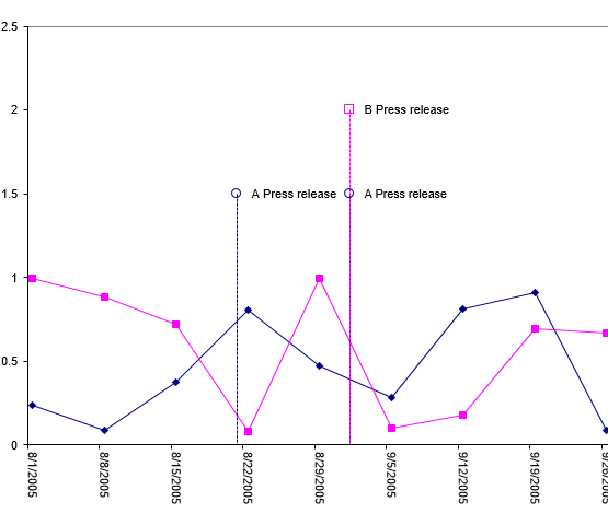
I would love to see the ability to put "pins" or "markers" for events on a time based chart. A lot of the work I'm doing with charts revolves around IoT, so we see a lot of value based data that needs to be contextualized with events.
Example:
Hi
We would like to be able to draw a label for a group of series in the chart axis while also labelling the series individually. See the following example:
In Kendo UI you can achieve this: https://dojo.telerik.com/ulIJihIF. In Blazor, we can force the text into the chart axis categories, but we cannot seem to position them accurately, REPL.
Thank you
Hi!
I'm more than a little impressed with your Blazor efforts to-date, but there's one component lacking: a CandleStick chart.
I would like to be able to control the rendering of the Lines on the X and Y axis for the Chart. For example, I would like to be able to hide them, change their color, etc. Currently, such an option is available for the stock chart with the following nested tags: StockChartCategoryAxisLine and StockChartValueAxisLine.
It would be fantastic to be able to visualize boolean data on a time based chart. We have a lot of time series data, and a good bit of it is boolean. It would be very beneficial to be able to plot that data along side our numeric data to provide context to both.
Example (blue/green bar at bottom of chart):
The additional functionality of the stock chart (crosshairs, navigator) fits our needs very well, but our data is not currency formatted. As far as we have found, we have not seen a way to remove currency as a default format. I'm not sure if this is a bug, or intended functionality; but it's preventing us from rolling charts with that extended functionality.
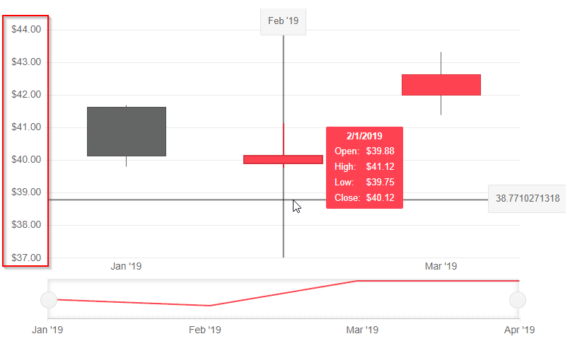
See attached image. I want an option to change position on ticks, like in Kendo (see here).
I can't find an option in docs to move the axis position.
Currently, I get the desired result using SyncFusion Chart Component, attribute LabelPlacement allow selection between OnTicks and BetweenTicks option.
Hello,
Please consider a built-in way to add spacing (gaps, margins, etc.) between the segments of a Donut and Pie charts. The <ChartSeries> tag has such parameters, but they are used for other settings or other series types.
Currently, it is possible to achieve the desired appearance with custom CSS, but that requires knowledge about the Chart rendering.