

Bug report
Reproduction of the problem
(bug report only)
Steps to reproduce:
- Place a TelerikChart with OnSeriesClick inside a TileLayoutItem
<h4>TileLayout:</h4>

<TelerikTileLayout Columns="1" RowHeight="340px">
    <TileLayoutItems>

        <TileLayoutItem ColSpan="1" RowSpan="1">
            <HeaderTemplate>
                <span>With fix (.k-tilelayout-item.k-card) - header stays stable on click</span>
            </HeaderTemplate>
            <Content>
                <p>Last clicked: <strong>@_lastClicked</strong></p>
                <TelerikChart Width="100%" OnSeriesClick="@OnSeriesClick">
                    <ChartSeriesItems>
                        <ChartSeries Type="ChartSeriesType.Donut"
                                     Data="@_chartData"
                                     Field="@nameof(SliceData.Value)"
                                     CategoryField="@nameof(SliceData.Label)"
                                     ColorField="@nameof(SliceData.Color)">
                        </ChartSeries>
                    </ChartSeriesItems>
                    <ChartLegend Position="ChartLegendPosition.Bottom"></ChartLegend>
                </TelerikChart>
            </Content>
        </TileLayoutItem>

    </TileLayoutItems>
</TelerikTileLayout>

@code {
    private string _lastClicked = "none";

    private List<SliceData> _chartData = new()
    {
        new SliceData { Label = "Confirmed", Value = 42, Color = "#4CAF50" },
        new SliceData { Label = "Pending",   Value = 28, Color = "#FF9800" },
        new SliceData { Label = "Inactive",  Value = 30, Color = "#F44336" }
    };

    private void OnSeriesClick(ChartSeriesClickEventArgs args)
    {
        _lastClicked = args.Category?.ToString() ?? "unknown";
    }

    private class SliceData
    {
        public string Label { get; set; } = "";
        public double Value { get; set; }
        public string Color { get; set; } = "";
    }
}
- Click any chart series
Current behavior
(optional)
Tile header collapses and disappears.
Root cause: The theme applies overflow: hidden to .k-card, which is the tile's root flex container. When a Chart series is clicked, the Chart briefly inflates the body height, causing the flex layout to squeeze the header to height 0. The overflow: hidden on the root then clips the zero-height header out of view entirely.
Expected/desired behavior
Tile header remains visible
Workaround:
<style>
    .k-tilelayout-item.k-card {
        overflow: scroll;
    }
</style>
Environment
- Kendo/Telerik version:
- Browser: [all ]
Due to the lack of an option to specify position, the tooltips cover part of the line markers, e.g., in a horizontal line Chart scenario.
The Chart tooltip template receives incorrect context for another data item when there is a missing data item for the current category and the series has MissingValues="@ChartSeriesMissingValues.Zero".
Test page: https://blazorrepl.telerik.com/QzOtFwln362xLl7q57
Compare with the Kendo UI jQuery Chart: https://dojo.telerik.com/qZCFVOPQ
Possible workarounds include:
- Check the FormattedValue property of the tooltip context. If it's "0", while the value in the DataItem is not zero, then there is a missing data item.
<TelerikChart Height="200px"> <ChartSeriesItems> <ChartSeries Type="ChartSeriesType.Line" Data="@Series1Data" Field="@nameof(SalesData.Revenue)" CategoryField="@nameof(SalesData.TimePeriod)" MissingValues="@ChartSeriesMissingValues.Zero"> <ChartSeriesLabels Visible="true"></ChartSeriesLabels> <ChartSeriesTooltip Visible="true"> <Template> @{ var point = context.DataItem as SalesData; } @if (point is not null && context.FormattedValue != "0") { <span>@point.Revenue</span> } else { <span>0 (no data item)</span> } </Template> </ChartSeriesTooltip> </ChartSeries> </ChartSeriesItems> <ChartCategoryAxes> <ChartCategoryAxis Min="@ChartCategoryAxisMin" Type="@ChartCategoryAxisType.Date"></ChartCategoryAxis> </ChartCategoryAxes> </TelerikChart> - Set MissingValues to Gap or Interpolate.
- Provide dummy data items with a zero or null value. These dummy items depend on the Min and Max axis values and can be appended after the Chart data is retrieved from the data source, so that they are not hard-coded there.
- Do not use a Chart tooltip template.
In the docs https://www.telerik.com/blazor-ui/documentation/components/chart/overview#styling-with-css-variables there is an example on using CSS variables to set colours of the Chart component. And yes, if I set the --kendo-chart-bg CSS variable to some colour, the chart background is coloured with it. But, I can't change the colour at runtime, for example for switching between light and dark themes at user request.
But, shouldn't this be possible as the SVG is rendered inline? I see the chart being rendered as elements like below where the fill propertys value comes from the --kendo-chart-bg variable. But if the fill was instead set to "var(--kendo-chart-bg)" I would be able to change --kendo-chart-bg at runtime and the chart would reflect the change without needing to be refreshed separately? Same should go for all the text and series' colours.
<svg>
<g>
<path d="M0 0 L 400 0 400 240 0 240Z" stroke="none" fill="#0f0"></path>
</g>
</svg>
I also saw this, but I think this is before you added the CSS colouring? https://feedback.telerik.com/blazor/1496389-using-custom-themes-changing-at-runtime-does-not-change-the-chart-component-style
Currently, the TelerikChartBreadcrumb does not allow specifying how the Breadcrumb items are visualized when their total width exceeds the width of the component.
A possible alternative to achieve the same result is to override the default theme styles with the following CSS rule:
.k-breadcrumb-container {
    flex-flow: row wrap;
}
Here is a REPL example to see the result of the above CSS approach - https://blazorrepl.telerik.com/GTOyPYbG23PugZBQ36
When OnAxisLabelClick is set, the ChartCategoryAxisLabels do not get 'cursor: pointer' which is confusing for users because it makes it appear as if the axis labels are not clickable when they actually are.
===ADMIN EDIT===
In the meantime add the cursor: pointer CSS style to the labels. Here is a REPL example:
https://blazorrepl.telerik.com/cyvEYNbP27vsCSLG28
For real-time data purposes, I need to update the data and add new items. If I drill down and then add a new item, the Chart refreshes and goes to the top page (resets the drill down level to 0).
Reproduction: https://blazorrepl.telerik.com/QeOtQaOD46j4I3Ih46.

I want to be able to dynamically enable/disable the Pan and Zoom functionalities at runtime. Currently, the Chart does not react to such changes.
===
ADMIN EDIT
===
A possible option for the time being is to dispose the component and re-initialize it after changing the Pan/Zoom properties: https://blazorrepl.telerik.com/mSuNQkEj10nSug2k22.
I would like to synchronize several Charts, so when I move the mouse through one of them, the other two Charts show crosshairs at the same position as the first hovered Chart.
===
ADMIN EDIT
===
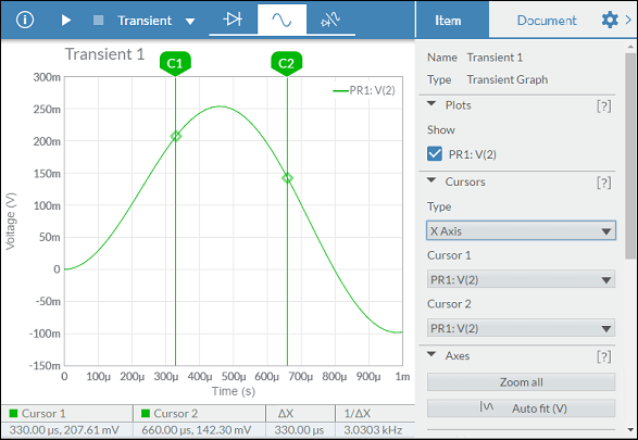
Prerequisite: Chart Crosshair
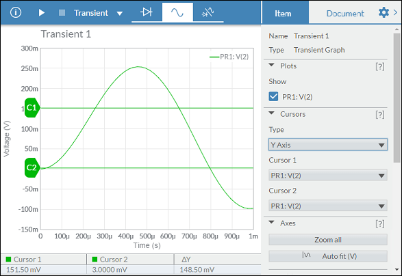
This functionality would be very useful for data analysis.
Moving the cursors within the chart itself, allows to define a range within the series, being able to offer useful data.
Examples:
Hello,
I want to connector to be directly connected with the chart.
See https://dojo.telerik.com/AkEHuSiq/3 for reference.
Thank you.
Enhance the Chart date axis label format, so that it's culture-aware in globalization scenarios, and there is no need to set ChartCategoryAxisLabels Format explicitly.
In the meantime, here are a few workarounds for the case when the ChartCategoryAxis BaseUnit is Days and the Chart shows MM/dd labels even to non-US users.
- The easier option is to use a standard format string:
<ChartCategoryAxis BaseUnit="ChartCategoryAxisBaseUnit.Days"
                    Type="ChartCategoryAxisType.Date">
    <ChartCategoryAxisLabels Format="d" />
</ChartCategoryAxis>
- The above contains the year, so another option is MonthDayPattern:
<ChartCategoryAxis BaseUnit="ChartCategoryAxisBaseUnit.Days"
                    Type="ChartCategoryAxisType.Date">
    <ChartCategoryAxisLabels Format="@( CultureInfo.CurrentUICulture.DateTimeFormat.MonthDayPattern )" />
</ChartCategoryAxis>
- To display a shorter numeric month, use the MonthDayPattern to detect the day-month order and then set a custom format string.
Razor
<ChartCategoryAxis BaseUnit="ChartCategoryAxisBaseUnit.Days"
                    Type="ChartCategoryAxisType.Date">
    <ChartCategoryAxisLabels Format="@( GetShortDayMonthPattern() )" />
</ChartCategoryAxis>
C#
    private string GetShortDayMonthPattern()
    {
        var mdp = CultureInfo.CurrentUICulture.DateTimeFormat.MonthDayPattern;
        var separator = CultureInfo.CurrentUICulture.DateTimeFormat.DateSeparator;
        string pattern = mdp.IndexOf("M") < mdp.IndexOf("d") ? $"MM{separator}dd" : $"dd{separator}MM";

        return pattern;
    }
Regards, Author nickname Progress Telerik
In Kendo-React chart i can set the property "maxDivision" like this:
<ChartCategoryAxis>
<ChartCategoryAxisItem
maxDivisions={30}
name="categoryAxisName"
categories={categories}
...
and the chart will show only 30 dates in the displayed range, even if zoom in.
Is there a way for doing the same thing in Blazor Chart?
I tryed Type"fit" and MaxDateGroup but i need to show always all the points and this isnot a good solution.
I tryed ChartCategoryAxisLabels Step="number_of_labels_to_render" but when i zoom in the chart
will not show other dates.
Regards,
Davide