.png)
Hello
The column group headers functionality is great, however it messes with the export to excel/csv, as the headers no longer align on the 1 row.
Just seeing if there was a way to export to csv/excel but ignore the column group headers? Maybe a feature on the <GridCsvExport ExportGroupHeaders=false /> option?
Or is there a way to turn off column group headers programmatically? Then this could be removed then readded on the events; OnBeforeExport, OnAfterExport
Cheers
Phil
Hi,
I have found some evidence of a bug which I believe add to the portrait of this issue which has already been reported but declined. Could you please have a look at my recent comments and report it to follow on it (so it remains active)?
https://feedback.telerik.com/blazor/1532895-initcheckbox-was-undefined
Regards.
Maurice.
in blazor ui version 2.24.1 I use this code in program.cs for globalization:
public static async Task Main(string[] args)
{
var builder = WebAssemblyHostBuilder.CreateDefault(args);
builder.RootComponents.Add<App>("#app");
builder.Services.AddTransient(sp => new HttpClient { BaseAddress = new Uri(builder.HostEnvironment.BaseAddress) });
builder.Services.AddTelerikBlazor();
// register a custom localizer for the Telerik components, after registering the Telerik services
builder.Services.AddSingleton(typeof(ITelerikStringLocalizer), typeof(SampleResxLocalizer));
var host = builder.Build();
await SetCultureAsync(host);
await host.RunAsync();
}
private static async Task SetCultureAsync(WebAssemblyHost host)
{
var jsRuntime = host.Services.GetRequiredService<IJSRuntime>();
var cultureName =await jsRuntime.InvokeAsync<string>("blazorCulture.get");
if (cultureName != null)
{
var culture = new CultureInfo("fa-IR");
DateTimeFormatInfo info = culture.DateTimeFormat;
info.AbbreviatedDayNames = new string[] { "ی", "د", "س", "چ", "پ", "ج", "ش" };
info.DayNames = new string[] { "یکشنبه", "دوشنبه", "ﺳﻪشنبه", "چهارشنبه", "پنجشنبه", "جمعه", "شنبه" };
info.AbbreviatedMonthNames = new string[] { "فروردین", "ارديبهشت", "خرداد", "تير", "مرداد", "شهریور", "مهر", "آبان", "آذر", "دی", "بهمن", "اسفند", "" };
info.MonthNames = new string[] { "فروردین", "ارديبهشت", "خرداد", "تير", "مرداد", "شهریور", "مهر", "آبان", "آذر", "دی", "بهمن", "اسفند", "" };
info.AMDesignator = "ق.ظ";
info.PMDesignator = "ب.ظ";
info.ShortDatePattern = "yyyy/MM/dd";
info.FirstDayOfWeek = DayOfWeek.Saturday;
CultureInfo.DefaultThreadCurrentCulture = culture;
CultureInfo.DefaultThreadCurrentUICulture = culture;
}
}
when use TelerikDatePicker , id dosenot work properly. the code of my component in here:
<div class="demo-section k-form k-form-vertical">
<div class="k-form-field">
<label for="travel-date" class="k-label k-form-label">Travel Date</label>
<div class="k-form-field-wrap">
<TelerikDatePicker Min="@Min" Max="@Max" @bind-Value="@selectedDate" Id="travel-date"></TelerikDatePicker>
</div>
</div>
<div class="k-form-field">
<p>The selected travel date is: <strong>@selectedDate?.ToShortDateString()</strong></p>
<p>The selected travel date is: <strong>@selectedDate?.ToString()</strong></p>
<p>The selected travel date is: <strong>@selectedDate?.ToUniversalTime()</strong></p>
<p>The selected travel date is: <strong>@selectedDate?.ToLongDateString()</strong></p>
</div>
</div>
@code {
public DateTime Max = new DateTime(2050, 12, 31);
public DateTime Min = new DateTime(1950, 1, 1);
private DateTime? selectedDate=DateTime.Now;
}

when click the datepicker the date is not correct :

Reloading the page described down below cause memory leak. Commenting lines with telerik button prevents the problem.
@page "/"

<h3 style="position:absolute; top: 0; z-index: 1000; margin-top: 10px">Home</h3>

↓ commenting these lines prevents the memory leak
<div>
    <TelerikButton OnClick="@SayHelloHandler" Primary="true">Say Hello</TelerikButton>
    <div>@helloString</div>
</div>
↑ commenting these lines prevents the memory leak

@code {
    List<string> strings = new List<string>();

    MarkupString helloString;

    protected override void OnInitialized()
    {
        // Attempt to clear memory with Garbage Collector
        GC.Collect();
        GC.WaitForPendingFinalizers();
        for (int i = 0; i < 1000000; i++)
        {
            string a = "asdasdasdasdddddddddasasdasdasdasdddddddddasasdasdasdasdddddddddasasdasdasdasdddddddddasasda";
            strings.Add(a + "b");
        }


        base.OnInitialized();
    }

    void SayHelloHandler()
    {
        string msg = string.Format("Hello from <strong>Telerik Blazor</strong> at {0}.<br /> Now you can use <b><u><i>C#</i></u></b> to write front-end!", DateTime.Now);
        helloString = new MarkupString(msg);
    }
}
MainLayout.razor:
@layout TelerikLayout
@inherits LayoutComponentBase


<style>
    .navmenu .k-drawer-items {
        margin-top: 3.5rem;
    }

    .navmenu .k-widget.k-drawer {
        background-image: linear-gradient(180deg, rgb(5, 39, 103) 0%, #3a0647 100%);
    }

    .k-drawer-container {
        height: 100vh;
    }

    .btn-margin, .btn-margin:hover {
        width: 48px;
        height: 56px;
        color: #FFF;
    }

    .navmenu .k-drawer {
        color: #ffffffd6;
    }

    .navmenu .k-drawer-item:hover, .navmenu .k-drawer-item.k-state-hover {
        color: #ffffffd6;
        background-color: #f0f0f012;
    }

        .navmenu .k-drawer-item:hover.k-state-selected {
            color: #ffffff;
            background-color: #7bafff94;
        }

    .navmenu .k-drawer-item:not(:hover).k-state-selected {
        color: #ffffff;
        background-color: #7bafffbd;
    }

    .navmenu .k-drawer:hover .k-drawer-wrapper {
        width: 240px;
    }

    .navmenu .k-drawer .k-drawer-wrapper {
        transition-duration: 300ms !important;
    }
</style>


<TelerikDrawer Data="@NavigablePages" MiniMode="true" Mode="@DrawerMode.Push" SelectedItem="SelectedItem" Class="navmenu sidebar"
                SelectedItemChanged="ChangeSelectedItem" TItem="DrawerItem">
    <Content>
        <div class="page">

            <div class="main">
                <div class="top-row px-4 auth">
                </div>


                <div class="content px-4">
                    @Body
                </div>
            </div>
        </div>
    </Content>
</TelerikDrawer>


@code {
    List<DrawerItem> NavigablePages { get; set; } =
        new List<DrawerItem>
        {
            new DrawerItem { Text = "Home", Url = "/", Icon = "home" }
        };

    public class DrawerItem
    {
        public string Text { get; set; }
        public string Url { get; set; }
        public string Icon { get; set; }
        public bool IsSeparator { get; set; }
    }
    DrawerItem SelectedItem { get; set; }

    private void ChangeSelectedItem(DrawerItem chosenItem)
    {
        SelectedItem = chosenItem;
    }
}
This code is example. The main problem was with TelerikGrid. Usage of any telerik component caused the same memory leak.
Hello.
Is there a Timeline control for Blazor similar to this https://docs.telerik.com/devtools/wpf/controls/radtimeline/visual-structure ? If not, is there a plan for such control?
Thank you
I am getting a combination of these two errors below when instituting SignalR
   connection = new HubConnectionBuilder()
                                             .WithUrl(nm.ToAbsoluteUri("DataHub"))
                                             .Build();
                                            connection.On("ReceivedSyncRecord", this.OnReceiveSync);
                                            StateHasChanged();

                                            await connection.StartAsync();
System.IO.InvalidDataException: Invalid negotiation response received. ---> System.Text.Json.JsonReaderException: '<' is an invalid start of a value. LineNumber: 2 | BytePositionInLine: 0. at System.Text.Json.ThrowHelper.ThrowJsonReaderException(Utf8JsonReader& json, ExceptionResource resource, Byte nextByte, ReadOnlySpan`1 bytes) at System.Text.Json.Utf8JsonReader.ConsumeValue(Byte marker) at System.Text.Json.Utf8JsonReader.ReadFirstToken(Byte first) at System.Text.Json.Utf8JsonReader.ReadSingleSegment() at System.Text.Json.Utf8JsonReader.Read() at Microsoft.AspNetCore.Internal.SystemTextJsonExtensions.CheckRead(Utf8JsonReader& reader) at Microsoft.AspNetCore.Http.Connections.NegotiateProtocol.ParseResponse(ReadOnlySpan`1 content) --- End of inner exception stack trace --- at Microsoft.AspNetCore.Http.Connections.NegotiateProtocol.ParseResponse(ReadOnlySpan`1 content) at Microsoft.AspNetCore.Http.Connections.Client.HttpConnection.NegotiateAsync(Uri url, HttpClient httpClient, ILogger logger, CancellationToken cancellationToken) at Microsoft.AspNetCore.Http.Connections.Client.HttpConnection.GetNegotiationResponseAsync(Uri uri, CancellationToken cancellationToken) at Microsoft.AspNetCore.Http.Connections.Client.HttpConnection.SelectAndStartTransport(TransferFormat transferFormat, CancellationToken cancellationToken) at Microsoft.AspNetCore.Http.Connections.Client.HttpConnection.StartAsyncCore(TransferFormat transferFormat, CancellationToken cancellationToken) at System.Threading.Tasks.ForceAsyncAwaiter.GetResult() at Microsoft.AspNetCore.Http.Connections.Client.HttpConnection.StartAsync(TransferFormat transferFormat, CancellationToken cancellationToken) at Microsoft.AspNetCore.Http.Connections.Client.HttpConnectionFactory.ConnectAsync(EndPoint endPoint, CancellationToken cancellationToken) at Microsoft.AspNetCore.Http.Connections.Client.HttpConnectionFactory.ConnectAsync(EndPoint endPoint, CancellationToken cancellationToken) at Microsoft.AspNetCore.SignalR.Client.HubConnection.StartAsyncCore(CancellationToken cancellationToken) at Microsoft.AspNetCore.SignalR.Client.HubConnection.StartAsyncInner(CancellationToken cancellationToken) at System.Threading.Tasks.ForceAsyncAwaiter.GetResult() at Microsoft.AspNetCore.SignalR.Client.HubConnection.StartAsync(CancellationToken cancellationToken) at TexicanInc.Pages.UserPages.ActiveWorkQueue.OnInitializedAsync() in C:\Users\ShawnRye\source\repos\TexicanInc\TexicanInc\Pages\UserPages\ActiveWorkQueue.razor:line 548
System.Threading.Tasks.TaskCanceledException: A task was canceled. at Microsoft.JSInterop.JSRuntime.InvokeAsync[TValue](Int64 targetInstanceId, String identifier, Object[] args) at Microsoft.JSInterop.JSRuntimeExtensions.InvokeVoidAsync(IJSRuntime jsRuntime, String identifier, Object[] args) at Telerik.Blazor.Components.Common.Animation.AnimationGroupBase.Dispose() at System.Threading.Tasks.Task.<>c.<ThrowAsync>b__140_0(Object state) at Microsoft.AspNetCore.Components.Rendering.RendererSynchronizationContext.ExecuteSynchronously(TaskCompletionSource`1 completion, SendOrPostCallback d, Object state) at Microsoft.AspNetCore.Components.Rendering.RendererSynchronizationContext.<>c.<.cctor>b__23_0(Object state) at System.Threading.ExecutionContext.RunInternal(ExecutionContext executionContext, ContextCallback callback, Object state) --- End of stack trace from previous location --- at System.Threading.ExecutionContext.RunInternal(ExecutionContext executionContext, ContextCallback callback, Object state) at Microsoft.AspNetCore.Components.Rendering.RendererSynchronizationContext.ExecuteBackground(WorkItem item)
Incremental Search A grid that can be searched incrementally as one types in the search box.
On-demand Sort It should have the ability to do a toggle between ascending and descending sort order when the user taps on a column header.
Pagination It should provide customizable pagination so only one page worth of data is fetched at any given time.
Did I describe the jQuery Datatable functionality? It is because it is so good and having the equivalent of its server-side implementation equivalent in Blazor will be awesome.
Implementation Thoughts The control sends a predefined model to an event bound function as parameter. The model has the information like requested page, column-sort request, letters the user typed into the search box etc. The function fetches data based on the model and the grid updates dynamically.
I have a form with a range of checkboxes. With 2.25, the code worked. With 2.26, I receive an error initCheckbox was undefined.
<TelerikWindow @bind-Visible="ShowAdd" Modal="true" Class="NewRequest">
    <WindowTitle>Add Applications</WindowTitle>
    <WindowContent>
        <div style="position: relative; width: 90vw; max-width: 400px; display: grid; ">
            <span style="font-size: medium">@thisEmployee.EmpNickName</span>
            <div style="align-content: center; padding: 5px; width: 100%; display:flex; justify-content: center; align-items: center; border: inset">
                <div style="padding: 1px "><label for="ckDev">Dev</label><TelerikCheckBox Id="ckDev" @bind-Value="@thisEmployee.Developer" /></div>
                <div style="padding: 1px "><label for="ckSales">Sales</label><TelerikCheckBox Id="ckSales" @bind-Value="@thisEmployee.Salesman" /></div>
                <div style="padding: 1px "><label for="ckEng">Eng</label><TelerikCheckBox Id="ckEng" @bind-Value="@thisEmployee.Engineer" /></div>
                <div style="padding: 1px "><label for="ckPE">PE</label><TelerikCheckBox Id="ckPE" @bind-Value="@thisEmployee.LeadEng" /></div>
                <div style="padding: 1px "><label for="ckPM">PM</label><TelerikCheckBox Id="ckPM" @bind-Value="@thisEmployee.PM" /></div>
                <div style="padding: 1px "><label for="ckPurch">Purch</label><TelerikCheckBox Id="ckPurch" @bind-Value="@thisEmployee.Purchasing" /></div>
                <div style="padding: 1px "><label for="ckSF">Shop</label><TelerikCheckBox Id="ckSF" @bind-Value="@thisEmployee.ShopFore" /></div>
                <div style="padding: 1px "><label for="ckFS">Super</label><TelerikCheckBox Id="ckFS" @bind-Value="@thisEmployee.FieldSuper" /></div>
            </div><br />
            <div style="font-size:smaller">
                <TelerikGrid Data="@allApps" Height="50vh" FilterMode="@GridFilterMode.FilterMenu" FilterMenuType="@FilterMenuType.CheckBoxList">
                    <GridColumns>
                        <GridColumn Field="MenuCategoryTitle" Title="Category" />
                        <GridColumn Field="MenuCategoryID" Width="0" />
                        <GridColumn Width="3em">
                            <Template>
                                <div style="float:left; cursor:pointer; color: forestgreen; padding-right: 8px" title="Add Category" @onclick="@((args) => AddCategory((context as Index_Menu).MenuCategoryID))"><ic class="fad fa-plus-square" /></div>
                            </Template>
                        </GridColumn>
                        <GridColumn Field="MenuItemID" Width="0" />
                        <GridColumn Field="MenuItemTitle" Title="App" />
                        <GridColumn Width="3em">
                            <Template>
                                @if ((context as Index_Menu).MIAssigned == false)
                                {
                                    <div style="float:left; cursor:pointer; color: forestgreen; padding-right: 8px" title="Add App" @onclick="@((args) => AddItem((context as Index_Menu).MenuItemID))"><ic class="fad fa-plus-square" /></div>
                                }
                                else
                                {
                                    <div style="float:left; cursor:pointer; color: red; padding-right: 8px" title="Delete App" @onclick="@((args) => DeleteApp((context as Index_Menu).MenuItemID))"><ic class="fad fa-trash-alt" /></div>
                                }
                            </Template>
                        </GridColumn>
                    </GridColumns>
                </TelerikGrid>
            </div>
            <div style="align-content:center; padding:5px; width: 100%; display: flex;  justify-content: center;  align-items: center;  ">
                <TelerikButton OnClick="@CancelWindow">CLOSE</TelerikButton>
            </div>
        </div>
    </WindowContent>
</TelerikWindow>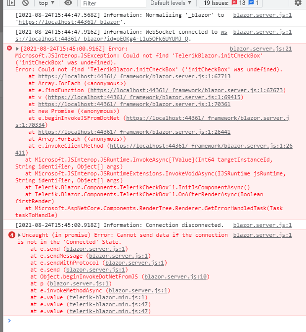
I have a column grouped by groupname of producttype having values likes diesel,electric,gas,petrol but i want specific order in groups to appear like diesel,petrol,electric,gas
Using
Protected void onstateinithandler(gridstateeventargs <prdouctmodel> args)
{
gridstate <productmodel> statetobe = new gridstate <productmodel>()
{
GroupDescriptors = new list <groupdescriptor>()
{
new GroupDescriptor()
{ Member= "producttype",
Membertype =typeof (string)
}
},
Collapsedgroups =enumerable.range (0,4).tolist ()
};
args.gridstate = statetobe
}
Would be great to have a user XML Editor, with input/output from string/stream and an attached XSD for continuous validation?
I realise this wouldn't be priority, just wondered if it could be put on roadmap at some point.
Many thanks,
David Speak.
This is useful for breaks (no appointments at lunch time) or holidays.
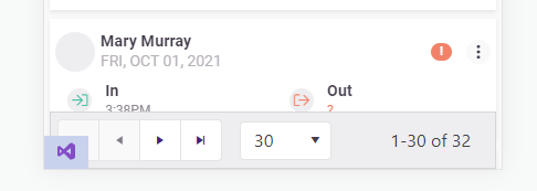
Allow "items per page" and "1 - X of Y items" on the pager configurable or even allow them to be hidden/removed.
On mobile devices the telerik pager takes up too much room and needs to be more responsive. I'm already aware of this feature request: https://feedback.telerik.com/blazor/1442883-responsive-layout-for-the-pager
But I would like to take it a step further and be capable of customizing/removing the text.
Add the following Parameters to the TelerikPager:
[Parameter] public bool ShowItemsPerPageText { get; set; } = true;
[Parameter] public bool ShowXofYItemsText{ get; set; } = true;
<TelerikPager ShowItemsPerPageText="false" />
<TelerikPager ShowXofYItemsText="false" />
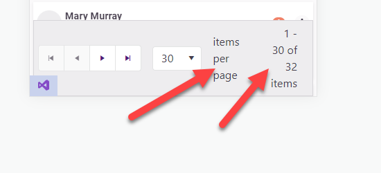
In my opinion this looks better
==============
ADMIN EDIT
==============
In the meantime, you can change the pager text through localization. It is important to keep the same number of placeholders, however, so that the string.Format() call it is used in will not throw.
This strings are behind the following keys:
- "items per page" - key: "Pager_ItemsPerPage"
- "1 - X of Y items" - key: "Pager_Display" . Default value is "{0} - {1} of {2} items".
I am experiencing this problem with version 2.29 when the dropdown list is in a "component"
It seems to be intermittent but dependent on how long the async method takes to complete.
Edit page
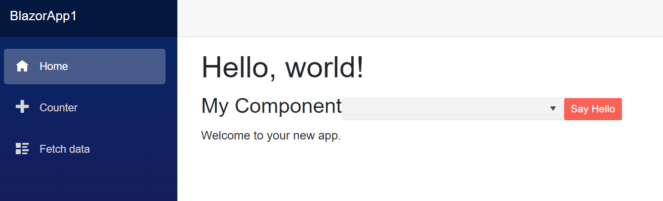
@page "/"
@using System.Diagnostics
@using System.Threading
@using BlazorApp1.Components

<h1>Hello, world!</h1>

<EditForm class="form-inline" Model="@Model">
    <MyComponent />
</EditForm>

Welcome to your new app.

@code {
    object Model = new();
    private Guid InstanceId;

    public Index()
    {
        InstanceId = Guid.NewGuid();
        Debug.WriteLine($"Index - {InstanceId}");
    }

    protected override Task OnInitializedAsync()
    {
        Debug.WriteLine("Index - OnInitializedAsync");
        return base.OnInitializedAsync();
    }

    protected override Task OnParametersSetAsync()
    {
        Debug.WriteLine("Index - OnParametersSetAsync");
        return base.OnParametersSetAsync();
    }
}
Component
@using System.Diagnostics
<h3>My Component</h3>
<br />
<TelerikDropDownList @bind-Value=_selectedValue Data="@myComboData" TextField="MyTextField" ValueField="MyValueField" TValue="int" TItem="MyDdlModel"></TelerikDropDownList>
<br />
<TelerikButton OnClick="@SayHelloHandler" Primary="true">Say Hello</TelerikButton><br />
@helloString
<br />
@code {
private Guid InstanceId;
MarkupString helloString;
int _selectedValue { get; set; } = 2; // Preselected value
IEnumerable<MyDdlModel> myComboData { get; set; } = Enumerable.Empty<MyDdlModel>();
void SayHelloHandler()
{
string msg = string.Format("Hello from <strong>Telerik Blazor</strong> at {0}.<br /> Now you can use C# to write front-end!", DateTime.Now);
helloString = new MarkupString(msg);
}
public MyComponent()
{
InstanceId = Guid.NewGuid();
Debug.WriteLine($"MyComponent - {InstanceId}");
}
protected override async Task OnInitializedAsync()
{
Debug.WriteLine("MyComponent - OnInitializedAsync");
myComboData = await LoadData();
await base.OnInitializedAsync();
}
protected override Task OnParametersSetAsync()
{
Debug.WriteLine("MyComponent - OnParametersSetAsync");
return base.OnParametersSetAsync();
}
private async Task<IEnumerable<MyDdlModel>> LoadData()
{
await Task.Delay(100);
return Enumerable.Range(1, 20).Select(x => new MyDdlModel { MyTextField = "item " + x, MyValueField = x });
}
public class MyDdlModel
{
public int MyValueField { get; set; }
public string MyTextField { get; set; }
}
}
Hi,
In most of my projects I use the ObjectGraphDataAnnotationsValidator component for validating complex types; and I also use a lot of your components. I've noticed what I *think* might be a clash between this validator and some of your input components. I've built a simple (and crude) example but I think it demonstrates the problem.
In the example code we have a table with 2 cells - in both cells we have an EditForm and 10 TelerikTextArea components. The first cell's EditForm contains a ObjectGraphDataAnnotationsValidator instance and the 2nd cell doesn't. Hopefully when you try to reproduce you will notice a distinct difference in performance with the performance of the 2nd EditForm being great, while the 1st EditForm is quite laggy and gets worse the more items you add.
I'm wondering if there is a clash here between the ObjectGraphDataAnnotationsValidator and the input components or I'm using them incorrectly?
Thanks
Michael.
@page "/"

<table width="100%">
    <tr>
        <td width="50%">
            <h3>EditForm with ObjectGraphDataAnnotationsValidator</h3>
            <EditForm Model="Items">
                <ObjectGraphDataAnnotationsValidator />
                @foreach (var item in Items)
                {
                    <div style="display: flex">
                        <TelerikTextArea @bind-Value="item.TextValue" />

                        @if (Items.IndexOf(item) == (Items.Count - 1))
                        {
                            <TelerikButton OnClick="@(() => Items.Add(new DataItem()))">
                                Add
                            </TelerikButton>
                        }
                    </div>
                }
            </EditForm>
        </td>
        <td width="50%">
            <h3>EditForm without ObjectGraphDataAnnotationsValidator</h3>
            <EditForm Model="Items">
                @foreach (var item in Items)
                {
                    <div style="display: flex">
                        <TelerikTextArea @bind-Value="item.TextValue" />

                        @if (Items.IndexOf(item) == (Items.Count - 1))
                        {
                            <TelerikButton OnClick="@(() => Items.Add(new DataItem()))">
                                Add
                            </TelerikButton>
                        }
                    </div>
                }
            </EditForm>
        </td>
    </tr>
</table>

@code {
    protected List<DataItem> Items { get; set; }

    protected override void OnInitialized()
    {
        Items = new List<DataItem>();
        for (var i = 1; i <= 10; i++)
        {
            Items.Add(new DataItem { TextValue = $"This is item number {i}." });
        }
    }

    public class DataItem
    {
        public string TextValue { get; set; }
    }
}
I am implementing custom filtering by column in a data grid. The data source is very large so the filtering will be done by a stored procedure in the database. In order to avoid excessive calls to the procedure it would be great if the TextBox had a DebounceDelay property like the one in the SearchBox.
---
ADMIN EDIT
While not technically useful for the grid itself (see the bottom of this thread for more ideas and information on that, a built-in feature is coming there as well), there can be benefit in adding that to the inputs (e.g., the Editor has something like that already by default because it is designed for large content).
Thus, I am reopening this so we can gauge the interest.
In the meantime, using a few lines of application code can achieve debouncing of expensive api calls. Using the OnChange or OnBlur event may also be suitable workarounds, depending on the goal you are after.
---
1) Validation of handwritten value after loosing focus.
When there are restrictions for min / max values of component, user can't picks invalid date with dropdown and validation works perfectly. However when user enters value as a string, telerik component lets him do that without any alerts. After loosing focus component sets date that match to chosen interval. The problem arrives when user clicks "Save button" after handwritten invalid date and Telerik corrects it by itself with valid but not always correct date from user side. Is it normal situation or there might be a solution to prevent possibility of entering of invalid date before loosing control?
2) Result date after handwritten input that out of accessible range.
After input of out of range date Telerik compute valid date and set it in component. May be situation when user entered correct value for the first time and then tried to change it to invalid, then he would lose his first entered date. Maybe should save last valid date for the next attempts of inputs or leave component logic in current condition?
There is example of situation:
1. TelerikDateTimePicker.Max = 11/1/2021 6:12 PM;
2. User picks date 11/1/2021 6:07 PM;
3. User decides to set 11/1/2021 6:35 PM and writes it in text field;
4. Telerik corrects its date to 11/1/2021 6:03 PM because it's valid, but previous user date was lost.
Hello Team;
We are building a "Social Media" style application. One of the requirements, is to provide an easy and professional for user to traverse through an Image gallery.
I'd like to request for such feature that allows us:
- Ability to for us to provide a list of links (to physical location of images) to the Image Gallery component to display images in list format or individual image to traverse through the list.
- Ability for user to click on image to see image in full size in a window.
- Ability for user to download image.
It would be great if we don't have to resort to use the old jQuery implementation. We're trying to minimize to load jQuery, as Blazor client is already large enough.
Thank you in advance!
..Ben