I'd like to use the adaptive rendering but I also need to keep AllowCustom feature.
===
ADMIN EDIT
===
This request applies to all components that support AllowCustom feature and adaptive rendering: for example, ComboBox, MultiColumnComboBox.
If the Height parameter is not specified, in the Gantt tree list, every line after the number of lines of the initial display are not shown.
The steps are easy to reproduce:
Start from the official Gantt Demo in the REPL and simply remove the Height parameter from TelerikGantt.
If you do this, you will see that opening the children of the first and only element in the tree list will show everything correctly in the Timeline part (if no mistake) but doesn't show the children lines in the TreeList part.
Therefore, I believe, the Height parameter should become mandatory until we can allow the height of the Gantt to be dynamic without rendering issues.
TelerikDateInput control works fine in windows (browsers chrome and edge) and android (chrome)
on iPhone (safari) the page jumps to top every time after user provides a value for day, month or year.
code:
@bind-Value="@_applicationViewModel.DateOfBirth"
Format="dd/MM/yyyy">
<DateTimePickerFormatPlaceholder Day="dd" Month="mm" Year="yyyy" />
</TelerikDateInput>
see video attached
Hi,
I would like to have a Expand/Collapse All Grid Groups button in the Grid Header. I know this is possible to do so programmatically outside of the grid but my users want it inside the Grid.
Thanks,
Humayoon
Currently the MultiColumnComboBoxColumn Width is only in pixels.
I would much rather use em or %. I can do this with a <style> but the width does not calculate correctly and I cannot specify a width in the MultiColumnComboBoxColumns
IMHO, since blazor is a web UI, widths should be more than pixels.
We use QueryableExtensions.ToDataSourceResultmethod to load some data in our component. And at some moment we need to cancel data loading. But ToDataSourceResult method doesn’t support CancellationToken. So we are forced to use a workaround and just ignore the task's result. But task is still executing and causing the performance hit…
It would be great if you implemented support for this feature!
following you can see a my code sample .how we can edit cell without loading grid .
@using System.ComponentModel.DataAnnotations

<TelerikButton ThemeColor="primary" OnClick="@SetGridGroup">Group</TelerikButton>


<TelerikGrid Data=@MyData EditMode="@GridEditMode.Incell" Pageable="true" Height="500px"
            OnUpdate="@UpdateHandler"
            OnEdit="@EditHandler"
            OnDelete="@DeleteHandler"
            OnCreate="@CreateHandler"
            OnCancel="@OnCancelHandler"
            Groupable="true">
    <GridToolBarTemplate>
        <GridCommandButton Command="Add" Icon="@FontIcon.Plus">Add Employee</GridCommandButton>
    </GridToolBarTemplate>
    <GridColumns>
        <GridColumn Field=@nameof(SampleData.ID) Title="ID" Editable="false" />
        <GridColumn Field=@nameof(SampleData.FirstName) Title="Name" />
        <GridColumn Field=@nameof(SampleData.LastName) Title="Last Name" />

        <GridColumn Field=@nameof(SampleData.Team ) Title="Team" />
        <GridCommandColumn>
            <GridCommandButton Command="Delete" Icon="@FontIcon.Trash">Delete</GridCommandButton>
        </GridCommandColumn>
    </GridColumns>
</TelerikGrid>
@code {
    async Task SetGridGroup()
    {
        GridState<SampleData> desiredState = new GridState<SampleData>()
        {
            GroupDescriptors = new List<GroupDescriptor>()
            {
                new GroupDescriptor()
                {
                    Member = "Team",
                    MemberType = typeof(string)
                },

            },
            // choose indexes of groups to be collapsed (they are all expanded by default)
            CollapsedGroups = new List<int>() { 0 },
        };
        await Grid.SetStateAsync(desiredState);
    }
    void EditHandler(GridCommandEventArgs args)
    {
        SampleData item = (SampleData)args.Item;
        // prevent opening for edit based on conditionif (item.ID < 3)
        {
            args.IsCancelled = true;// the general approach for cancelling an event
        }
        Console.WriteLine("Edit event is fired.");
    }
    async Task UpdateHandler(GridCommandEventArgs args)
    {
        SampleData item = (SampleData)args.Item;
        await MyService.Update(item);
        await GetGridData();
        Console.WriteLine("Update event is fired.");
    }
    async Task DeleteHandler(GridCommandEventArgs args)
    {
        SampleData item = (SampleData)args.Item;
        await MyService.Delete(item);
        await GetGridData();
        Console.WriteLine("Delete event is fired.");
    }
    async Task CreateHandler(GridCommandEventArgs args)
    {
        SampleData item = (SampleData)args.Item;
        await MyService.Create(item);
        await GetGridData();
        Console.WriteLine("Create event is fired.");
    }
    void OnCancelHandler(GridCommandEventArgs args)
    {
        SampleData item = (SampleData)args.Item;
        Console.WriteLine("Cancel event is fired. Can be useful when people decide to not satisfy validation");
    }
    public class SampleData
    {
        publicint ID { get; set; }
        [Required]
        public string FirstName { get; set; }
        public string LastName { get; set; }

        public string Team {get;set;}
    }
    public List<SampleData> MyData { get; set; }
    async Task GetGridData()
    {
        MyData = await MyService.Read();
    }
    protected override async Task OnInitializedAsync()
    {
        await GetGridData();
    }
   publicstaticclassMyService
    {
        private static List<SampleData> _data { get; set; } = new List<SampleData>();
        public static async Task Create(SampleData itemToInsert)
        {
            itemToInsert.ID = _data.Count + 1;
            _data.Insert(0, itemToInsert);
        }
        publicstaticasync Task<List<SampleData>> Read()
        {
            if (_data.Count < 1)
            {
                for (int i = 1; i < 50; i++)
                {
                    _data.Add(new SampleData()
                    {
                        ID = i,
                        FirstName = "Name " + i.ToString(),
                        LastName = "Last Name " + i.ToString(),

                        Team="Team" +(i%5).ToString()
                    });
                }
            }
            returnawait Task.FromResult(_data);
        }
        public static async Task Update(SampleData itemToUpdate)
        {
            var index = _data.FindIndex(i => i.ID == itemToUpdate.ID);
            if (index != -1)
            {
                _data[index] = itemToUpdate;
            }
        }
        public static async Task Delete(SampleData itemToDelete)
        {
            _data.Remove(itemToDelete);
        }
    }
}
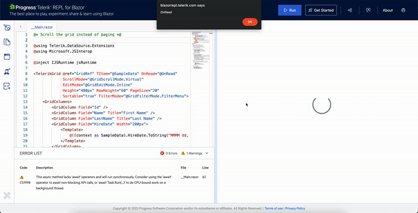
When edit is initiated from code with virtual scroll, a duplicate OnRead request is also triggered.
But this is not the case when built-in edit command button is used.
Hi
I'm using the month view for the Telerik Blazor scheduler which works so great and is really easy to use. But I'm missing a feature where I can control how many weeks of the month are visible at once to the user. For example, I don't want to show the entire month, but only two weeks of the month.
I know there is the MultiDay view, but this shows everything in one horizontal row. It would be great to have a feature where the user sees the month with a custom number of weeks.
My suggestion is to add a property to the SchedulerMonthView component called e.g. "WeekCount".
<SchedulerMonthView WeekCount="2"></SchedulerMonthView>Something like this also exists in Telerik UI for WinForms.
Best Regards,
Roman
I am handling the SelecteditemsChanged event of the Grid and when an exception is thrown in its handler, the ErrorBoundarydoes not catch it.
For reference, I tried attaching the same handler to a click of a button and it is successfully caught by the ErrorBoundary in this case.
I would like to disable the browser autocomplete.
Applicable components:
ComboBox, AutoComplete, MultiSelect
Please add group header template for the select components. There are two goals:
- Customize the group items' appearance.
- Implement custom behaviors, for example - batch select or unselect of all items in the group by clicking on the group header.