The default `ButtonType` looks for any matching form and triggers validation and submission of the form.
This can very quickly lead to unintended behaviour.
The default should be a regular button that does not invoke any additional functions.
Hi,
Could you expose the Print Command of Blazor PDF Viewer? I would like to call it from within my code.
Regards
Gerald Man
On applying aquatic and desert theme, Separator is not visible
Repro Steps:
- Hit the URL:Blazor Splitter Overview - Telerik UI for Blazor
- Turn on High contrast theme
- Tab till Preview under Creating Splitter for Blazor
- Tab till separator
- Verify that separator is visible on applying aquatic and desert theme or not
Actual Result: On applying aquatic and desert Theme, Separator is not visible.
Expected Result: On applying aquatic and desert Theme, Separator should be visible
User Impact:
Users who rely on the contrast themes may feel difficulty if the close buttons in Feedback popup are not completely visible.
Hi
Telerik Autocomplete does not have a ValueTemplate.
Mostly the Value is an Id, which in most examples does not make sense to be displayed to the User when selected.
Kind regards
Nicolas
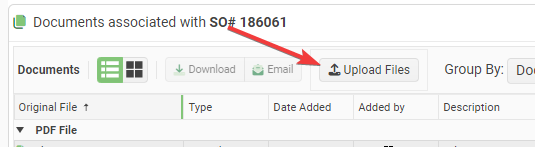
It is impossible to customize the Text and Icon for the Telerik Upload Blazor Component. It always sans "Select Files". This is not easy to see at a glance.
Requests:
- Add a Title attribute to the upload component that lets you change the text from the default "Select Files".
- Add the ability to set the Icon on the upload button.
Proposed Code:
<TelerikUpload Title="Upload Files" Icon="@SvgIcon.Upload" ... />I had to write some hacky JavaScript interop to accomplish this:
function setTelerikUploadButtonText(text) {
// Finds all the telerik blazor upload components on the page and changes the text of the upload button.
let replaced = 0;
const defaultText = "Upload";
// Find all the buttons with class "k-upload-button". There should be one for each upload component.
const buttons = document.getElementsByClassName("k-upload-button");
for (let i = 0; i < buttons.length; i++) {
// Find the span with class "k-button-text" and change its text.
const spans = buttons[i].getElementsByClassName("k-button-text");
if (spans.length > 0) {
// Add horizontal padding to the span.
spans[0].classList.add("px-2");
// Change the text.
spans[0].innerHTML = text ?? defaultText;
// Insert a font awesome icon.
spans[0].insertAdjacentHTML('afterbegin', '<i class="fas fa-upload"></i> ');
// Track how many buttons were updated.
replaced++;
}
}
console.info("setTelerikUploadButtonText: " + replaced + " buttons updated.");
return replaced;
}/// <summary>
/// Finds all the telerik blazor upload components on the page and changes the text of the upload button.
/// </summary>
/// <returns>The number of upload components button text that were found & replaced.</returns>
public static async Task SetTelerikUploadButtonText(this IJSRuntime jSRuntime,
string text = "Upload Files")
{
await jSRuntime.InvokeVoidAsync("setTelerikUploadButtonText", text);
}
Screenshot:
following you can see a my code sample .how we can edit cell without loading grid .
@using System.ComponentModel.DataAnnotations

<TelerikButton ThemeColor="primary" OnClick="@SetGridGroup">Group</TelerikButton>


<TelerikGrid Data=@MyData EditMode="@GridEditMode.Incell" Pageable="true" Height="500px"
            OnUpdate="@UpdateHandler"
            OnEdit="@EditHandler"
            OnDelete="@DeleteHandler"
            OnCreate="@CreateHandler"
            OnCancel="@OnCancelHandler"
            Groupable="true">
    <GridToolBarTemplate>
        <GridCommandButton Command="Add" Icon="@FontIcon.Plus">Add Employee</GridCommandButton>
    </GridToolBarTemplate>
    <GridColumns>
        <GridColumn Field=@nameof(SampleData.ID) Title="ID" Editable="false" />
        <GridColumn Field=@nameof(SampleData.FirstName) Title="Name" />
        <GridColumn Field=@nameof(SampleData.LastName) Title="Last Name" />

        <GridColumn Field=@nameof(SampleData.Team ) Title="Team" />
        <GridCommandColumn>
            <GridCommandButton Command="Delete" Icon="@FontIcon.Trash">Delete</GridCommandButton>
        </GridCommandColumn>
    </GridColumns>
</TelerikGrid>
@code {
    async Task SetGridGroup()
    {
        GridState<SampleData> desiredState = new GridState<SampleData>()
        {
            GroupDescriptors = new List<GroupDescriptor>()
            {
                new GroupDescriptor()
                {
                    Member = "Team",
                    MemberType = typeof(string)
                },

            },
            // choose indexes of groups to be collapsed (they are all expanded by default)
            CollapsedGroups = new List<int>() { 0 },
        };
        await Grid.SetStateAsync(desiredState);
    }
    void EditHandler(GridCommandEventArgs args)
    {
        SampleData item = (SampleData)args.Item;
        // prevent opening for edit based on conditionif (item.ID < 3)
        {
            args.IsCancelled = true;// the general approach for cancelling an event
        }
        Console.WriteLine("Edit event is fired.");
    }
    async Task UpdateHandler(GridCommandEventArgs args)
    {
        SampleData item = (SampleData)args.Item;
        await MyService.Update(item);
        await GetGridData();
        Console.WriteLine("Update event is fired.");
    }
    async Task DeleteHandler(GridCommandEventArgs args)
    {
        SampleData item = (SampleData)args.Item;
        await MyService.Delete(item);
        await GetGridData();
        Console.WriteLine("Delete event is fired.");
    }
    async Task CreateHandler(GridCommandEventArgs args)
    {
        SampleData item = (SampleData)args.Item;
        await MyService.Create(item);
        await GetGridData();
        Console.WriteLine("Create event is fired.");
    }
    void OnCancelHandler(GridCommandEventArgs args)
    {
        SampleData item = (SampleData)args.Item;
        Console.WriteLine("Cancel event is fired. Can be useful when people decide to not satisfy validation");
    }
    public class SampleData
    {
        publicint ID { get; set; }
        [Required]
        public string FirstName { get; set; }
        public string LastName { get; set; }

        public string Team {get;set;}
    }
    public List<SampleData> MyData { get; set; }
    async Task GetGridData()
    {
        MyData = await MyService.Read();
    }
    protected override async Task OnInitializedAsync()
    {
        await GetGridData();
    }
   publicstaticclassMyService
    {
        private static List<SampleData> _data { get; set; } = new List<SampleData>();
        public static async Task Create(SampleData itemToInsert)
        {
            itemToInsert.ID = _data.Count + 1;
            _data.Insert(0, itemToInsert);
        }
        publicstaticasync Task<List<SampleData>> Read()
        {
            if (_data.Count < 1)
            {
                for (int i = 1; i < 50; i++)
                {
                    _data.Add(new SampleData()
                    {
                        ID = i,
                        FirstName = "Name " + i.ToString(),
                        LastName = "Last Name " + i.ToString(),

                        Team="Team" +(i%5).ToString()
                    });
                }
            }
            returnawait Task.FromResult(_data);
        }
        public static async Task Update(SampleData itemToUpdate)
        {
            var index = _data.FindIndex(i => i.ID == itemToUpdate.ID);
            if (index != -1)
            {
                _data[index] = itemToUpdate;
            }
        }
        public static async Task Delete(SampleData itemToDelete)
        {
            _data.Remove(itemToDelete);
        }
    }
}
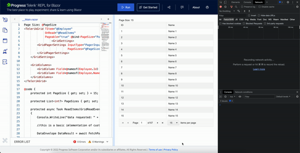
When edit is initiated from code with virtual scroll, a duplicate OnRead request is also triggered.
But this is not the case when built-in edit command button is used.
In the TelerikForm component, you have "FormItem" with a string parameter of Field and from the string, you somehow bind the data to that field.
For other components, we must use the @bind-Value to get this 2-way binding.
I would like to request the "Field" parameter for more controls like TelerikTextBox where we can bind using the string name of the field like we do in FormItem.
So instead of:
<TelerikTextBox @bind-Value="@customer.CustomerName" />
we would be able to do this:
<TelerikTextBox Field="CustomerName" />
Peter
Hi
I'm using the month view for the Telerik Blazor scheduler which works so great and is really easy to use. But I'm missing a feature where I can control how many weeks of the month are visible at once to the user. For example, I don't want to show the entire month, but only two weeks of the month.
I know there is the MultiDay view, but this shows everything in one horizontal row. It would be great to have a feature where the user sees the month with a custom number of weeks.
My suggestion is to add a property to the SchedulerMonthView component called e.g. "WeekCount".
<SchedulerMonthView WeekCount="2"></SchedulerMonthView>Something like this also exists in Telerik UI for WinForms.
Best Regards,
Roman
https://docs.telerik.com/blazor-ui/common-features/icons#fonticon-component
in the SvgIcon Component section, there is this sample code, needs to be updated.
<TelerikSvgIcon Icon="@SvgIcon.Calendar" />

<TelerikSvgIcon Icon="@SvgIcon.Audio"
                Size="@ThemeConstants.Icon.Size.Large"
                ThemeColor="@ThemeConstants.Icon.ThemeColor.Primary" />
Should be
ThemeConstants.SvgIcon or ThemeConstants.FontIcon
The Image Thumbnail Viewer Component should have features like:
- Face detection-based image cropping
- Overlay an image over detected faces [To hide faces]
- Blur or pixelate faces
- Thumbnail masking within different shapes like:
- Circle
- Square
- Rectangle
- Hexagon
- Star etc.
- Content Aware Padding of images to fix the container size
- Set transparent background
- Text overlay
- Image watermark overlays
- Recolor a picture
- Antic Effect
This Thumbnail Viewer can then be used within Data Grid, File Manager/Explorer, Card View, Drop down lists, List Views, Tiles etc.
I couldn't find a way to change the default AnimationDuration of the combobox's popup. Personally, I find the default AnimationDuration set at 300ms way too high.
I'd like a way to change it either per-component, by setting animation properties on them when appropriate, or globally, by configuring it in Startup.cs or on TelerikRootComponent perhaps. I've no idea how this should work.
---
ADMIN EDIT
Here is a way to change the animation of the dropdown per component - through the PopupClass (note that the popup class may move to the topmost element of the popup in a future version, if this stops working, inspect the rendering to see where the custom class is and how to cascade through it):
<style>
    .fast-animation.k-popup.k-reset {
        transition-duration: 100ms !important;
    }

    .slow-animation.k-popup.k-reset {
        transition-duration: 1000ms !important;
    }

    .no-animation.k-popup.k-reset {
        transition: none !important;
    }
</style>


<TelerikComboBox PopupClass="fast-animation"
                 Data="@myComboData"
                 TextField="MyTextField"
                 ValueField="MyValueField"
                 @bind-Value="selectedValue"
                 Placeholder="Fast animation"
                 ClearButton="true" Filterable="true">
</TelerikComboBox>

<TelerikDropDownList PopupClass="no-animation"
                     Data="@myComboData"
                     TextField="MyTextField"
                     ValueField="MyValueField"
                     @bind-Value="selectedValue"
                     DefaultText="No Animation">
</TelerikDropDownList>

<TelerikDatePicker PopupClass="slow-animation" @bind-Value="@SelectedDate"></TelerikDatePicker>

@code {

    IEnumerable<MyDdlModel> myComboData = Enumerable.Range(1, 20).Select(x => new MyDdlModel { MyTextField = "item " + x, MyValueField = x });
    DateTime SelectedDate { get; set; } = DateTime.Now;
    int selectedValue { get; set; }
    public class MyDdlModel
    {
        public int MyValueField { get; set; }
        public string MyTextField { get; set; }
    }
}
I would like to disable the browser autocomplete.
Applicable components:
ComboBox, AutoComplete, MultiSelect
In my blazor application, I have to use a numeric box component . In order to do that, I have created a custom numeric box component like below. my issue is while I am typing something on the numeric box, time to time some characters are automatically getting cleared. I have to type those again and again .i don't know what is the issue behind this.
<span @onfocusin="@FocusComponentAsync" @ref="@InputWrapperRef">

                <TelerikNumericTextBox Value="Amount"
                                       ValueChanged="(decimal val)=>OnBlNumercChanged(val)"
                                       Arrows=false>

                </TelerikNumericTextBox>
</span>


@code{

    private ElementReference InputWrapperRef { get; set; }

    private decimal Amount;


    protected override void OnParametersSet()
    {
            this.StateHasChanged();

            base.OnParametersSet();
    }

    private async void OnBlNumercChanged(decimal value)
    {

       //code
    }

    public async void OnNumericBoxKeyUp(KeyboardEventArgs e){

       //code

    }

    public async Task FocusComponentAsync()
    {
       await _jsRuntime.InvokeVoidAsync("highlightInput", InputWrapperRef);
    }

}
window.highlightInput = (inputWrapper) => {
    var input = inputWrapper.querySelector("input");
    if (!input) return;
    input.select();
}
The demo for onseriesclicked does not work. I get the error: An unhandled error has occurred. Reload. Reload is a link, when I select it, I still get the error. I can just rip out the demo code and try it myself, but I thought you might want to know, it doesn't work for me:
Widows Edge Browser
Windows 10 OS