Two related defects in `TelerikTabStrip` when the tab headers wrap onto multiple rows.
Filed for GLS (Governance & Legislative System), the resolution submission form
(`/submit-resolution`), which has 12 tabs.
## Environment
- **Telerik UI for Blazor:** v14 (please fill in the exact build number from your
`LegislationApplications` package reference before submitting)
- **.NET:** 10.0
- **Render mode:** Blazor **Server** (Interactive Server), no WebAssembly
- **Browser:** reproduced in Chromium-based browsers on a wide (≥1200px) window
- **Component config (abridged):**
```razor
<TelerikTabStrip @bind-ActiveTabId="ActiveTabId"
PersistTabContent="true"
OverflowMode="TabStripOverflowMode.None" @* wide screens *@
ScrollButtonsPosition="TabStripScrollButtonsPosition.Split"
ScrollButtonsVisibility="TabStripScrollButtonsVisibility.Auto">
@* 12 TabStripTabs; several use Visible="@boolExpr" (conditionally shown);
most use a <HeaderTemplate> that renders the title plus an optional indicator icon *@
</TelerikTabStrip>
```
- On a wide window with `OverflowMode="None"`, the 12 tab headers **wrap onto two rows**
(row 1 ends at "Budget Impact"; row 2 begins at "OGR Consultation").
---
## Bug 1 — Wrapped tabs: activating a tab at the wrap boundary shows the WRONG content panel
### Repro
1. Open a form whose tab headers wrap to two rows (wide window, `OverflowMode="None"`, enough
tabs to force a second row).
2. Activate the tab that sits at the **end of the first row** (its immediate left neighbour is on
the same row; its right neighbour is on the next row). In our form: activate **External
Documents**, then click **Budget Impact** (last tab on row 1).
### Expected
Budget Impact’s content panel is displayed.
### Actual
- The Budget Impact **header** receives focus/active styling, but the **content area still shows
the previous tab’s panel** (External Documents).
- It is **deterministic** from the left-neighbour: a 2-second pause before clicking does **not**
help.
- **Workarounds that do make it switch:** double-clicking the tab, or first activating a tab on a
**different row** (e.g. OGR Consultation) and then clicking Budget Impact once.
### Proof the server/binding side is correct (it is a client-side rendering defect)
We instrumented the `ActiveTabId` setter and component renders. On the failing single click:
```
ActiveTabId 'tab-submitter' -> 'tab-external-documents' (click External)
RENDER activeTab=tab-external-documents
ActiveTabId 'tab-external-documents' -> 'tab-budget-impact' (click Budget Impact)
RENDER activeTab=tab-budget-impact
(no further activity)
```
So `ActiveTabIdChanged` fires with the correct id, `ActiveTabId` becomes `tab-budget-impact`, and
the component re-renders exactly once with the correct active tab — yet the browser keeps showing
the External Documents content panel. The subsequent “rescue” clicks that fix the display produce
**no** server activity at all, confirming the mismatch is purely in the component’s client-side
content-panel switching.
### Confirmed trigger: the wrapping
Forcing the tab headers onto a **single row** with CSS (no other change) makes the bug disappear
entirely — every tab activates its correct panel on the first click:
```css
.k-tabstrip-items-wrapper { flex-wrap: nowrap; overflow-x: auto; }
.k-tabstrip-items { flex-wrap: nowrap; }
```
This is not an acceptable final fix for us (the product requires the wrapped, all-tabs-visible
layout), but it isolates the cause: **`TelerikTabStrip` mismaps the active content panel when its
headers wrap to more than one row.**
---
## Bug 2 — `OverflowMode="Scroll"` throws an exception for this configuration
### Repro
Set `OverflowMode="TabStripOverflowMode.Scroll"` (instead of `None`) on the same TabStrip
(12 tabs, `PersistTabContent="true"`, several tabs with `Visible="@expr"` including one that is
currently `Visible="false"`, and `<HeaderTemplate>`s).
### Actual
The page throws an unhandled exception on load / render (Blazor error UI). Reverting to
`OverflowMode="None"` removes the exception.
> **To complete this section before filing:** capture the exact exception type, message, and the
> top Telerik stack frames from the browser DevTools console or the app’s server log (Aspire
> dashboard → `legislationwebapp` resource) while `OverflowMode="Scroll"` is active. We suspect it
> relates to scroll-width measurement of a `Visible="false"` tab and/or `HeaderTemplate` tabs, but
> the stack trace will confirm.
---
## Why this matters / requested outcome
- Bug 1 forces a poor workaround (users must double-click or approach tabs from a specific
direction) or a UX compromise (single-row scrolling instead of the required wrapped layout).
- Bug 2 blocks the natural single-row fix (`OverflowMode="Scroll"`).
We would like `TelerikTabStrip` to either (a) correctly map the active content panel when headers
wrap, or (b) provide a supported single-row/wrapping option that does not throw for this
configuration.
I'd like to have an ExpansionPanel component where I can declare my desired panel instances and their content in the markup.
Similar to https://www.telerik.com/kendo-angular-ui/components/layout/expansionpanel/
The Telerik UI for Blazor TimePicker currently does not appear to expose an equivalent to the Kendo UI for jQuery TimePicker "focusTime" option.
https://github.com/telerik/kendo-ui-core/blob/master/docs/api/javascript/ui/timepicker.md#focustime-datedefault-null
In Kendo UI for jQuery, focusTime allows the popup to open with a specific time focused without actually setting the selected value. This is useful when the picker has no value yet.
For example, let's say we want the time-picker to open up with the placeholder value of 08:00, how would we achieve this in Telerik UI for Blazor? Currently it defaults the placeholder to the current time.
Thanks
Issue: Opening and closing a window will cause the window to reopen with each following OnClick. This seems to have been introduced with the upgrade to .net10
Code: Below is an example used on the basic Telerik Blazor template. Copy this and replace Home.razor with it.
@page "/"

<PageTitle>Telerik Blazor App | Home</PageTitle>

<div id="home-page">
    <HomeSvg />

    <h1>Hello, Telerik UI for Blazor!</h1>

    <p>Welcome to your new Telerik Blazor app.</p>

    <TelerikButton OnClick="OpenWindow1">Click Here First</TelerikButton>
    <TelerikButton OnClick="OpenWindow2">Click Here Second</TelerikButton>
    <TelerikButton OnClick="@(async () => {await Task.Delay(100);})">Unrelated OnClick</TelerikButton>


</div>

<TelerikWindow Visible="ShowWindow1">
    <WindowActions>
        <WindowAction OnClick="CloseWindow1" Name="Close"></WindowAction>
    </WindowActions>
    <WindowContent>
        <span>Moving window now will help find this window in next step, but not necessary to replicate bug.</span>
        <br />
        <span>Close window using 'X'.</span>
    </WindowContent>
</TelerikWindow>

<TelerikWindow Visible="ShowWindow2">
    <WindowActions>
        <WindowAction OnClick="CloseWindow2" Name="Close"></WindowAction>
    </WindowActions>
    <WindowContent>
        <span>Window 1 shouldn't be appearing now, but it it is. Window 1 may be behind this window if you didn't drag in previous step.</span>
        <br />
        <span>If you close these windows, and click the 'Unrelated OnClick' button, both of these windows will reappear, despite just firing Task.Delay(100)</span>
    </WindowContent>
</TelerikWindow>

<style>
    #home-page {
        margin-left: auto;
        margin-right: auto;
        max-width: max-content;
        text-align: center;
        font-size: var(--kendo-font-size-xl);
    }

    @@media (min-height: calc(56px + 50px + 400px)) {
        /* header + footer + home page container*/
        #home-page {
            margin-top: calc(50vh - 28px - 25px - 200px);
        }
    }
</style>

@code {
    public bool ShowWindow1 { get; set; }
    public bool ShowWindow2 { get; set; }

    public async Task OpenWindow1()
    {
        ShowWindow1 = true;
    }

    public async Task OpenWindow2()
    {
        ShowWindow2 = true;
    }

    public void CloseWindow1()
    {
        ShowWindow2 = false;
        StateHasChanged();
    }

    public void CloseWindow2()
    {
        ShowWindow2 = false;
    }
}
If the Height parameter is not specified, in the Gantt tree list, every line after the number of lines of the initial display are not shown.
The steps are easy to reproduce:
Start from the official Gantt Demo in the REPL and simply remove the Height parameter from TelerikGantt.
If you do this, you will see that opening the children of the first and only element in the tree list will show everything correctly in the Timeline part (if no mistake) but doesn't show the children lines in the TreeList part.
Therefore, I believe, the Height parameter should become mandatory until we can allow the height of the Gantt to be dynamic without rendering issues.
Hello,
after playing with AI chat integration with telerikgrid, few bumps up shows:
lets have this scenario- request from aichat, to perform some filtering/operations on grid with clumn names like col1,col2,col3... generic.
        public async Task<GridAIResponse> GetGridAIData(GridAIRequestDescriptor request)
        {
            var options = new ChatOptions();
            var columnsx = JsonSerializer.Deserialize<List<GridAIColumn>>(JsonSerializer.Serialize(request.Columns));
              options.Tools = new List<AITool>();
               options.Tools.Clear();
     1)   //describe the columns or general behavior like "aprox, arround, near"
            var ff = ChatOptionsExtensions.GetFilter(columnsx);
            ForceSetDescription(ff, @"
If users enters phrases like 'aprox', 'arround', 'near',
operate with field value in between ±10 %.
Example: 'dimensions arround 1000'  results in: 'dimension >= 900 AND dimension<= 1100'.
");

            options.Tools.Add(ff);
options.Tools.Add(ChatOptionsExtensions.GetSort(columnsx));

ChatResponse completion = await _chatClient.GetResponseAsync(conversationMessages, options);
....
return completion.ExtractGridResponse();
}
how to extend "GridAIRequestDescriptor"?
1) - ability to describe column(add). but Description is readonly (coders should add titles or any text manually from column definition - be aware. grid IColumn is accessible only by reflection just now)
OR
2) - ability to specify the "meaninfgull name" (place, where coders can add this)
OR
3)- instead of using just "Fieldname" of the column, use/add the Title(which is more understandable for LLM)
OR
4) field mapping translation layer. GridColumn.Field -> something descriptive and back after fetching response from LLM
fieldnames are mostly "system DB name" and cannot be changed. So FieldName="Column44qty" and Title="qty available stock", you get the point which one tells you more.
new[]
{
new {
Field = "Column44qty",
Title = ""qty available stock",
Type = "number",
Description = "......",
Values = new[] { "x", "yyy", "zzz" }
},...
}
all points 1-4 are not needed, just one of them is ok.
The following exception occurs:
Microsoft.JSInterop.JSDisconnectedException: JavaScript interop calls cannot be issued at this time. This is because the circuit has disconnected and is being disposed.
............
at Telerik.Blazor.Components.Common.Loader.ComponentLoaderContainer.DisposeAsync()
When the user closes the browser and the web page contains any of the below components:
- DockManager
- FileManager
- Grid
- ListView
- PdfViewer
- PivotGrid
- Scheduler
- SpreadSheet
- TreeList
Hi
I have an TelerikMenu with a mix of internal and external links. The menu is using Data binding to a list of menu items. When using the mouse and clicking the external links it works as expected.
However when using the tab to set focus into the menu, then using the arrow keys to navigate to a menu item then hit Enter key, the link opens in the current tab, even if it set to target="_blank".
In this REPL the Enter key does nothing when at Telerik/Documentation and hitting Enter:
https://blazorrepl.telerik.com/mgYflMuM27MjqZrD54
In my case, the URL is opened in the current tab, instead of a new tab.
I'm using ItemTemplade to render the links and my template for external links looks like this:
if (item.IsExternal) { <ahref="@item.Url"class="@cssClass"target="_blank"rel="noopener noreferrer" @onclick="() => { if (isMobile) CloseMobileMenu(); }" @onclick:stopPropagation="!isMobile"> @item.Text <TelerikSvgIconIcon="@SvgIcon.HyperlinkOpen"Size="@ThemeConstants.SvgIcon.Size.Small"Class="@(isMobile ? "ms-2" : "ms-2")"/></a> }
The rendered HTML looks like this:
<li data-id="595df6d2-0580-42fd-999d-37f73afedcb6" tabindex="-1" class="k-item k-menu-item " role="menuitem" aria-live="polite"><span class="k-link k-menu-link "><div class="d-flex align-items-center justify-content-between w-100 px-2"><a href="https://theurl.com/an/l/45" class="k-menu-link-text" target="_blank" rel="noopener noreferrer">Go to external page<!--!-->
<!--!--><span class="telerik-blazor ms-2 k-icon-sm k-icon k-svg-icon k-svg-i-hyperlink-open" aria-hidden="true"><svg xmlns:xlink="http://www.w3.org/1999/xlink" xmlns="http://www.w3.org/2000/svg" viewBox="0 0 512 512"><!--!--><path d="M32 480h448V256h-32v192H64V64h192V32H32zM320 32l56.9 56.9.5.5L224 242.7l45.3 45.3 153.3-153.4L480 192V32z"></path></svg></span></a></div></span></li>I'd rather nog involve js-hacks to solve this issue. Is this a known bug or am i doing it wrong?
Please consider adding a pluggable runtime localization provider for Telerik UI for Blazor, primarily targeting Blazor WebAssembly scenarios.
This request is not critical for ASP.NET MVC / Razor / Blazor Server, where IDisplayMetadataProvider already provides a valid extensibility point for custom localization. However, Blazor WebAssembly has no equivalent mechanism, which creates a significant limitation.
Problem (Specific to Blazor WebAssembly)
In Blazor WebAssembly:
DisplayAttributeis static and reflection‑based- It cannot use DI, async logic, tenant context, or database access
- MVC metadata extensions such as
IDisplayMetadataProviderare not available
As a result, Telerik components can only resolve UI text via:
DisplayAttribute.resxresources
This makes it impossible to integrate:
- Database‑driven localization
- Multi‑tenant localization
- User‑editable translations
- Runtime language switching
Why This Matters
In modern Blazor WebAssembly (SPA) applications, localization is often:
- Runtime‑resolved
- Backed by a database
- Tenant‑ and user‑aware
Other libraries already support this model through pluggable localization providers.
A good example is FluentValidation, which allows localization logic to be resolved at runtime via DI, including custom providers and non‑resource‑based implementations.
References:
- FluentValidation – Localization documentation:
https://docs.fluentvalidation.net/en/latest/localization.html - FluentValidation – Custom language manager / provider implementation:
https://github.com/FluentValidation/FluentValidation/blob/main/docs/localization.md
Because Telerik UI for Blazor does not expose a similar extensibility point, developers are forced to manually specify labels, headers, and enum texts throughout the UI, losing the benefits of automatic localization.
Suggested Direction
Introduce an optional localization provider that Telerik components can use when resolving UI text:
- Keep full backward compatibility with
DisplayAttribute - Enable advanced runtime‑based localization scenarios in Blazor WebAssembly where static attributes are insufficient
This would significantly improve Telerik UI’s suitability for enterprise and multi‑tenant Blazor WASM applications, without impacting existing server‑side solutions.
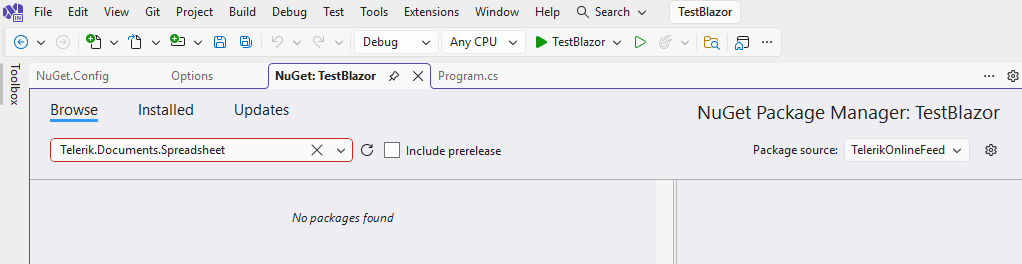
With an active Blazor trial, the Telerik Document Processing NuGet packages are not found in the Visual Studio Package Manager and in the Terminal as well:

Description
When the dropdown is open, the button's aria-controls attribute references a value that matches the popup's data-id, not its actual id. Since aria-controls must point to an element's id, the attribute is invalid and no element in the DOM matches the reference, breaking the accessible relationship between the button and its popup.
Button renders:
aria-controls="50dc5df2-b83e-41bd-8c34-98470aba77c6"
Popup element has:
data-id="50dc5df2-b83e-41bd-8c34-98470aba77c6"
id="8630d4e4-2f22-4eaf-b96c-7cae113b70ed"
Steps to Reproduce
- Add a TelerikDropDownButton using the standard Telerik example (source below).
- Open the dropdown and inspect the HTML or run a Lighthouse audit.
<TelerikDropDownButton Icon="@SvgIcon.Share" OnClick="@(()=>OnItemClick("Primary"))">
    <DropDownButtonContent>Share</DropDownButtonContent>
    <DropDownButtonItems>
        <DropDownButtonItem Icon="@SvgIcon.Facebook" OnClick="@(()=>OnItemClick("Facebook"))">Facebook</DropDownButtonItem>
        <DropDownButtonItem Icon="@SvgIcon.Twitter" OnClick="@(()=>OnItemClick("Twitter"))">Twitter</DropDownButtonItem>
        <DropDownButtonItem Icon="@SvgIcon.Linkedin" OnClick="@(()=>OnItemClick("Linkedin"))">Linkedin</DropDownButtonItem>
        <DropDownButtonItem Icon="@SvgIcon.Reddit" OnClick="@(()=>OnItemClick("Reddit"))">Reddit</DropDownButtonItem>
    </DropDownButtonItems>
</TelerikDropDownButton>
Description
When the dropdown is open, the input's aria-activedescendant attribute references an id that does not exist in the DOM. Since aria-activedescendant must point to the id of an actually rendered option element, the attribute is invalid and assistive technologies cannot determine which option is currently active.
Input renders:
aria-activedescendant="b45bcb14-4093-4de8-ad31-cae8ec8ca9c4"
Steps to Reproduce
- Add a TelerikMultiSelect using the standard Telerik example (source below).
- Open the dropdown and inspect the HTML or run a Lighthouse audit.
<TelerikMultiSelect Data="@Hobbies"
@bind-Value="@SelectedHobbyIds"
ValueField="@nameof(HobbiesDto.HobbyId)"
TextField="@nameof(HobbiesDto.HobbyName)"
Placeholder="Select your favourite sport..."
Id="multiselect"
Width="100%"
Rounded="@ThemeConstants.DropDownList.Rounded.Medium"
FillMode="@ThemeConstants.AutoComplete.FillMode.Outline"
TagMode="@MultiSelectTagMode.Single"
ShowClearButton="false">
    <MultiSelectSettings>
        <MultiSelectPopupSettings Height="@CustomThemeConstants.Multiselect.PopupHeight" MaxHeight="@CustomThemeConstants.Multiselect.PopupMaxHeight" />
    </MultiSelectSettings>
</TelerikMultiSelect>

@code {
    public List<int> SelectedHobbyIds { get; set; } = [];

    public IEnumerable<HobbiesDto> Hobbies { get; set; } = new List<HobbiesDto>()
    {
        new HobbiesDto(1, "Basketball"),
        new HobbiesDto(2, "Golf"),
        new HobbiesDto(3, "Baseball"),
        new HobbiesDto(4, "Table Tennis"),
        new HobbiesDto(5, "Volleyball"),
        new HobbiesDto(6, "Football"),
        new HobbiesDto(7, "Boxing"),
        new HobbiesDto(8, "Badminton"),
        new HobbiesDto(9, "Cycling"),
        new HobbiesDto(10, "Gymnastics"),
        new HobbiesDto(11, "Swimming"),
        new HobbiesDto(12, "Wrestling"),
        new HobbiesDto(13, "Snooker"),
        new HobbiesDto(14, "Skiing"),
        new HobbiesDto(15, "Handball"),
    };

    public class HobbiesDto
    {
        public int    HobbyId   { get; set; }
        public string HobbyName { get; set; } = string.Empty;

        public HobbiesDto() { }

        public HobbiesDto(int id, string name)
        {
            HobbyId = id;
            HobbyName = name;
        }
    }
}
This public feature request:
- Explains how the TelerikRootComponent works.
- Outlines the problems of the current software design in static .NET 8 Blazor apps.
- Measures customer demand for a major change that may possibly resolve the current limitations.
How the TelerikRootComponent Works
Historically, the TelerikRootComponent was designed with the following purposes:
- To host and render all Telerik Blazor popups as RenderFragments. This means that all popups are rendered where the TelerikRootComponent is defined in the application's component hierarchy. In most cases, correct popup position requires the TelerikRootComponent to wrap all the content on the web page. Otherwise the correct position is not guaranteed and this is documented. In addition, the TelerikRootComponent instance is a CascadingValue, which allows it to collect all popup RenderFragments.
- The TelerikRootComponent exposes parameters for global application-wide Telerik settings, such as icon type or RTL support. This is another reason why it makes sense to have a single TelerikRootComponent that wraps all the page content.
Problems and Limitations in .NET 8 Blazor Static Apps
.NET 8 Blazor apps with "Per Component" interactivity location create a big challenge for the above state of affairs:
- Cascading values do not pass across render mode boundaries. .NET 8 includes a new feature for passing cascading values to interactive components (builder.Services.AddCascadingValues()), but this mechanism does not support passing of RenderFragments, because they are not JSON serializable. This brings the requirement that the TelerikRootComponent is part of an interactive component hierarchy.
- When the TelerikRootComponent is in a non-layout .razor file, it triggers more re-renders than normally. They are related to internal MediaQuery instances and all popups, which the root component manages.
So, developers who work with a globally static app with specific interactive components ("islands of interactivity") may need to:
- Place the TelerikRootComponent somewhere inside the component hierarchy, so it can't wrap all the page content. This will lead to wrong popup position.
- Use multiple TelerikRootComponents. This requires to define the same parameters for each TelerikRootComponent instance.
Next Steps
All developers who develop static .NET 8 Blazor apps with "Per Component" interactivity location:
- Please vote for this feature request, so that we can measure how many customers are affected by the described limitations.
- Post here and describe:
- Why do you need to use apps with "Per Component" interactivity.
- Your specific challenges with the current TelerikRootComponent setup.
Currently working on moving from winform to Blazor and found a feature not supported in Telerik atm.
Getting current error when trying to enable Virtualiztion inside a grid
Groupable is not supported with the Virtualization feature of Telerik Grid
Where im already setting grouping on one of the columns