This request is to add the aria-invalid attribute to your components so that we can manually flag a field for screen reader accessibility if there is a validation issue. I perform some validation rules manually without using an edit form, and would like to be able to add that attribute to the controls when there is an issue. Numeric Text Box is one of your controls in particular that I need this for.
Additionally, adding a title attribute to these controls would be helpful to allow providing tooltips on the control.
I would also like to point out that allowing attribute splatting in your controls would solve both of these requests and any future attributes that may come up that developers may need to add.
My team is currently using animation containers as menu popups in our web app, which will need to work on both desktop and mobile devices in a web browser. For the mobile layout, I would like to be able to open animation containers via swipe gestures. I understand that animation containers are not strictly menus, however, I would love to see swipe action support in Telerik UI for Blazor, and then be able to bind that action to an animation container.
The only framework I have found by way of example is https://onsen.io/. Please observe how it is possible to open a panel by swiping close to the edge of the sample device on their homepage.
This feature would make it much easier to build dynamic web apps that perform well on desktop and feel native on mobile devices as well.
Thank you,
David
Hello.
I have a scenario where I need to make some nodes in a TreeView checkable and some not. It would be nice if there was an "IsCheckable" binding that determines whether a node should render a checkbox or not.
Although I've no use for it yet, the same could be done for "IsSelectable".
Is there some way to do this already, and I'm just not seeing it? I'd prefer not to use JavaScript interop, or recreate the checkbox functionality through an ItemTemplate.
Hi,
it would be nice to have a single button in the GridToolbar that opens the column chooser menu or something like that (popup?).
Often we need to save space in a grid and disable the menu option for the columns but then we lose the ability to choose which columns the user might want to disable. This also apply to very small columns with small header information, e.g. if you just need 2 or 3 letters to describe the column data then the menu with its three dotted button is to large.
Best Regards,
Thomas
It would be helpful to have a <WindowFooter> template inside Window, like <WindowTitle>, or <WindowContent> that stays 'sticky' to the window, so buttons and other content can be placed there , regardless on the height of the window and its contents.
Regards
Hi we are using blazor for mobile apps.
For image upload via Camera, we need features where by compressed images can be upload.
Also zoom in and zoom out features when we are showing at front end app
Hello,
is there a way to use the kendo-popup from https://www.telerik.com/kendo-angular-ui/components/popup/ in Telerik UI for Blazor? Is it a planned feature for the future?
Thank you,
Christian
Hello,
I need to perform some tasks in case of pressing some keyboard shortcuts. For example when a user press Alt+Enter key combination. But it seems that your grid catches this key combination as well and performs its action (Editing the current cell and jumping to the next one below). How can I suppress this behavior please? Maybe not just for this key combination but more generally.
I attached a small sample to better demonstrate the problem. Just run the sample please, focus some cell in the grid and press Alt+Enter.
Very thanks.
Miroslav
Hi,
I see this feature request which is marked as COMPLETED in v2.28 (I`m running v3.7) but I don`t see how to achieve the functionality of having a blank placeholder for a DateTimePicker which has a null datetime variable bound it.
Are you able to help please?
Regards,
Tom
Create a word style component.
Currently my wpf desktop app uses a editor style component and refreshes a crystal reports window component to show edits made to a pre created document. We use this to create quote letters using custom legal jargon.
I am in the process of moving that program to Blazor. A word component that i can wrap our custom texts around and buttons in the title bar for pasting our prefomatted text would be so much better than our current setup.
Could this be added to the roadmap?
Please consider refactoring Telerik.DataSource to allow for Dynamic Linq expressions rather than fixed Member.
1. You don't have to reinvent the wheel in creating lambda expressions. You can simplify Telerik.DataSource code to just use Dynamic Linq.
2. Allows support for Sorts & Grouping to be expressions such as "Math.Abs(field ?? 0)" rather than just "field".
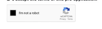
Hi Team,
I am looking for captcha component to verify user as human like below screenshot. Please let me know if this feature is available
can you provide a initial File click event handler attribute?
I want the user to be able to click on an initial file to download the file.
Grids honor the [DisplayFormat(DataFormatString ... )] annotation for column content, but the FilterMenuType.CheckBoxList filter menu and the TelerikCheckBoxListFilter component don't. This is particularly noteworthy for formatting that truncates the contents such as DateTime which frequently tracks data smaller than user's care about, which can generate many visually identical checkboxes. To go along with the requested change, it would be nice if the filter matched off of the DisplayFormat string considering that is what the user sees and would therefore be referencing, since again, many DataFormatStrings can truncate data.
Because the TelerikCheckBoxListFilter component requires the field to match the data type of the grid's field, there isn't a way for the programmer to choose to show the filter menu with a checklist that matches the displayed values without building a fully custom FilterMenuTemplate with their own foreach loop and then figuring out a way to construct a CompositeFilterDescriptor filled with bracketing FilterDescriptors to account for the range of matching values. This is doubly troublesome since using the structure of CompositeFilterDescriptors needed to do that is not supported in the FilterMenuTemplate without also having to override the FilterMenuButtonsTemplate.
Generally speaking, it would make more sense to the users if the default options in the filter logically and visually matched with the default displayed values.
Reference material:
Grid column contents: https://www.telerik.com/blazor-ui/documentation/components/grid/columns/display-format
Checkbox List: https://www.telerik.com/blazor-ui/documentation/components/grid/filter/checkboxlist
Alternate FilterDescriptor shapes not supported: https://feedback.telerik.com/blazor/1681745-clear-button-in-grid-filtermenu-not-properly-clearing-custom-filter
Example Repl: https://blazorrepl.telerik.com/mJOSuxQw117zM1h321
Since <TelerikGrid> is implemented as two separate <table>s, one for the headers and a second for the grid, it does not show repeated headers on subsequent pages when using the browser's Print feature.
Due to limitations of the <TelerikGrid> export functionality, I use the browser print function to export PDFs.
I need the table headers to duplicate on subsequent printed and exported pages.
I wonder if there is a way to duplicate the <thead> info in the second table and suppress its display but enable it for @media Print.
More details in ticket 1691848