Create a general purpose component to allow dragging and dropping of other components or files from the filesystem. Expose events that let us get access to the files that were dropped so that we can access the contents of those files or send them off to be uploaded.
Currently in Blazor we can do this with the InputFile component. But I would like the ability to create a droppable UI and have any kind of child content in it. And also get at the file content of files dropped.
Hi,
I had to figure this out myself for the ComboBoxSettings because there is no documentation for this.
The MinWidth works from the Combobox width or greater extending the size of the popup and
MaxWidth only creates a popup width of the Combobox only.
Please document this feature and how to use it. And, is this intentional because it wasn't intuitive for me to figure out.
I created a REPL for you to test this out for yourself.
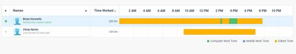
I need to track users activity per day like this, it is possible to do with any of the current components scheduler timeline? can you provide such option/component?
Need to include different colors in the bar. We were using google charts timeline but it is discontinued.
I would really like to see a flyout control. Something like the below
This would allow me to attach a popup dialog to a control instead of just doing a dialog at the center of the screen.
Currently we have 2 SelectionMode to select from in the ButtonGroup. I would like to have a third option that is a mix betwen Single and Multiple.
This third option should work like the Multiple mode but don't allow the user to deselect all ToggleButtons, like in the Single mode at least one button is allways selected. If the user clicks on the last selected Togglebutton he will not be able to deselect it.
Hi,
Could you expose the Print Command of Blazor PDF Viewer? I would like to call it from within my code.
Regards
Gerald Man
The Visible parameter removes the underlying render fragment when set to false.
Please expose APIs (maybe Show/Hide methods) to keep the DOM in tree but only modify visibility / display CSS attributes to hide/show the telerik window element. This would allow developer to retain content / state of the window which may need to be displayed very frequently.
Currently, the Splitbar of the TelerikSplitter is rather small.
It can be adjusted with CSS as shown here (https://blazorrepl.telerik.com/wnEfmyYp50ldIHsF13) but if the overall height of the page is large, the small arrow-icon that needs to be clicked in order to expand a collapsed SplitPane must be scrolled into view first.
It would be great to add alternative ways to expand a SplitPane, e.g. on a Double-Click on the Splitbar or maybe an additional Button.
After reading your documentation, it appears that the Pager Position enum only allows for the grid pager to be at the top OR the bottom of the grid.
It would be most excellent to allow it to be BOTH. For very large grids, it would be convenient for the user to see the grid at the very top, but if they do happen to need to scroll to the very bottom of the grid, seeing the pager component there would also be convenient for the user.
This is in regard to this page:
https://www.telerik.com/blazor-ui/documentation/components/grid/paging
Please add a .Both option to the PagerPosition enum that allows both Top and Bottom at the same time.
Thanks! :)
Overview
As a developer user, I need to add a Markdown Editor control to my Blazor UI application so that I can capture and display markdown-compliant text input.
Acceptance criteria
- The editor control supports rich WYSIWYG editing with support for standard markdown styling including: headers, emphasis, lists, images, links, blockquotes and inline code.
- The editor control supports raw markdown editing mode, as well as WYSIWYG (preview) mode.
- The editor control supports raw markdown output and HTML output.
Bonus criteria
- A paired Markdown Display control supports presentation of markdown as HTML (so that developers can store markdown in a database, for example, and convert to HTML on the client for display.
I would like to pass a defined piece of data in when I add a new row in a hierarchical Blazor grid. in the example below, I have a hierarchy of Agency > District > School. When I add a new school within a district, I would like to pass the District ID so that the user does not have to select it or type it in.
I have a district ID column in the schools grid, but (a) it would be better if the user did not see this and (b) when I click "Add school" that field is always passed as empty. Is there any way to pass the
districtSchools.Dist.DISTRICT_ID
variable when I add a row?
<TelerikGrid Data="@Agencies" Sortable="true" Reorderable="true" OnUpdate="@UpdateHandlerAgency">
                <DetailTemplate Context="granteeAgency">
                    @{
                        var leadAgency = granteeAgency as Agency;
                        <TelerikGrid Data="leadAgency.Districts" OnUpdate="@UpdateHandlerDistrict" OnRowRender="@OnRowRenderHandlerDistrict">
                            <GridColumns>
                                <GridColumn Field="@(nameof(District.Dist.DistrictName))" Editable="false">
                                    <Template>
                                        @((context as District).Dist.DistrictName.ToString())
                                    </Template>
                                </GridColumn>
                                <GridColumn Field="@(nameof(District.DistAlloc))">
                                    <Template>
                                        @((context as District).DistAlloc.ToString("C"))
                                    </Template>
                                </GridColumn>
                                <GridCommandColumn>
                                    <GridCommandButton Command="Edit" Icon="edit">Edit</GridCommandButton>
                                    <GridCommandButton Command="Save" Icon="save" ShowInEdit="true">Update</GridCommandButton>
                                    <GridCommandButton Command="Cancel" Icon="cancel" ShowInEdit="true">Cancel</GridCommandButton>
                                </GridCommandColumn>
                            </GridColumns>
                            <DetailTemplate Context="districtSchools">
                                    <TelerikGrid Data="districtSchools.Schools" OnCreate="@CreateHandlerSchool" OnDelete="@DeleteHandlerSchool" OnUpdate="@UpdateHandlerSchool" OnRowRender="@OnRowRenderHandlerSchool">
                                        <GridToolBar>
                                            <GridCommandButton Command="Add" Icon="add">Add School</GridCommandButton>
                                        </GridToolBar>
                                        <GridColumns>
                                            <GridColumn Field="@(nameof(School.SchoolName))">
                                                <Template>
                                                    @((context as School).SchoolName.ToString())
                                                </Template>
                                            </GridColumn>
                                            <GridColumn Field="@(nameof(School.SchoolAlloc))">
                                                <Template>
                                                    @((context as School).SchoolAlloc.ToString("C"))
                                                </Template>
                                            </GridColumn>
                                            <GridColumn Field="" Visible="true">
                                                <Template>
                                                    @districtSchools.Dist.DISTRICT_ID
                                                </Template>
                                                <EditorTemplate>
                                                    @districtSchools.Dist.DISTRICT_ID
                                                </EditorTemplate>
                                            </GridColumn>
                                            <GridCommandColumn>
                                                <GridCommandButton Command="Edit" Icon="edit">Edit</GridCommandButton>
                                                <GridCommandButton Command="Save" Icon="save" ShowInEdit="true">Update</GridCommandButton>
                                                <GridCommandButton Command="Delete" Icon="delete">Delete</GridCommandButton>
                                                <GridCommandButton Command="Cancel" Icon="cancel" ShowInEdit="true">Cancel</GridCommandButton>
                                            </GridCommandColumn>
                                        </GridColumns>
                                    </TelerikGrid>
                            </DetailTemplate>
                        </TelerikGrid>
                    }
                </DetailTemplate>
                <GridColumns>
                    <GridColumn Field="@(nameof(Agency.AgencyName))" Editable="false">
                        <Template>
                            @((context as Agency).AgencyName.ToString())
                        </Template>
                    </GridColumn>
                    <GridColumn Field="@(nameof(Agency.AgencyAlloc))">
                        <Template>
                            @((context as Agency).AgencyAlloc.ToString("C"))
                        </Template>
                    </GridColumn>
                    <GridCommandColumn>
                        <GridCommandButton Command="Edit" Icon="edit">Edit</GridCommandButton>
                        <GridCommandButton Command="Save" Icon="save" ShowInEdit="true">Update</GridCommandButton>
                        <GridCommandButton Command="Cancel" Icon="cancel" ShowInEdit="true">Cancel</GridCommandButton>
                    </GridCommandColumn>
                </GridColumns>
</TelerikGrid>.png)
Hello
I noticed the DateRangePicker "OnChange" fires "on blur".
Confirmed by the docs;
https://docs.telerik.com/blazor-ui/components/daterangepicker/events#onchange
Is it possible to expose OnInput even for a "react style" onchange event?
https://linguinecode.com/post/onblur-vs-onchange-react-text-inputs
I think the StartValueChanged and EndValueChanged events have the same behaviour so unbinding might not be a solution..?
Attached is a use case where it is confusing because the events are not in sync... You'll see the grid data changes (data bound), but OnChange after you click out.
There doesn't seem to be a way to deselect the selected row either by clicking on a selected row again or by two-way-binding and setting it to an empty list.
This would be pretty handy as currently the only way that makes sense for me is to make no use of selection mode at all.
It would be nice to switch the color schemes used by the telerik Blazor components on-the-fly in an application (i.e. switch from light mode to dark mode). I realize you have a JS approach to this problem, however that requires maintaining multiple stylesheets and custom javascript, which we are trying to avoid in a Blazor project. I like the approach used by MudBlazor where basically all css colors are variables that can be easily switched at runtime without any javascript:
https://mudblazor.com/wasm/customization/theming/overview
Hi,
we are having a hard time to come up with a general application layout (menu/navigation).
We found PanelBar, Menu and Drawer... are there any other controls related to menu & navigation?
A more UX oriented documentation (and not only for the technical components individually) would be nice e.g. like they do it here: Overview | Clarity Design System
Kind regards
Steffen