It stops working if you open it too fast. It goes into a state where no matter what you do (Rebind/changing data bound values etc.), it will not open and show items.
It can be reproduced easily by calling .Open() in OnInitializedAsync()
I have reproduced it without MS Playwright in REPL, so you can easily debug it.
https://blazorrepl.telerik.com/QIOUYoPc57iQKy6702
If you uncomment the await Task.Delay(3000); the code will work.
Expected behavior:
It is ok that Open() does nothing while the control is initializing. It is not ok that just because you called Open() once, then you are forever stuck without being able to open it later, no matter how long you wait or what you do with the items.
I do not want to insert random Delays in my code either as I expect the TelerikDropDownList to not malfunction just because I open it too early.
I hope you can prioritize this as right now the DropDownList is not usable for us.
<input class="form-control" readonly="@(!EditMode)" type="text" @bind="@FormField.TextValue"/>As far as I can tell none of the Telerik input controls support a read only mode. Putting the same attribute on TelerikDropDownList for instance (not surprisingly) results in this:
I couldn't find a way to change the default AnimationDuration of the combobox's popup. Personally, I find the default AnimationDuration set at 300ms way too high.
I'd like a way to change it either per-component, by setting animation properties on them when appropriate, or globally, by configuring it in Startup.cs or on TelerikRootComponent perhaps. I've no idea how this should work.
---
ADMIN EDIT
Here is a way to change the animation of the dropdown per component - through the PopupClass (note that the popup class may move to the topmost element of the popup in a future version, if this stops working, inspect the rendering to see where the custom class is and how to cascade through it):
<style>
    .fast-animation.k-popup.k-reset {
        transition-duration: 100ms !important;
    }

    .slow-animation.k-popup.k-reset {
        transition-duration: 1000ms !important;
    }

    .no-animation.k-popup.k-reset {
        transition: none !important;
    }
</style>


<TelerikComboBox PopupClass="fast-animation"
                 Data="@myComboData"
                 TextField="MyTextField"
                 ValueField="MyValueField"
                 @bind-Value="selectedValue"
                 Placeholder="Fast animation"
                 ClearButton="true" Filterable="true">
</TelerikComboBox>

<TelerikDropDownList PopupClass="no-animation"
                     Data="@myComboData"
                     TextField="MyTextField"
                     ValueField="MyValueField"
                     @bind-Value="selectedValue"
                     DefaultText="No Animation">
</TelerikDropDownList>

<TelerikDatePicker PopupClass="slow-animation" @bind-Value="@SelectedDate"></TelerikDatePicker>

@code {

    IEnumerable<MyDdlModel> myComboData = Enumerable.Range(1, 20).Select(x => new MyDdlModel { MyTextField = "item " + x, MyValueField = x });
    DateTime SelectedDate { get; set; } = DateTime.Now;
    int selectedValue { get; set; }
    public class MyDdlModel
    {
        public int MyValueField { get; set; }
        public string MyTextField { get; set; }
    }
}
Telerik.Blazor.Components.TelerikSwitch`1[System.Boolean] requires a value for the 'ValueExpression' ValueExpression is provided automatically when using 'bind-Value'
This error occurs when the component is used with the EditForm component.
In our application we use some large datasets and present them in a TelerikGrid. We use WPF + Blazor Hybrid and noticed, that in some cases the memory usage of the Web View process grows up to some gigabytes.
Here a screenshot of the task manager with a lot of RAM usage for the web view.
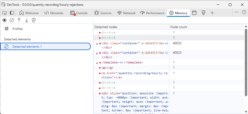
Here a screenshot of the detached DOM elements after a two navigations. The container divs are not garbage collected.
I tracked down the issue to come from the TelerikGrid, because when I remove it from the pages, everything runs fine. I also removed all GridColumns and the issue is still present. In the developer tools I noticed that one of the parent div elements remains in memory every time I navigate back and forth.
I also created a blank Blazor WebAssembly Standalone application and added a simple instance of the grid. Here, the issue is also present. I attach the one blazor page that causes the issue.
I've tested all major versions from 5.1 upwards, every version is affected.
It seems like Blazor on the server-side will be re-branded as Razor Components. Will Telerik support it?
The CSS classes used by Blazor UI are not documented. (I haven't looked outside the Blazor area, so maybe it's somewhere else in the docs? My team has no need for other Telerik products.) On a similar note, the Themes page in the documentation explains how to reference alternate themes like Bootstrap, but it doesn't explain how to actually use the classes, or how it integrates with the real Bootstrap CSS, which have many various useful, well-known utilities like margin and padding settings, which don't seem to be part of the Telerik theme support. (I'm an architect at a very large corporation, we do have one of those includes-everything DevCraft licenses, I just can't log in with that account.)
For the Grid, is is possible to have a a SortField along with Field (that displays the data) in columns.
The SortField will be used instead of Field when sorting (if Grid is Sortable), like in WebForms: https://docs.microsoft.com/en-us/dotnet/api/system.web.ui.webcontrols.gridview.sortexpression?view=netframework-4.8.
Maybe you want to sort data based on other values instead of what is displayed.
This could be especially useful for dates that have been formatted for display in Field
but you don't want to use for sorting because date and string sorting is not the same.
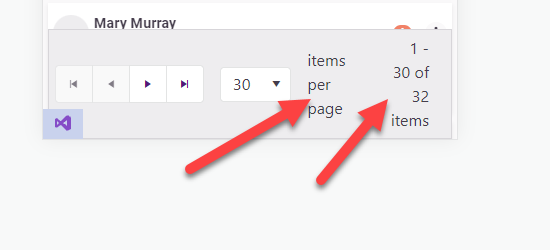
Allow "items per page" and "1 - X of Y items" on the pager configurable or even allow them to be hidden/removed.
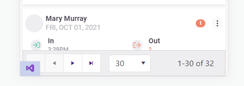
On mobile devices the telerik pager takes up too much room and needs to be more responsive. I'm already aware of this feature request: https://feedback.telerik.com/blazor/1442883-responsive-layout-for-the-pager
But I would like to take it a step further and be capable of customizing/removing the text.
Add the following Parameters to the TelerikPager:
[Parameter] public bool ShowItemsPerPageText { get; set; } = true;
[Parameter] public bool ShowXofYItemsText{ get; set; } = true;
<TelerikPager ShowItemsPerPageText="false" />
<TelerikPager ShowXofYItemsText="false" />
In my opinion this looks better
==============
ADMIN EDIT
==============
In the meantime, you can change the pager text through localization. It is important to keep the same number of placeholders, however, so that the string.Format() call it is used in will not throw.
This strings are behind the following keys:
- "items per page" - key: "Pager_ItemsPerPage"
- "1 - X of Y items" - key: "Pager_Display" . Default value is "{0} - {1} of {2} items".
The 300ms default transition time for popups is too long for our app, and I would like an option to set it globally. It looks great on demos, but turns the interface into a sludge for doing real work.
The original solution to https://feedback.telerik.com/blazor/1469662-way-to-modify-default-values-of-animations-such-as-duration-and-delay-for-a-component-such-as-combobox (from 2020) allowed a default animation speed through css.
However, with the new PopupSettings approach, animation speed is hard coded into the style attribute on the .k-popup, thwarting any attempts to override it globally. Adding PopupSettings to all components in our app is hardly a workable solution. The only workaround I've figured out so far is to disable animations on .k-popups alltogether (by adding a "transition: none" to .k-input)
Since upgrading from 3.8 to 4.4 (including all new css) created dialogs from DialogFactory are sometimes behind an already opened modal window.
The reason for this seems to be an incorrectly, automatically calculated z-index of 10003 when the open dialog has 10006.
This does not always happen, there are scenarios where the first created dialog works fine, and the next called in the same method suddenly is behind the dialog, thus the error seems to be in telerik and not our side.
We could not yet find a proper workaround apart from creating custom dialogs.
Telerik UI for Blazor requires unsafe-inline styles in order to render style attributes from the .NET runtime.
Please add support for strict CSS CSP without the need for unsafe inline styles.
===
TELERIK EDIT:
Due to the complexity and required effort to add strict CSS CSP support:
- The feature request must gather enough votes.
- We may implement it gradually. That's why, everyone who is interested, please specify the exact components and features that you need to be compliant sooner.
Hi,
Firstly, love what you're doing with your Blazor components. I'd like to be able to add custom style to your components. For example
<TelerikTextBox Style="margin-left: 20px" />
Now of course we should be using a class for this and I know your components have a Class parameter, however what I'd like to do is something like this
<TelerikTextBox Style="@CssHelper.Margin.Top(20)" />
where the style is generated at runtime. I'm experimenting with such an approach to apply all styles, however I can't do so with a lot of your controls. Having said that, I've noticed that your animation container does have something along these lines with its ParentInlineStyle parameter.
        <TelerikAnimationContainer @ref="@AnimationContainer"
                                   Top="-72px" Left="calc(100% - 280px)" Width="300px"
                                   AnimationType="AnimationType.SlideDown"
                                   Class="k-popup"
                                   ParentInlineStyle="@Style">
So just wondering if this is something you're looking at doing?
thanks
Michael.
I'd like to request a native Blazor Image Component that allows to provide different parameters to control the image.
This could also help to connect it to the upload component, for user to see the image while still in browser and make some changes, i.e resizing, cropping, Black/White, before sending it to server to be stored.
Thanks!
..Ben
I have an ENUM like this:
  public enum DeliveryMailOptions
        {
            Regular,
            [Display(Name ="FedEx Priority")]
            FedExPriority,
            [Display(Name ="FedEx Two-Day")]
            FedExTwoDay
        }
It is used in a data model like so:
[Display(Name = "Mail Option")]
public DeliveryMailOptions MailOption { get; set; }
When rendered, it ignores the Display attribute and only shows the enum text.


