The Telerik UI for Blazor TimePicker currently does not appear to expose an equivalent to the Kendo UI for jQuery TimePicker "focusTime" option.
https://github.com/telerik/kendo-ui-core/blob/master/docs/api/javascript/ui/timepicker.md#focustime-datedefault-null
In Kendo UI for jQuery, focusTime allows the popup to open with a specific time focused without actually setting the selected value. This is useful when the picker has no value yet.
For example, let's say we want the time-picker to open up with the placeholder value of 08:00, how would we achieve this in Telerik UI for Blazor? Currently it defaults the placeholder to the current time.
Thanks
Hello,
after playing with AI chat integration with telerikgrid, few bumps up shows:
lets have this scenario- request from aichat, to perform some filtering/operations on grid with clumn names like col1,col2,col3... generic.
        public async Task<GridAIResponse> GetGridAIData(GridAIRequestDescriptor request)
        {
            var options = new ChatOptions();
            var columnsx = JsonSerializer.Deserialize<List<GridAIColumn>>(JsonSerializer.Serialize(request.Columns));
              options.Tools = new List<AITool>();
               options.Tools.Clear();
     1)   //describe the columns or general behavior like "aprox, arround, near"
            var ff = ChatOptionsExtensions.GetFilter(columnsx);
            ForceSetDescription(ff, @"
If users enters phrases like 'aprox', 'arround', 'near',
operate with field value in between ±10 %.
Example: 'dimensions arround 1000'  results in: 'dimension >= 900 AND dimension<= 1100'.
");

            options.Tools.Add(ff);
options.Tools.Add(ChatOptionsExtensions.GetSort(columnsx));

ChatResponse completion = await _chatClient.GetResponseAsync(conversationMessages, options);
....
return completion.ExtractGridResponse();
}
how to extend "GridAIRequestDescriptor"?
1) - ability to describe column(add). but Description is readonly (coders should add titles or any text manually from column definition - be aware. grid IColumn is accessible only by reflection just now)
OR
2) - ability to specify the "meaninfgull name" (place, where coders can add this)
OR
3)- instead of using just "Fieldname" of the column, use/add the Title(which is more understandable for LLM)
OR
4) field mapping translation layer. GridColumn.Field -> something descriptive and back after fetching response from LLM
fieldnames are mostly "system DB name" and cannot be changed. So FieldName="Column44qty" and Title="qty available stock", you get the point which one tells you more.
new[]
{
new {
Field = "Column44qty",
Title = ""qty available stock",
Type = "number",
Description = "......",
Values = new[] { "x", "yyy", "zzz" }
},...
}
all points 1-4 are not needed, just one of them is ok.
Please consider adding a pluggable runtime localization provider for Telerik UI for Blazor, primarily targeting Blazor WebAssembly scenarios.
This request is not critical for ASP.NET MVC / Razor / Blazor Server, where IDisplayMetadataProvider already provides a valid extensibility point for custom localization. However, Blazor WebAssembly has no equivalent mechanism, which creates a significant limitation.
Problem (Specific to Blazor WebAssembly)
In Blazor WebAssembly:
DisplayAttributeis static and reflection‑based- It cannot use DI, async logic, tenant context, or database access
- MVC metadata extensions such as
IDisplayMetadataProviderare not available
As a result, Telerik components can only resolve UI text via:
DisplayAttribute.resxresources
This makes it impossible to integrate:
- Database‑driven localization
- Multi‑tenant localization
- User‑editable translations
- Runtime language switching
Why This Matters
In modern Blazor WebAssembly (SPA) applications, localization is often:
- Runtime‑resolved
- Backed by a database
- Tenant‑ and user‑aware
Other libraries already support this model through pluggable localization providers.
A good example is FluentValidation, which allows localization logic to be resolved at runtime via DI, including custom providers and non‑resource‑based implementations.
References:
- FluentValidation – Localization documentation:
https://docs.fluentvalidation.net/en/latest/localization.html - FluentValidation – Custom language manager / provider implementation:
https://github.com/FluentValidation/FluentValidation/blob/main/docs/localization.md
Because Telerik UI for Blazor does not expose a similar extensibility point, developers are forced to manually specify labels, headers, and enum texts throughout the UI, losing the benefits of automatic localization.
Suggested Direction
Introduce an optional localization provider that Telerik components can use when resolving UI text:
- Keep full backward compatibility with
DisplayAttribute - Enable advanced runtime‑based localization scenarios in Blazor WebAssembly where static attributes are insufficient
This would significantly improve Telerik UI’s suitability for enterprise and multi‑tenant Blazor WASM applications, without impacting existing server‑side solutions.
Description
When the dropdown is open, the input's aria-activedescendant attribute references an id that does not exist in the DOM. Since aria-activedescendant must point to the id of an actually rendered option element, the attribute is invalid and assistive technologies cannot determine which option is currently active.
Input renders:
aria-activedescendant="b45bcb14-4093-4de8-ad31-cae8ec8ca9c4"
Steps to Reproduce
- Add a TelerikMultiSelect using the standard Telerik example (source below).
- Open the dropdown and inspect the HTML or run a Lighthouse audit.
<TelerikMultiSelect Data="@Hobbies"
@bind-Value="@SelectedHobbyIds"
ValueField="@nameof(HobbiesDto.HobbyId)"
TextField="@nameof(HobbiesDto.HobbyName)"
Placeholder="Select your favourite sport..."
Id="multiselect"
Width="100%"
Rounded="@ThemeConstants.DropDownList.Rounded.Medium"
FillMode="@ThemeConstants.AutoComplete.FillMode.Outline"
TagMode="@MultiSelectTagMode.Single"
ShowClearButton="false">
    <MultiSelectSettings>
        <MultiSelectPopupSettings Height="@CustomThemeConstants.Multiselect.PopupHeight" MaxHeight="@CustomThemeConstants.Multiselect.PopupMaxHeight" />
    </MultiSelectSettings>
</TelerikMultiSelect>

@code {
    public List<int> SelectedHobbyIds { get; set; } = [];

    public IEnumerable<HobbiesDto> Hobbies { get; set; } = new List<HobbiesDto>()
    {
        new HobbiesDto(1, "Basketball"),
        new HobbiesDto(2, "Golf"),
        new HobbiesDto(3, "Baseball"),
        new HobbiesDto(4, "Table Tennis"),
        new HobbiesDto(5, "Volleyball"),
        new HobbiesDto(6, "Football"),
        new HobbiesDto(7, "Boxing"),
        new HobbiesDto(8, "Badminton"),
        new HobbiesDto(9, "Cycling"),
        new HobbiesDto(10, "Gymnastics"),
        new HobbiesDto(11, "Swimming"),
        new HobbiesDto(12, "Wrestling"),
        new HobbiesDto(13, "Snooker"),
        new HobbiesDto(14, "Skiing"),
        new HobbiesDto(15, "Handball"),
    };

    public class HobbiesDto
    {
        public int    HobbyId   { get; set; }
        public string HobbyName { get; set; } = string.Empty;

        public HobbiesDto() { }

        public HobbiesDto(int id, string name)
        {
            HobbyId = id;
            HobbyName = name;
        }
    }
}
Hello,
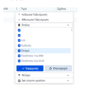
We want the grid column chooser to have a search bar for the user to search what column they need to add/remove to the grid.
We use many non-visible columns in our grid and allow the user to customize what they want to see via the column chooser.
However, since the user cannot search the available columns they have to scroll with their mouse through a large list to find what they want.
(Notice the scroll bar in the following screenshot)
Thank you
Magnifiable Image Component
A Blazor component designed to provide an interactive image magnification experience, similar to popular eCommerce websites.
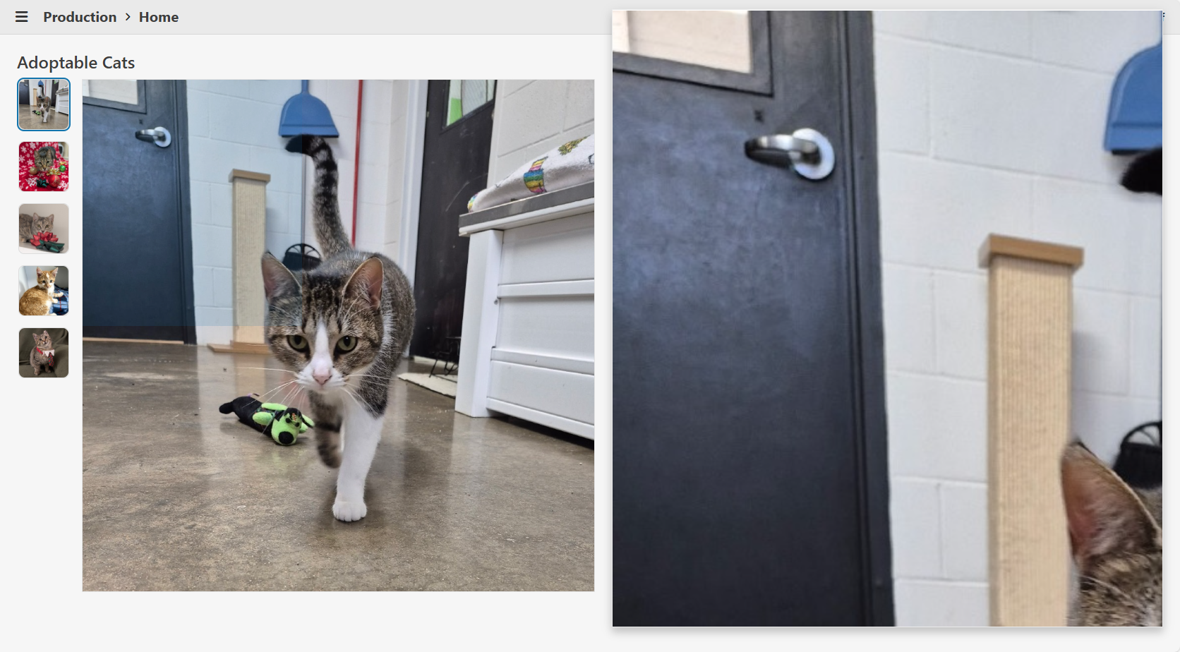
Features
- Interactive Magnifier: On mouse hover, a magnifier appears beside the image, following the cursor and displaying a zoomed-in portion of the image. At the same time an overlay appears on the image indicating the zoomed-in portion of the image.
- Screen Space Awareness: The magnifier dynamically stretches to fill the available space to the right or left of the image, ensuring optimal use of the viewport and consistent margins.
- Popover Integration: Utilizes Telerik's Popover for the magnifier, ensuring it appears above all other UI elements and avoids clipping or stacking issues.
- Configurable Magnification: The magnification scale is configurable via the
MagnifyScaleparameter. - Accessibility: The image is wrapped in a button for keyboard accessibility, and all images support alt text.
- Full-Size View: Clicking the image opens a modal window displaying the image at its actual size.
Sample Code
MagnifiableImage.razor
@inject IJSRuntime JS
@using Microsoft.JSInterop

@* Container *@
<div @ref="_containerRef" class="@($"magnifiable-image-container {Class}")" style="height: @Height;  width: @Width;">

    @* Image *@
    <button @onclick="@OnClick" class="magnifiable-image-button">
        <img src="@Image.Src" alt="@Image.Alt" style="height: 100%; width: 100%;"
             @onmousemove="@OnMouseMove" @onmouseenter="@OnMouseEnterAsync" @onmouseleave="@OnMouseLeave"/>
    </button>

    @* Magnifier *@
    <TelerikPopover @ref="_popoverRef" AnchorSelector=".magnifiable-image-container" Position="@(_showOnRight ? PopoverPosition.Right : PopoverPosition.Left)" Offset="@MagnifierMargin"
                    Width="@($"{_magnifierWidth}px")" Height="@($"{_magnifierHeight}px")" Class="popover-magnifier" Collision="PopoverCollision.Fit">
        <PopoverContent>

            @* Magnified Image *@
            <img src="@Image.Src" alt="@Image.Alt" class="magnified-image"
                 style="@($"width: {_magnifiedImageWidth}px; height: {_magnifiedImageHeight}px; transform: translateX({_magnifiedImageTransformX}px) translateY({_magnifiedImageTransformY}px); left: {_magnifiedImageLeft}px; top: {_magnifiedImageTop}px;")"/>

        </PopoverContent>
    </TelerikPopover>

    @* Magnifier Overlay *@
    @if (_isMouseOver)
    {
        <div class="magnifier-overlay"
             style="@($"width: {_magnifierOverlayWidth}px; height: {_magnifierOverlayHeight}px; transform: translateX({_magnifierOverlayTransformX}px) translateY({_magnifierOverlayTransformY}px);  left: {_magnifierOverlayLeft}px; top: {_magnifierOverlayTop}px;")))">
        </div>
    }

    @* Actual Image *@
    <TelerikWindow @bind-Visible="@_isClicked" Modal="true" CloseOnOverlayClick="true" Draggable="false" Resizable="false" Class="window-rounded">
        <WindowActions>
            <WindowAction Name="Close"/>
        </WindowActions>
        <WindowContent>
            <img src="@Image.Src" alt="@Image.Alt"/>
        </WindowContent>
    </TelerikWindow>

</div>

<style>
    .magnifiable-image-container {
        position: relative;
        display: inline-block;
        cursor: zoom-in;
    }

    .magnifiable-image-button {
        background: none;
        border: none;
        padding: 0;
        margin: 0;
        font: inherit;
        color: inherit;
        cursor: inherit !important;
        outline: none;
        box-shadow: none;
        appearance: none;
        -webkit-appearance: none;
        -moz-appearance: none;
        display: block;
        width: 100%;
        height: 100%;
    }
        .magnifiable-image-button:focus-visible {
            outline: none;
            box-shadow: 0 0 0 2px color-mix(in srgb, var(--kendo-color-on-app-surface, #424242) 50%, transparent);
        }

    .popover-magnifier {
        overflow: hidden;
        border-radius: 0;
        position: relative;
        top: @(_adjustForTelerikFit ? $"{(_showOnBottom ? "" : "-")}{MagnifierMargin/4}px" : $"{(_showOnBottom ? "" : "-")}{MagnifierMargin}px");
    }

    .magnified-image {
        position: absolute;
    }

    .magnifier-overlay {
        position: absolute;
        background: color-mix(in srgb, var(--kendo-color-primary, #1274AC) 15%, transparent);
        pointer-events: none;
        z-index: 5;
        box-sizing: border-box;
        display: block;
    }
</style>

@code
{
    [Parameter] public required ImageInfo Image { get; set; }

    /// <summary>
    /// The height of the image (e.g., "200px", "100%", or "auto"). Default is "auto".
    /// </summary>
    [Parameter]
    public string Height { get; set; } = "auto";

    /// <summary>
    /// The width of the image (e.g., "200px", "100%", or "auto"). Default is "auto".
    /// </summary>
    [Parameter]
    public string Width { get; set; } = "auto";

    /// <summary>
    /// The magnification scale for the magnifier. Default is 3 (3x magnification).
    /// </summary>
    [Parameter]
    public double MagnifyScale { get; set; } = 3;

    /// <summary>
    /// Applies additional CSS classes to the MagnifiableImage's root element for custom styling and visual modifications.
    /// </summary>
    [Parameter]
    public string Class { get; set; } = string.Empty;

    private const int MagnifierMargin = 24;

    // State for magnifier visibility and container reference
    private bool _isMouseOver;
    private bool _isClicked;
    private ElementReference _containerRef;
    private TelerikPopover? _popoverRef;

    // Image and magnified image dimensions
    private double _imageWidth;
    private double _imageHeight;
    private double _magnifiedImageWidth;
    private double _magnifiedImageHeight;

    // Magnifier position and size
    private bool _showOnRight = true;
    private bool _showOnBottom = true;
    private bool _adjustForTelerikFit;
    private double _magnifierWidth;
    private double _magnifierHeight;

    // Magnified image offset within the magnifier
    private double _magnifiedImageLeft;
    private double _magnifiedImageTop;

    // Mouse position clamping bounds
    private double _minMouseX;
    private double _minMouseY;
    private double _maxMouseX;
    private double _maxMouseY;

    // Mouse position and transform for magnified image
    private double _mouseX;
    private double _mouseY;
    private double _magnifiedImageTransformX;
    private double _magnifiedImageTransformY;

    // Magnifier overlay size and transform
    private double _magnifierOverlayWidth;
    private double _magnifierOverlayHeight;
    private double _magnifierOverlayLeft;
    private double _magnifierOverlayTop;
    private double _magnifierOverlayTransformX;
    private double _magnifierOverlayTransformY;

    private void OnClick()
    {
        _isClicked = true;
    }

    private async Task OnMouseEnterAsync()
    {
        _isMouseOver = true;
        _popoverRef?.Show();

        // Get layout info about the image container using getElementLayoutInfo from wwwroot/js/magnifiable-image.js
        var containerLayoutInfo = await JS.InvokeAsync<ElementLayoutInfo>("getElementLayoutInfo", _containerRef);

        // Store image size
        _imageWidth = containerLayoutInfo.Width;
        _imageHeight = containerLayoutInfo.Height;
        _magnifiedImageWidth = _imageWidth * MagnifyScale;
        _magnifiedImageHeight = _imageHeight * MagnifyScale;

        // Determine magnifier position based on available space
        _showOnRight = containerLayoutInfo.DistanceFromViewportRight >= containerLayoutInfo.DistanceFromViewportLeft;
        _adjustForTelerikFit = Math.Abs(containerLayoutInfo.DistanceFromViewportBottom - containerLayoutInfo.DistanceFromViewportTop) < 20;
        _showOnBottom = containerLayoutInfo.DistanceFromViewportBottom >= containerLayoutInfo.DistanceFromViewportTop;

        // Calculate magnifier size based on available space
        _magnifierWidth = _showOnRight
            ? containerLayoutInfo.DistanceFromViewportRight - MagnifierMargin*2
            : containerLayoutInfo.DistanceFromViewportLeft - MagnifierMargin*2;
        _magnifierHeight = containerLayoutInfo.ViewportHeight - MagnifierMargin*2;

        // Center the magnified image in the magnifier
        _magnifiedImageLeft = (_magnifierWidth / 2) - (_imageWidth / 2);
        _magnifiedImageTop = (_magnifierHeight / 2) - (_imageHeight / 2);

        // Calculate min and max mouse X/Y to prevent showing empty space in the magnifier
        _minMouseX = Math.Floor((_magnifierWidth / MagnifyScale) / 2);
        _minMouseY = Math.Floor((_magnifierHeight / MagnifyScale) / 2);
        _maxMouseX = Math.Ceiling(_imageWidth - ((_magnifierWidth / MagnifyScale) / 2));
        _maxMouseY = Math.Ceiling(_imageHeight - ((_magnifierHeight / MagnifyScale) / 2));

        // Calculate magnifier overlay size and position
        _magnifierOverlayWidth = Math.Floor(Math.Clamp(_magnifierWidth / MagnifyScale, 0, _imageWidth)) - 1;
        _magnifierOverlayHeight = Math.Floor(Math.Clamp(_magnifierHeight / MagnifyScale, 0, _imageHeight)) - 1;
        _magnifierOverlayLeft = -((_magnifierOverlayWidth / 2) + 1);
        _magnifierOverlayTop = -((_magnifierOverlayHeight / 2) + 1);
    }

    private void OnMouseLeave()
    {
        _isMouseOver = false;
        _popoverRef?.Hide();
    }

    private void OnMouseMove(MouseEventArgs e)
    {
        // Clamp mouse X/Y to prevent showing empty space in the magnifier
        if (_minMouseX > _maxMouseX) _mouseX = _imageWidth / 2;
        else _mouseX = Math.Clamp(e.OffsetX, _minMouseX, _maxMouseX);
        if (_minMouseY > _maxMouseY) _mouseY = _imageHeight / 2;
        else _mouseY = Math.Clamp(e.OffsetY, _minMouseY, _maxMouseY);

        // Calculate the transform for the magnified image
        _magnifiedImageTransformX = -Math.Round((_mouseX * MagnifyScale) - (_imageWidth / 2));
        _magnifiedImageTransformY = -Math.Round((_mouseY * MagnifyScale) - (_imageHeight / 2));

        // Calculate the transform for the magnifier overlay
        _magnifierOverlayTransformX = Math.Round(_mouseX);
        _magnifierOverlayTransformY = Math.Round(_mouseY);

        _popoverRef?.Refresh();
    }

    private record ElementLayoutInfo(
        double Width,
        double Height,
        double ViewportHeight,
        double DistanceFromViewportLeft, // distance from viewport's left edge to element's left edge
        double DistanceFromViewportRight, // distance from element's right edge to viewport's right edge
        double DistanceFromViewportTop, // distance from viewport's top edge to element's top edge
        double DistanceFromViewportBottom); // distance from element's bottom edge to viewport's bottom edge
}
magnifiable-image.js
// Returns width, height, and the space to the left and right of the element relative to the viewport
window.getElementLayoutInfo = (element) => {
    if (!element) return null;
    const elementRect = element.getBoundingClientRect();
    return {
        width: elementRect.width,
        height: elementRect.height,
        viewportHeight: window.innerHeight,
        distanceFromViewportLeft: elementRect.left, // distance from viewport's left edge to element's left edge
        distanceFromViewportRight: window.innerWidth - elementRect.right, // distance from element's right edge to viewport's right edge
        distanceFromViewportTop: elementRect.top, // distance from viewport's top edge to element's top edge
        distanceFromViewportBottom: window.innerHeight - elementRect.bottom // distance from element's bottom edge to viewport's bottom edge
    };
};
Note
Only tested in Blazor WebAssembly. The component may see performance issues in Blazor Server.
Please expose the popup collision settings of the Popup and Popover components to all other applicable components, such as:
- AutoComplete
- ColorPicker
- ComboBox
- DropDownList
- DatePicker
- DateRangePicker
- DateTimePicker
- MultiColumnComboBox
- MultiSelect
- TimePicker
- Tooltip
I realize we can build Blazor components to associate "label" to controls, but IMHO, this should come standard with any control tool set. Reasons:
1. Coding simplicity
2. Automatic theme inheritance
3. Flexibility in label positioning relative to the control (left, right, top, bottom)
Example:
<TelerikCheckBox Label="Is Chasssis" LabelPosition="left" @bind-Value="equipment.IsChassis"/>
I realize you folks put some effort into a "Floating Label", but my users have rejected this implementation because:
1. Having Text in a label as a means to identify the label makes them think a value is already provided (so they try to remove it or call for support).
2. When typing in the label and the appearance of the label identification appears above adds to their confusion as they are used to seeing validation errors appearing above a label.
Description
Affected components: those inheriting from TelerikInputBase (e.g., TelerikDatePicker). When an exception is thrown inside an async Task event handler for the OnChange, OnBlur, OnOpen, and ValueChanged events, the exception is completely and silently swallowed. The exception is not caught by ErrorBoundary.
Steps To Reproduce
- Use a standard ErrorBoundary in MainLayout.razor.
<ErrorBoundary>
    <ChildContent>
        @Body
    </ChildContent>
    <ErrorContent>
        <p class="error">An unhandled error has occurred.</p>
    </ErrorContent>
</ErrorBoundary>
- Declare a TelerikDatePicker and bind an async Task method to the ValueChanged or OnChange event.
<TelerikDatePicker Value="@DatePickerValue"
                   ValueChanged="@((DateTime inputDate) => OnDatePickerValueChanged(inputDate))">
</TelerikDatePicker>


<TelerikButton OnClick="@(() => throw new Exception("Exception from button"))">Click to test ErrorBoundary</TelerikButton>

@code {
    private DateTime DatePickerValue { get; set; } = DateTime.Today;

    private async Task OnDatePickerValueChanged(DateTime newValue)
    {
        throw new InvalidOperationException("This exception should be caught by the ErrorBoundary!");
    }
}
- Run the page and select a date in the DatePicker.
Actual Behavior
The exception thrown in the OnDatePickerValueChanged event handler is not caught by ErrorBoundary.
Expected Behavior
The exception thrown in the OnDatePickerValueChanged event handler is caught by ErrorBoundary.
Browser
All
Last working version of Telerik UI for Blazor (if regression)
No response
Description
Affected components: those inheriting from TelerikSelectBase (e.g., TelerikDropDownList, TelerikComboBox, TelerikMultiSelect, TelerikAutoComplete). When an exception is thrown inside an async Task event handler for the OnChange, OnBlur, OnOpen, and ValueChanged events, the exception is completely and silently swallowed. The exception is not caught by ErrorBoundary.
Related: #6333
Steps To Reproduce
Steps to Reproduce
- Use a standard ErrorBoundary in MainLayout.razor.
<ErrorBoundary>
    <ChildContent>
        @Body
    </ChildContent>
    <ErrorContent>
        <p class="error">An unhandled error has occurred.</p>
    </ErrorContent>
</ErrorBoundary>
- Declare a TelerikDropDownList and bind an async Task method to the ValueChanged or OnChange event.
<TelerikDropDownList
    Data="@DropDownData"
    ValueChanged="@( (int newValue) => OnDropDownValueChanged(newValue))"
    TextField="@nameof(TestItem.Name)"
    ValueField="@nameof(TestItem.Id)" />

<TelerikButton OnClick="@(() => throw new Exception("Exception from button"))">Click to test ErrorBoundary</TelerikButton>

@code {
    private int? SelectedDropDownValue;

    private List<TestItem> DropDownData = new()
    {
        new() { Id = 1, Name = "Select me to throw exception" },
    };

    private async Task OnDropDownValueChanged(int newValue)
    {
        throw new InvalidOperationException("This exception should be caught by the ErrorBoundary!");
    }

    public class TestItem
    {
        public int Id { get; set; }
        public string Name { get; set; } = string.Empty;
    }
}
- Run the page and select the item in the DropDownList's list.
Actual Behavior
The exception thrown in the OnDropDownValueChanged event handler is not caught by ErrorBoundary.
Expected Behavior
The exception thrown in the OnDropDownValueChanged event handler is caught by ErrorBoundary.
Browser
All
Last working version of Telerik UI for Blazor (if regression)
No response
Hi !
I tried using the combobox but, since my datasource is too big and I need grouping, therefore virtualization is not possible, I need to do the filtering on the server side, using the OnRead method to fetch my data based on what the user has entered in the input field. The problem is that the client side filtering is always active and I can't reproduce the same type of filtering I do server side on the client side and I lose some results. I think it would be really nice if we could specify to not filter client side or something like that, to give us more control.
Thank you very much !
Hello,
I would like to have the Polar chart available in Blazor.
Radar Chart are nice but the categorical axis are not usable when having directional data to display
Thank you
Thomas
Hi Team,
It might be a better user experience if the user does not have a valid license key to either:
a) make it clear that if the downloader does not have a license assigned the downloaded license key will not be valid
or
b) do not let anyone without a license assigned download the key file (that seems preferable & probably easier to implement)
Thank you!