

Hi,
I reported this last week but it got declined ?? Perhaps a picture will help
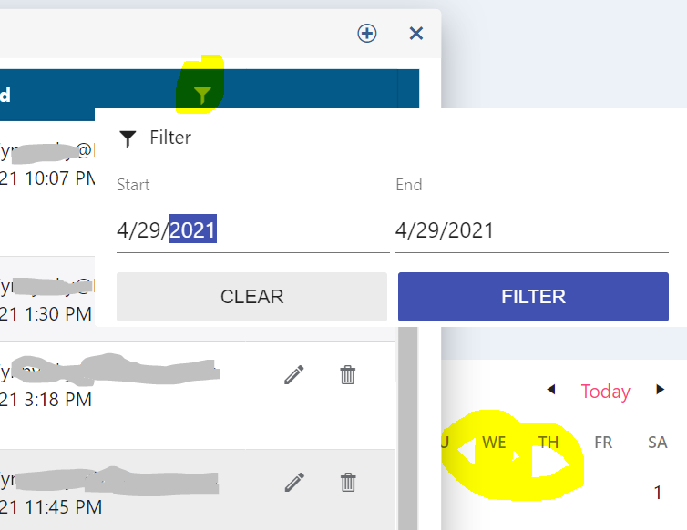
The default grid displays the filter icon OVER the text and this makes the text unreadable. This is just the material format from your websites themebuilder
The icon should be closer to the column width adjuster - as you can see from the attachment there is more space between the columns than there is text
I would expect it to be "| Description Y |" and not "| Desc... Y |" which is what its doing. (really the space between the filter icon and the column adjusted is just wasted and there seems to be no way to fix it)
I've tried to move the k-i-filter using CSS and while giving it a left margin of 32px is working ok and making it look reasonable, it still has the circle highlighter when you click it in the wrong place and I can't figure out how to move that also.
There doesn't seem to be a way to deselect the selected row either by clicking on a selected row again or by two-way-binding and setting it to an empty list.
This would be pretty handy as currently the only way that makes sense for me is to make no use of selection mode at all.
Hi,
I have a grid, it has quite a few columns - maybe 10-15, and this is causing 2 problems which are kind of related.
First problem is it tries to squash them all onto the screen making them all narrow and that hides the header text - I have played with horizontal scrollbar but so far I've only managed to resize them after it loads (or to workaround that I have tried save state after I've resized them with some success, but i'd really prefer the default starting point to be wider than the screen - if you have an example you can show me how to do this?)
Next problem is when I add a filter row to it - its basically unusable. Even though the columns are narrow, they look like they should be wide enough, but instead what happens is the filter button appears in the middle by itself and nothing else appears - sometimes I see " ___ Y " but most of the time its " Y ". It seems very poor use of space by default. This is the material theme.
Can you help? I did try with the filter menu but it is more complicated for our users and they prefer the idea of filterrow, plus it also crashes intermittently (see below for callstack).
Intermittent crash in filter menu - happens when user clicks the menu then clicks filter, before the filter menu is displayed.
Error: System.NullReferenceException: Object reference not set to an instance of an object.
at Telerik.Blazor.Components.Common.Filters.FilterList.TelerikFilterList.GetFilterOperators()
at Telerik.Blazor.Components.Common.Filters.FilterList.TelerikFilterList.InitFilterOperators()
at Telerik.Blazor.Components.Common.Filters.FilterList.TelerikFilterList.OnInitializedAsync()
at Microsoft.AspNetCore.Components.ComponentBase.RunInitAndSetParametersAsync()

---
ADMIN EDIT
The following should let the multiselect render above the custom yellow element, but it does not. A workaround is available as the second CSS snippet that you can uncomment.
<style>
    /*should work but does not*/
    .high-zindex {
        z-index: 124;/*note how this is higher than the z-index of the div element, and is higher than the default z-index of the component*/
    }

    /*workaround*/
    .k-animation-container {
        z-index: 15000;
    }
</style>

<div style="position: absolute; z-index: 123; width: 600px; height: 200px; background: yellow;">
    <TelerikMultiSelect Data="@Countries"
                        @bind-Value="@Values"
                        Placeholder="Enter Balkan country, e.g., Bulgaria"
                        ClearButton="true" AutoClose="false"
                        PopupClass="high-zindex">
    </TelerikMultiSelect>
</div>

@code {
    List<string> Countries { get; set; } = new List<string>();
    List<string> Values { get; set; } = new List<string>();

    protected override void OnInitialized()
    {
        Countries.Add("Albania");
        Countries.Add("Bosnia & Herzegovina");
        Countries.Add("Bulgaria");
        Countries.Add("Croatia");
        Countries.Add("Kosovo");
        Countries.Add("North Macedonia");
        Countries.Add("Montenegro");
        Countries.Add("Serbia");
        Countries.Add("Slovenia");

        base.OnInitialized();
    }
}
---

It would be really cool to be able to edit documents much like the WPF syntax editor.
Our use case is that we use blazor for our admin tools and we need to give a better look and feel (color coding) to some stored SQL and XML. Nothing fancy just a better experience.
I see a good solution for angular (PopupSettings.appendTo)
https://www.telerik.com/forums/datepicker-doesn%27t-open-in-ionic-modal#5117655
but blazor only has the PopupClass attribute to work with. Assigning that a class with a large z-index didn't help
I'm looking for what you have in WPF as we migrate ourselves over to Blazor - https://www.telerik.com/products/wpf/conversational-ui.aspx
---
ADMIN EDIT
For the time being, you can consider using the Kendo Chat widget as described in this sample project.
---
It would be helpful if I had a rating control similar to Rating - MudBlazor.
Further it would be helpful if the selected/unselected items could be different visually for colors and icons.
The attributes that the Telerik Input components, FormItem, and FormGroup should all be consistent in the attributes that are supported. For example, the TelerikSlider component doesn't support an Id property. The FormGroup component doesn't support a Class property.
If I place the Slider inside a FormItem Template and provide my own label. I can't associate the label with the Slider since there is no Id property.
Also, if I am using a FormGroup to make sure that two input controls are shown horizontally install of vertically, I can't override the gray horizontal rule that shows with the group, especially when I am not providing LabelText. I don't want to override this at the TelerikForm as I would like the default behavior in specific instances.
The attached screen shot highlights the issue. Here is the razor component markup. Note: Replace the custom RecSetSelector component with a dropdownlist.
@{
    var model = ViewModel.Model;
}

<TelerikForm EditContext="@EditContext"
             Columns="2"
             ColumnSpacing="20px"
             Orientation="FormOrientation.Vertical"
             OnValidSubmit="OnValidSubmit">
    <FormValidation>
        <FluentValidationValidator />
    </FormValidation>
    <FormItems>
        <FormGroup LabelText="Set options">
            <FormItem>
                <Template>
                    <label class="k-label k-form-label" for="setName">Set Name</label>
                    <TelerikTextBox Id="setName" @bind-Value="@model.SetName"></TelerikTextBox>
                </Template>
            </FormItem>
            <FormItem>
                <Template>
                    <TelerikDateRangePicker @bind-StartValue="@model.StartDate"
                                            @bind-EndValue="@model.EndDate"
                                            Min="@ViewModel.MinStartDate"
                                            StartId="startDate"
                                            EndId="endDate"
                                            DisabledDates="@ViewModel.DisabledDates">
                    </TelerikDateRangePicker>
                </Template>
            </FormItem>
            <FormGroup Columns="2">
                <FormItem>
                    <Template>
                        <label class="k-label k-form-label" for="allowAutoFill">Allow Auto Fill</label>
                        <TelerikCheckBox Id="allowAutoFill" @bind-Value="@model.AllowAutoFill"></TelerikCheckBox>
                    </Template>
                </FormItem>
                <FormItem Field="@nameof(model.RequiredRecsToExpire)">
                    <Template>
                        <label class="k-label k-form-label">Required Recs to Expire</label>
                        <TelerikSlider @bind-Value="@model.RequiredRecsToExpire"
                                       Min="0"
                                       Max="20"
                                       SmallStep="1"
                                       LargeStep="5"
                                       ShowButtons="false"/>
                    </Template>
                </FormItem>
            </FormGroup>
        </FormGroup>
        <FormGroup LabelText="Initial starting point">
            <FormItem LabelText="existingSets">
                <Template>
                    <label class="k-label k-form-label" for="existingSets">From existing recommendation sets:</label>
                    <RecSetSelector AvailableSets="@ViewModel.AvailableSets"
                                    IsNew="true"
                                    SelectedSetId="@ViewModel.SelectedSetId"
                                    OnSetSelected="@OnSetSelected" />
                </Template>
            </FormItem>
            <FormItem>
                <Template>
                    <label class="k-label k-form-label" for="eanList">From a list of EANs:</label>
                    <TelerikTextArea Id="eanList"
                                     @bind-Value="@ViewModel.EanList"
                                     AutoSize="true">
                    </TelerikTextArea>
                </Template>
            </FormItem>
        </FormGroup>
        <FormItem ColSpan="2" Field="@nameof(model.Comment)">
            <Template>
                <TelerikTextArea Id="comment"
                                 @bind-Value="@model.Comment"
                                 AutoSize="true">

                </TelerikTextArea>
            </Template>
        </FormItem>
        <ValidationSummary />
    </FormItems>
    <FormButtons>
        <div class="justify-content-end">
            <TelerikButton ButtonType="ButtonType.Button" OnClick="OnCancel">Cancel</TelerikButton>
            <TelerikButton ButtonType="ButtonType.Submit" Primary="true">Save</TelerikButton>
        </div>
    </FormButtons>
</TelerikForm>
Similar to how TelerikTextBox lets you set a label that moves above the control when filled, TelerikComboBox and TelerikMultiSelect also need this.
Currently you can set a label on TextBox but not some of the other editor controls.
Here is a screenshot comparing the textbox with the combo:

Here is the material UI demo for a combo with this feature:
https://material-ui.com/components/selects/

I wasn't sure if I should report this as a bug or not. With a modal window, you can tab beyond the modal window into the URL, and then continue on into the page behind the modal window itself. I was able to recreate this on the Modal demo, and fire a search, even though I couldn't click to get there. As I saw in another post that it is essentially a viewport modal (https://feedback.telerik.com/blazor/1510450-prevent-the-user-from-dragging-a-window-out-of-the-viewport), would it be possible to force modal to be system modal, as was available back in the ancient Winforms days?
---
ADMIN EDIT
That's how a web page behaves. Code in a web page cannot and should not prevent the user from using their OS. The browser chrome (address bar, buttons and so on) are part of the OS, and as such are beyond the sandbox of the web app. The web app is limited to the viewport, it cannot go out of it, or interact or control elements outside of it. Anything else would be a severe security issue.
A system-wide modal dialog is only possible though a native application, but not in a web application.
---
Hi,
In most of my projects I use the ObjectGraphDataAnnotationsValidator component for validating complex types; and I also use a lot of your components. I've noticed what I *think* might be a clash between this validator and some of your input components. I've built a simple (and crude) example but I think it demonstrates the problem.
In the example code we have a table with 2 cells - in both cells we have an EditForm and 10 TelerikTextArea components. The first cell's EditForm contains a ObjectGraphDataAnnotationsValidator instance and the 2nd cell doesn't. Hopefully when you try to reproduce you will notice a distinct difference in performance with the performance of the 2nd EditForm being great, while the 1st EditForm is quite laggy and gets worse the more items you add.
I'm wondering if there is a clash here between the ObjectGraphDataAnnotationsValidator and the input components or I'm using them incorrectly?
Thanks
Michael.
@page "/"

<table width="100%">
    <tr>
        <td width="50%">
            <h3>EditForm with ObjectGraphDataAnnotationsValidator</h3>
            <EditForm Model="Items">
                <ObjectGraphDataAnnotationsValidator />
                @foreach (var item in Items)
                {
                    <div style="display: flex">
                        <TelerikTextArea @bind-Value="item.TextValue" />

                        @if (Items.IndexOf(item) == (Items.Count - 1))
                        {
                            <TelerikButton OnClick="@(() => Items.Add(new DataItem()))">
                                Add
                            </TelerikButton>
                        }
                    </div>
                }
            </EditForm>
        </td>
        <td width="50%">
            <h3>EditForm without ObjectGraphDataAnnotationsValidator</h3>
            <EditForm Model="Items">
                @foreach (var item in Items)
                {
                    <div style="display: flex">
                        <TelerikTextArea @bind-Value="item.TextValue" />

                        @if (Items.IndexOf(item) == (Items.Count - 1))
                        {
                            <TelerikButton OnClick="@(() => Items.Add(new DataItem()))">
                                Add
                            </TelerikButton>
                        }
                    </div>
                }
            </EditForm>
        </td>
    </tr>
</table>

@code {
    protected List<DataItem> Items { get; set; }

    protected override void OnInitialized()
    {
        Items = new List<DataItem>();
        for (var i = 1; i <= 10; i++)
        {
            Items.Add(new DataItem { TextValue = $"This is item number {i}." });
        }
    }

    public class DataItem
    {
        public string TextValue { get; set; }
    }
}

Hello Team;
I'd would to see an Image & gallery Blazor component that is is data bound with the following effects:
https://ambient-image.wemakesites.net/?ref=madewithvuejs.com
This will allow us to create attractive apps related to imaging and marketing apps.
Thanks!
Hello team;
Let's say, depending on the user's authorization level, we just want to show the content of the Editor as "Read-Only" with no toolbar. So it will basically looks like an HTML rendered content to them to read.
Is it possible to do so with Editor or can we add a feature to hide the toolbar and make it read only?
If not, what's the best way and lightest way to show the content as read-only on different devices based medias query?
Thanks!

Can I use Translators or any other abstraction of Telerik component for my Selenium UI tests?
---
ADMIN EDIT
Even if Telerik does not provide some example translators to facilitate e2e testing with Selenium, you can build your own translators and abstractions to access the correct DOM elements. You can find some guidance in this forum thread: https://www.telerik.com/forums/xunit-selenium-tests.
---
.png)
Hello
I noticed the DateRangePicker "OnChange" fires "on blur".
Confirmed by the docs;
https://docs.telerik.com/blazor-ui/components/daterangepicker/events#onchange
Is it possible to expose OnInput even for a "react style" onchange event?
https://linguinecode.com/post/onblur-vs-onchange-react-text-inputs
I think the StartValueChanged and EndValueChanged events have the same behaviour so unbinding might not be a solution..?
Attached is a use case where it is confusing because the events are not in sync... You'll see the grid data changes (data bound), but OnChange after you click out.