In
<FilterMenuTemplate Context="context">
<TelerikCheckBoxListFilter Data="@NameOptions"
Field="@(nameof(NameFilterOption.Name))"
@bind-FilterDescriptor="@context.FilterDescriptor">
</TelerikCheckBoxListFilter>
</FilterMenuTemplate>
I would like to have a DisplayField or TextField so that i can show the user something meaningful, while still filtering based on IDs behind the scenes?
More details on the concept for custom data: https://docs.telerik.com/blazor-ui/components/grid/filter/checkboxlist#custom-data
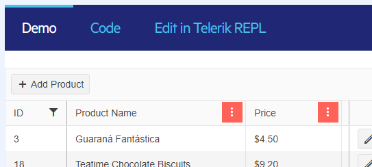
When a column is filtered, I'd like a better visual indicator of that fact.
The solid background to the menu button is not appealing, and it is applied whether a column is sorted or filtered.
The only full-featured Blazor DataGrid | Telerik UI for Blazor
I'd like a distinct indication of whether a column is filtered -- perhaps a filter icon next to the header text similar to how you might see an arrow when sorted.
---
I've attempted to create this myself using OnStateChangedHandler to iterate through the columns and call a Javascript function that finds the right column header and appends a filter icon. It kind of works sometimes, but I'm not sure I'll able to get it working consistently. Even so, it feel like a fragile hack that will probably break in a future update.
Ideally this would be an added feature, but in the meantime is there a way I can accomplish this myself?
I saw the FloatingActionButton Web control available in KendoUI and ASP.NET Core and I would like it in UI for Blazor: https://demos.telerik.com/kendo-ui/floatingactionbutton/index
QueryableExtensions.ToDataSourceResult throws IndexOutOfRangeException if a DataTable contains deleted rows.
using System.Data;
using Telerik.DataSource;
using Telerik.DataSource.Extensions;

var dt = GetData();

var res = dt.ToDataSourceResult(new DataSourceRequest());

DataTable GetData()
{
    DataTable table = new DataTable();

    // Make sure you specify the correct types
    // If you have any nulls in your (database) Column, you should use nullable type (int?, DateTime?,...)
    table.Columns.Add("ProductId", typeof(int));
    table.Columns.Add("ProductName", typeof(string));
    table.Columns.Add("UnitPrice", typeof(decimal));
    table.Columns.Add("UnitsInStock", typeof(short));

    // You should set default values to the columns that could be skipped in Create/Edit.
    // The alternative approach is to set the default values in the UpdateHandler and/or CreateHandler.

    // Having a default value in this case will prevent having DBNull values in your DataTable, because
    // DBNull is not parsable to any other primitive type and if you pass it to the grid, some of the operations could be broken
    table.Columns["ProductName"].DefaultValue = default(string);
    table.Columns["UnitPrice"].DefaultValue = default(decimal);
    table.Columns["UnitsInStock"].DefaultValue = default(short);

    for (int i = 1; i < 50; i++)
    {
        table.Rows.Add(i, $"Product{i}", i * 5.2, i * 2);
    }

    table.AcceptChanges();

    var lastRow = table.Rows[table.Rows.Count - 1];

    lastRow.Delete();

    return table;
}
Have been pouring through all your release videos, (Great Job Sam, Ed Et Al...) to be better informed as to what project type to select for a new Enterprise Admin App. The FilterView control stood out as a means of potentially saving me more than a week of work, but I just can't see making a new forms app going forward. Blazor and Maui seem like the only logical choices going forward, please add if convenient...
Thanks.
Hi,
is it possible to add control of vertical timeline like this (https://antblazor.com/en-US/components/timeline) with extra features like:
- adding new items with button on top
- inline edit
- item selection
- item actions
I also attached image of what i build based on control from link above, I would like to implement something similar with Telerik.
Maybe you can recommend some other controls to replace it with?
Thank you :)
I'd like to have an ExpansionPanel component where I can declare my desired panel instances and their content in the markup.
Similar to https://www.telerik.com/kendo-angular-ui/components/layout/expansionpanel/
.png)
Hello
Just seeing if it would be easy to separate the "StockChartNavigator" component that currently sits within the "TelerikStockChart" component.
So in other words, have a generic "ChartNavigator" component; the navigator is very good as a standalone and could be applied to many things such as grids, non-telerik charts (not only stock data) etc.
Alternatively, if there were a way to override the chart template of the TelerikStockChart, that would achieve the same result?
Cheers
Phil
Hello
The column group headers functionality is great, however it messes with the export to excel/csv, as the headers no longer align on the 1 row.
Just seeing if there was a way to export to csv/excel but ignore the column group headers? Maybe a feature on the <GridCsvExport ExportGroupHeaders=false /> option?
Or is there a way to turn off column group headers programmatically? Then this could be removed then readded on the events; OnBeforeExport, OnAfterExport
Cheers
Phil
Hi.
I'd like to request the ability to use a TimeSpanPicker component in Blazor.
For example, see https://www.telerik.com/maui-ui/timespanpicker
Thank you.
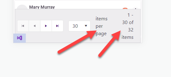
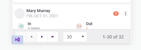
Allow "items per page" and "1 - X of Y items" on the pager configurable or even allow them to be hidden/removed.
On mobile devices the telerik pager takes up too much room and needs to be more responsive. I'm already aware of this feature request: https://feedback.telerik.com/blazor/1442883-responsive-layout-for-the-pager
But I would like to take it a step further and be capable of customizing/removing the text.
Add the following Parameters to the TelerikPager:
[Parameter] public bool ShowItemsPerPageText { get; set; } = true;
[Parameter] public bool ShowXofYItemsText{ get; set; } = true;
<TelerikPager ShowItemsPerPageText="false" />
<TelerikPager ShowXofYItemsText="false" />
In my opinion this looks better
==============
ADMIN EDIT
==============
In the meantime, you can change the pager text through localization. It is important to keep the same number of placeholders, however, so that the string.Format() call it is used in will not throw.
This strings are behind the following keys:
- "items per page" - key: "Pager_ItemsPerPage"
- "1 - X of Y items" - key: "Pager_Display" . Default value is "{0} - {1} of {2} items".
I'd like to bind a model with a different field name to the TelerikCheckBoxListFilter in the filter menu. Currently, this does not work because the Data has to have a member with the same name as the Field, which is used to update the filter descriptors.
Current Situation:
I have a single API for retrieving lookup values for the filters, that are always called on-demand (when the menu displays). This also supports cascading filter menus. If I want to supply the values back to filter menu I have to make specific code for each field on the model that I want to filter. For example, if I have a FlightNumber column it looks something like this...
public async Task<IEnumerable<object>> FilterValues_FlightNumberAsync() =>
(await Service.GetFilterValuesAsync(nameof(MyModel.FlightNumber), GetLastGridRequest()))
.Select(v => new { FlightNumber = v.Value });
The results of FilterValues_FlightNumberAsync() are then passed in via FilterData below (where @Field would be set to "FlightNumber")
<TelerikCheckBoxListFilter Data="@FilterData" Field="@Field" @bind-FilterDescriptor="Filters" />
This leads to a bunch of tedious code that should not be needed... A specific FilterValues_ function is needed for every column that needs to be filtered
What would be preferable:
Being able to use a single method to retrieve filter values. e.g.
public async Task<IEnumerable<object>> FilterValuesAsync(string memberName) =>await Service.GetFilterValuesAsync(memberName, GetLastGridRequest()); // returns something like LookupValue[] which is a generic LookupValue { Value =... } class
To not break backwards compat, maybe could have an optional DataField parameter...
<TelerikCheckBoxListFilter Data="@FilterData" DataField="Value" Field="@Field" @bind-FilterDescriptor="Filters" />
This would take in LookupValues and and produce FilterDescriptors with MemberName set to Field
Or maybe event better, use generics and allow a callback to extract the filter value...
<TelerikCheckBoxListFilter Data="@FilterData" GetFilterValue="GetFilterValue" Field="@Field" @bind-FilterDescriptor="Filters" />
where GetFilterValue is a Func<TData, string> for example.
===========
ADMIN EDIT
===========
We will most likely keep the Field parameter as is (pointing to the field from the Grid data that will be used to take the distinct options) and expose something like TextField parameter that will point to the field form the TelerikCheckBoxListFilter data containing the distinct options/labels.
Hi. Still in the trial phase, and I was curious about this.
I'm trying to develop two apps, one in ASP.NET Core and the other in Blazor WASM.
I found the ASP.NET Core Bottom Navigation which is perfect for the ASP.NET Core project. Shown here.
However, I'd like to be able to show continuity as users transition to the Blazor project and I don't see a BottomNavigation component listed for Blazor.
Is this something that can be added to the Blazor UI tools, or is there an example someplace I can use to get started?
Thanks in advance.