In TreeView the selected and checked items have to be provided as IEnumerable<object>. This can make things a bit of a pain if you have for example outside events that are also trying to change the list of checked items. Not insurmountable or hard but just a pain.
For example to remove an item since IEnumerable is immutable you to have to completely re-assign the collection. SelectedItems = SelectedItems.Where[Some condition] . Instead of SelectedItems.Remove, add etc.
I realize the reasons you are binding to IEnumerable<object> and not using generics
I propose adding "CheckedField" and "SelectedField" in your observable treeview binding and then we would not have to pass in Checked / Selected Items at all and just bind those fields to the Data we are passing in. Make life a lot easier.
The same thing likely applies to some other controls that have the same problem. So keep it consistent.
Unexpected scroll behaviour is seen after selecting an item in a DropDownList/Multiselect with a scroll mode set to virtualise. We are unable to easily scroll upwards using the scroll bar in the control or using a mouse/trackpad. The scroll position immediately snaps back to the selected item. Sometimes we are able 'escape' this by rapidly scrolling but this does not feel like intended behaviour.
Downward scrolling seems okay and using the keyboard arrow keys also seems unaffected. This is reproducible on the demo page: Blazor DropDownList - Virtualization - Telerik UI for Blazor and https://docs.telerik.com/blazor-ui/components/multiselect/virtualization.
Reproduction steps on Chrome:
- Navigate to demo page and render local example preview
- Select item "Name 27"
- try to scroll up with the arrow buttons on the scrollbar or the mouse wheel
Minimal reproducible example: Blazor MultiSelect - Virtualization - Telerik UI for Blazor
Hi Team,
I was implemeting the approach mentioned in the below URL in my Blazor .Net Project
https://github.com/telerik/blazor-ui/tree/master/common/pdf-jpg-export-js
But getting this error while execution, can someone please look into this or help me.
Error: Could not find 'telerikClientExporter.exportPDF' ('telerikclientexporter' was undefined).
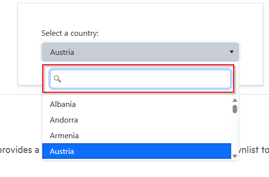
Please add the option for the Multiselect to filter the same way the DropDownList does. It's very odd & confusing for end users (and bad UX) in a UI toolkit for similar controls to do things in different ways. Can you please add the ability for the Multiselect control to filter items in the popup window the same way the DropDownList does with the nice filter text box.
https://demos.telerik.com/blazor-ui/form/templates
When you edit in Telerik Repl, you get a warning message:

What was weird though, is when I ran it from directly from the link in the documentation, I didn't get an error. I made one small change to the code (swapped line 54 and 55 (just seeing if I could change the rendering order, which I can) and then I saw this warning. But any change to the code generates the warning.
Peter
Are you thinking about developing an app builder for Blazor to create a project and add telerik component and finally export it as Blazor app (server or wasm)?
(like this one develop from Infragistics https://appbuilder.indigo.design/app/)
This tool export every single page as razor page.
BR,
Flavio
I would like to be able to set the aria-required or the required HTML attribute to the input components in the Telerik UI for Blazor suite. This is needed because currently, the screen readers do not notify the users of the application that an input is required.
Is there any scope to add a Blazor Ranged Bar/Column Chart component as seen in other products:
- Telerik Web Forms Range Column Chart - RadHtmlChart - Telerik UI for ASP.NET AJAX
- Demo of core features in jQuery Range Bar Charts widget | Kendo UI for jQuery (telerik.com)?
We attempted to work around this by adding an invisible stacked series underneath our dataset. However, without the Ability to customize the highlighted/hovered series item (telerik.com), we are not able to effectively hide the invisible series from the user. We will have to fall back into the jQuery Kendo UI components once again. Alternatively, are there any other known work arounds to achieve this in Blazor?
I'd like to use the adaptive rendering but I also need to keep AllowCustom feature.
===
ADMIN EDIT
===
This request applies to all components that support AllowCustom feature and adaptive rendering: for example, ComboBox, MultiColumnComboBox.
Right now, when calling the ToDataSourceResult extension method on IQueryable object, the DB is queried using the given filters for example from a DataSourceRequest object. However, if I want to apply complex queries based on those filters, this is not possible unless rewriting the existing extension method to return an IQueryable.
Proposal Example API
var dataSourceRequest = new DataSourceRequest();

DataSourceResultWithQuery dataSourceResultWithQuery = query.ToDataSourceResultWithQuery(dataSourceRequest);

public class DataSourceResultWithQuery : DataSourceResult
{
    [JsonIgnore]
    public IQueryable query { get; set; }
}
Is it possible for this to be added as an extension method? I am currently doing this using a custom class that parses the dataSourceRequest class and returning the IQueryable, but it would be nice if this was an included extension method.
Thank you.
Normally, when we develop we try to give a homogeneous behavior to our applications for the user.
This is a uncomfortable when the default behavior of our application does not match those of the Telerik controls because it becomes verbose and repetitive. I look at my code and constantly repeat configurations for the different controls.
For example, in 99% times I use:
<TelerikGrid EditMode="GridEditMode.Inline" />
or
<GridColumn ShowFilterCellButtons="false" TextAlign="ColumnTextAlign.Center" />
{
"TelerikGrid.EditMode": "GridEditMode.Inline",
"GridColumn.ShowFilterCellButtons": false,
"GridColumn.TextAlign": "ColumnTextAlign.Center"
}<GridCommandColumn Width="90px">
<div class="text-center">
<GridCommandButton Command="Edit" Icon="@SvgIcon.Pencil" />
<GridCommandButton Command="Delete" Icon="@SvgIcon.Trash" />
<GridCommandButton Command="Save" Icon="@SvgIcon.Save" ShowInEdit="true" />
<GridCommandButton Command="Cancel" Icon="@SvgIcon.Cancel" ShowInEdit="true" />
</div>
</GridCommandColumn>Changing "Delete" icon in the whole application seems trivial, but think that you could modify the default behavior homogeneously in the whole application or in part of it if the configuration file had a hierarchical behavior, changing one properpty in one place.
I think it would be a very useful functionality to give homogeneity to an application in a very effective way, without breaking changes and making a less verbose and repetitive code.
Thank you for reading me !
Hi,
When we use the TelerikDropDownList with a large amount of data (client side) in Blazor, the dropdown takes several seconds to open the popup. (*)
Even with the most simple version of the TelerikDropDownList component:
<TelerikDropDownList Data=@Logic.LuNacebelCodes
                    TextField="DisplayName"
                    ValueField="Id"
                    @bind-Value=@dto.Party.LuNacebelCodeId
                    Filterable="true" FilterOperator="@StringFilterOperator.Contains">
    <DropDownListSettings>
        <DropDownListPopupSettings Height="200px" />
    </DropDownListSettings>
</TelerikDropDownList>
But isn't it strange the same dropdownlist in Kendo for jQuery (AngularJS) with exactly the same dataset, doesn't react slow and opens on the fly..?
Is the DOM manipulation in Blazor that much slower then?
(*) We know Virtualization fixes this problem, but it has some limitations.
Thanks in advance.
Hi
I am trying to do very simple InCell editing of various columns string etc. In my model i have various Decimal? types fields. When i update the grid incell the
OnUpdate event fires but the property value is always null. Its like its not biding properly. Seems like you have had similar to this bug in previous versions. Seems like a very simple functionality that the grid should support.
Also it doesn't allow me to enter more than 1 digit after this also as if i type a decimal point it jsut clears it.
I have added a video showing this behaviour.
Please assist. This is the Grid code below.
@if (_stockOrderLinePOCO != null)
{
<TelerikGrid @ref="_stockOrderLineGrid"
Width="@AppStateService.ViewPortWidth"
Height="100%"
Data=@_stockOrderLinePOCO.Current
Sortable="@false"
FilterMode="@GridFilterMode.None"
Pageable="true"
Groupable="false"
PageSize="@AppSettings.Value.DataPageSize"
Resizable="true"
Reorderable="false"
EditMode="GridEditMode.Incell"
PageChanged="@StockOrderLineGridPageChangedHandler"
OnRowRender="@StockOrderLineGridRowRenderHandler"
OnUpdate="@StockOrderLineGridUpdateHandler" OnEdit="@StockOrderLineGridEditHandler" OnCancel="@StockOrderLineGridCancelHandler" OnDelete="@StockOrderLineGridDeleteHandler" OnStateInit="@((GridStateEventArgs<StockOrderLine> args) => OnStockOrderLineStateInitHandler(args))">
<GridColumns>
@{
foreach(PropertyInfo prop in (typeof(StockOrderLine)).GetProperties())
{
switch (prop.Name)
{
case "ID":
<GridColumn Field=@prop.Name Title=@Localizer["Line"] FieldType=@prop.GetType() Editable="false"> Width="1rem"</GridColumn>
break;
case "ProductID":
<GridColumn Field=@prop.Name Title=@Localizer["Product"] FieldType=@prop.GetType() Editable="true" Width="40rem">
<Template>
@{
CurrentlyEditedStockOrderLine = context as StockOrderLine;
@CurrentlyEditedStockOrderLine.ProductID @CurrentlyEditedStockOrderLine.ProductDescription
}
</Template>
<EditorTemplate>
@{
CurrentlyEditedStockOrderLine = context as StockOrderLine;
<div class="row">
<div class="col mr-0">
<TelerikComboBox @bind-Value="CurrentlyEditedStockOrderLine.ProductID" Data="@_priceListProducts" TextField="ProductID" ValueField="ProductID" FillMode=@ThemeConstants.DropDownList.FillMode.Outline Filterable="true">
<ItemTemplate Context="subContext">
@subContext.ProductID @subContext.Description_en_AU
</ItemTemplate>
</TelerikComboBox>
</div>
<div class="col ml-0">
<TelerikButton class="mb-0 ml-0" ButtonType="ButtonType.Button" Size="lg" FillMode="outline" Icon="search" @onclick="LookupItem">
</TelerikButton>
</div>
</div>
}
</EditorTemplate>
</GridColumn>
break;
case "ProductDescription":
<GridColumn Field=@prop.Name Title=@Localizer["Description"] FieldType=@prop.GetType() Editable="true"> </GridColumn>
break;
case "QuantityOrdered":
<GridColumn Field=@prop.Name Title=@Localizer["Qty"] FieldType=@prop.GetType() Editable="true"></GridColumn>
break;
case "SalePrice":
<GridColumn Field=@prop.Name Title=@Localizer["Price"] FieldType=@prop.GetType() Editable="true"></GridColumn>
break;
case "Value":
<GridColumn Field=@prop.Name Title=@Localizer["Amount"] FieldType=@prop.GetType() Editable="false"></GridColumn>
break;
default:
break;
}
}
<GridCommandColumn Width="4rem">
<GridCommandButton Command="Delete" Icon="delete"></GridCommandButton>
</GridCommandColumn>
}
</GridColumns>
</TelerikGrid>
}
Currently, the Splitbar of the TelerikSplitter is rather small.
It can be adjusted with CSS as shown here (https://blazorrepl.telerik.com/wnEfmyYp50ldIHsF13) but if the overall height of the page is large, the small arrow-icon that needs to be clicked in order to expand a collapsed SplitPane must be scrolled into view first.
It would be great to add alternative ways to expand a SplitPane, e.g. on a Double-Click on the Splitbar or maybe an additional Button.
In a cascading parent/child scenario (both DropDownLists), the args.Request.Skip property in the child's OnRead handler is not reset after rebinding the child data from the OnChange of the parent. This is a problem when the Skip is larger than the total amount of child items that are available from the back-end for the new parent. The api that is called in the OnRead handler returns nothing when for example the Skip still is 15 and there are only 10 items available.
I tried many things (in many different orders) to clear the child's state properly:
- set the model property which is bound to the child to it's default value
- called StateHasChanged()
- played around with Task.Delay
- set the child's value to it's default value
- set the child's Data property to null
- set the child's Data property to an empty list
- called child.Refresh()
- called child.Rebind()
- even tried to use reflection to reset the private proteced Skip property
Sort of a workaround:
In the OnRead handler after the api call compare the total item count with the skip and refetch with skip = 0 when skip > total item cound. This gives me the data I need but it is still shown at the old Skip position (with a buch of empty lines before that).
This bugreport (https://feedback.telerik.com/blazor/1558042-cascading-virtual-dropdownlist-does-not-reset-scrollbar) seems similar. In a response we are advised to clear the scrollbar position maually (which sounds a bit like the Skip position).
Please advise on how to reset the state manually because I don't see how. And if this is not possible, please add some functionality to do so. Perhaps something like the DataGrid's GetState, SetState methods?
Regards,
Harmen
Can you update the templates that come with Telerik Blazor?
For example, you are using an EditForm control instead of the telerik Blazor Form control.
There is an expression, eat your own dog food. I often spin up template projects to play with new features or tweak existing ones. Be nice take full advantage of current state of blazor components and provide samples that people can use as a learning tool or launching point.
Peter
Hello there,
I encountered an issue with the TelerikGrid component. This started to be an issue from version 4.1.0 and can be reproduced from here:
If this line from the example:
<GridColumn Field=@nameof(SampleData.Name) Title="Name" /><GridColumn Field=@nameof(SampleData.Name) Title="Name" Visible="@!isVisible">
<Template>
@((context as SampleData).Name)
</Template>
</GridColumn>you can see that once the template GridColumn is shown, its data overwrites the data of the "Hire Date" column when toggling the visibility of the columns. The header of the column is changing but the data stays the same.
To provide a visual context of the issue, I have attached a video.
Best regards,
Ivaylo
Hello,
is there a way to use the kendo-popup from https://www.telerik.com/kendo-angular-ui/components/popup/ in Telerik UI for Blazor? Is it a planned feature for the future?
Thank you,
Christian