### Bug report
When the Input() option of the Grid's pager is enabled, the page number buttons are displayed, too.
### Reproduction of the problem
1) Create a Grid and enable the Input() option of the pager.
2) The pager displays both the page number buttons and the page numeric input:

### Expected/desired behavior
When the numeric input is enabled, the page number buttons must not be displayed.
### Environment
* **Telerik UI for ASP.NET MVC version: 2025.2.702
### Bug report
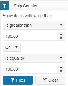
When filtering a specified Grid column, the filter expressions are inverted when the value of the first expression is empty/null.
### Reproduction of the problem
1) Filter a Grid column by leaving the first filter value empty:
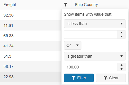
2) Filter the Grid and open again the filter menu. The filter expressions are inverted:
A Dojo sample for reproduction: https://dojo.telerik.com/CXChcTJT
### Expected/desired behavior
The filter menu expressions must remain the same.
### Environment
* **Kendo UI version: 2025.2.702
* **jQuery version: 3.7.0
* **Browser: [all]
Bug report
In a state persistence scenario, the Grid state is not properly restored when the "all" pageSizes option is selected.
Reproduction of the problem
- Run this dojo example: https://dojo.telerik.com/yGLYKKQz
- Select "all" in the Grid's pager dropdown and click the Save button above the component.
- Select a different page size option in the pager dropdown, e.g., 20.
- Click the Load button.
Current behavior
The Grid shows page 1 of the data and the currently selected page sizes option is shown (e.g., 20).
Expected/desired behavior
The Grid shows all the data and the pager dropdown shows "all" as the selected value.
Environment
- Kendo UI version: 2024.4.1112
- Browser: All
Bug Report
The SaveButton() method does not render the Cancel Command button in Grid's Toolbar Template
Reproduction of the issue
- Declare the Grid's Toolbar.Template() API configuration with an Action or Delegate
- Notice, that Grid's Toolbar does not explicitly add the Cancel Command button.
@(Html.Kendo().Grid<GridModel>()
    ...
   .Name("grid")
   .ToolBar(t =>
      {
          t.Template(@<text>
            <span class="group-buttons">
	         @item.SaveButton();
            </span>
          </text>);
  })
)
Current behaviour
The SaveButton() method does not render the Cancel Command in Grid's Toolbar Template.
Expected behavior
The SaveButton() method should render the Cancel Command in Grid's Toolbar Template.
Workaround
A possible way to circumvent this behavior would be to explicitly declare both the Save and Cancel buttons as independent Button components via the Toolbar.ClientTemplate() API configuration.
@(Html.Kendo().Grid<GridModel>()
	...
	.Name("grid")
        .ToolBar(t =>
	{
		t.ClientTemplate(Html.Kendo().Template()
				.AddHtml(@<text>
					<span class="group-buttons">
				</text>)
				.AddComponent(saveBtn => saveBtn
					.Button()
					.Name("saveBtn")
					.Icon("check")
					.HtmlAttributes(new { @class = "k-grid-save-changes", style="margin-right: 2%;" })
					.Content("Save Changes")
				)
				.AddComponent(cancelBtn => cancelBtn
					.Button()
					.Icon("cancel")
					.Name("cancelBtn")
					.HtmlAttributes(new { @class = "k-grid-cancel-changes" })
					.Content("Cancel Changes")
				)
				.AddHtml("</span>")
		);
	})
)
Is it possible to implement a MaxLength() option in the Filterable(f => f.Cell()) configuration that will set the maxlength attribute to the Filter row element in order to limit the length of the string that the user can enter into the Filter row input?
For example:
@(Html.Kendo().Grid(Model)
                   .Name("grid")
                   .Columns(columns =>
                   {
                       columns.Bound(x => x.Name).Filterable(ftb => ftb.Cell(c => c.MaxLength(5)));
                   })
                   ...
)
### Bug report
When the Grid is set up for InCell editing, and the column editor is the Upload widget, the user cannot select a file to upload when the Grid is navigatable.
The issue occurs in version >= 2024.1.130
### Reproduction of the problem
1. Create an InCell editable Grid and enable its "navigatable" option.
2. Set the Upload widget as a column editor.
3. Enter a specified cell in edit mode and try to select a file for upload.
4. The cell closes immediately.
A Dojo sample for reproduction: https://dojo.telerik.com/oDaNaLiQ
### Expected/desired behavior
The cell must remain focused when the Upload button is clicked.
### Workaround
Handle the "edit" event of the Grid, handle the "mousedown" event of the Upload button, and call stopImmediatePropagation():
            $("#grid").kendoGrid({
                editable: true,
              	navigatable: true,
                edit: function(e) {
                   if($(e.container).find("input[type='file']")) {
                   	$(".k-upload-button").on("mousedown", function (event) {
                          event.stopImmediatePropagation();
            		});
                   }
                }
                ...
            });
### Environment
* **Kendo UI version: 2024.1.130
* **jQuery version: 3.7.0
* **Browser: [all]
Bug report
Reproduction of the problem
- Go to https://demos.telerik.com/aspnet-mvc/grid/paste-from-excel
- Inspect the Grid toolbar
Current behavior
No dropdown is rendered.
Expected/desired behavior
A dropdown is rendered (see the same demo in Kendo UI for jQuery, or UI for ASP.NET Core)
Workaround - call the Grid's setOptions method on document.ready as shown below:
<script>
    $(document).ready(function() {
        //replace 'grid' with the actual Name value of your Grid:
        $("#grid").data("kendoGrid").setOptions({
            toolbar: ["paste"]
        })
    })
</script>
Environment
- Kendo UI version: 2024.2.514
- jQuery version: x.y
- Browser: [all]
Is it possible to add the ClientTemplateView() to load a partial view into the column template?
@(Html.Kendo().Grid <OrderViewModel>()
        .Name("grid")
        .Columns(columns =>
        {
            columns.Bound(p => p.ShipName).ClientTemplateView(Html.Partial("~/Views/Details/MyView.cshtml"));
            ...
        })
        ...
)
Bug report
The specific here is the disabled Sortable configuration. With Sortable enabled, the rendering on the header content is correct.
Similar issue: #6955
Reproduction of the problem
- Initialize a Grid without setting Sortable:
@(Html.Kendo().Grid<TelerikMvcApp1.Models.OrderViewModel>()
    .Name("grid")
    .Columns(columns =>
    {
        columns.Bound(p => p.OrderID).Filterable(false).Width(200);
        columns.Bound(p => p.Freight).Width(200);
        columns.Bound(p => p.OrderDate).Format("{0:MM/dd/yyyy}").Width(200);
        columns.Bound(p => p.ShipName).Width(200);
        columns.Bound(p => p.ShipCity).Width(200);
    })
    .Pageable()
    .Scrollable()
    .Filterable()
    .HtmlAttributes(new { style = "height:550px;" })
    .DataSource(dataSource => dataSource
        .Ajax()
        .PageSize(20)
        .Read(read => read.Action("Orders_Read", "Grid"))
    )
)
- Inspect the rendering of a column header
Current behavior
The column name is nested directly in the th element, instead of being wrapped in additional elements like in the Kendo UI for jQuery Grid or in the Grid for ASP.NET Core.
Expected/desired behavior
The column name should be wrapped in additional span elements with classes k-cell-inner, k-link, k-column-title:
<span class="k-cell-inner">
    <span class="k-link">
        <span class="k-column-title">Ship Name</span>
    </span>
    ... anchor element...
</span>
Environment
- Kendo UI version: 2024.2.514
- jQuery version: x.y
- Browser: [all]
### Bug report
When there is an initially hidden column in the Grid with multi-column headers, the hiding/showing of columns through the ColumnMenu does not work correctly.
### Reproduction of the problem
1) Hide a column in the Grid with the Hidden(true) option.
2) Hide a column through the Grid column menu.
3) The header of the column that is hidden is added to the previous visible column.
4) Show the same column through the column menu - it does not render back as expected.
The issue is caused by the a mismatch in the column group header rendering:
- Group header:
- aria-haspopup="dialog" is missing;
- data-title="{group name}" is missing;
- the title in the group header must be rendered as:
<span class="k-cell-inner"><span class="k-link"><span class="k-column-title">Product Information</span></span></span>- Header:
- aria-haspopup="menu" is missing;
### Environment
* **Telerik UI for ASP.NET MVC version 2024.2.514
Bug report
There are multiple differences in the theme files. In the theme file added by the NuGet browser-specific styles are missing and calc values differ. Likely the issue is due to autoprefixer and postcss-calc being used in the kendo-themes repo: https://github.com/telerik/kendo-themes/blob/develop/postcss.config.js
and not being used in theme compilation logic in the kendo repo:
https://github.com/telerik/kendo/blob/production/gulpfile.js#L55C38-L55C39
https://github.com/telerik/kendo/blob/master/build/gulp/sass.js
Reproduction of the problem
- In an ASP.NET MVC app install the Telerik.UI.for.AspNet.Mvc NuGet package.
- The NuGet package adds the kendo theme files to the MyApp\Content\kendo\2024.2.514
- Open the classic-silver.css file added by the NuGet package and compare it to the file hosted on the CDN: https://kendo.cdn.telerik.com/themes/8.0.1/classic/classic-silver.css
Current behavior
There are multiple differences similar to the exemplary ones posted below:
Example 1:
CDN line 33994:
.k-menu-vertical > .k-menu-item > .k-menu-link > .k-menu-expand-arrow {
    margin-inline-start: var(--kendo-spacing-2, 0.5rem);
    margin-inline-end: calc(var(--kendo-spacing-2, 0.5rem)*2*-1 + -16px - var(--kendo-spacing-2, 0.5rem)/2*-1);
}
NuGet:
.k-menu-vertical > .k-menu-item > .k-menu-link > .k-menu-expand-arrow {
    margin-inline-start: var(--kendo-spacing-2, 0.5rem);
    margin-inline-end: calc( -1 * (calc( var(--kendo-spacing-2, 0.5rem) * 2 + 16px) - var(--kendo-spacing-2, 0.5rem)/2));
}
Note the difference in the margin-inline-end value.
Example 2:
CDN line 36510:
.k-progressbar-vertical .k-progress-status {
    -ms-writing-mode: tb-lr;
        writing-mode: vertical-lr;
}
NuGet:
.k-progressbar-vertical .k-progress-status {
    writing-mode: vertical-lr;
}
Expected/desired behavior
The theme files distributed through CDN and NuGet should be identical.
Environment
- Kendo UI version: 2024.2.514
- jQuery version: x.y
- Browser: [all ]
Bug report
Reproduction of the problem
- Initialize a Grid with the following Filter and ColumnMenu configuration:
@(Html.Kendo().Grid<TelerikMvcApp1.Models.OrderViewModel>()
    .Name("grid")
    .Columns(columns => {
        columns.Bound(p => p.OrderID).Filterable(false).Width(100);
        columns.Bound(p => p.ShipCity).Width(100);
        columns.Bound(p => p.ShipCity).Width(150);
        columns.Bound(p => p.OrderDate).Format("{0:MM/dd/yyyy}").Width(140);
    })
    .Sortable()
    .Filterable(f => f.Extra(true)
        .Messages(message => message.Equals("Равно"))
        .Messages(message => message.Filter("Приложи"))
        .Messages(message => message.Clear("Изчисти"))
        .Messages(message => message.Info("Покажи записи които:"))
        .Messages(message => message.And("и"))
        .Messages(message => message.Or("или"))
        .Messages(message => message.AdditionalOperator("fdfdfd"))
        .Messages(message => message.IsFalse("Активни  "))
        .Messages(message => message.IsTrue("Неактивни   "))
    )
    .ColumnMenu()
    .DataSource(dataSource => dataSource
        .Ajax()
        .PageSize(20)
        .Model(model => model.Id(p => p.OrderID))
        .Read(read => read.Action("Orders_Read", "Grid"))
     )
)
Or use this REPL example: https://netcorerepl.telerik.com/QSYflePv05yaqnLZ07
The issue is also reproducible with the ColumnMenu set the following way:
.ColumnMenu(cm => cm
        .Messages(message => message.Columns("Колони"))
        .Messages(message => message.ColumnSettings("Насторйки"))
        .Messages(message => message.Filter("Филтър"))
        .Messages(message => message.SortAscending("Сортирай възходящ ред"))
        .Messages(message => message.SortDescending("Сортирай низходящ ред"))
    )
Current behavior
The filter menu messages are not set.

Expected/desired behavior
The filter menu messages are set regardless of whether a ColumnMenu is enabled or not.
Environment
- Kendo UI version: 2024.1.314
- jQuery version: x.y
- Browser: [all]
### Bug report
When the Grid uses an external DataSource, the aggregates are undefined within the ClientGroupFooterTemplate().
### Reproduction of the problem
Use the following REPL sample that demonstrates the issue:
https://netcorerepl.telerik.com/mIkyQnvB382bsiFt24
1. Group the Grid by the "Freight" column.
2. An error is thrown in the browser console: "Uncaught ReferenceError: sum is not defined".
3. The aggregates=["sum"] is missing in the column options in the Grid initialization script;
"columns":[{"title":"Order ID","field":"OrderID","filterable":false,"encoded":true},{"title":"Freight","groupFooterTemplate":"Sum: #=sum#","field":"Freight","filterable":{"messages":{"title":"Show items with value that"},"checkAll":false},"encoded":true},{"title":"Ship City","width":"150px","field":"ShipCity","filterable":{"messages":{"title":"Show items with value that"},"checkAll":false},"encoded":true}]When the DataSource is defined within the Grid configuration, the aggregate is displayed as expected.
### Expected/desired behavior
The "sum" aggregate must be displayed within the group footer template of the column when the Grid is grouped.
### Workaround
Define the DataSource in the Grid configuration or update the Grid settings by using the setOptions() method when the page is loaded:
<script>
    $(document).ready(function () {
        var grid = $("#grid").data("kendoGrid");
        if (grid) {
            let gridColumns = grid.columns;
            if (!gridColumns[1].aggregates) { // update [1] with the index of the column that has a group footer template. For example, "1" is the 2nd Grid column
                gridColumns[1].aggregates = ["sum"];
                grid.setOptions({ columns: gridColumns });
            }
        }
    });
</script>
### Environment
* **Telerik UI for ASP.NET Core/MVC: 2024.1.319
* **Browser: [all]
Bug report
A hidden template column that is not included in the ColumnMenu appears after showing another column
Reproduction of the problem
- Use the following declaration for the columns:
              .Columns(columns =>
              {
                  //Hidden template column
                  columns.Template(x =>
                  {
                      int rptIndex = Model.IndexOf(x);
                      string namePrefix = "Grid[" + rptIndex + "].";
                      Html.Hidden(namePrefix + "Id", x.Id, new { @readonly = "readonly" });
                      Html.Hidden(namePrefix + "Name", x.Name, new { @readonly = "readonly" });
                  }).Hidden().IncludeInMenu(false);

                  columns.Bound(x => x.Id).Width(120).Hidden(true);
                  columns.Bound(x => x.Name).Width(200);
                  columns.Bound(x => x.ReportingDateOriginal).Width(500).HtmlAttributes(new { id = "reporting-date-original" })
                    .Filterable(f => f.UI(GridFilterUIRole.DateTimePicker).Cell(c => c.Template("dateFilter")));
                  columns.Bound(x => x.Test1).Width(200).Hidden(true);
                  columns.Bound(x => x.TimezoneOffset).Width(200).HtmlAttributes(new { id = "reporting-date-offset" });
                  columns.Bound(x => x.Test2).Width(200).Hidden(true);
                  columns.Bound(x => x.ReportingDateAdjusted).Width(500).HtmlAttributes(new { id = "reporting-date-adjusted" })
                    .Filterable(f => f.UI(GridFilterUIRole.DateTimePicker).Cell(c => c.Template("dateFilter")));
                  columns.Bound(x => x.Test3).Width(200);
                  columns.Bound(x => x.Test4).Width(200).Hidden(true);
                  columns.Bound(x => x.Test5).Width(200);
              })
- Show the Id column
Current behavior
The first time instead of the Id, the template column appears.
Expected/desired behavior
The Id column should appear and the template column should remain hidden.
Environment
- Kendo UI version: 2024.1.130
- Browser: [all]
Bug report
Reproducible in MVC with a custom toolbar tool that has a ClientTemplate.
Reproduction of the problem
- Configure the Grid for incell editing and a custom command with a template to its toolbar configuration
@(Html.Kendo().Grid<TelerikMvcApp2.Models.OrderViewModel>()
    .Name("grid")
    .Columns(columns =>
    {
        columns.Bound(p => p.OrderID).Filterable(false);
        columns.Bound(p => p.Freight);
        columns.Bound(p => p.OrderDate).Format("{0:MM/dd/yyyy}");
        columns.Bound(p => p.ShipName);
        columns.Bound(p => p.ShipCity);
    })
    .ToolBar(toolbar =>
    {
        toolbar.Save();
        toolbar.Spacer();
        toolbar.Custom().ClientTemplate("<span>test</span>");
    })
    .Pageable()
    .Sortable()
    .Scrollable()
    .Filterable()
    .HtmlAttributes(new { style = "height:550px;" })
    .Editable(editable => editable.Mode(GridEditMode.InCell))
    .DataSource(dataSource => dataSource
        .Ajax()
        .PageSize(20)
        .Model(model => model.Id(p => p.OrderID))
        .Read(read => read.Action("Orders_Read", "Grid"))
        .Create("Orders_Create", "Grid")
        .Update("Orders_Update", "Grid")
    )
)
Current behavior
Duplication of the "Cancel" button.
Expected/desired behavior
A single "Cancel" button is rendered in the toolbar.
Environment
- Kendo UI version: 2024.1.130
- jQuery version: x.y
- Browser: [all]
Bug report
The rendering (structure and order of elements) of the th element of a column, for which a HeaderTemplate is set, does not match the Kendo UI Grid's rendering in a similar scenario. Prerequisites: HeaderTemplate, Sortable, Filterable enabled. For more context, see Ticket ID: 1639834.
Reproduction of the problem
Check the rendering of the header of the second column:
@(Html.Kendo().Grid<TelerikMvcApp1.Models.OrderViewModel>()
    .Name("grid2")
    .Columns(columns => {
        columns.Bound(p => p.OrderID).Filterable(false).Width(100);
        columns.Bound(p => p.Freight).HeaderTemplate("<span class='k-link'>My Template</span>");
        columns.Bound(p => p.OrderDate).Format("{0:MM/dd/yyyy}").Width(140);
        columns.Bound(p => p.ShipName);
        columns.Bound(p => p.ShipCity).Width(150);
    })
    .Sortable()
    .Filterable()
    .Pageable()
    .Scrollable()
    .HtmlAttributes(new { style = "height:430px;" })
    .DataSource(dataSource => dataSource
        .Ajax()
        .PageSize(20)
        .Read(read => read.Action("Orders_Read", "Grid"))
     )
)
Current behavior
The content of the th is the following:
<a aria-hidden="true" class="k-grid-filter-menu k-grid-header-menu">
    ...
</a>
<span class="k-link">
    ...
</span>
Expected/desired behavior
The th content should be rendered as follows:
<span class='k-cell-inner'>
    <span class='k-link'>
        ...
    </span>
    <a aria-hidden='true' class='k-grid-filter-menu k-grid-header-menu'>
        ...
    </a>
</span>
It should match the Kendo UI Grid's rendering: https://dojo.telerik.com/oTalIGir/8
Environment
- Kendo UI version: 2024.1.130
- jQuery version: x.y
- Browser: [all]
Bug report
The Grid cell does not enter edit mode on double tap on iOS in Chrome and Edge. Works correctly in Safari.
Reproduction of the problem
- Run this dojo example on iOS in Chrome or Edge: https://dojo.telerik.com/idOVAZiP/3
- Double tap a cell to edit its value
Current behavior
The cell does not enter edit mode.
Expected/desired behavior
The cell enters edit mode.
Environment
- Kendo UI version: 2023.3.1114
- jQuery version: x.y
- Browser: [iOS Chrome, iOS Edge]
Bug report
Regression introduced in R3 2023 SP1
If an initially hidden column is shown with the showColumn API method, the column header remains hidden because of the k-hidden class that remains in the th element.
Reproduction of the problem
- Click on the button above the Grid in the example below
<input type="button" name="btn1" value="Show the hidden columns" onclick="btn1Click()" />
<br />
<br />

@(Html.Kendo().Grid<TelerikMvcApp1.Models.OrderViewModel>()
    .Name("Grid")
    .Columns(columns =>
    {
        columns.Bound(p => p.OrderID);
        columns.Bound(p => p.Freight);
        columns.Bound(p => p.ShipName);
        columns.Bound(p => p.ShipCity).Hidden(true);
        columns.Bound(p => p.OrderDate).Format("{0:MM/dd/yyyy}").Hidden(true);
    })
    .DataSource(dataSource => dataSource
        .Ajax()
        .PageSize(20)
        .Read(read => read.Action("Orders_Read", "Grid"))
    )
)

<script>
    function btn1Click() {
        var grid = $("#Grid").data("kendoGrid");

        grid.showColumn("ShipCity");
        grid.showColumn("OrderDate");
    }
</script>
Current behavior
The hidden columns are shown but their headers remain hidden.
As a workaround, the k-hidden class can be removed from the column header, after showing the column:
grid.showColumn("ShipCity");
$(".k-grid .k-header[data-field='ShipCity']").removeClass("k-hidden");
Expected/desired behavior
The columns and their headers are shown.
Environment
- Kendo UI version: 2023.3.1114
- jQuery version: x.y
- Browser: [all ]
.jpg)
Bug report
The ClientGroupFooterTemplate and ClientFooterTemplate configuration lead to an invalid template error when strict CSP mode is enabled. There are no corresponding methods that accept a TemplateHandler.
Reproduction of the problem
@(Html.Kendo().Grid<TelerikMvcApp3.Models.OrderViewModel>()
    .Name("grid")
    .Columns(columns =>
    {
        columns.Bound(p => p.OrderID).Filterable(false);
        columns.Bound(p => p.Freight);
        columns.Bound(p => p.OrderDate).Format("{0:MM/dd/yyyy}");
        columns.Bound(p => p.ShipName);
        columns.Bound(p => p.ShipCity).ClientGroupFooterTemplate("Total:").ClientFooterTemplate("Team Total");
    })
    .Groupable()
    .Pageable()
    .Sortable()
    .Scrollable()
    .Filterable()
    .HtmlAttributes(new { style = "height:550px;" })
    .DataSource(dataSource => dataSource
        .Ajax()
        .PageSize(20)
        .Read(read => read.Action("Orders_Read", "Home"))
    )
)


@(Html.Kendo().DeferredScriptFile())
Current behavior
JS exceptions on initializing the Grid and on attempting to group it by ShipCity.
Expected/desired behavior
CSP compatible templates.
Environment
- Kendo UI version: 2023.3.1114
- jQuery version: x.y
- Browser: [all]