Bug report
Regression introduced in R1 2022.
Reproduction of the problem
Reproducible in the demo: https://demos.telerik.com/aspnet-mvc/grid/search-panel
Current behavior
There is a difference in the rendering of the search panel.
MVC:
<span class="k-textbox k-grid-search k-display-flex">
    <input autocomplete="off" class="k-input" placeholder="Search..." title="Search..." type="text">
    <span class="k-input-icon">
       <span class="k-icon k-i-search"></span>
    </span>
</span>
Kendo UI for jQuery and Core:
<span class="k-searchbox k-input k-input-md k-rounded-md k-input-solid k-grid-search">
    <span class="k-input-icon k-icon k-i-search"></span>
    <input autocomplete="off" placeholder="Search..." title="Search..." class="k-input-inner">
</span>
As a result, in MVC the search panel's magnifying glass is displayed outside the input.
Additionally, the search panel's appearance in Kendo UI for jQuery and Core is different than the one in the previous versions. In R3 2021, the input is positioned on the left hand side of the Grid's toolbar and the magnifying glass appears at the right end of the input. In R2 2022, the input is positioned on the right side of the toolbar and the magnifying glass is displayed at the beginning of the input.
R3 2021 dojo
R1 2022 dojo
Expected/desired behavior
Positioning of the input within the toolbar and the magnifying glass icon within the input, to be as in R3 2021.
Environment
- Kendo UI version: 2022.1.119
- jQuery version: x.y
- Browser: [all]
Bug report
A regression introduced in R1 2022.
Reproduction of the problem
Reproducible with the RadioButton and RadioButtonFor helpers.
@Html.Kendo().RadioButton().Name("HealthA1").Label("Yes").Value(true).HtmlAttributes(new { id = "HealthA1_True" })
@Html.Kendo().RadioButton().Name("HealthA1").Label("No").Value(false).HtmlAttributes(new { id = "HealthA1_False" })
Current behavior
The rendering is broken: no label element is rendered, the Kendo classes are not applied to the input.
Expected/desired behavior
The RadioButton renders properly.
Environment
- Kendo UI version: 2022.1.301
- jQuery version: x.y
- Browser: [all]
Using the MVC wrappers to style checkboxes and assign bindings works well except for the visible binding. the style is applied to the hidden input rather than the created styled label.
I'm using the ClientTemplate-Feature to render buttons for CRUD-actions in grids. For one entity I have to use a TreeList instead of a Grid due to parent-child relations. It would be great if I could use the same templates I use for the grid for the treelist as well.
Example:
columns.Bound(x => x.UserName)
        .ClientTemplate("<a href='" + Url.Admin().Account() + "/#= Id#/edit'>#= UserName #</a>")
        .Width(300);
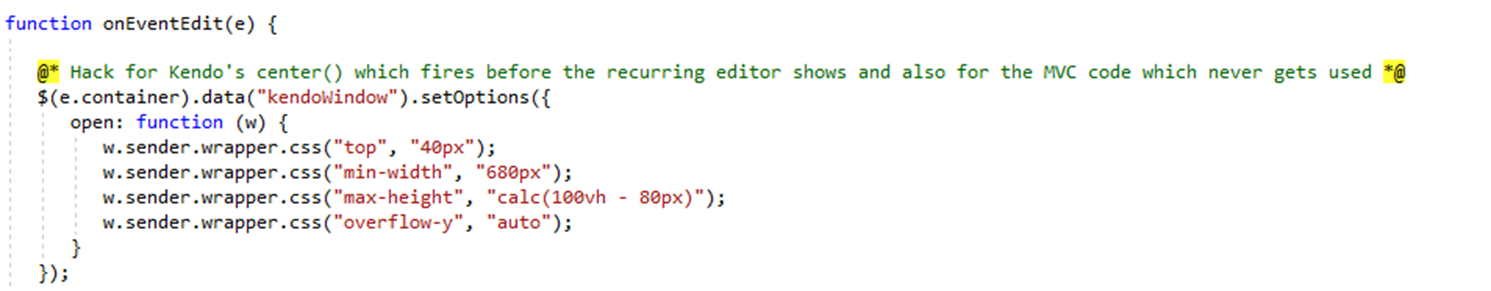
Please note the following MVC code:

Bug 1: The Window should have the top set by the Top() method. It does not.
Bug 2: The Window should have the top set by the HtmlAttributes() method. That does not work either.
Bug 3: The scrollable method also does nothing to the window. So this entire line seems to be omitted.
Bug 4: The window is supposed to be centered by the Kendo native code. It isn’t. The recurring editor div element is not shown until after the window centers. So the window generates, centers on the screen, then the recurring DIV is shown which expands the window downwards, then the window is shown. This makes it go off the bottom of the screen. I didn’t need vertical center anyways so I fixed this by setting the top to 40px. Which is when I ran into the above issues. However if I was not doing this, the center() issue would still be there. I fixed this in JavaScript on the event’s edit event.
Bug report
Reproduction of the problem
Inspect the Grid in the MVC demos.
Current behavior
The Grid renders the k-widget class.
Expected/desired behavior
The rendering must be consistent with jQuery and Core and the k-widget class should not be rendered. The issue is specifically in the MVC Grid. The Kendo UI for jQuery and the Core Grid no longer render this class.
Environment
- Kendo UI version: 2023.1.314
- jQuery version: x.y
- Browser: [all]
My web page displays grids on multiple pages, and each grid has a pager with a page size control.
In recent updates the styling broke in all but one page.
In the case where I was creating the grid using Kendo UI for JQuery, it worked fine.
In the instances when I create it using MVC, there are styling errors. (See in the image how the number "10" is truncated.)
After much drilling into the HTML, I found the difference in how the Razor library creates the HTML elements, as opposed to how the JQuery creates the HTML elements.
JQuery generates the following element structure. Note that the k-pager-sizes element comes after the k-pager-numbers-wrap element
<div class="k-pager k-grid-pager k-pager-md"> <!-- The pager bar -->
     <div class="k-pager-numbers-wrap">
             <!-- ... -->
     </div>
     <span class="k-pager-sizes k-label">
            <!-- The page-size picker goes here -->
     </span>
</div>
In contrast, the Kendo Razor libraries generates the following element structure, where the k-pager-sizes element falls inside the k-pager-numbers-wrap element:
<div class="k-pager k-grid-pager k-pager-md"> <!-- The pager bar -->
     <div class="k-pager-numbers-wrap">
             <!-- ... -->
            <span class="k-pager-sizes k-label">
                  <!-- The page-size picker goes here -->
             </span>
     </div>

</div>
This breaks the styling. (I am using the bootstrap kendo theme) There is styling rule that imposes a minimum width on all buttons under .k-pager-numbers-wrap. This makes the drop-down arrow too wide, which causes the page size number to truncate.
    @each $size, $size-props in $kendo-pager-sizes {
        $_padding-x: k-map-get($size-props, padding-x);
        $_padding-y: k-map-get($size-props, padding-y);
        $_item-group-spacing: k-map-get($size-props, item-group-spacing);
        $_item-min-width: k-map-get($size-props, item-min-width);
        $_pager-dropdown-width: k-map-get($size-props, pager-dropdown-width);

        .k-pager-#{$size} {
            padding-inline: $_padding-x;
            padding-block: $_padding-y;
            gap: $_item-group-spacing;

            .k-pager-numbers-wrap {
                .k-button {
                    min-width: $_item-min-width;
                }
My current hack workaround is to add a more specific CSS rule.
@import "@progress/kendo-theme-bootstrap/dist/all.scss";

.k-pager-md .k-pager-numbers-wrap .k-dropdownlist .k-button {
	min-width:inherit;
}
In a Selectable grid, when only one column is shown in the grid, and the model's Id field is specified, an error occurs on selection.
If you include more than one column (must be more than one visible) it works correctly.
If the model's Id is not specified, it works correctly even with only one column visible.
@(Html.Kendo().Grid<TelerikMvcApp1.Models.OrderViewModel>()
    .Name("grid1")
    .Columns(columns => {
        columns.Bound(p => p.ShipName);
        columns.Bound(p => p.ShipCity).Hidden(true);
    })
    .Pageable()
    .Sortable()
    .Scrollable()
    .Filterable()
    .Selectable(s => s.Mode(GridSelectionMode.Single))
    .HtmlAttributes(new { style = "height:430px;" })
    .DataSource(dataSource => dataSource
        .Ajax()
        .PageSize(20)
        .Read(read => read.Action("Orders_Read", "Grid"))
        .Model(m => m.Id("OrderID"))
     )
)