Bug report
The Scheduler is not rendered correctly when the Custom Toolbar is declared with a Template component
Reproduction of the problem
Open the following demo and notice that the Scheduler has not been rendered accordingly.
Current behavior
The Scheduler is not rendered accordingly.
Expected/desired behavior
The Scheduler should be rendered accordingly.
The issue is a regression starting with 2024.3.1015
Environment
- Kendo UI version: 2024.3.1015
- Browser: [all ]
Bug report
Reproduction of the problem
- Run this dojo example: https://dojo.telerik.com/EpOWEPoz/3
Current behavior
The Test1 event is rendered too short (compare it to the other 2 events). This happens only with certain majorTick values, e.g., 660 or 600.
Expected/desired behavior
Correct event rendering
Environment
- Kendo UI version: 2024.2.514
- jQuery version: x.y
- Browser: [all]
Hi Team,
I have a request for any of the Telerik controls, but specifically it would be helpful with the Kendo UI Scheduler.
I would like to ask for a specific functionality where all the developer would need to do is drop a simple HTML tag related to a control into a page, and a tag from a service(can be third party) which would generate the content for the control.
For the Kendo UI Scheduler, this would help with modifying a current view without having to code anything for the un-editable service.
Thank you!
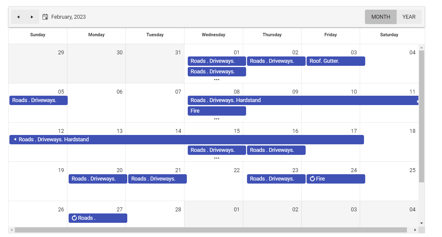
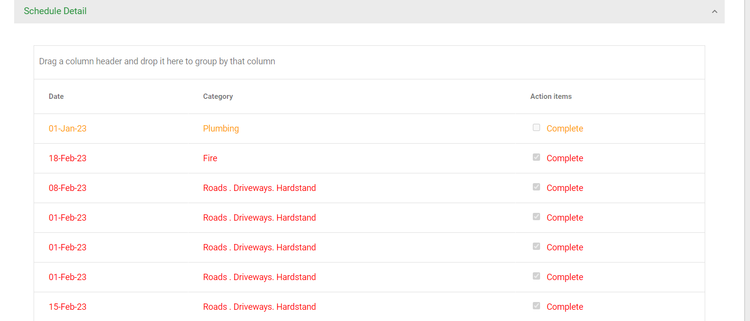
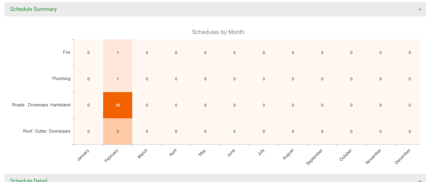
It would be nice to have a default option to display all Scheduler events in a heatmap and grid:
1. Events:
2. Grid format (repeatable events should be added multiple times):
3. Heatmap format:
Hello,
I have a Scheduler Hierarchical Grouping similar as https://demos.telerik.com/aspnet-mvc/scheduler/resources-grouping-hierarchical
rather than meeting room in the above sample, I have department name instead. I group a list of user names by department name on a scheduler timeline view.
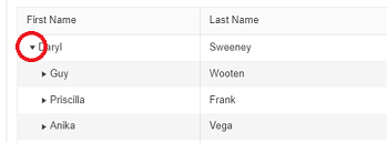
Is it possible to have a expand/collapse icon to allow me expand/collapse on each department? similar as tree list below
Please advise. Thanks!
Bug report
Regression introduced in R1 2022 SP1.
Reproduction of the problem
Dojo example: https://dojo.telerik.com/akaJaXin/4
- Scroll down the Scheduler and add a new event.
- Double-click the newly added event and after the editor shows up, click on the "Cancel" or on the "Delete" button.
Current behavior
The popup closes and the Scheduler automatically scrolls to the top of the view.
Expected/desired behavior
The scroll position should remain. The current behavior is not user friendly, because if the user has multiple events with similar start times to remove, they will have to scroll back down every time they delete an event.
Environment
- Kendo UI version: 2022.2.621
- jQuery version: x.y
- Browser: [all]
If you open the Scheduler's event popup by clicking on a slot (.Selectable(true)) and then press the "c" keyboard key, the slot's time and resource are not taken into account. A default "12AM" time value is set to the Start and End fields, and no resource is selected: https://dojo.telerik.com/OXusoMON
It would be better if the event data is set properly based on the currently selected slot, similarly to the way it works when you open the event popup by double-clicking a slot.
Add an option to use an EventTemplate, when the Mobile is enabled in the Scheduler:
.Mobile(MobileMode.Auto)
and the Scheduler is viewed on a mobile device. Currently, the month view does not use the template and always displays the events as small circles.
Hi Team,
I'd like to request the functionality to be able to use strongly-typed editors for the TreeList's editor.
Thank you!
Bug report
Reproduction of the problem
Dojo: https://dojo.telerik.com/InusevuW/2
- Click the resize handle on the right side of the the event and resize it so that it ends on June 10 at 9:00 AM.
- Try to move the event so that it ends 1h later (e.g. at 10:00 AM) but don't drop it.
Current behavior
The event snaps to the last slot of June 10.
Resizing the event (1) then moving it to start 1h earlier (3PM) doesn't work either. Dropping the event at 3PM makes it appear incorrectly.
Expected/desired behavior
The slots the event spans over should be properly calculated and on moving the event it should snap to the hovered slots.
Environment
- Kendo UI version: 2021.2.511
- jQuery version: x.y
- Browser: [all ]
Hello,
We're interested in the possibility of exporting the Scheduler views in an Excel format.
I've read the forums post and if I understood correctly, this was not possible, at least in 2017 when the last reply was added. (Export to Excel in UI for ASP.NET MVC Scheduler - Telerik Forums). I also couldn't find a similar post about the feature existing.
Was there any step made in that direction, because I saw there were few posts requesting this and on one of them, one of your colleagues wrote that there are plans of introducing this feature.
Or if there's any workaround to export any scheduler view in an Excel format, I'll be happy to hear about it.
Thanks and have a nice day!
Bug report
Regression introduced in R1 2020. Reproducible with the SASS themes, but the Kendo UI script version has effect on the behavior. For example, the behavior is not reproducible if the latest (2020.1.406) SASS theme is used along with an older (2019.2.1023) version of the kendo.all.min.js file.
Reproduction of the problem
Dojo example.
- The behavior is exhibited when an event ends at the same time another event starts, as it is demonstrated in the dojo where "Interview" ends and "Meeting" starts at the same time - 06:15.
Current behavior
"Meeting" is displayed below and to the right of "Interview", similarly to how events are displayed when their time spans overlap.
Expected/desired behavior
"Meeting" should be displayed below "Interview".
Environment
- Kendo UI version: 2020.1.406
- jQuery version: x.y
- Browser: [all]
Bug report
When using MVVM generated DropDownList input decorated with required attribute the validation message is not displayed upon validation.
Reproduction of the problem
- Run this dojo
- Click on a slot to create an event
- Select an item from the second DropDownList
- Click Save
Current behavior
Upon clicking Save the validation fails, as the first input has a required attribute, but a validation message is not displayed.
Expected/desired behavior
On failed validation, a validation message should be displayed.
Environment
- Kendo UI version: 2020.1.406
- Browser: [all]
Currently the scheduler widget determines the layout based on device type. Unfortunately this does not provide a fully responsive design. Modern day responsive websites should look good on any sized screen regardless of device type. There is also the issue that with new devices constantly coming out the list of devices being checked may become out of date quite quickly. Another consideration I have when I design an app is that one may not be viewing something full screen on a laptop or desktop computer. If this is the case then a page can look horrible due to the fact that an assumption is made on screen size because it is a windows device. I've also seen laptops with screens as small if not smaller than some tablets which also effects the screen size assumption.
Being web developer for a very long time I understand the complexities that would be involved in this change so I'd also like to provide an interim solution that may (but may not be) easier to attain. In working with your scheduler I had the idea of putting my own logic in to force moble/tablet view. I was able to accomplish this with very little code except that manually switching the mode (setting the mobile setting to phone or tablet) doesn't work for the scheduler. If that could be fixed it would at least provide a workaround for the above feature until you figured out how you wanted to handle it long term.
Thank you,
Brandon
Bug report
The Footer option of the UI for ASP.NET MVC Scheduler is disabled by default.
Reproduction of the problem
Demo.
Current behavior
No footer is rendered.
Expected/desired behavior
The footer should be enabled by default.
Currently, it has to be enabled explicitly: .Footer(true)
Environment
- Kendo UI version: 2020.1.114
- jQuery version: x.y
- Browser: [all]
I have a "Timeline Month" view in my kendo scheduler and I would like to make the columns sortable like it is with the Grid component.
We need functionality like this: When the user presses for the first time on the header of a column to sort the table ascending, second time descending and third time to remove the sort.
Check attached picture - if I press on the "January 12" header I expect to reorder the rows in the ascending order of the event name: Abwesend, Geplant, Home Office.
Bug report
The Scheduler's header container holding the dates and hours in the "Timeline Month" view is misaligning when the "Create new event" popup for the last event in the view appears on the screen.
Reproduction of the problem
- Open this Dojo and run it
- Scroll horizontally to the max right position
- Double click on the last day in the view
Current behavior
The header and the cells differentiating each day in the view are misaligned

Expected/desired behavior
There shouldn't be any misalignments when the "Create new event" popup appears on the screen
Environment
- Kendo UI version: 2019.3.1023
- jQuery version: x.y
- Browser: [all]
Bug report
If the CurrentTimeMarker is enabled (it is by default), the resources are grouped, and events with different resource values (about 70) are loaded for the current day, a significant performance deterioration is observed.
With the CurrentTimeMaker disabled or the events loaded for a date different than today (past or future) the performance issue is not exhibited.
Reproduction of the problem
MVCSchedulerCurrentTimeMarker.zip
- Run the attached sample project.
Current behavior
No exceptions are thrown, but the Scheduler becomes unresponsive.
Expected/desired behavior
There should be no performance hit, regardless of CurrentTimeMarker being enabled/disabled.
Environment
- Kendo UI version: 2019.3.917
- jQuery version: x.y
- Browser: [all]


