Bug report
Even if a message file is added, the command buttons and the popup title in the Grid are not localized
Reproduction of the problem
- Open the Dojo examples:
- Dojo with messages file - https://dojo.telerik.com/CehWjRrE
- Dojo with overriding the kendo.ui.Grid.prototype.options.messages - https://dojo.telerik.com/RWCxqxIm
- Decrease the size of the screen so the Grid to be displayed in adaptive mode.
- Click on a row and select the 'Edit' button to open the Edit popup
Current behavior
The command buttons and the dialog title are not localized:

Expected/desired behavior
It should be possible to change and localize the messages texts.
Workaround
 function onEdit(e){
      e.container.closest('.k-window').find('.k-window-title').text('My custom text')
      e.container.closest('.k-window').find('.k-button[ref-update-button]').text('Button Update Changed');
      e.container.closest('.k-window').find('.k-button[ref-cancel-button]').text('Button Cancel Changed');
 }
Environment
- Kendo UI version: 2025.4.1217
- Browser: [all ]
Currently, the text in the Grid commands can be customized in Kendo UI for jQuery using the following commands:
However, such options are missing in the wrappers. Thus, to customize the texts of the commands in the edit dialog, the elements must be modifed as in the example below:
 function onEdit(e){
      e.container.closest('.k-window').find('.k-window-title').text('My custom text')
      e.container.closest('.k-window').find('.k-button[ref-update-button]').text('Button Update Changed');
      e.container.closest('.k-window').find('.k-button[ref-cancel-button]').text('Button Cancel Changed');
 }
In addition, it will be good to have an option that will allow customizing the Edit Dialog text
Starting with version 2025.2.520, the toolbar tools like "Save changes" and "Cancel changes" are hidden by default. When the ShowInactiveTools(true) option is set, the inactive tools are displayed as disabled until a change in the Grid's data is made (for example, the tools are active when the edited cell is closed).
Is it possible to create an option that enables the previous behavior of the inactive toolbar tools - to keep the tools always active and visible no matter if there is a change or not?
For example:
.ToolBar(toolbar =>toolbar
            .Items(itm =>
            {
                itm.Create();
                itm.Save();
            })
            .EnableInactiveTools(true)
)
Using Telerik.Ui.for.aspnetcore version 2025.4.1111, when i create a grid
@(
Html.Kendo().Grid<Land_Management_System.LASIViewModels.LASIMainRecordViewModel>()
.Name("LASIGrid")
.Height("auto")
.Editable(x => x.Enabled(true)
.Mode(GridEditMode.PopUp)
.TemplateName("_LASITabStrip")
.Window(x =>
{
x.Width("90vw").Height("90vh");
x.Resizable().Scrollable(true);
x.Actions(x => x.Minimize().Maximize().Close());
})).Events(x => x.Save("onGridSave").Edit("onGridEdit"))
.Columns(columns =>
{
columns.Bound(p => p.Id).Filterable(true).Visible(false);
columns.Bound(p => p.LASIGuid).Title("LASI Ref No").Filterable(true);
columns.Bound(p => p.UPRN).Title("UPRN").Filterable(true).Visible(false);
columns.Bound(p => p.SiteLocation).Title("Site Location").Filterable(true);
columns.Bound(p => p.Region).Title("Region").Filterable(true).Visible(false);
columns.Bound(p => p.Pre2015Council).Title("Former NIHE District").Filterable(true).Visible(false);
columns.Bound(p => p.SuperCouncil).Title("Super Council").Filterable(true);
columns.Bound(p => p.AreaOffice).Title("Area Office").Filterable(true);
columns.Bound(p => p.ParliamentaryConstituency).Title("Parliamentary Constituency").Filterable(true).Visible(false);
columns.Bound(p => p.DevelopmentLimit).Title("Development Limit").ClientTemplate("#= DevelopmentLimit ? DevelopmentLimit.Name : '' #").Filterable(true);
columns.Bound(p => p.Area).Title("Area").Filterable(true);
columns.Bound(p => p.ReferenceType).Title("Reference Type").ClientTemplate("#=ReferenceType ? ReferenceType.Name : ''#").Filterable(true);
columns.Bound(p => p.PlannerText).Title("Planner").Filterable(true);
columns.Command(command =>
{
command.Custom("Edit").Click("showEdit");
command.Custom("Details").Click("showDetails");
});
})
.Filterable(filterable => filterable
.Mode(GridFilterMode.Menu) // Enables per-column filtering
)
.Width("auto")
.Pageable()
.Groupable()
.ToolBar(t =>
{
t.Create();
})
.Sortable()
.Scrollable()
.DataSource(dataSource => dataSource
.Ajax()
.Events(events => events.Error("grid_error_handler").RequestEnd("on_board_grid_request_end"))
.PageSize(10)
.ServerOperation(true)
.Model(model =>
{
model.Id(p => p.Id);
model.Field(prop => prop.Id).DefaultValue(0);
model.Field(prop => prop.DevelopmentLimit).DefaultValue(new DevelopmentLimitViewModel());
model.Field(prop => prop.ReferenceType).DefaultValue(new ReferenceTypeViewModel());
model.Field(prop => prop.Planner).DefaultValue(new UsersViewModel());
model.Field(prop => prop.Category).DefaultValue(new CategoryViewModel());
model.Field(prop => prop.TempUploadKey);
})
.Read(read => read.Action("LASIRead", "LASI"))
.Create(create => create.Action("LASICreate", "LASI"))
.Update(update => update.Action("LASIUpdate", "LASI"))
)
.NoRecords(true)
)
when i try and create a new record the save button is disabled when it fails validation, when i complete the failed validation fields the button is not re-enabling
### Bug report
When an Editor component in inline mode is set as an editor in an InCell editable Grid, the Grid cell does not enter edit mode on "click". The issue occurs since version 2023.1.314.
### Reproduction of the problem
1) Create an InCell editable Grid.
2) Set an Editor component in inline mode as an editor to a specified Grid column.
3) Try to edit the cell.
4) The cell flashes and does not enter edit mode.
A Dojo sample for reporduction: https://dojo.telerik.com/zQUvDQEq (check out the "ProductName" column)
### Expected/desired behavior
The Grid column that uses Editor component in inline mode must be editable.
### Environment
* **Kendo UI version: since 2023.1.314
* **jQuery version: 3.4.1
* **Browser: [all]
It will be great if we can have a very simple "out-of-the-box" way to add a Column Chooser in the toolbar, similar to the Search Feature.
Something like Syncfusion's column chooser here:
https://ej2.syncfusion.com/aspnetcore/Grid/ColumnChooser
This will help me significantly in my development effort and provide a much better experience for my paying customers.
I have hundreds of grid tables with different schemas, columns with MinScreenWidth, and hidden columns (depending on the availability of data).
On a page, it can have multiple grid tables that are dynamically generated.
I also use View Component to generate each grid table.
The current column menu isn't perfect because I want it to only act as a filter checkbox, not a menu where a user needs to click twice to access the filtering feature. (And my users need to use the filtering mechanism A LOT)
Thanks,
Luke
### Bug report
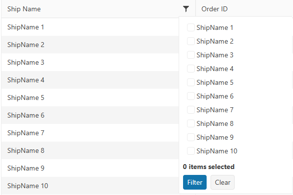
When using the default column checkbox filter menu and the data requested from the server takes time to load, the filter menu popup does not resize correctly when opening the menu for the first time.
The issue started to occur in version 2025.1.211.
### Reproduction of the problem
1) Enable the checkbox filter menu of a specified column. The Grid binds to remote data and the data operations are perfomed on the server.
2) Open the filter menu when the Grid is loaded.
3) The Read request triggers and a loader is displayed to indicate that the data is loading:
4) The options are loaded, but the popup container does not expand as expected:
5) Close the filter menu and opend it again:
### Expected/desired behavior
The filter menu popup must display all options when the data is loaded.
### Workaround
<style>
     .k-animation-container-shown {
        overflow: visible !important;
    }
</style>
### Environment
* **Kendo UI version: 2025.2.520
* **jQuery version: 3.7.1
* **Browser: [all]
Bug report
When ParseFormats is set in the DatePicker editor used in the Grid popup, the picker does not show the field value to which it is bound.
Reproduction of the problem
- Add a DateOnly? field to the model:
public DateOnly? OrderDate { get; set; }
- Bind a Grid column to the field.
- Set the default value in the DataSource:
.Model(model =>
{
    model.Id(p => p.OrderID);
    model.Field(p => p.OrderDate).DefaultValue(new DateOnly());
})
- Configure Popup editing in the Grid.
- Add a DateOnly.cshtml editor in EditorTemplates:
@model DateOnly?

@(Html.Kendo().DatePickerFor(m => m).ParseFormats(new string[] { "MM/dd/yyyy" }).HtmlAttributes(new { title = Html.ViewContext.ViewData.TemplateInfo.GetFullHtmlFieldName("") }))
Current behavior
When editing a record. The value of the OrderDate field is not displayed in the DatePicker.
If you remove the ParseFormats option from the DatePicker, it shows the value as expected.
Expected/desired behavior
The field value should be displayed in the picker, even when ParseFormats is set.
Environment
- Kendo UI version: 2024.4.1112
- Browser: All
column-command template does not access datasource as an ordinary column template.
<kendo-grid name="grid">
    <columns>
        <column field="ProductID" title="ID" />
        <column title="Column" template="#=columnTemplate(data.ProductID)#" />
        <column title="ColumnCommand">
        <commands>
            <column-command name="change" template="#=columnTemplate(data.ProductID)#"></column-command>
        </commands>
    </column>
    </columns>
    <datasource type="DataSourceTagHelperType.Custom" server-filtering="true">
        <transport>
            <read url="@Url.Action("ServerFiltering_GetProducts", "MultiSelect")" />
        </transport>
    </datasource>
</kendo-grid>

<script>
    function columnTemplate(productID) {
        if (productID % 2 == 0)
            return 'even';
        else
            return 'odd';
    }
</script>
Reproduction of the problem:
https://netcorerepl.telerik.com/myurdlbI16kA1TM213
Current behavior:
There is no way to have a dynamic template for column commands that depends on datasource.
Expected/desired behavior:
Having column-command template as column template, making it possible to access data from datasource.
Environment:
Kendo UI version: 2024.2.514
Workaround:
As an alternative solution, I'm using data-bound event, performing a for loop to all rows, but it needs to go line by line, which is not the best solution for large data.
### Bug report
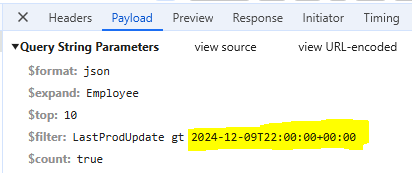
When the Grid is set up for OData-v4 binding, the columns that bind to DateOnly fields fail to filter. The date value in the filter expression contains the time portion and the following error is thrown:
"The binary operator GreaterThan is not defined for the types 'System.Nullable`1[System.DateOnly]' and 'System.Nullable`1[System.DateTimeOffset]'."
### Reproduction of the problem
1) Create a Grid that uses OData-v4 binding.
2) Bind a specified column to a DateOnly field.
3) Filter the column through the default column filter menu and open the browser DevTools to review the response of the request.
//Model
public DateOnly LastProdUpdate { get; set; }

//View
@(Html.Kendo().Grid<ProductViewModel>()
    .Name("grid")
     .Columns(columns =>
        {
            columns.Bound(p => p.LastProdUpdate).Format("{0:dd/MM/yyyy}");
        })
        ...
        .Filterable()
        .DataSource(dataSource => dataSource
        .Custom()
        .Type("odata-v4")
        .Transport(t =>
        {
            t.Read(read => read.Url("/odata/Products").Data("function() {return {'$expand': 'Employee'} }"));
        })
        .PageSize(10)
        .ServerPaging(true)
        .ServerFiltering(true)
        .ServerSorting(true)
     )
)
### Expected/desired behavior
The DateOnly fields must be filtered successfully as the DateTime fields.
### Environment
* **Kendo UI version: 2024.4.1112
* **Browser: [all]
Bug report
Filterable configuration in ForeignKey is not serialized in TagHelper Grid.
Reproduction of the problem
Open this REPL example
Current behavior
Filterable configuration in ForeignKey is not serialized in TagHelper Grid.
Expected/desired behavior
Filterable configuration in ForeignKey should be serialized in TagHelper Grid.
TicketID:
1692361
Environment
- Kendo UI version: 2025.2.702
- Browser: [all]
Hi,
I'm following this document to load data into the grid view control using local data binding.
https://demos.telerik.com/aspnet-core/grid/local-data-binding
I'm not sure this is an issue or expected grid view behavior when using local data binding. If loader-type and no-records are added. What happens is when there are no records, the Skeleton is still displayed and the no-records template is not displayed (see the attached image)
<kendo-grid mobile="Disabled" name="Grid" loader-type="GridLoaderType.Skeleton">
 <columns>
 <column field="ProductName" title="Product Name">
 </column>
 <column field="UnitPrice" format="{0:C}" title="Unit Price" width="130">
 </column>
 <column field="UnitsInStock" title="Units In Stock" width="130">
 </column>
 <column field="Discontinued" title="Discontinued" width="130">
 </column>
 </columns>
 <datasource type="DataSourceTagHelperType.Ajax" page-size="20" server-operation="false" data="@Model">
 </datasource>
 <filterable enabled="true">
 </filterable>
 <scrollable enabled="true" />
 <pageable enabled="true">
 </pageable>
 <sortable enabled="true" />
<no-records template="string HTML template, automatically centered" />
</kendo-grid>
Thanks
Bob
Currenty, when the Grid is in InCell edit mode, if a column binds to a boolean field, it is required a custom logic to display the field as a checkbox, which is always in edit mode and can be updated through a single click. Here is a REPL sample that shows the example:
https://netcorerepl.telerik.com/GJOhEIkj47P2xHf709
My opinion is that this functionality should work correctly out of the box without additional coding. If this is not available, then there should be an applicable sample code.
Is it possible to make an example where EF, Dirty works, no double click required and the checkbox always looks like a checkbox?
Bug report
The rowReorder event does not return the correct newIndex when dragging a row from a lower row index to a higher row index.
Reproduction of the problem
- Run this dojo https://dojo.telerik.com/omyPpaZb
- Drag
Chaiand drop afterChang. NoteoldIndexis 0,newIndexis 2, which is unexpected as indices are 0-based
- Re-run the dojo to start fresh and drag
Changand drop beforeChaiand the indices are correct -oldIndex: 1,newIndex: 0
Current behavior
The returned newIndex is incorrect.
Expected/desired behavior
The returned newIndex should be correct.
Environment
- Kendo UI version: 2025.2.520
- Browser: [all]
### Bug report
When using the sort" and "filter" toolbar commands, the "sort" and "filter" events do not trigger.
### Reproduction of the problem
A Dojo sample for reporduction: https://dojo.telerik.com/ySEQTSSS
### Expected/desired behavior
The "sort" and "filter" events must trigger when sorting and filterng the columsn through the respective toolbar commands.
### Environment
* **Kendo UI version: 2025.2.520
* **jQuery version: 3.7.1
* **Browser: [all]
### Bug report
The "Clear Sorting" and "Clear all filters" labels cannot be localized when using the "sort" and "filter" toolbar commands.
### Reproduction of the problem
A Dojo sample for reporduction: https://dojo.telerik.com/JHJGUaSH
### Expected/desired behavior
The "Clear Sorting" and "Clear all filters" messages should be exposed for localization.
### Environment
* **Kendo UI version: 2025.2.520
* **jQuery version: 3.7.1
* **Browser: [all]
### Bug report
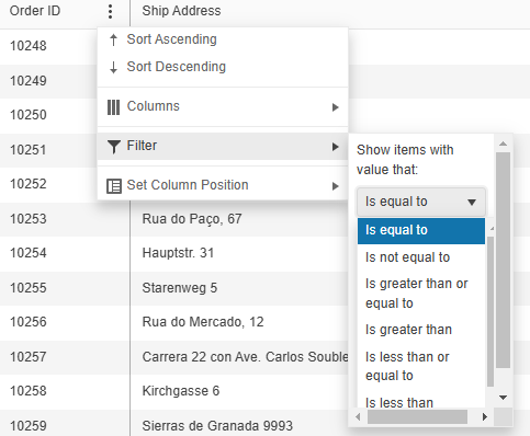
When opening the filter menu of a specified column through the classic ColumnMenu, the filter container is displayed with scrollbars when the dropdown of the filter operator is opened.
### Reproduction of the problem
1) Define a Grid and enable its classic ColumnMenu.
2) Open the filter menu of a specified column and then open the dropdown to select a filter operator.
3) The filter container has scrollbars. The "k-menu-popup" element has "overflow: auto";
Use the following demo to test the case and select the "classic" type for the ColumnMenu: https://demos.telerik.com/kendo-ui/grid/column-menu
The issue does not appear when using version 2024.4.1112.
### Expected/desired behavior
The filter menu container must not change its appearance when the dropdown opens.
### Workaround:
<style>
.k-menu-popup {
    overflow: visible !important;
}
</style>* **Kendo UI version: 2025.1.211
* **jQuery version: 3.7.1
* **Browser: [all]
Bug report
The Core Grid throws an exception when setting its toolbar template through the ClientTemplateId option. The issue is a regression introduced in version 2025.2.520.
Reproduction of the problem
- Configure the toolbar of the Grid like this:
.ToolBar(toolbar => {
     toolbar.ClientTemplateId("myTemplate");
})
Current behavior
An exception is thrown:
NullReferenceException: Object reference not set to an instance of an object
Expected/desired behavior
The configuration works without throwing exceptions.
Wokraround
Use the alternative way of setting the toolbar template, on the Grid's root level:
@(Html.Kendo().Grid <MyModel>()
      .Name("grid")
      .ToolBarClientTemplateId("myTemplate")
Environment
- Kendo UI version: 2025.2.520
- Browser: [all]
Bug report
Expose additional API configurations for the Grid's ToolBar
Reproduction of the problem
As of recent releases, the Kendo UI Grid Toolbar has been substituted with the Kendo UI Toolbar. This change allows users to add the majority ToolBar.items API options apart from the built-in tools.
As noted within the Kendo UI for jQuery API documentation for the Grid's Toolbar:
"Apart from the built-in tools, the Grid fully exposes the ToolBar.items API. This way you can specify any custom tools in the widget using the components available in the ToolBar itself."
Current behavior
The inherited ToolBar.items API options are not available for the server-side Telerik UI Grid for ASP.NET Core and MVC wrappers as well.
Expected/desired behavior
It would be beneficial to the customers if the inherited ToolBar.items API options are available for the server-side Telerik UI Grid for ASP.NET Core and MVC wrappers as well.
Environment
- Kendo UI version: 2024.1.130
- Browser: [all]
Enhancement
Expose the sorts TagHelper for the Grid's column filter datasource taghelper
Overview
Currently, the Grid's Column Filter Datasource Taghelper exposes the following inner child TagHelpers.
Unlike its HtmlHelper counterpart which happens to expose the .Sort() API configuration. For example:
.Columns(columns =>
{
    columns.Bound(p => p.ShipName).Filterable(ftb =>
    {
        ftb.Multi(true);
        ftb.Search(true);
        ftb.CheckAll(true);
        ftb.DataSource(dataSource => dataSource
            .Custom()
            ...
            .Sort(sort =>
            {
                sort.Add("ShipName").Ascending();
            })
        );
    });
})


