Dear Support Team,
we are currently trying out RadPdfViewer and have found that hyperlinks in the PDFs do not work.
During my research, I found that this has now been implemented for the Kendo UI PDF viewer for Angular (https://www.telerik.com/kendo-angular-ui/components/changelogs/kendo-angular-ui#v18.5.0).
Will this also be implemented for the ASP.NET viewer, and if so, when?
Best regards
Frank
Hi Team,
I would like to request a way to insert a new record at the bottom of the InPlace Editable RadGrid so that the row would be within the RadGrid container.
Thank you!
Hi,
I am using the pdf viewer control and can't find anything on displaying the PDF document in a 2 page spread mode e.g. page 1 and 2 side by side, 3 and 4 side by side etc.
Does the control support this?
Thanks
Hi,
many customers are asking us a more MS Word-like editor supporting true document layout features such as:
- page margins and rulers
- Headers and footers
- section breaks or document structure more similar to MS Word
- Microsoft Word-inspired UI
Many thanks,
Max
I know its a long shot, but do you have anything that resembles the attached control.
Thank you
I reeally would like to see the Blazor Sankey Chart component in the ASP.NET AJAX library!
Kind regards
Robert
https://icons8.com/icons/
https://bsky.app/
We now have Blue Sky, written by the guys who wrote Twitter; there is no icon for this, but there will be new platforms coming along, and how do you keep up? Therefore, to be able to customize your social share would be useful. Then define your CSS name as 'sshShareOnxxxxx01', with the custom behaviours as a template, is this page as a template token '{url}' , this also needs to deal with "Comment on the page" (not just share it), to copy the URL (to cut and paste into a SMS message or WhatsApp). This social share is part of the new world, eg what do you do with a share with voice.
Eg attach this URL to a WhatsApp voice message?
This would be useful in Campaigning when you want to send a URL and a voice message (e.g., "Vote for Me").
You also need to have in the template a localization flag. We can assume its always en_us but that's not Telerik,
Also adding the CSS content as a SVG would be good to.
Also would be nice to have this in KendoUI as well.
.sshShareOnTwitter::before {
    content: url("../X.png");
}.png)
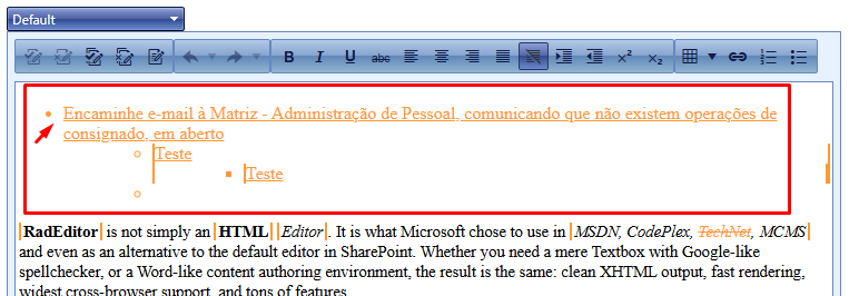
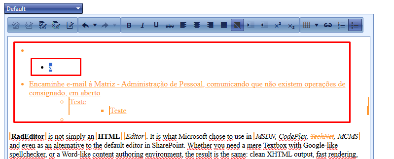
There is a formatting issue in the editor when the "Tab" key is pressed, triggering the editor's "InsertTab" event on text that has been modified by another user. In this event, when set_enableTrackChangesOverride(true) is enabled, the editor inserts an "a" character and misformats the text in question (as shown in the video). When set_enableTrackChangesOverride(false) is set, this error does not occur.
Note: In this scenario, we need track changes enabled so the user can accept or reject the changes made by the previous user, and set_enableTrackChangesOverride(true) so that the current user can reconcile the changes made by both User 1 and User 2 without tracking their own modifications.
Before insert Tab:
After insert Tab:
We would like to request updating the Azure library for uploading files to Azure Blob Storage.
The WindowsAzure.Storage library has been deprecated and is no longer maintained.
<%-- <dx:ASPxFormLayout ID="layout" runat="server" Width="100%" Visible="true" Theme="ios" >
<Items>
<dx:TabbedLayoutGroup Caption="tabbed group" Width="100%">
<Items>
<dx:LayoutGroup Caption="Location Information">
<Items>
<dx:LayoutItem Caption="" FieldName="">
<LayoutItemNestedControlCollection>
<dx:LayoutItemNestedControlContainer ID="LayoutItemNestedControlContainer1" runat="server">
<dx:ASPxFormLayout ID="ASPxFormLayout1" runat="server"
DataSourceID="datasourceThisLocation" ColumnCount="2" Theme="Aqua">
<Items>
<dx:LayoutItem FieldName="company" ColSpan="1" Caption="location">
<LayoutItemNestedControlCollection>
<dx:LayoutItemNestedControlContainer runat="server">
<dx:ASPxTextBox runat="server" Width="310px" ID="ASPxFormLayout1_E2"></dx:ASPxTextBox>
</dx:LayoutItemNestedControlContainer>
</LayoutItemNestedControlCollection>
</dx:LayoutItem>
<dx:LayoutItem FieldName="phone" ColSpan="1">
<LayoutItemNestedControlCollection>
<dx:LayoutItemNestedControlContainer runat="server">
<dx:ASPxTextBox runat="server" Width="310px" ID="ASPxFormLayout1_E3"></dx:ASPxTextBox>
</dx:LayoutItemNestedControlContainer>
</LayoutItemNestedControlCollection>
</dx:LayoutItem>
<dx:LayoutItem FieldName="fax" ColSpan="1">
<LayoutItemNestedControlCollection>
<dx:LayoutItemNestedControlContainer runat="server">
<dx:ASPxTextBox runat="server" Width="310px" ID="ASPxFormLayout1_E4"></dx:ASPxTextBox>
</dx:LayoutItemNestedControlContainer>
</LayoutItemNestedControlCollection>
</dx:LayoutItem>
<dx:LayoutItem FieldName="contractStatus" Caption="contract status" ColSpan="1">
<LayoutItemNestedControlCollection>
<dx:LayoutItemNestedControlContainer runat="server">
<dx:ASPxTextBox runat="server" Width="310px" ID="ASPxFormLayout1_E5"></dx:ASPxTextBox>
</dx:LayoutItemNestedControlContainer>
</LayoutItemNestedControlCollection>
</dx:LayoutItem>
<dx:LayoutItem FieldName="timeZone" ColSpan="1" Caption="time zone">
<LayoutItemNestedControlCollection>
<dx:LayoutItemNestedControlContainer runat="server">
<dx:ASPxTextBox runat="server" Width="310px" ID="ASPxFormLayout1_E6"></dx:ASPxTextBox>
</dx:LayoutItemNestedControlContainer>
</LayoutItemNestedControlCollection>
</dx:LayoutItem>
<dx:LayoutItem FieldName="primaryContact" ColSpan="1" Caption="prinary contact">
<LayoutItemNestedControlCollection>
<dx:LayoutItemNestedControlContainer runat="server">
<dx:ASPxTextBox runat="server" Width="310px" ID="ASPxFormLayout1_E7"></dx:ASPxTextBox>
</dx:LayoutItemNestedControlContainer>
</LayoutItemNestedControlCollection>
</dx:LayoutItem>
<dx:LayoutItem FieldName="street" ColSpan="1" Caption="address">
<LayoutItemNestedControlCollection>
<dx:LayoutItemNestedControlContainer runat="server">
<dx:ASPxTextBox runat="server" Width="310px" ID="ASPxFormLayout1_E10"></dx:ASPxTextBox>
</dx:LayoutItemNestedControlContainer>
</LayoutItemNestedControlCollection>
</dx:LayoutItem>
<dx:LayoutItem FieldName="street2" ColSpan="1" Caption="address">
<LayoutItemNestedControlCollection>
<dx:LayoutItemNestedControlContainer runat="server">
<dx:ASPxTextBox runat="server" Width="310px" ID="ASPxFormLayout1_E11"></dx:ASPxTextBox>
</dx:LayoutItemNestedControlContainer>
</LayoutItemNestedControlCollection>
</dx:LayoutItem>
<dx:LayoutItem FieldName="city" ColSpan="1">
<LayoutItemNestedControlCollection>
<dx:LayoutItemNestedControlContainer runat="server">
<dx:ASPxTextBox runat="server" Width="310px" ID="ASPxFormLayout1_E12"></dx:ASPxTextBox>
</dx:LayoutItemNestedControlContainer>
</LayoutItemNestedControlCollection>
</dx:LayoutItem>
<dx:LayoutItem FieldName="state" ColSpan="1">
<LayoutItemNestedControlCollection>
<dx:LayoutItemNestedControlContainer runat="server">
<dx:ASPxTextBox runat="server" Width="310px" ID="ASPxFormLayout1_E13"></dx:ASPxTextBox>
</dx:LayoutItemNestedControlContainer>
</LayoutItemNestedControlCollection>
</dx:LayoutItem>
<dx:LayoutItem FieldName="zip" ColSpan="1">
<LayoutItemNestedControlCollection>
<dx:LayoutItemNestedControlContainer runat="server">
<dx:ASPxTextBox runat="server" Width="310px" ID="ASPxFormLayout1_E14"></dx:ASPxTextBox>
</dx:LayoutItemNestedControlContainer>
</LayoutItemNestedControlCollection>
</dx:LayoutItem>
<dx:LayoutItem FieldName="email" ColSpan="1">
<LayoutItemNestedControlCollection>
<dx:LayoutItemNestedControlContainer runat="server">
<dx:ASPxTextBox runat="server" Width="310px" ID="ASPxFormLayout1_E16"></dx:ASPxTextBox>
</dx:LayoutItemNestedControlContainer>
</LayoutItemNestedControlCollection>
</dx:LayoutItem>
</Items>
</dx:ASPxFormLayout>--%>
Describe service request:
<telerik:RadTextBox ID="srevicetroubles" runat="server" Width="350px"></telerik:RadTextBox>
<%--<dx:ASPxTextBox ID="srevicetroubles" runat="server" Width="350px" Theme="Aqua" ></dx:ASPxTextBox>--%>
<telerik:RadButton ID="ASPxButton2" runat="server" Text="click here send request for service at this location"></telerik:RadButton>
<%--<dx:ASPxButton ID="ASPxButton2" runat="server" Text="click here send request for service at this location" Theme="Aqua"> </dx:ASPxButton>--%>
<asp:Label ID="Label1" runat="server" Text="" Visible="false"></asp:Label>
<%-- </dx:LayoutItemNestedControlContainer>
</LayoutItemNestedControlCollection>
</dx:LayoutItem>
</Items>
</dx:LayoutGroup>--%>
<%-- <dx:LayoutGroup Caption="Notes and Communication">
<Items>
<dx:LayoutItem Caption="" FieldName="">
<LayoutItemNestedControlCollection>
<dx:LayoutItemNestedControlContainer ID="LayoutItemNestedControlContainer3" runat="server">
<dx:ASPxGridView ID="ASPxGridView1" runat="server" DataSourceID="myStoreNotes"
EnableTheming="True" Theme="Moderno" KeyFieldName="id">
<Columns>
<dx:GridViewCommandColumn VisibleIndex="0" ShowNewButton="True" ShowUpdateButton="True" ShowClearFilterButton="True" />
<dx:GridViewDataColumn FieldName="DateAdded" Caption="Date Added" VisibleIndex="1">
<EditFormSettings VisibleIndex="1" Visible="False" />
</dx:GridViewDataColumn>
<dx:GridViewDataColumn FieldName="AddedBy" Caption="Added By" VisibleIndex="2">
<EditFormSettings VisibleIndex="2" Visible="False" />
</dx:GridViewDataColumn>
<dx:GridViewDataTextColumn FieldName="Note" Caption="Note" VisibleIndex="3">
<PropertiesTextEdit EncodeHtml="true"></PropertiesTextEdit>
</dx:GridViewDataTextColumn>
<dx:GridViewDataColumn FieldName="Ack" Caption="Acknowledged" VisibleIndex="4">
<EditFormSettings VisibleIndex="4" Visible="False" />
</dx:GridViewDataColumn>
<dx:GridViewDataColumn FieldName="ackBy" Caption="Acknowledged By" VisibleIndex="5">
<EditFormSettings VisibleIndex="5" Visible="False" />
</dx:GridViewDataColumn>
<dx:GridViewDataColumn FieldName="AckDate" Caption="Acknowledged Date" VisibleIndex="6">
<EditFormSettings VisibleIndex="6" Visible="False" />
</dx:GridViewDataColumn>
</Columns>
<Settings ShowFilterRow="True" />
<SettingsCommandButton>
<NewButton Text="Add Post-It Note" />
<UpdateButton Text="Save" />
</SettingsCommandButton>
</dx:ASPxGridView>
</dx:LayoutItemNestedControlContainer>
</LayoutItemNestedControlCollection>
</dx:LayoutItem>
</Items>
</dx:LayoutGroup>
<dx:LayoutGroup Caption="Open Work Orders">
<Items>
<dx:LayoutItem Caption="" FieldName="">
<LayoutItemNestedControlCollection>
<dx:LayoutItemNestedControlContainer ID="LayoutItemNestedControlContainer7" runat="server">
<dx:ASPxGridView ID="ASPxGridView2" runat="server" AutoGenerateColumns="true"
Visible="true" Theme="Moderno" Width="100%"
DataSourceID="dataSourceOpenTickets" KeyFieldName ="REQUESTNUMBER">
<Columns>
<dx:GridViewDataHyperLinkColumn Caption="WO #" FieldName="REQUESTNUMBER"
VisibleIndex="10" >
<PropertiesHyperLinkEdit NavigateUrlFormatString="/orders/edit.aspx?ID={0}"
TextField="REQUESTNUMBER">
</PropertiesHyperLinkEdit>
</dx:GridViewDataHyperLinkColumn>
<dx:GridViewDataColumn Caption="Service Facility" FieldName="branch" VisibleIndex="30">
</dx:GridViewDataColumn>
<dx:GridViewDataColumn Caption="My PO" FieldName="PO" VisibleIndex="40">
</dx:GridViewDataColumn>
<dx:GridViewDataMemoColumn Caption="Description" FieldName="DESCRIPTION" VisibleIndex="50">
</dx:GridViewDataMemoColumn>
<dx:GridViewDataColumn Caption="Type of Service" FieldName="serviceType" VisibleIndex="60">
</dx:GridViewDataColumn>
<dx:GridViewDataDateColumn Caption="Expected Completion" FieldName="ExpectedCompletionDate" VisibleIndex="80"></dx:GridViewDataDateColumn>
<dx:GridViewDataColumn Caption="Status of WO" FieldName="CurrentCustodyDisplay" VisibleIndex="90">
</dx:GridViewDataColumn>
</Columns>
<Templates>
<DetailRow>
<iframe id="myframeDetailGridView2" runat="server" scrolling="yes" marginwidth="0" marginheight="0" frameborder="0"
vspace="0" hspace="0" width="100%" height="650px" oninit="myframeDetailGridView2_Init"></iframe>
</DetailRow>
</Templates>
<Styles>
<AlternatingRow Enabled="true" />
<Header Wrap="True" />
</Styles>
<SettingsDetail ShowDetailRow="true" />
<Settings ShowFilterRow="True" ShowFilterRowMenu="true" ShowGroupPanel="True" />
<SettingsPager PageSize="15" />
<SettingsBehavior ColumnResizeMode="Control" />
<SettingsBehavior EnableRowHotTrack="true" />
</dx:ASPxGridView>
</dx:LayoutItemNestedControlContainer>
</LayoutItemNestedControlCollection>
</dx:LayoutItem>
</Items>
</dx:LayoutGroup>
<dx:LayoutGroup Caption="Completed Work Oders" Visible="true">
<Items>
<dx:LayoutItem Caption="" FieldName="">
<LayoutItemNestedControlCollection>
<dx:LayoutItemNestedControlContainer ID="LayoutItemNestedControlContainer2" runat="server">
<dx:ASPxGridView ID="ASPxGridView3" runat="server" AutoGenerateColumns="true"
Visible="true" Theme="Moderno" Width="100%"
DataSourceID="dataSourceCompletedTickets" KeyFieldName ="REQUESTNUMBER">
<Columns>
<dx:GridViewDataHyperLinkColumn Caption="WO #" FieldName="REQUESTNUMBER"
VisibleIndex="10" >
<PropertiesHyperLinkEdit NavigateUrlFormatString="/orders/edit.aspx?ID={0}"
TextField="REQUESTNUMBER">
</PropertiesHyperLinkEdit>
</dx:GridViewDataHyperLinkColumn>
<dx:GridViewDataColumn Caption="Service Facility" FieldName="branch" VisibleIndex="30">
</dx:GridViewDataColumn>
<dx:GridViewDataColumn Caption="My PO" FieldName="PO" VisibleIndex="40">
</dx:GridViewDataColumn>
<dx:GridViewDataColumn Caption="Description" FieldName="DESCRIPTION" VisibleIndex="50">
</dx:GridViewDataColumn>
<dx:GridViewDataColumn Caption="Type of Service" FieldName="serviceType" VisibleIndex="60">
</dx:GridViewDataColumn>
<dx:GridViewDataDateColumn Caption="Expected Completion" FieldName="ExpectedCompletionDate" VisibleIndex="80"></dx:GridViewDataDateColumn>
<dx:GridViewDataColumn Caption="Status of WO" FieldName="CurrentCustodyDisplay" VisibleIndex="90">
</dx:GridViewDataColumn>
</Columns>
<Templates>
<DetailRow>
<iframe id="myframeDetailGridView2" runat="server" scrolling="yes" marginwidth="0" marginheight="0" frameborder="0"
vspace="0" hspace="0" width="100%" height="650px" oninit="myframeDetailGridView2_Init"></iframe>
</DetailRow>
</Templates>
<Styles>
<AlternatingRow Enabled="true" />
<Header Wrap="True" />
</Styles>
<SettingsDetail ShowDetailRow="true" />
<Settings ShowFilterRow="True" ShowFilterRowMenu="true" ShowGroupPanel="True" />
<SettingsPager PageSize="15" />
<SettingsBehavior ColumnResizeMode="Control" />
<SettingsBehavior EnableRowHotTrack="true" />
</dx:ASPxGridView>
</dx:LayoutItemNestedControlContainer>
</LayoutItemNestedControlCollection>
</dx:LayoutItem>
</Items>
</dx:LayoutGroup>
<dx:LayoutGroup Caption="Onsite Equipment" Visible="true">
<Items>
<dx:LayoutItem Caption="" FieldName="">
<LayoutItemNestedControlCollection>
<dx:LayoutItemNestedControlContainer ID="LayoutItemNestedControlContainer5" runat="server">
<dx:ASPxGridView ID="ASPxGridView5" runat="server" AutoGenerateColumns="false" Visible="true"
Theme="Office2003Blue" Width="100%" KeyFieldName="EquipmentID" DataSourceID="myEquipment">
<Columns>
<dx:GridViewDataColumn Caption="Description" FieldName="EquipmentDescription" VisibleIndex="1">
</dx:GridViewDataColumn>
<dx:GridViewDataColumn Caption="Quantity" FieldName="EquipmentQTY" VisibleIndex="2">
</dx:GridViewDataColumn>
<dx:GridViewDataColumn Caption="Type" FieldName="EquipmentType" VisibleIndex="3">
</dx:GridViewDataColumn>
<dx:GridViewDataColumn Caption="Location" FieldName="EquipmentLocation" VisibleIndex="4">
</dx:GridViewDataColumn>
<dx:GridViewDataColumn Caption="Size" FieldName="EquipmentSize" VisibleIndex="5">
</dx:GridViewDataColumn>
<dx:GridViewDataColumn Caption="Last Inspection" FieldName="LastInspection" VisibleIndex="6">
</dx:GridViewDataColumn>
</Columns>
<Templates>
<DetailRow>
<dx:ASPxGridView ID="detailGrid" runat="server" DataSourceID="equipmentdetailrecord"
Width="100%" OnBeforePerformDataSelect="detailGrid_DataSelect" AutoGenerateColumns="false">
<Templates>
<DataRow>
<table cellpadding="2" cellspacing="1" style="border-style: none; width: 100%">
<tr>
<td colspan="2">
<h1>Equipment Information</h1>
</td>
</tr>
<tr>
<td align="right">description:</td>
<td><%# Eval("EquipmentDescription")%></td>
</tr>
<tr>
<td align="right">type:</td>
<td><%# Eval("EquipmentSize")%></td>
</tr>
<tr>
<td align="right">size:</td>
<td><%# Eval("EquipmentDescription")%></td>
</tr>
<tr>
<td align="right">serial number:</td>
<td><%# Eval("SerialNumber")%></td>
</tr>
<tr>
<td align="right">location:</td>
<td><%# Eval("EquipmentLocation")%></td>
</tr>
<tr>
<td align="right">model:</td>
<td><%# Eval("EquipmentModel")%></td>
</tr>
<tr>
<td align="right">warrenty expires:</td>
<td><%# Eval("WarrentyExpires")%></td>
</tr>
<tr>
<td align="right">inspection frequency:</td>
<td><%# Eval("Freq")%></td>
</tr>
<tr>
<td align="right">last inspection:</td>
<td><%# Eval("LastInspection")%></td>
</tr>
<tr>
<td align="right">next inspection:</td>
<td><%# Eval("EquipmentDescription")%></td>
</tr>
</table>
</DataRow>
</Templates>
</dx:ASPxGridView>
</DetailRow>
</Templates>
<Settings ShowFilterRow="True" ShowFilterRowMenu="true" ShowGroupPanel="True" />
<SettingsPager PageSize="25" />
<SettingsBehavior ColumnResizeMode="Control" />
<SettingsDetail ShowDetailRow="true" ShowDetailButtons="true" />
</dx:ASPxGridView>
<p><dx:ASPxButton ID="btnXlsExport" runat="server" OnClick="btnXlsExport_Click" Theme="Office2003Blue"
Text="Export to XLS">
</dx:ASPxButton></p>
<p> </p>
<dx:ASPxGridViewExporter ID="ASPxGridViewExporter1" runat="server" GridViewID="ASPxGridView1">
</dx:ASPxGridViewExporter>
</dx:LayoutItemNestedControlContainer>
</LayoutItemNestedControlCollection>
</dx:LayoutItem>
</Items>
</dx:LayoutGroup>
<dx:LayoutGroup Caption="Documents" Visible="true">
<Items>
<dx:LayoutItem Caption="" FieldName="">
<LayoutItemNestedControlCollection>
<dx:LayoutItemNestedControlContainer ID="LayoutItemNestedControlContainer4" runat="server">
<dx:ASPxGridView ID="ASPxGridView4" runat="server" Width="100%"
Theme="Moderno" DataSourceID="dsDocuments" KeyFieldName="DocID">
<Columns>
<dx:GridViewDataTextColumn Caption="Type" FieldName="DocType" VisibleIndex="40">
<EditFormSettings VisibleIndex="40" Visible="False" Caption="name:" />
</dx:GridViewDataTextColumn>
<dx:GridViewDataTextColumn Caption="WT #" FieldName="FalconServiceNumber" VisibleIndex="45">
<EditFormSettings VisibleIndex="45" Visible="False" Caption="name:" />
</dx:GridViewDataTextColumn>
<dx:GridViewDataDateColumn Caption="Index Date" FieldName="DocDate" VisibleIndex="46">
<EditFormSettings VisibleIndex="46" Visible="False" Caption="name:" />
</dx:GridViewDataDateColumn>
<dx:GridViewDataHyperLinkColumn Caption="Document" FieldName="DocID" VisibleIndex="110">
<PropertiesHyperLinkEdit NavigateUrlFormatString="javascript:ShowDetailPopup('{0}');" TextField="DocDescription">
</PropertiesHyperLinkEdit>
<EditFormSettings VisibleIndex="110" Visible="False" Caption="name:" />
</dx:GridViewDataHyperLinkColumn>
</Columns>
<Styles>
<AlternatingRow Enabled="true" />
<Header Wrap="True" />
<RowHotTrack BackColor="lightgray"></RowHotTrack>
</Styles>
<Settings ShowFilterRow="True" ShowFilterRowMenu="true" ShowGroupPanel="True" ShowFilterBar="Visible" />
<SettingsPager PageSize="20" />
<SettingsBehavior ColumnResizeMode="Control" />
</dx:ASPxGridView>
</dx:LayoutItemNestedControlContainer>
</LayoutItemNestedControlCollection>
</dx:LayoutItem>
</Items>
</dx:LayoutGroup>
</Items>
</dx:TabbedLayoutGroup>
</Items>
</dx:ASPxFormLayout>
Scenario:
1 Filter being used to filter 2 different Grids in 2 different TabStrip tabs
It would be good to add this functionality for a better customization of the Grid's newly inserted rows.
I am reaching out to inquire about the accessibility features of the RadGrid component in C# Webforms, specifically regarding the ability to perform grouping and resizing of columns using keyboard-only navigation in compliance with WCAG 2.2 Level AA standards.
Our organization is committed to ensuring that our web applications meet the Web Content Accessibility Guidelines (WCAG) 2.2 Level AA requirements. A critical part of this compliance involves enabling users to group and sort columns in data grids using only the keyboard.
Could you please confirm if the RadGrid component supports keyboard-only grouping and resizing of columns? Additionally, we would appreciate any guidance or documentation you can provide on how to implement and test these accessibility features within the RadGrid component to ensure compliance with WCAG 2.2 Level AA.
Thank you for your assistance with this matter. We look forward to your prompt response.
No Ticket 1659890 is explained a problem that occurs with our customers.
Hello,
For ASPX.NET AJAX... JQuery 1.x branch is still being utilized / embedded (even though some of the bigger issues have been manually changed by your Progress Team) does not cut it with our client base. JQuery Branch 1.x is not acceptable and has been a Severe security item for ALL PEN testing solutions for some time.
What are the Progress plans to get jQuery up to SPEC (3.7.x... etc.). We have no interest in over-riding the version of jQuery as is noted in some of the forums. This creates other issues at the Telerik component level... we do not want to deal with component issues as that is why we procure 3rd party Components in the first place.
"Security is paramount over functionality in most web applications today."
This is major, as we would have to move on to other technologies if your roadmap does not meet our needs. Q1 2025 at min.
I am certain many other users are in the same boat.
Kind Regards
Allow RadGantt to export the data to Excel