Steps to reproduce
- open QSF.sln
- open WorldClockView.xaml
- add x:Name="tabView" to RadTabView
- add IsVisible="False" to Auckland tab item !!!
- open WorldClockView.cs
- add this code to the end of page constructor:
 var tabItem = new TabViewItem()
 {
     Header = new TabViewHeaderItem { Text = "Prague" },
     Content = new StackLayout
     {
         Children =
         {
             new Label {Text = "Prague"}
         }
     },
 };
 var index = tabView.Items.Count - 2;
 tabView.Items.Insert(index, tabItem);
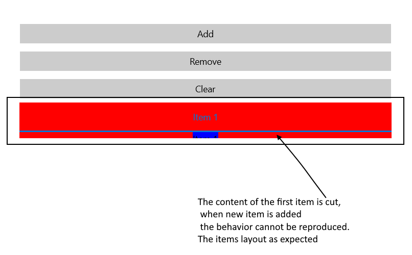
when TabView is inside Stack and item is added dynamically to the RadTabView, the content of this first item does not layout as expected.
<StackLayout>
    <Button Text="Add" Clicked="OnAddClicked" />
    <Button Text="Remove" Clicked="OnRemoveClicked" Margin="0,5,0,5" />
    <Button Text="Clear" Clicked="OnClearClicked" />


    <telerikPrimitives:RadTabView BackgroundColor="Red" x:Name="tabView" AutomationId="tabView"/>
</StackLayout>
In a scenario where TabView items are added and removed dynamically and IsContentPreserved property is set to "True" - if a new item is added, then the user selects it and the same item is removed, an exception is raised on iOS.
When we add some controls, for example, 3 controls in a row inside the first tab item, then 5-10 controls in a row in the second tab item of the tabview, we can only see the first 3 controls in the first tab. In other words, we can only see the controls in the row up to the height of the first tab's content.
The issue appears in SlideView control as well. The TabView control uses SlideView internally.
when the flow direction is changed to RTL
Expected: View should show in the order (tab2,tab1)
Actual: View is showing in the order (tab1,tab2)
https://material.io/design/usability/bidirectionality.html#mirroring-layout
Hi Team,
As we need to show loading spinner on Tabview so require property IsBusy or Isloading on Tabview. We are doing dynamic Tab header binding as per api response. Tab should be locked till loading spinner is showing on UI.
Regards
Abhishek Kesarwani
When longer string is used for HeaderText the text could not be wrapped. Also the issue occurs when using Label with LineBreakMode="WordWrap" inside the TabViewHeaderItem.Content:
<telerikPrimitives:TabViewItem.Header>
<telerikPrimitives:TabViewHeaderItem>
<telerikPrimitives:TabViewHeaderItem.Content>
<Label Text="Lorem ipsum dolor sit amet, consectetur adttert etertert erterter ipiscing elit." LineBreakMode="WordWrap"/>
</telerikPrimitives:TabViewHeaderItem.Content>
</telerikPrimitives:TabViewHeaderItem>
</telerikPrimitives:TabViewItem.Header>
<telerikPrimitives:TabViewItem.Content>
<Label Margin="10" Text="Label" />
</telerikPrimitives:TabViewItem.Content>
</telerikPrimitives:TabViewItem>
Currently RadTabView provides SelectedItem property
This feature request asks for the option to align the TabViewItemHeaders to one side of the HeaderPosition, using the minimal amount of horizontal space (rendered as if they're in a horizontal StackLayout)

As a good example, the UI for WPF TabControl does this, notice the tab headers are left-aligned: https://docs.telerik.com/devtools/wpf/controls/radtabcontrol/overview2
Allow different width tab headers. For example, 200, 100, 100.

Available in minor release 2018.2.727.250. It will also be available in the R3 2018 release.
Support for interactive TabHeader content (i.e. Buttons, Checkboxes) that does not invoke the tab selection and is aligned next to the tabs
Add support for tabs that cannot be selected
Introducing a TabItem.IsTabVisible property would be useful.

Currently, if you want to hide a tab, you need to remove it from the TabView.Items collection and cache it in a backing collection.

Then, to re-show the tab, remove it from the cache and add it back to the TabItems (preferably at the same index if you've also cached it's position).
Add functionality to slide through the items like in a SlideView/Carousel.
We should consider adding one or more events related to the selection of the TabView control.

